Plot Twist
Adding Interactivity to the
Elegance of {ggplot2} with {ggiraph}
Tanya Shapiro & Cédric Scherer
useR 2025
useR 2025
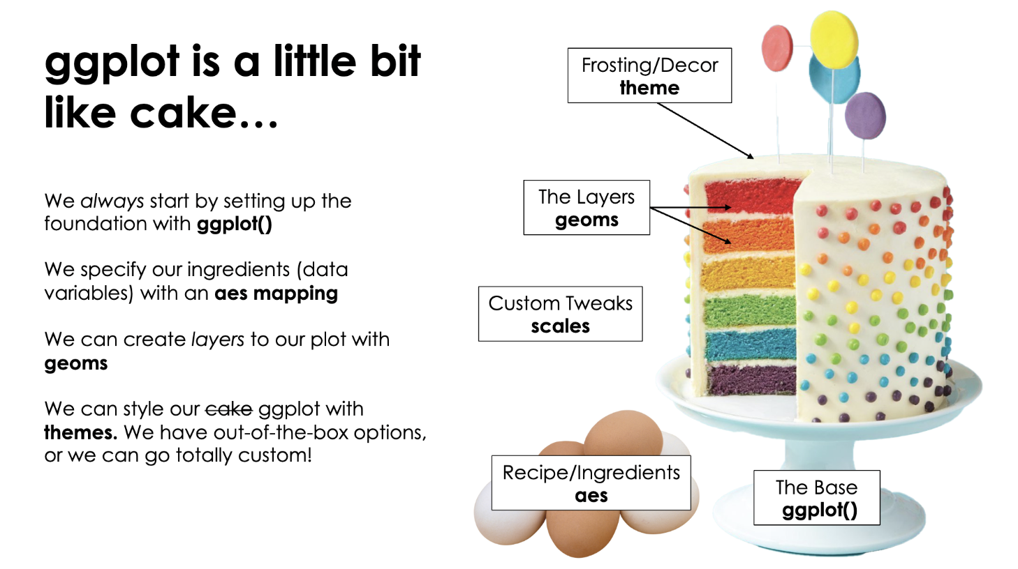
Why we ❤️ ggplot2
Explore Packages → ggplot2 Extension Gallery + Awesome ggplot2 Project
A collection of extension packages for (and built with) ggplot2. A wild mixture of the most popular packages, packages for very specific use cases, packages that provide color palettes, and very experimental stuff.
An illustration by Allison Horst: A person in a cape that reads “code hero” who looks like they are flying through the air while typing on a computer while saying “I’m doing a think all on my own!” The coder’s arms and legs have ropes attached to two hot air balloons lifting them up, with labels on the balloons including “teachers”, “bloggers”, “friends”, “developers”. Below the code hero, several people carry a trampoline with labels “support” and “community” that will catch them if they fall.
Illustration by Allison Horst
Why go interactive?
Static plots tell a story.
Interactive plots invite people to explore the story!
Where To Start?
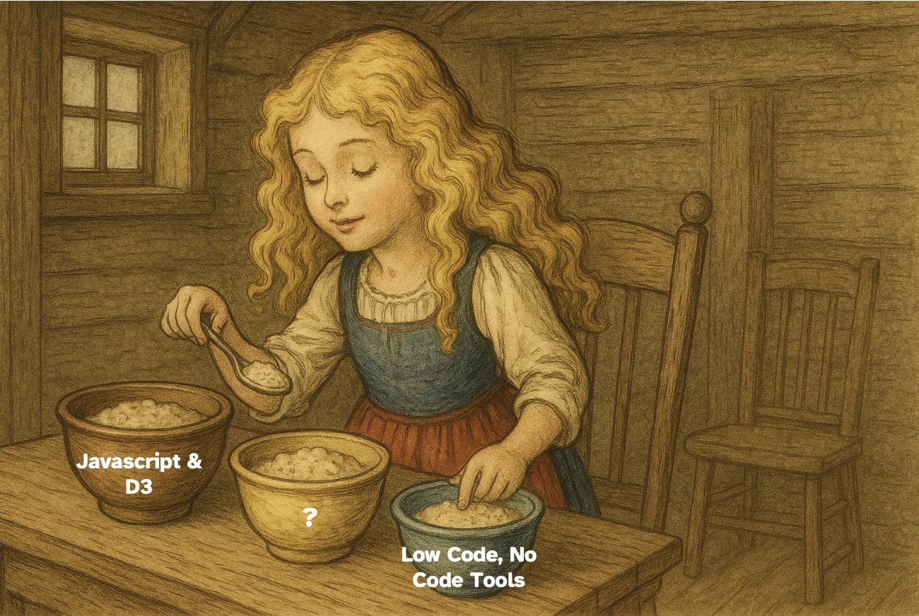
Goldilocks trying to find the right fit for interactive viz
The ggiraph Philosophy
If you know ggplot2…
you already know ggiraph
Plausible quote from Hadley Wickham,
Father of ggplot2
50 interactive ggiraph geoms!
Consistent naming convention to match ggplot2 geoms
| ggplot2 | ggiraph | |
|---|---|---|
geom_point |
➡️ | geom_point_interactive |
geom_text |
➡️ | geom_text_interactive |
geom_line |
➡️ | geom_line_interactive |
geom_tile |
➡️ | geom_tile_interactive |
Export result directly as HTML widgets —
or use with Quarto, R Markdown, or Shiny 🙌
Examples: Tooltips
Setting up Tooltips
p <- ggplot(simpsons_imdb, aes(x = episode, y = season, fill = rating)) +
geom_tile_interactive(
aes(tooltip = title, data_id = id),
color = "white", stroke = .2
) +
geomtextpath::geom_texthline(...) +
...
girafe(
ggobj = p,
options = list(
opts_tooltip(
opacity = 1, use_fill = TRUE,
css = "color: black; padding: 15px;"
),
opts_hover(css = "stroke-width: 1;"),
opts_hover_inv(css = "opacity: 0.3;")
)
)Create More Advanced Tooltips
p <-
simpsons_imdb |>
mutate(
title_wrapped = stringr::str_replace_all(stringr::str_wrap(title, 22), "\\n", "<br>"),
text_color = if_else(rating > 6.3 & rating < 8.5, "black", "white"),
tooltip_text = paste0(
"<span style='font-family:rethink sans;color:", text_color, ";'>",
"S", sprintf("%02d", season), " E", sprintf("%02d", episode), "<br>",
"<b style='font-size:150%;font-weight:600;font-family:piazzolla;'>",
title_wrapped, "</b><br><br>", "
IMDb Rating: ", sprintf("%1.1f", rating))
) |>
ggplot(aes(x = episode, y = season, fill = rating)) +
geom_tile_interactive(
aes(tooltip = tooltip_text, data_id = id),
color = "white", stroke = .2
) +
geomtextpath::geom_texthline(...) +
...
girafe(
ggobj = p,
options = list(
opts_tooltip(
opacity = 1, use_fill = TRUE,
css = "color: black; padding: 15px;"
),
opts_hover(css = "stroke-width: 1;"),
opts_hover_inv(css = "opacity: 0.3;")
)
)Example: Hovering
Basic Hover Effects
doctor_who_basic_plot<-ggplot() +
#interactive points per episode
ggiraph::geom_jitter_interactive(
data = df_eps,
position = position_jitter(seed = 42, height = .2, width = 3),
mapping = aes(
data_id = story_number,
x = rating,
y = reorder(doctor, avg_rating),
fill = I(color),
tooltip = tooltip
),
shape = 21,
color = "black",
size = 3,
alpha = 0.8
) +
geomtextpath::geom_textvline(
mapping = aes(
xintercept = overall_avg,
label = paste0("Overall Avg: ", round(overall_avg, 0))
),
size = 3,
color = pal_line,
hjust = 0.86,
vjust = -.2,
family = "Roboto"
) +
geom_segment(
data = df_doc_avg,
mapping = aes(
x = avg_rating,
xend = overall_avg,
y = doctor,
yend = doctor
),
color = pal_line
) +
geom_point(
data = df_doc_avg,
mapping = aes(x = avg_rating, y = doctor, fill = I(color)),
shape = 21,
color = "white",
size = 10
) +
geom_image(
data = df_doc_avg,
mapping = aes(x = avg_rating, y = doctor, image = image),
size = 0.06,
asp = 1.61
) +
geom_text(
data = df_doc_avg,
mapping = aes(
x = avg_rating,
y = doctor,
label = round(avg_rating, 1)
),
size = 2.5,
fontface= "bold",
color = "white",
vjust = 3.75,
family = "Roboto"
) +
geom_textbox(
data = df_doc_avg,
mapping = aes(x = 59.1, y = doctor, label = label),
family = "Roboto",
fill = NA,
box.size = NA,
box.padding = unit(rep(0, 4), "pt"),
color = pal_text,
hjust = 0
) +
#arrows
annotate(
geom = "text",
label = "Avg Rating\nper Doctor",
x = 76,
y = 2.5,
size = 2.5,
color = "white",
family = "Roboto"
) +
geom_curve(
mapping = aes(
x = 77,
xend = 81.4,
y = 2.7,
yend = 3
),
color = "white",
curvature = -0.2,
linewidth = 0.3,
arrow = arrow(length = unit(0.08, "in"))
) +
geom_curve(
mapping = aes(
x = 77,
xend = 80.8,
y = 2.3,
yend = 2
),
color = "white",
curvature = 0.2,
linewidth = 0.3,
arrow = arrow(length = unit(0.08, "in"))
) +
scale_x_continuous(
limits = c(59, 95),
expand = c(0, 0),
breaks = c(70, 75, 80, 85, 90, 95)
) +
coord_equal(ratio = 50 / 12) +
labs(
title = "Doctor Who was The Best?",
subtitle = "Ratings by Episode and Doctor for the popular TV series, Doctor Who.",
x = "Rating"
)+
theme(
legend.position = "none",
plot.background = element_rect(fill = pal_bg, color = pal_bg),
panel.background = element_blank(),
panel.grid = element_blank(),
plot.margin = margin(
l = 20,
r = 40,
b = 10,
t = 20
),
plot.caption = element_text(size = 7, color = "grey80"),
plot.title = element_text(
size = 14,
face = "bold",
margin = margin(b = 5)
),
plot.subtitle = element_text(size = 9, color = "#BABABA"),
text = element_text(color = pal_text, family = "Roboto"),
axis.text = element_text(color = pal_text, family = "Roboto Mono"),
axis.text.y = element_blank(),
axis.title.y = element_blank(),
axis.title.x = element_textbox_simple(
margin = margin(t = 10),
halign = 0.675,
hjust = 0.5
),
axis.ticks = element_blank()
)
ggiraph::girafe(
ggobj = doctor_who_basic_plot,
options = list(
ggiraph::opts_toolbar(saveaspng = FALSE),
ggiraph::opts_tooltip(css = "font-family:Roboto;"),
#modify hover css
ggiraph::opts_hover(css = "fill:white;stroke:grey;cursor:help;")
)
)Advanced Hover Effects
ggiraph::girafe(
ggobj = doctor_who_advanced_plot,
width_svg = 6.125, height_svg = 4.5,
options = list(
#turnoff download png
ggiraph::opts_toolbar(saveaspng = FALSE),
ggiraph::opts_sizing(width = .8),
#default tooltip font
ggiraph::opts_tooltip(
css = "font-family:Roboto;"
),
#remove default opts_hover settings
ggiraph::opts_hover(css=""),
#inverted hover, use girafe_css for more control on hover elements
ggiraph::opts_hover_inv(
girafe_css(
css = "",
point = "fill:#515151",
text = NULL
)
)
)
)…a creative use case with ggiraph hover
👀
Example: Combo Plots
Linking Data Across Plots
Combo Plot with {patchwork}
plot_owid <- ggplot(data = owid_urban, ...) +
geom_point_interactive(
aes(tooltip = tooltip, data_id = country, color = continent),
shape = 16, alpha = .72
) +
...
map_owid <- ggplot(data = owid_urban, ...) +
geom_sf_interactive(
aes(tooltip = tooltip, data_id = country, fill = continent),
color = "transparent", linewidth = .2
)
...
combined_owid <- plot_owid + map_owid +
plot_layout(ncol = 2, widths = c(.4, .6))
girafe(
ggobj = combined_owid, width_svg = 12, height_svg = 5.3,
options = list(
opts_tooltip(use_fill = TRUE, css = "
font-size: 17px;
font-weight: 400;
font-family: Spline Sans;
color:white;
padding: 10px;
border:2px solid white;
border-radius: 5px;
"),
opts_hover(css = "stroke: white; stroke-width: 0.5px; opacity: 1;"),
opts_hover_inv(css = "opacity: 0.2;"),
opts_toolbar(position = "bottomright"),
opts_zoom(min = 1, max = 4)
)
)Example: Shiny
Thank you!
Want to learn more?
Code Examples 👉 github.com/z3tt/ggiraph-user-2025 ggiraph Book by David Gohel 👉 ardata.fr/ggiraph-book
Fancy a workshop or collaboration?
We are always open for consulting and trainings!
![Screenshot of our interactive online course "ggplot2 [un]charted"](img/ggplot-uncharted.png)