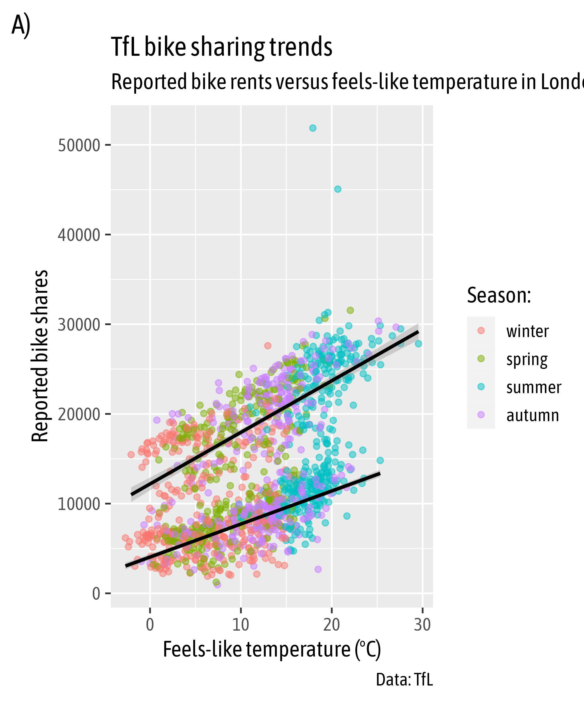
Designing Charts in R
Reproducible Graphic Design with {ggplot2}
{ggplot2} is a system for declaratively creating graphics,
based on “The Grammar of Graphics” (Wilkinson, 2005).
You provide the data, tell {ggplot2} how to map variables to aesthetics,
what graphical primitives to use, and it takes care of the details.
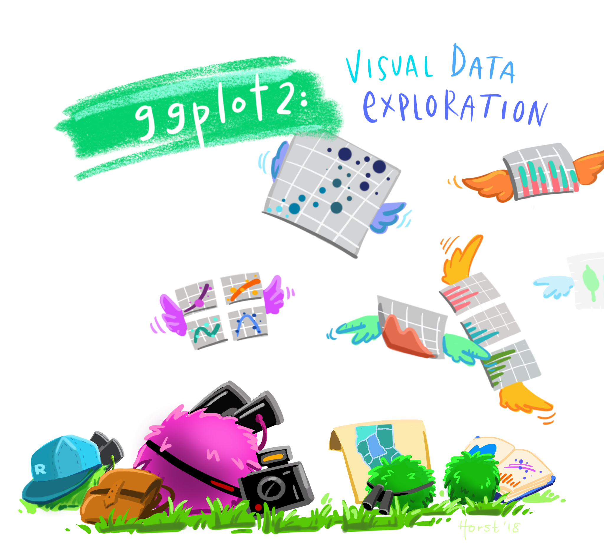
Illustration by Allison Horst

ggplot2 Examples featured on ggplot2.tidyverse.org
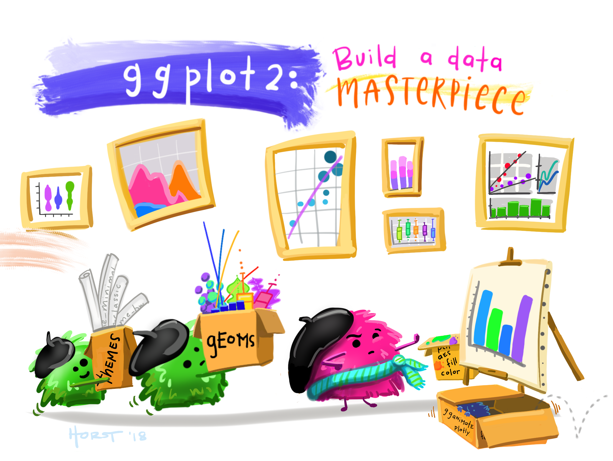
Illustration by Allison Horst
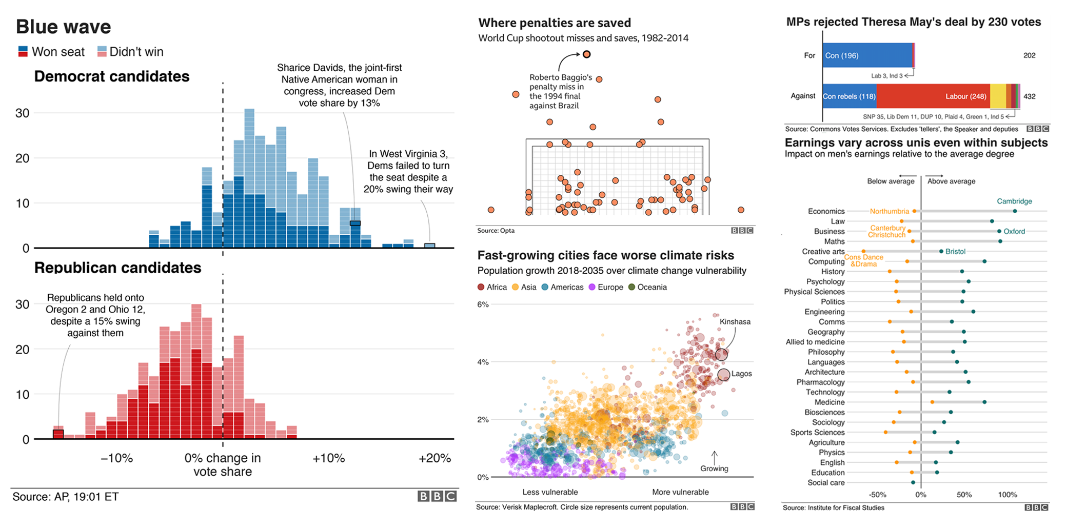
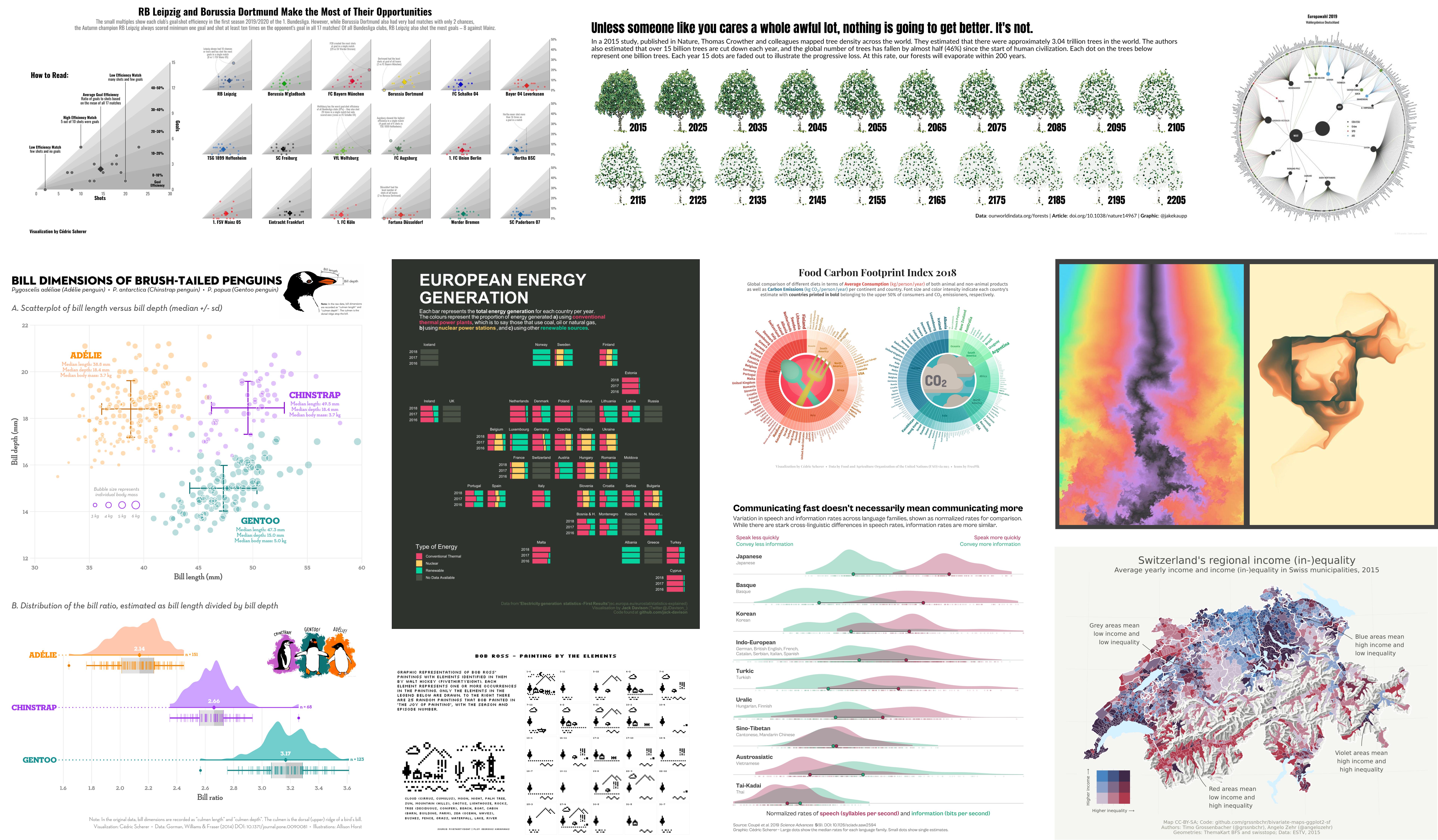
Selection of visualizations created 100% with ggplot2 by Thomas Linn Pedersen,
Georgios Karamanis, Timo Gossenbacher, Torsten Sprengler, Jake Kaupp, Jack Davison, and myself.
ggplot2::ggplot()
Data

Aesthetic Mapping

Aesthetic Mapping
Aesthetic Mapping

Geometries

Geometries
Geometries
Visual Properties of Layers
Setting vs Mapping of Visual Properties
Mapping Expressions
Solution Exercise
Solution Exercise
Solution Exercise
Solution Exercise
Solution Exercise
Solution Exercise

Solution Exercise
Solution Exercise

Source: Albert’s Blog
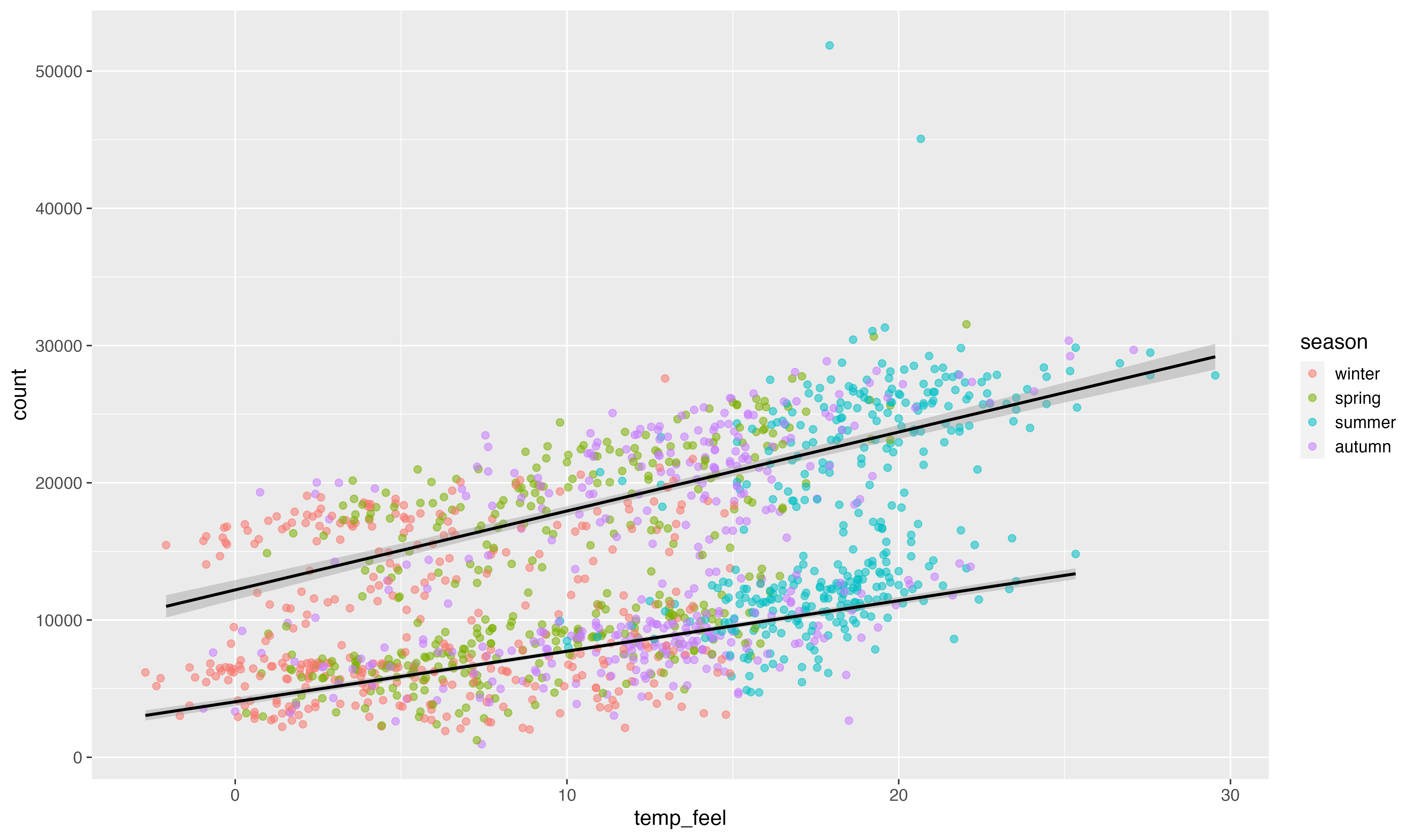
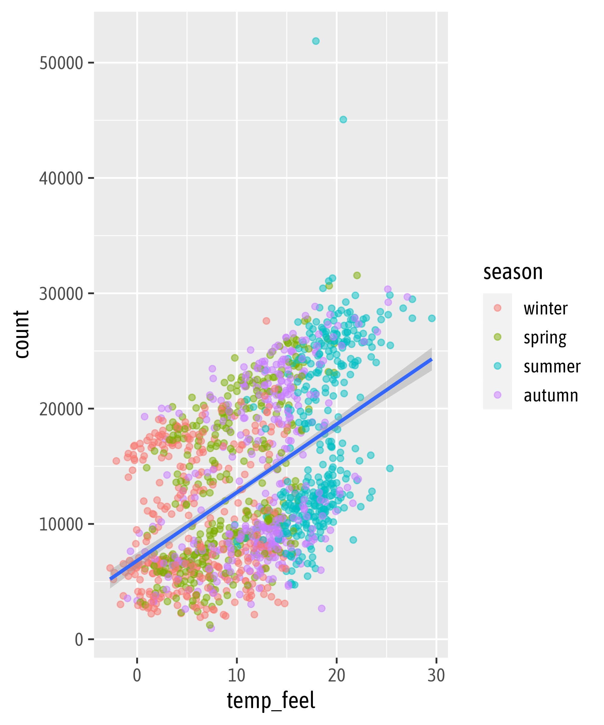
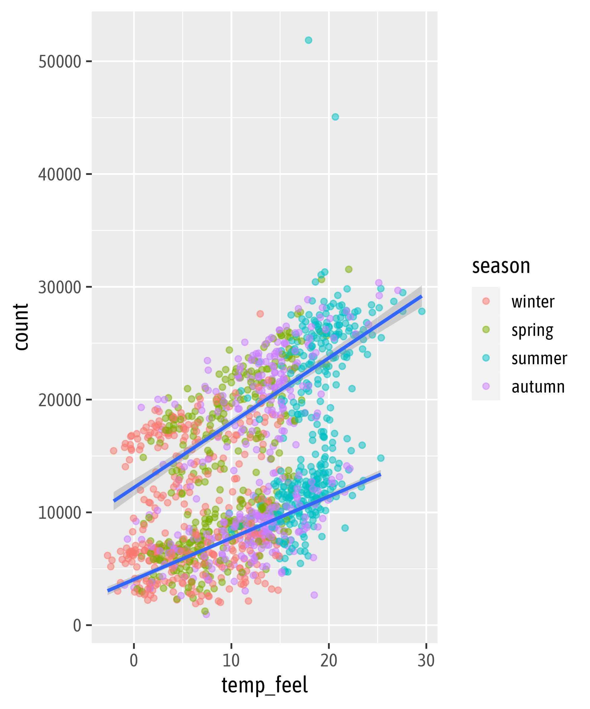
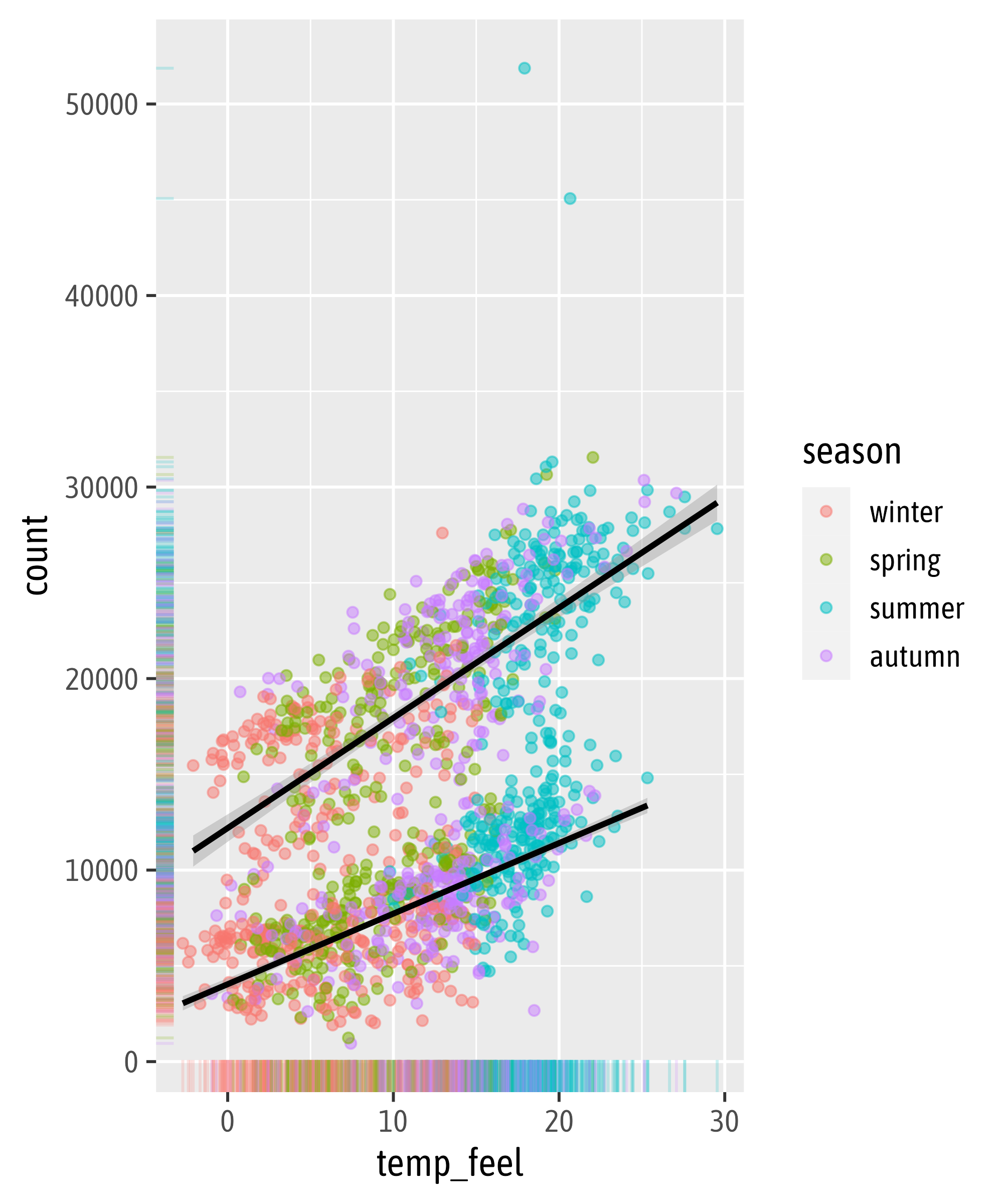
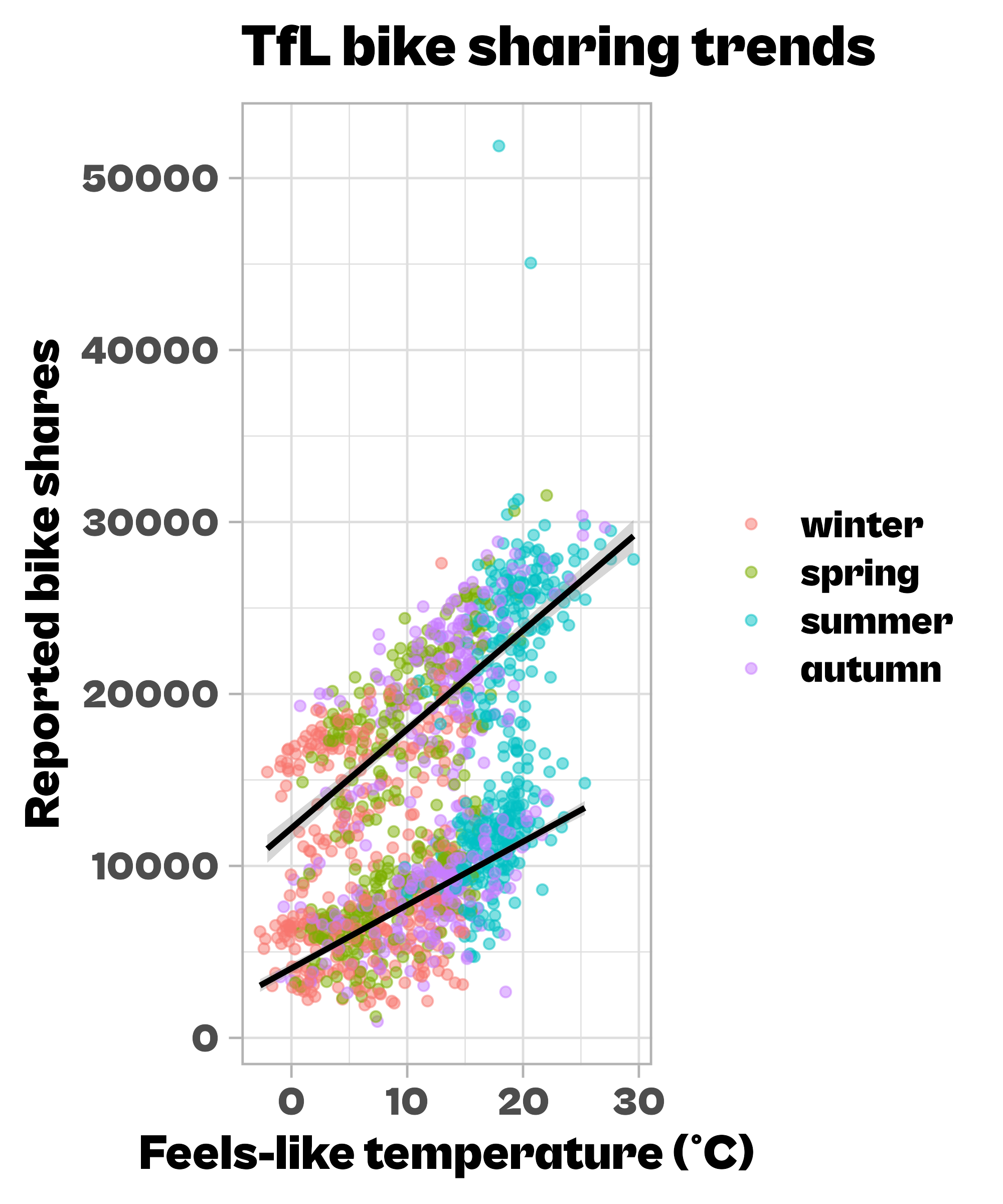
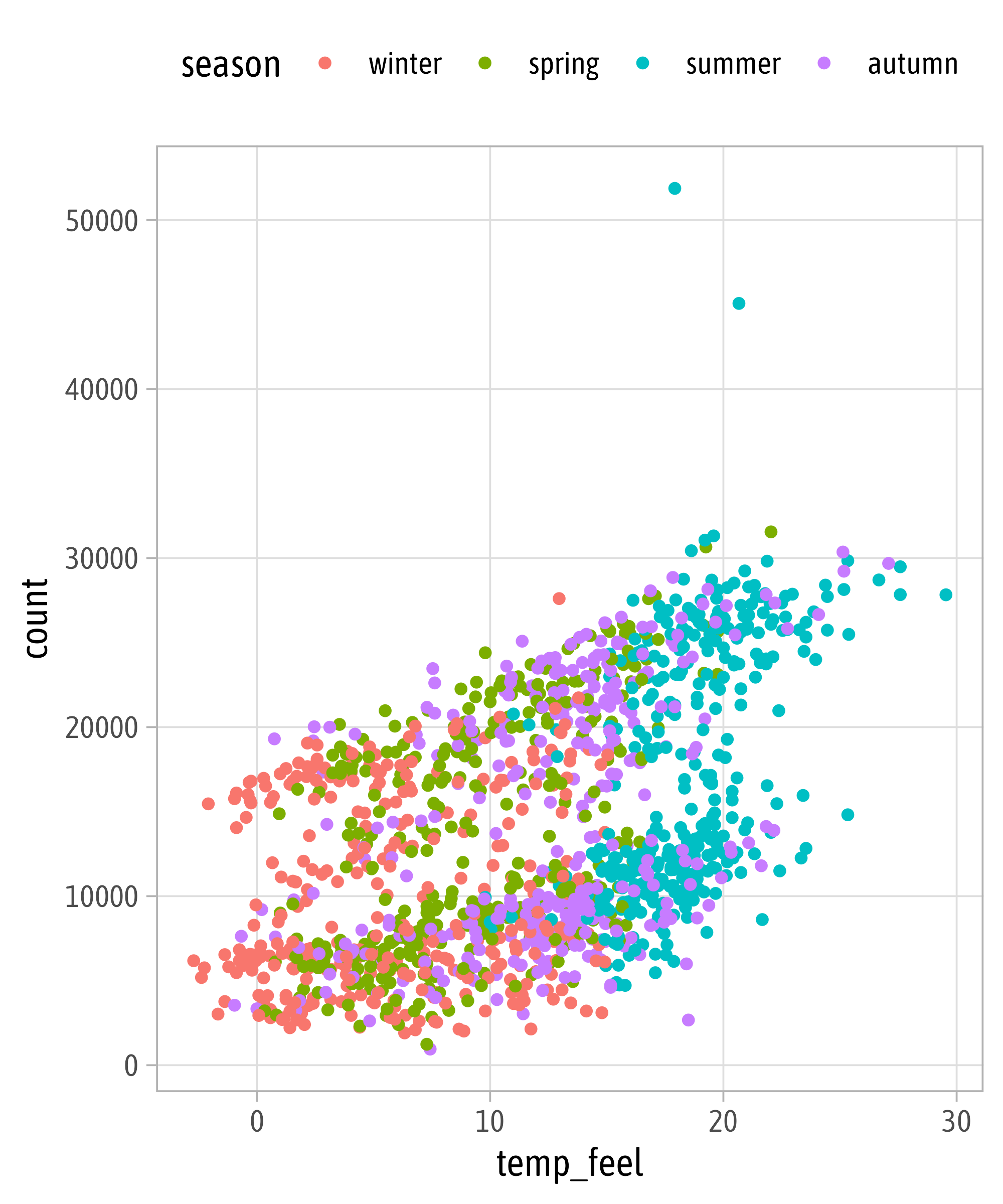
Local vs. Global Encoding

Adding More Layers

Global Color Encoding
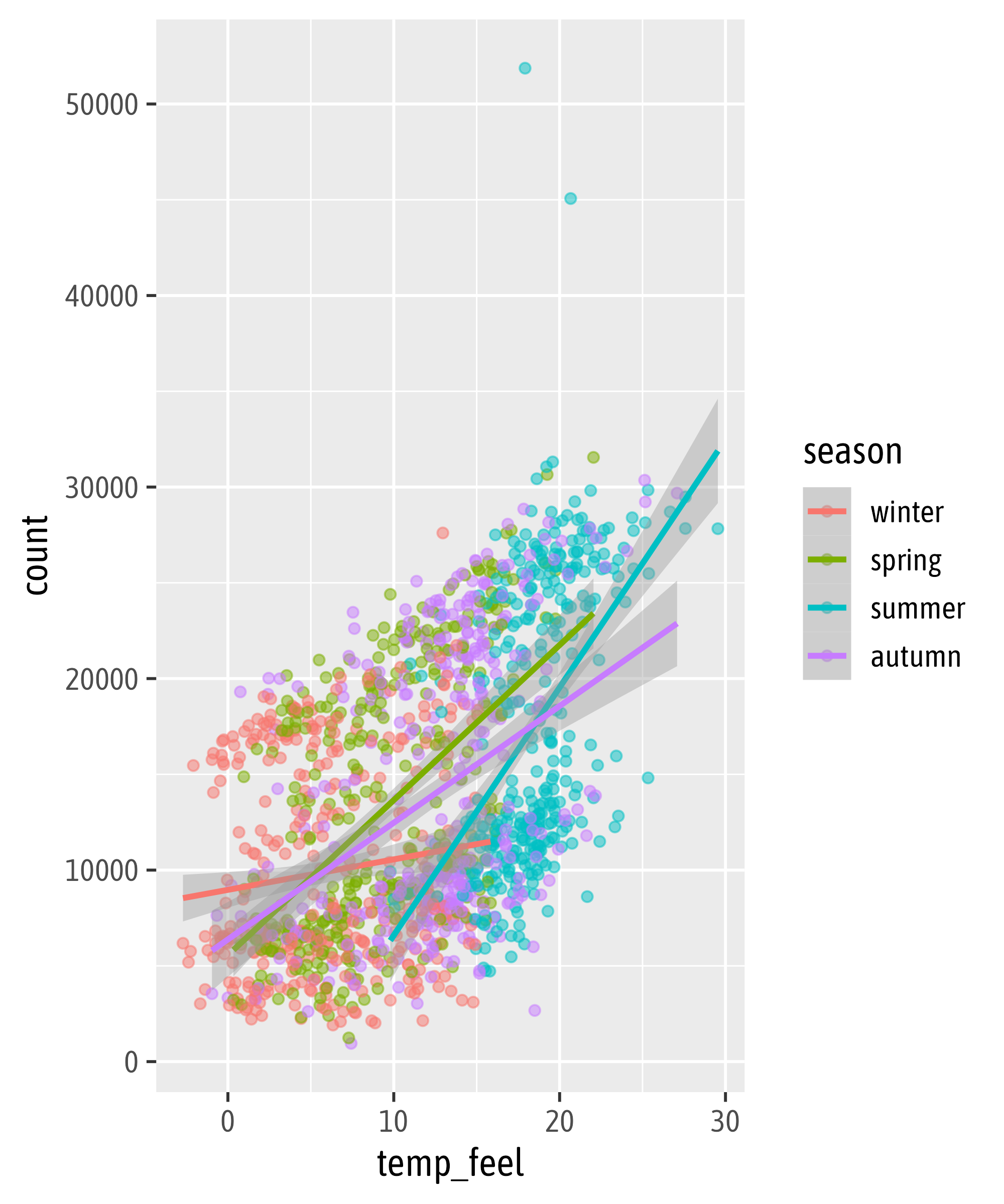
Local Color Encoding
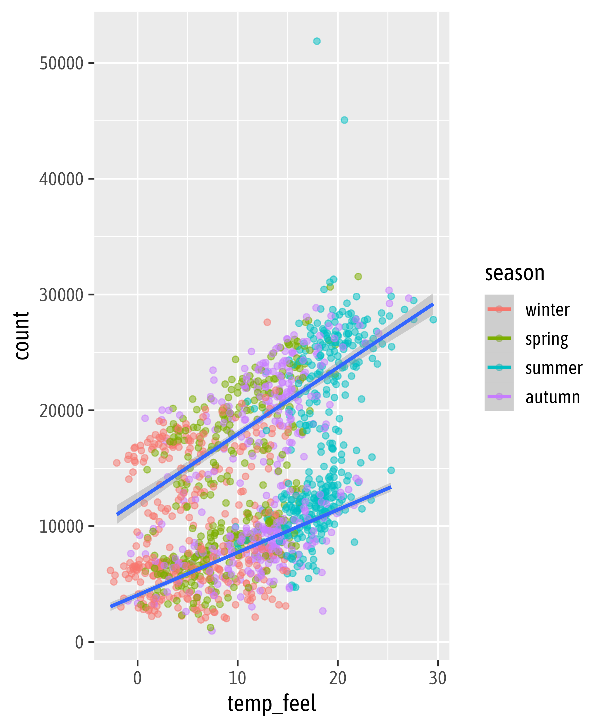
The `group` Aesthetic
Set Both as Global Aesthetics
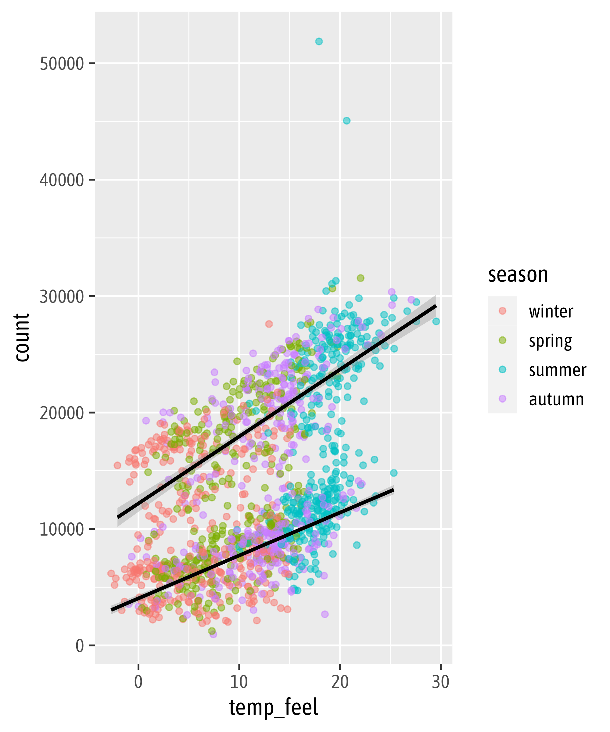
Overwrite Global Aesthetics
Add More Layers

Remove a Layer from the Legend
Add More Layers

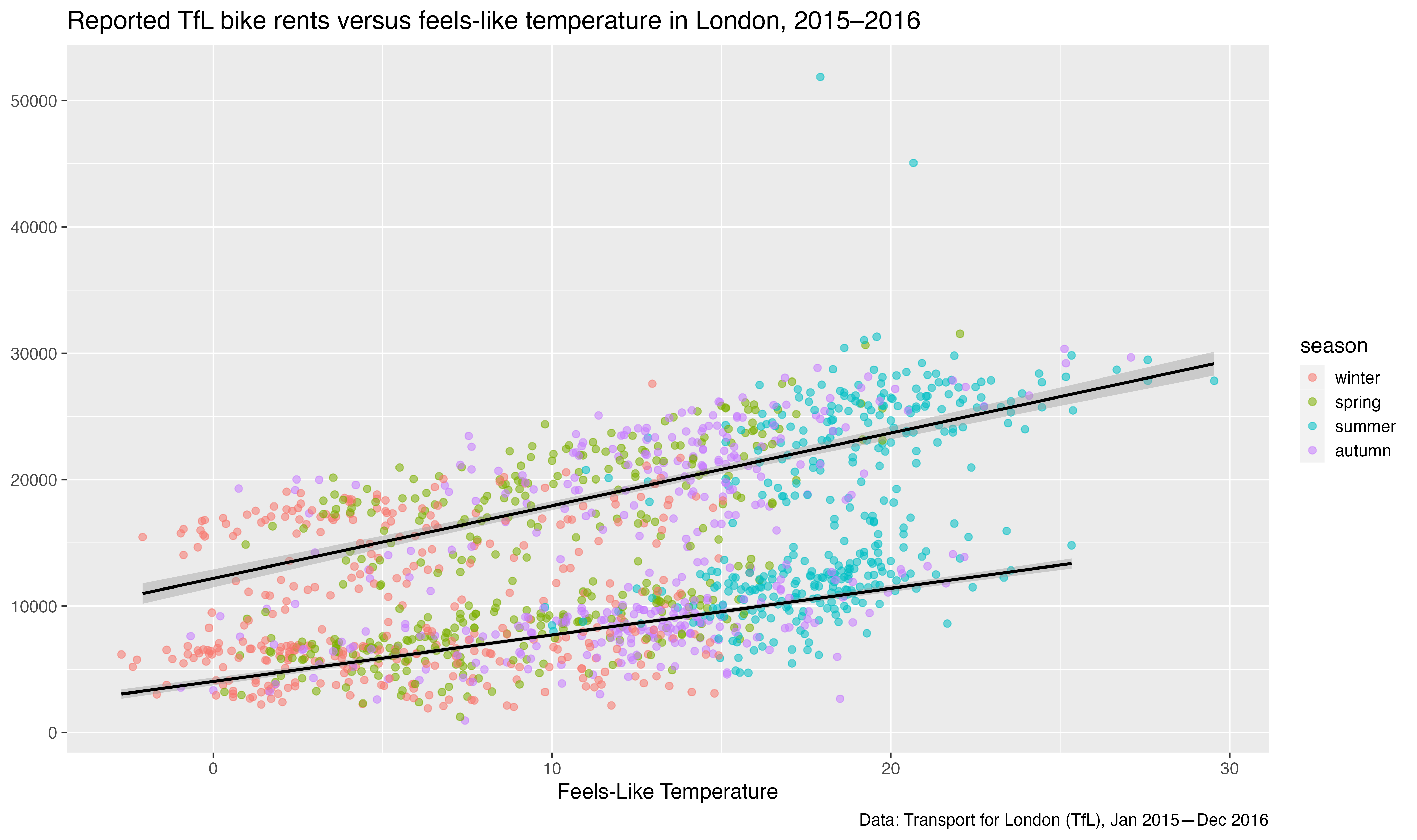
Add Labels
Add Labels
Add Labels
Add Labels
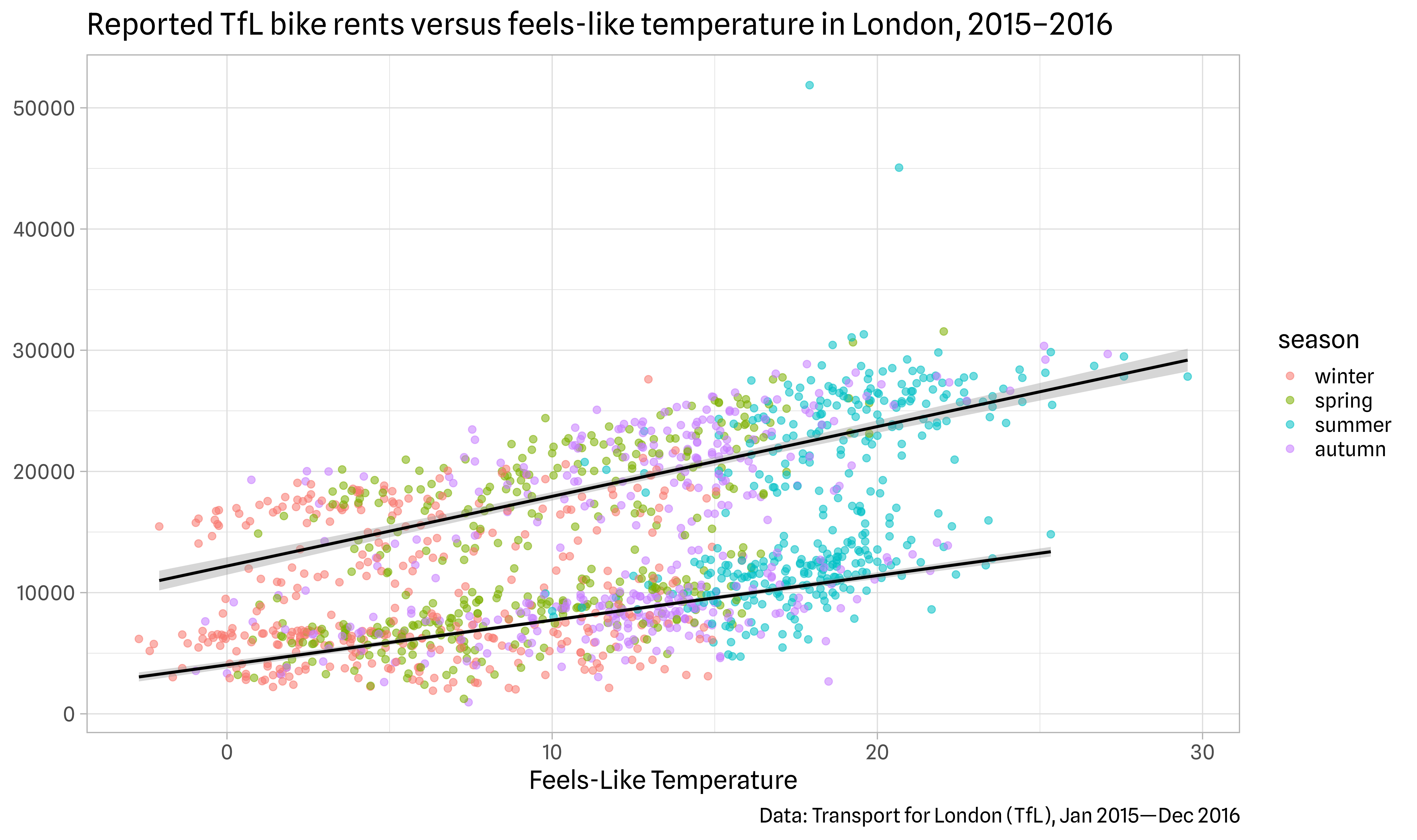
Themes

Themes
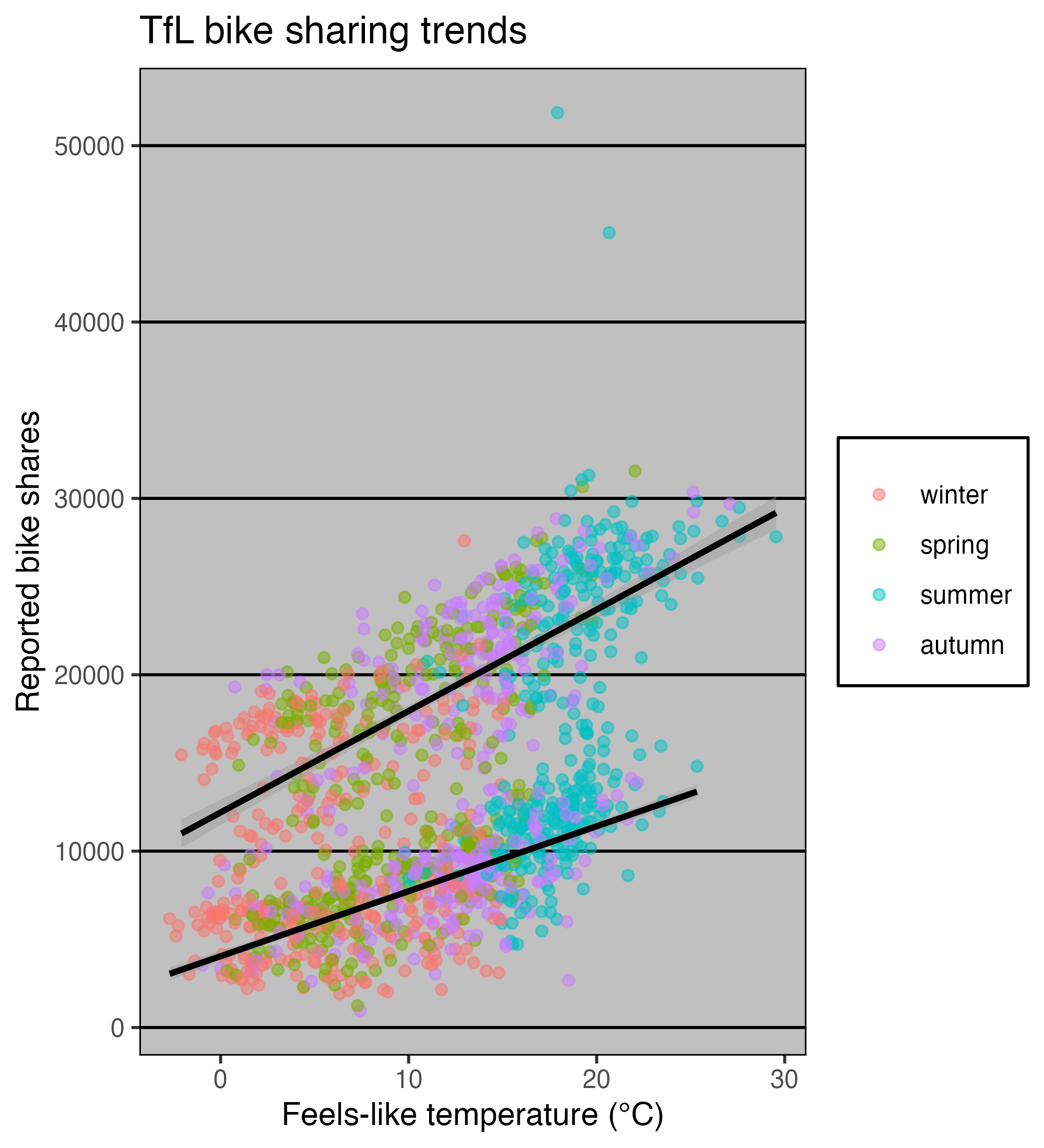
Change the Theme Base Settings

Set a Theme Globally
Change the Theme Base Settings

{systemfonts} + {ggplot2}
Overwrite Specific Theme Settings
Overwrite Specific Theme Settings
Overwrite Specific Theme Settings
Overwrite Specific Theme Settings
Overwrite Specific Theme Settings
Overwrite Theme Settings Globally

Modified from canva.com
Illustration by Allison Horst
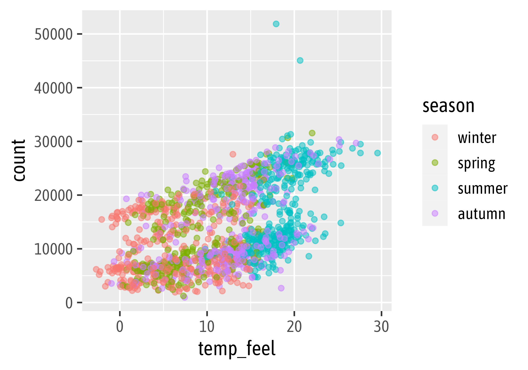
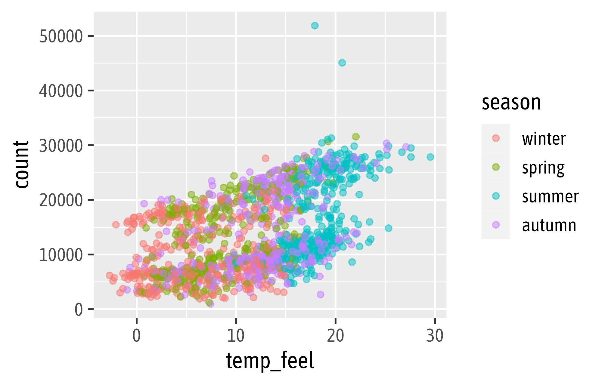
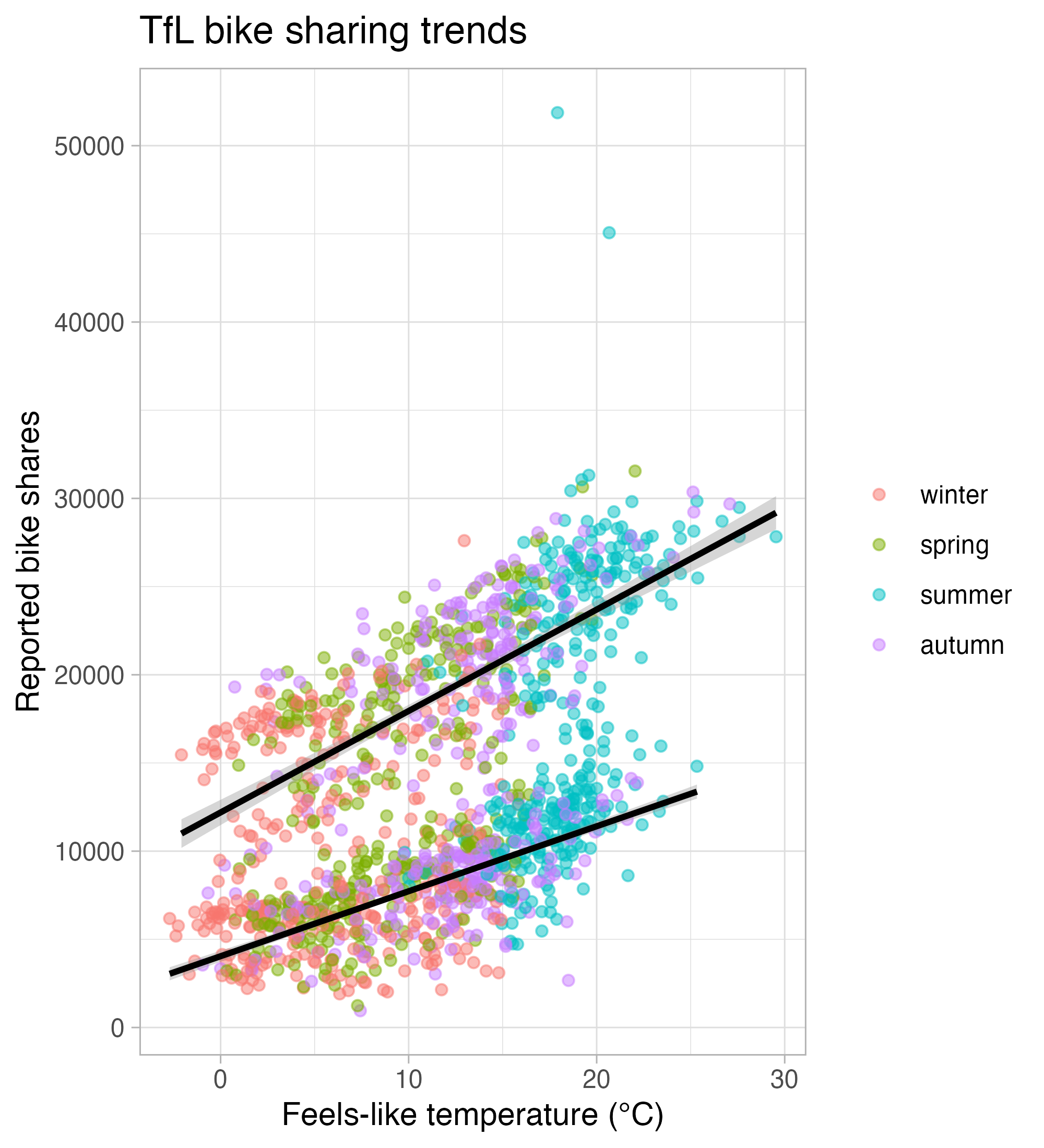
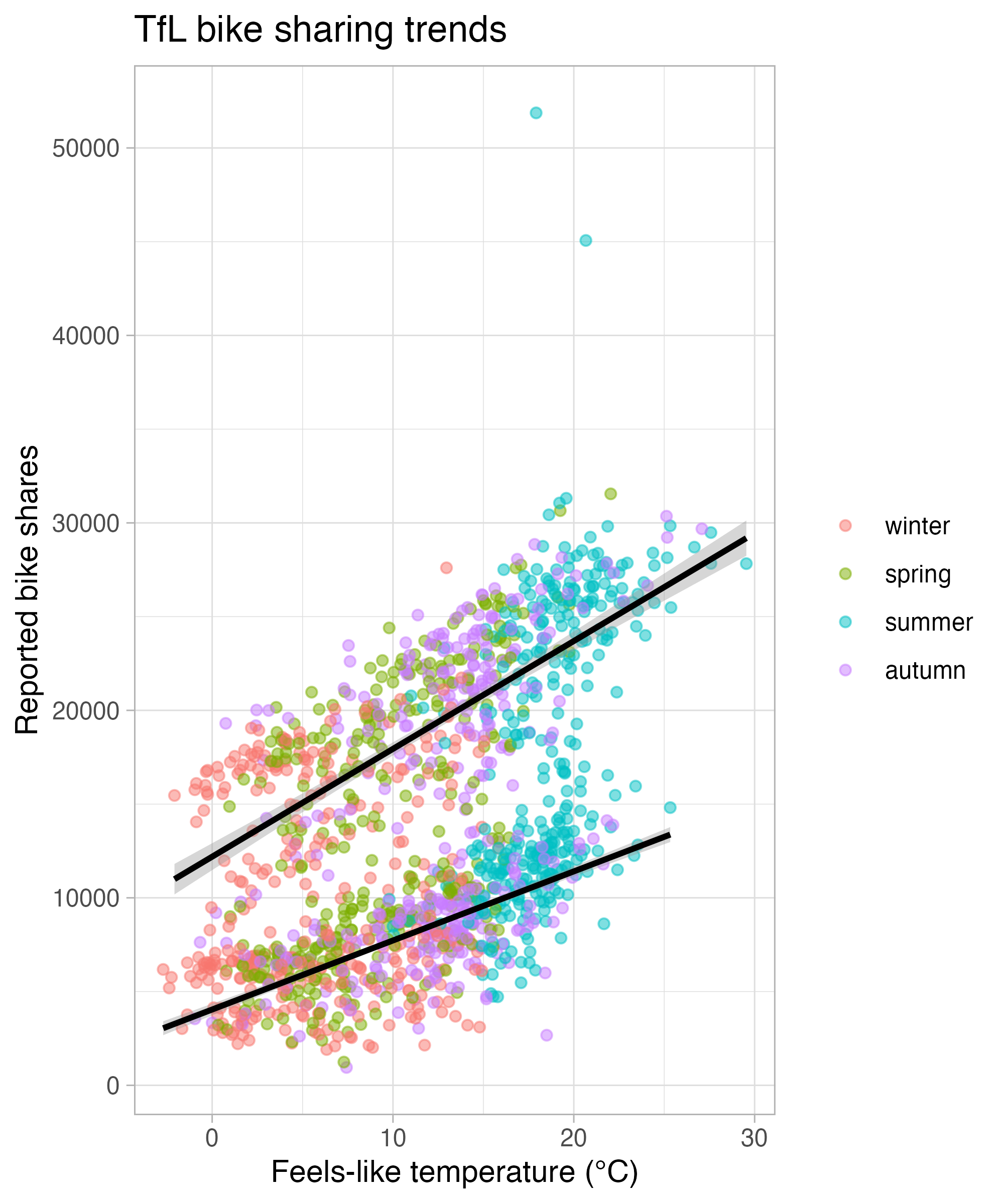
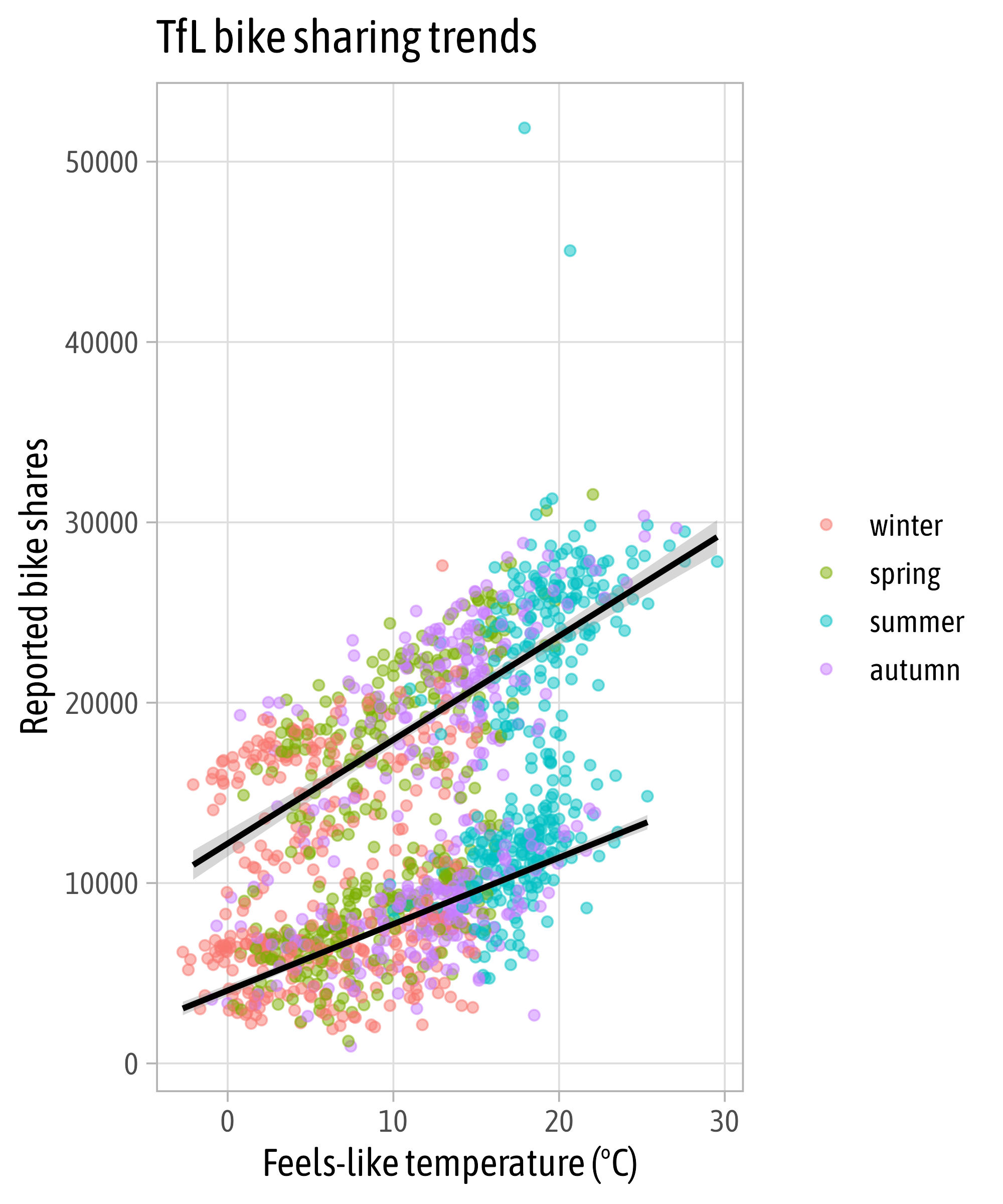
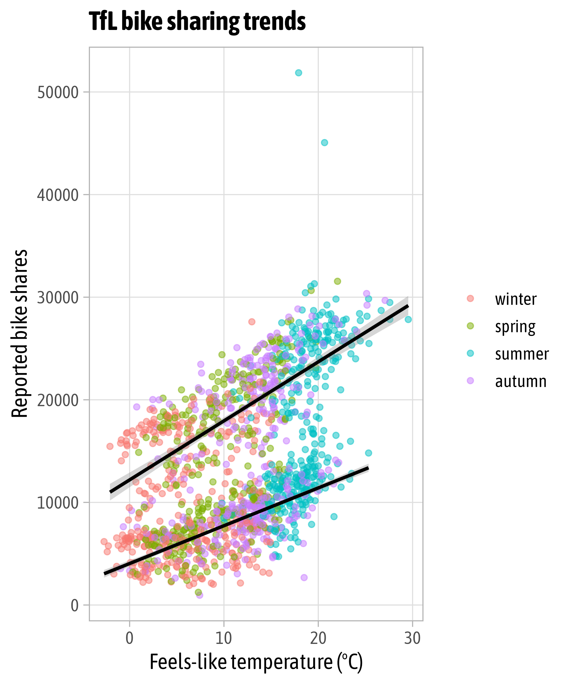
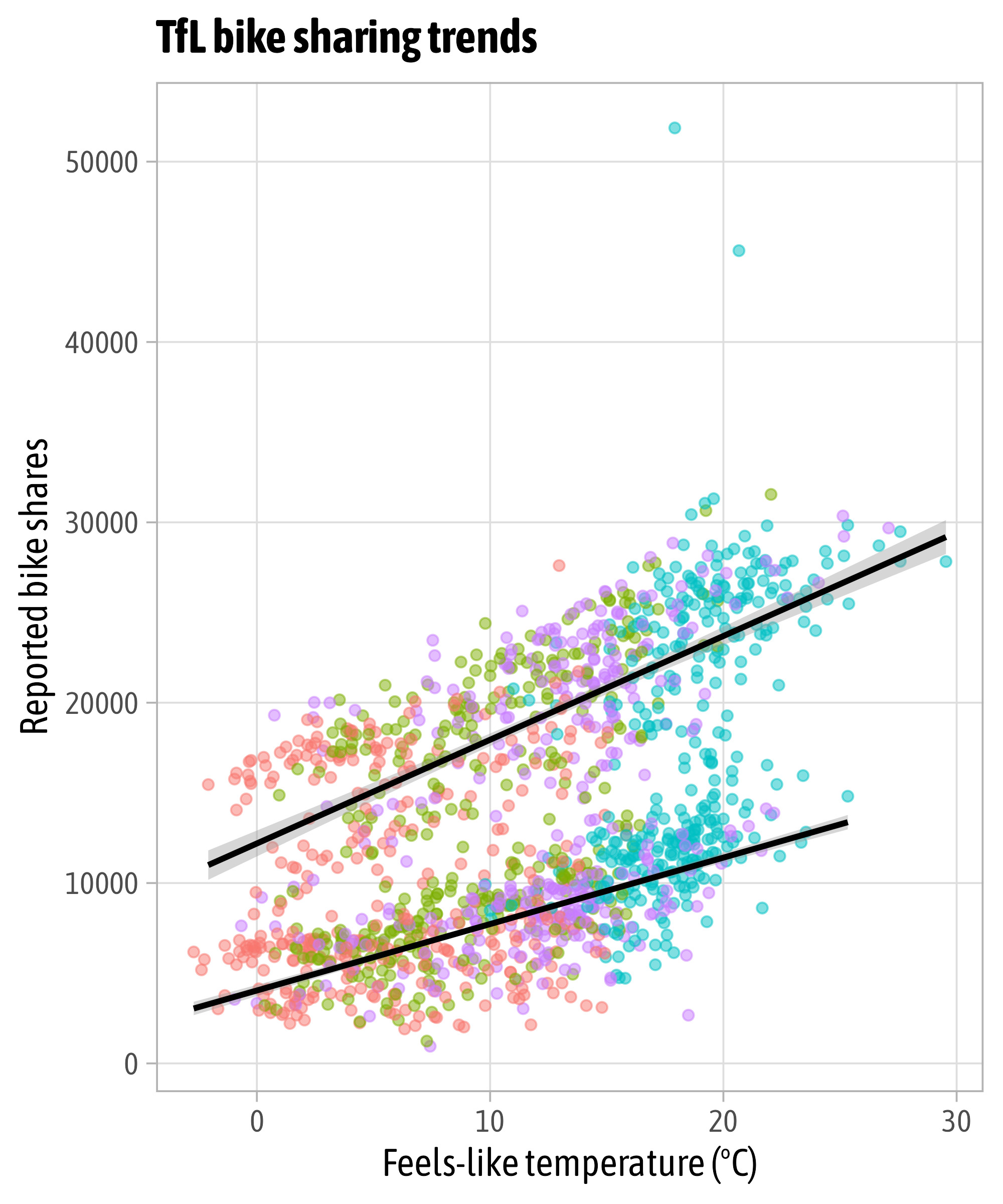
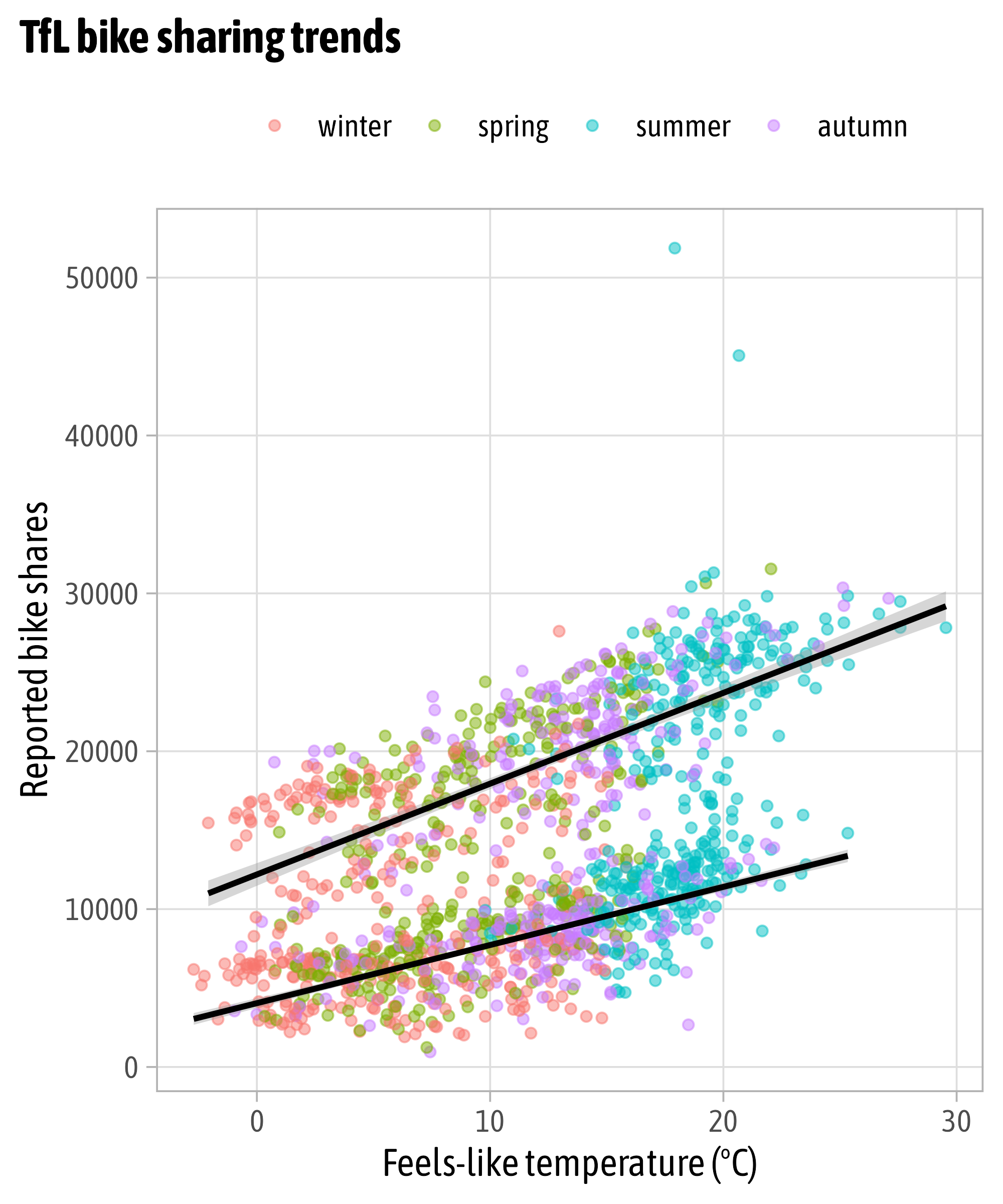
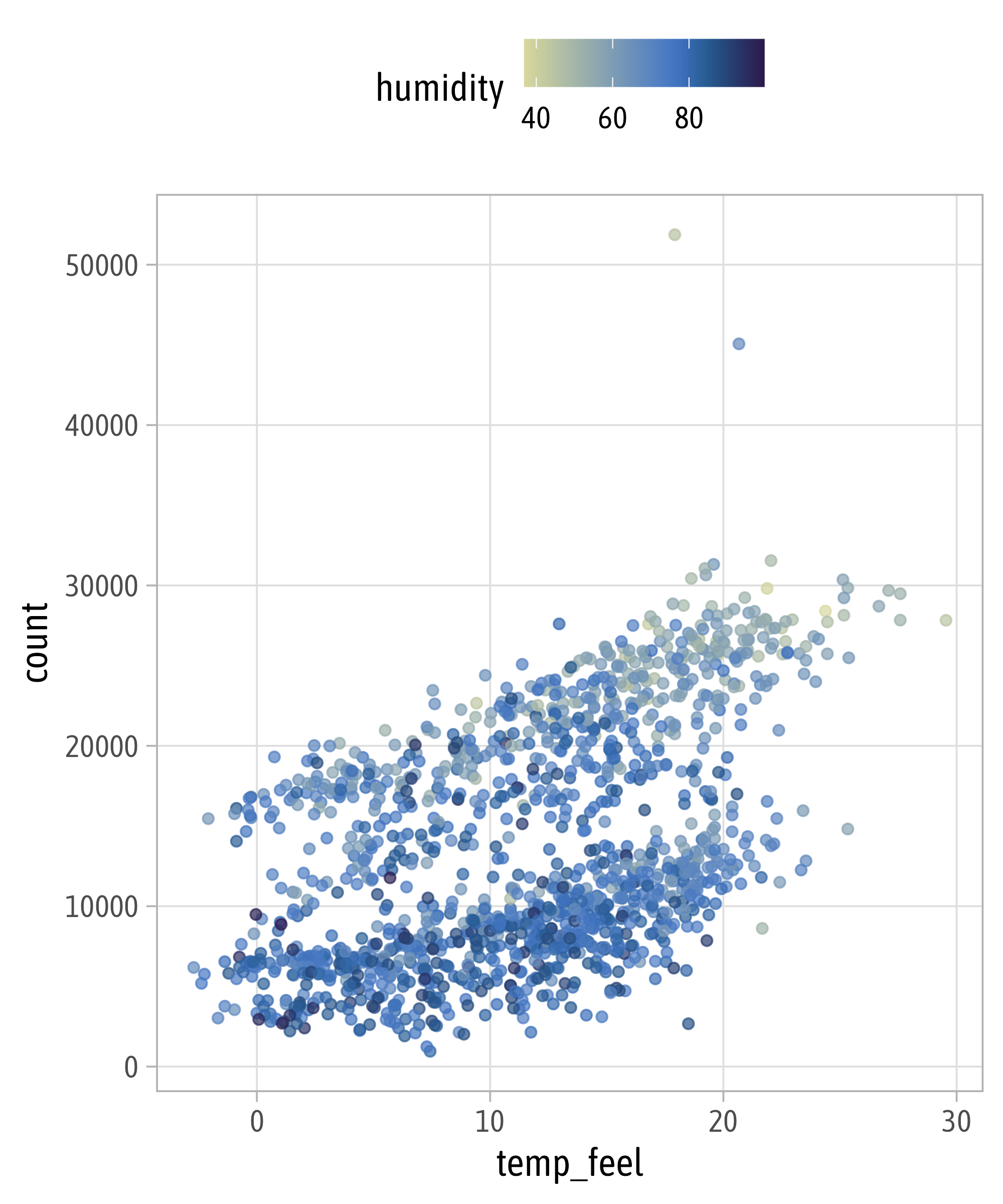
Aesthetics + Scales
Aesthetics + Scales
Aesthetics + Scales

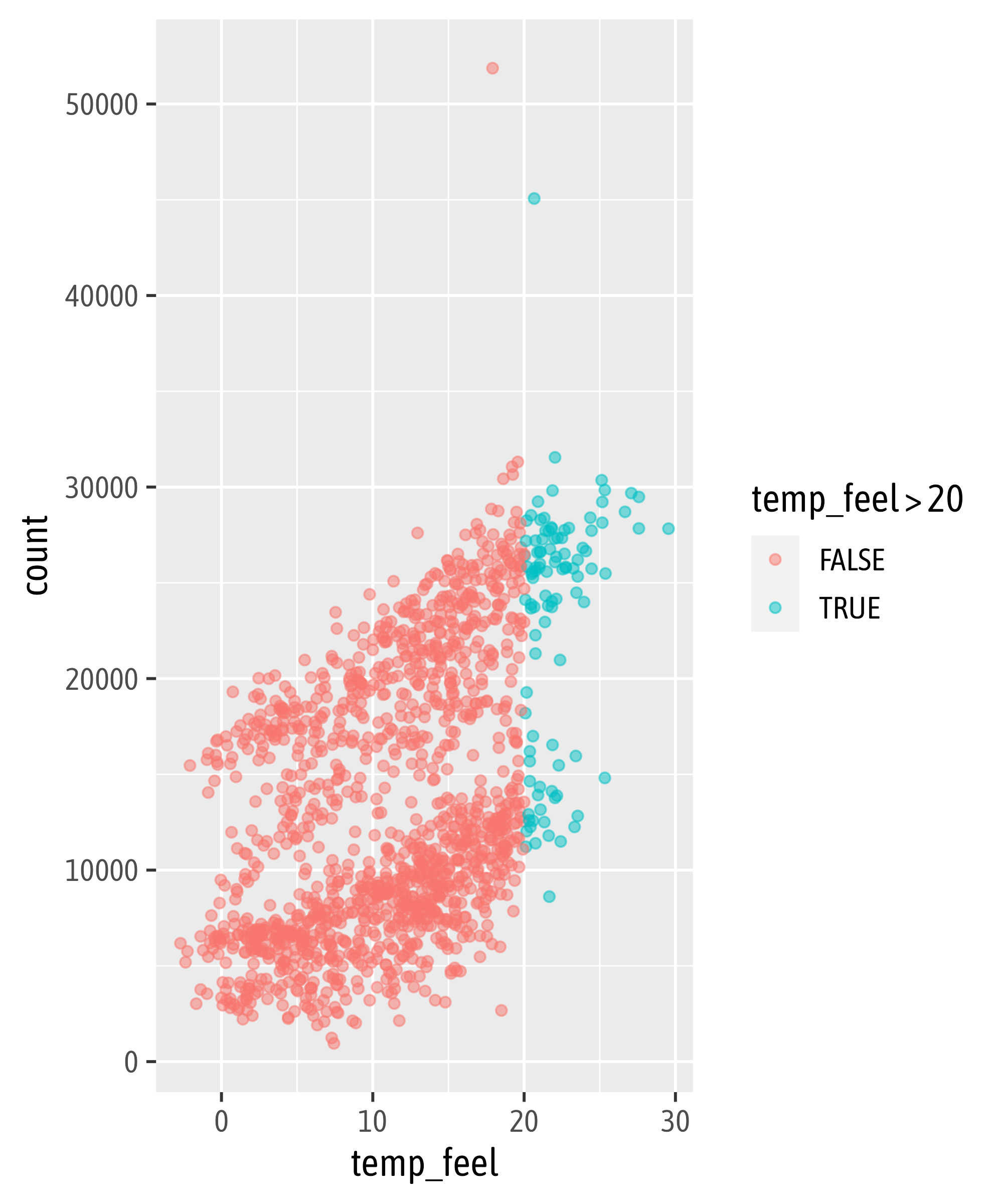
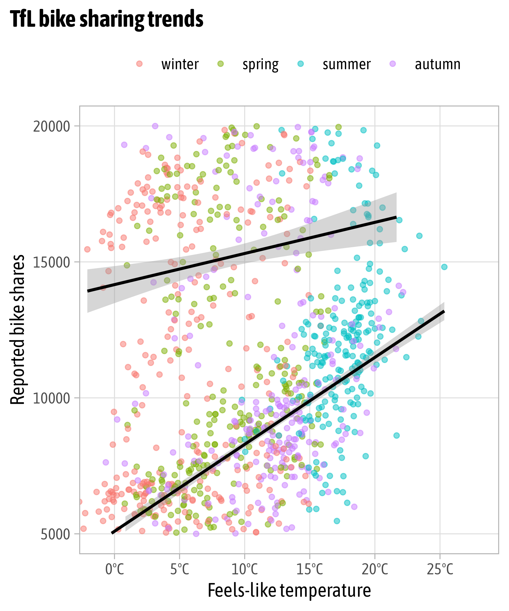
Overwrite Scales
Modify Scales

Modify Scales

Modify Scales
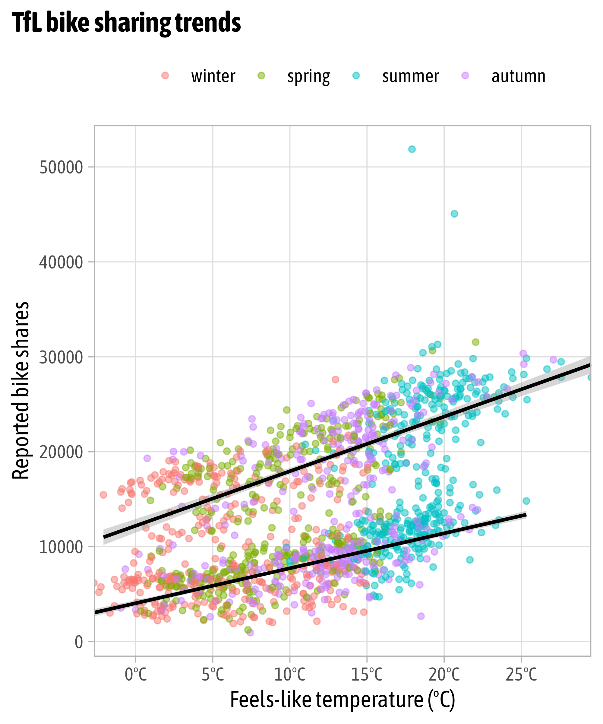
Modify Scales

Modify Scales

Modify Scales
Modify Scales

Modify Scales

Modify Scales
Modify Scales
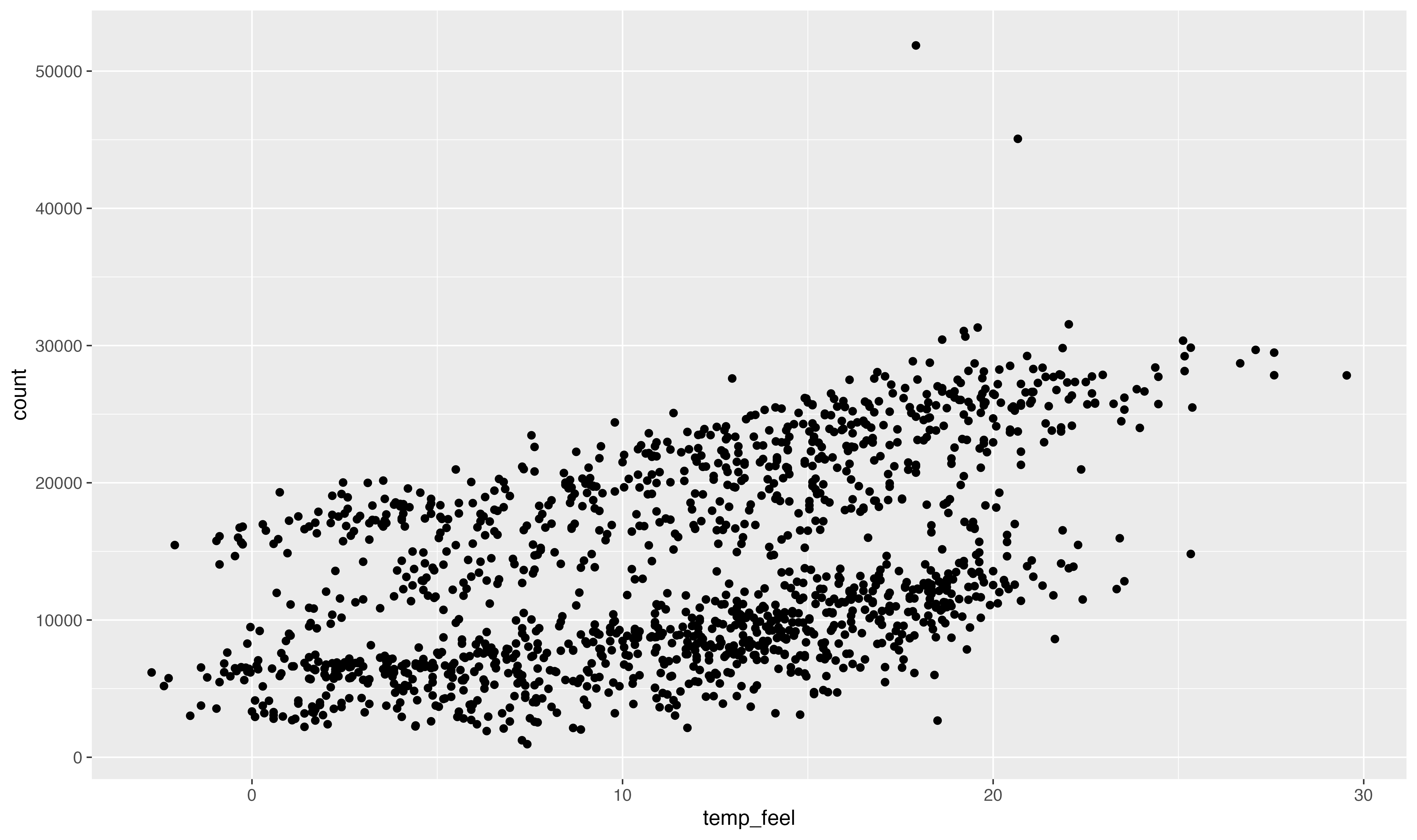
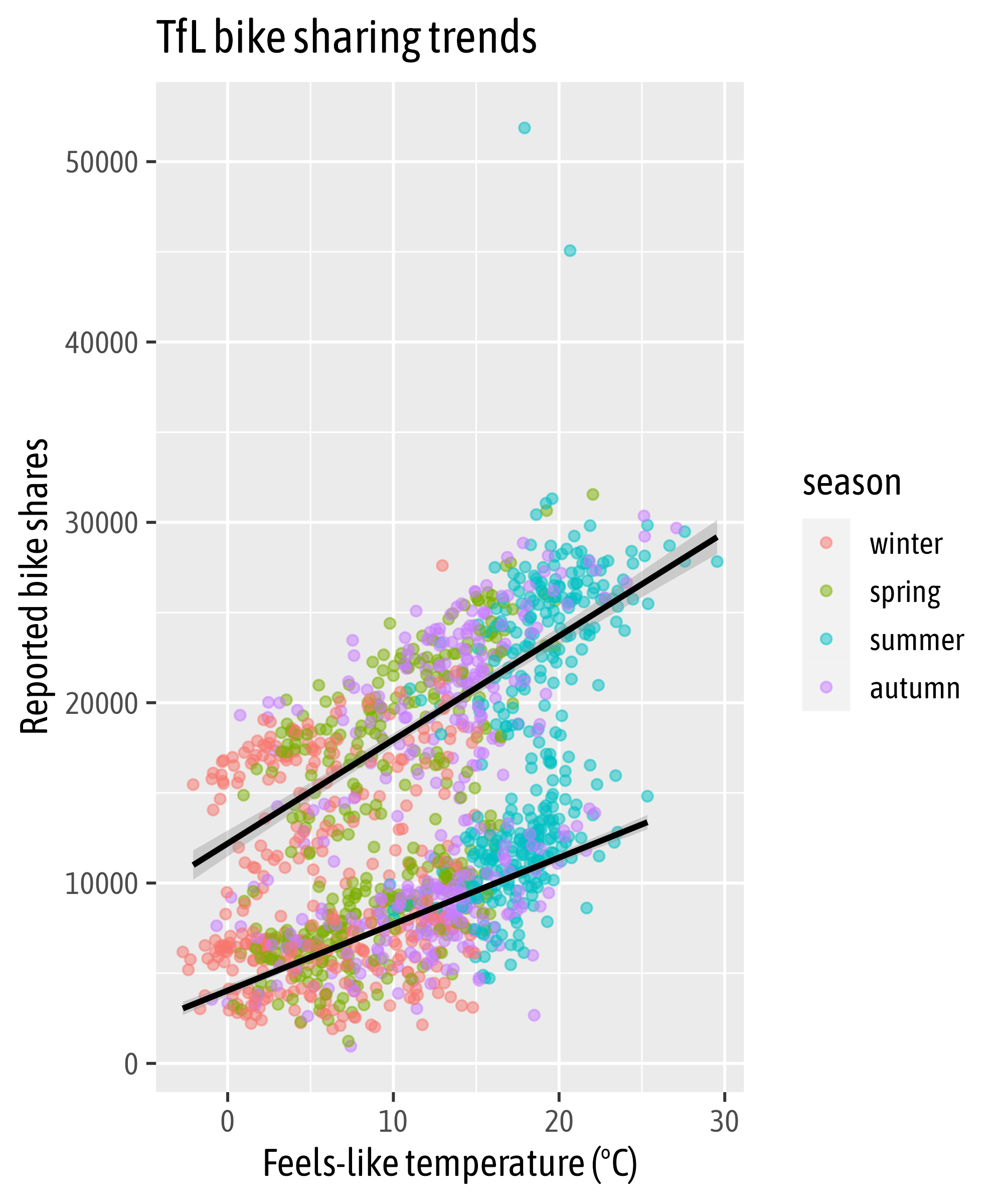
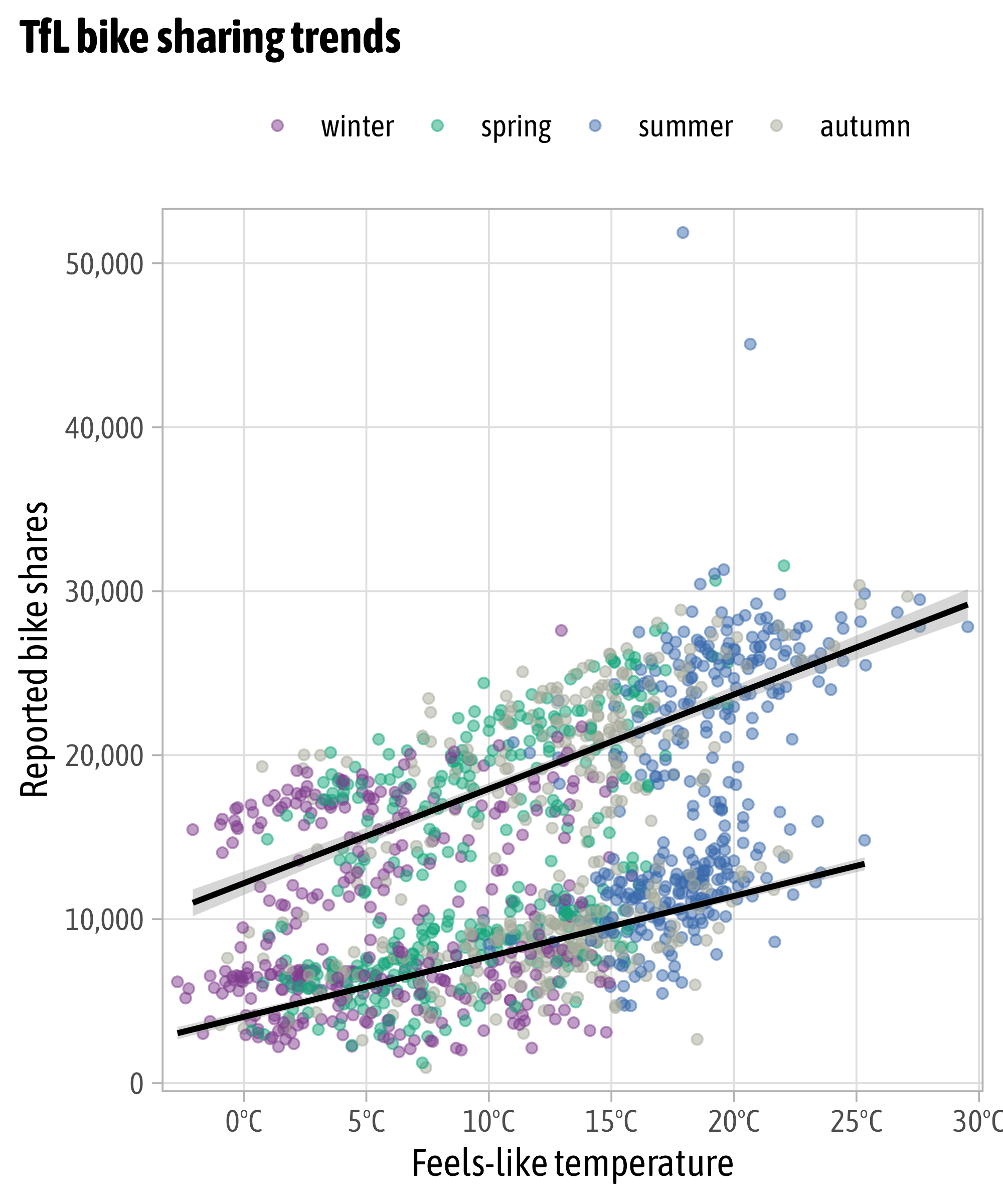
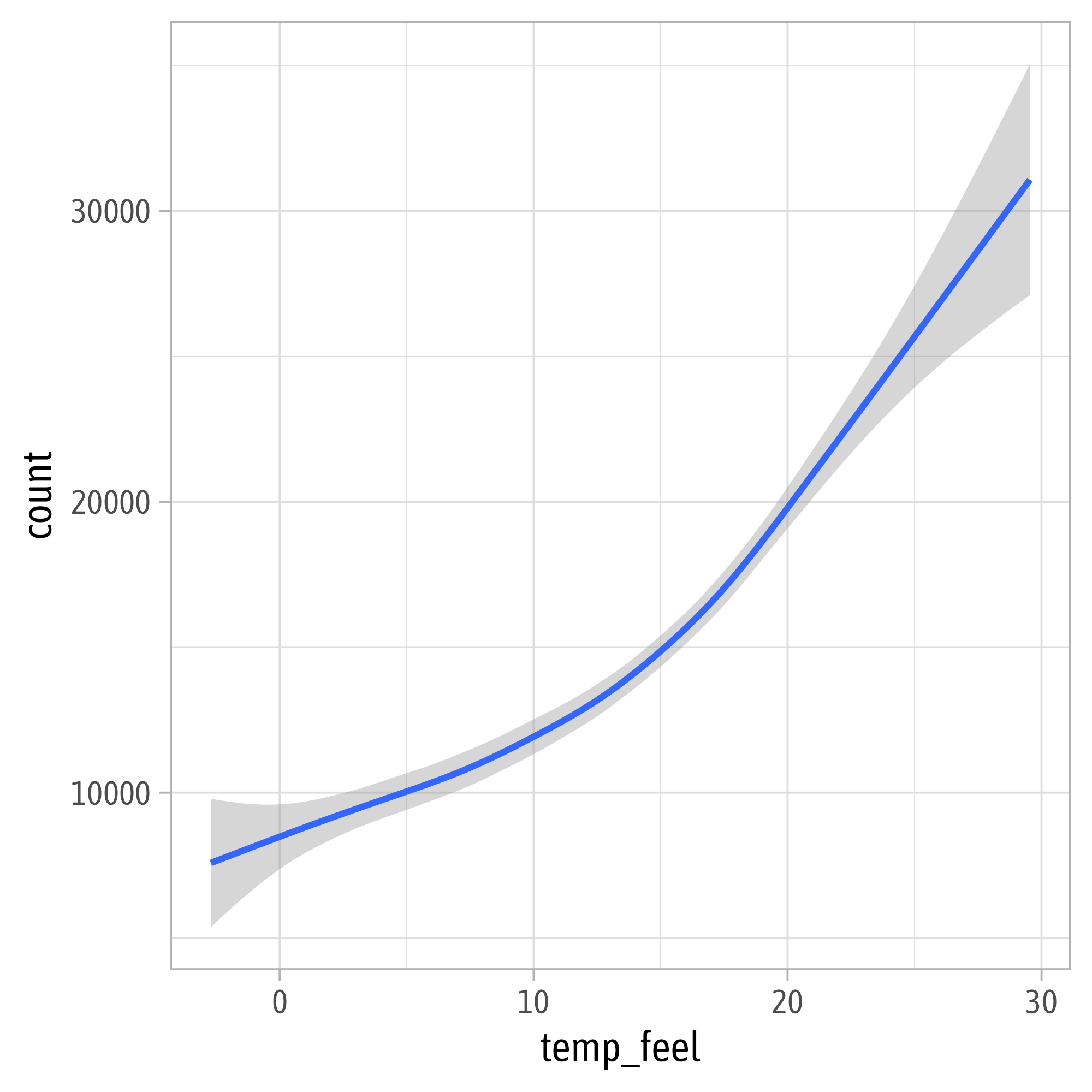
g +
  scale_x_continuous(
    expand = c(mult = 0, add = 0),
    breaks = seq(0, 30, by = 5),
    labels = function(x) paste0(x, "°C"),
    name = "Feels-like temperature"
  ) +
  scale_y_continuous(
    breaks = 0:5*10000,
    labels = scales::label_comma()
  ) +
  scale_color_discrete(
    type = c("#3c89d9", "#1ec99b", "#f7b01b", "#a26e7c")
  )
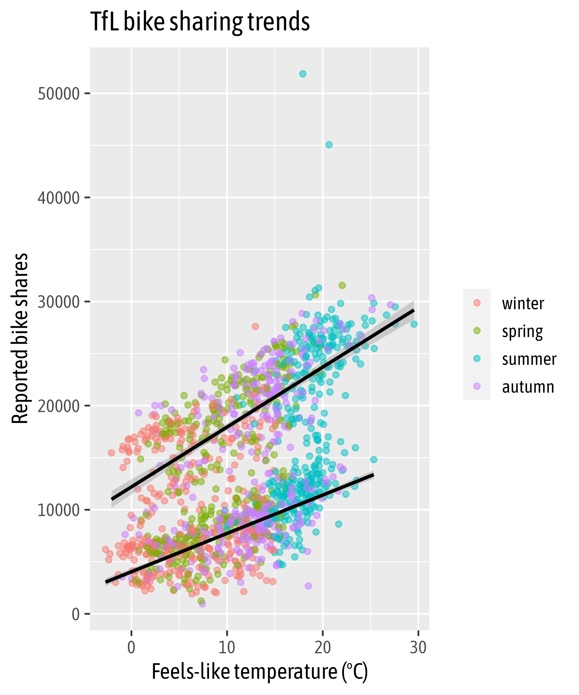
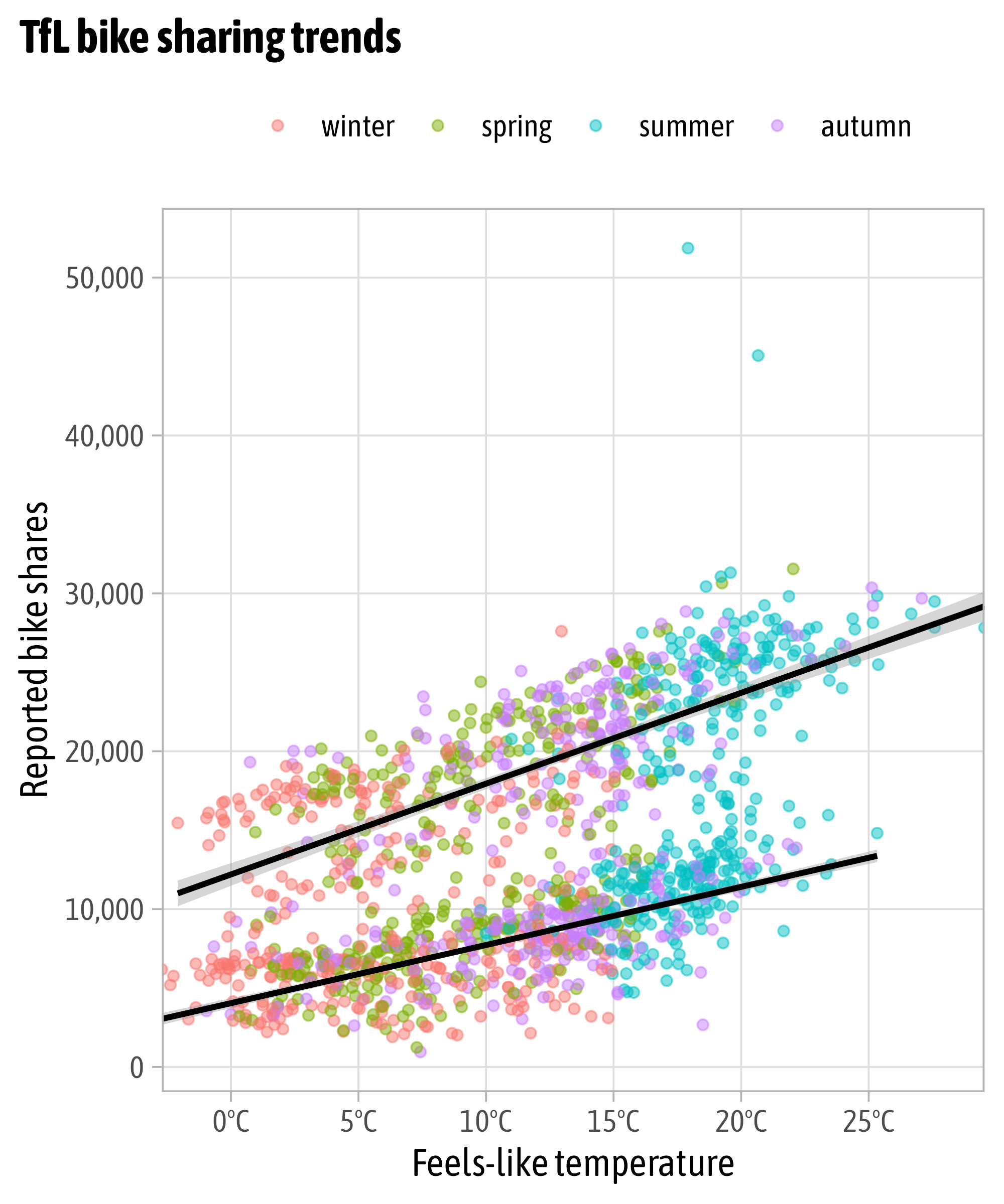
Modify Scales
g +
  scale_x_continuous(
    expand = c(mult = 0, add = 0),
    breaks = seq(0, 30, by = 5),
    labels = function(x) paste0(x, "°C"),
    name = "Feels-like temperature"
  ) +
  scale_y_continuous(
    breaks = 0:5*10000,
    labels = scales::label_comma()
  ) +
  scale_color_manual(
    values = c("#3c89d9", "#1ec99b", "#f7b01b", "#a26e7c")
  )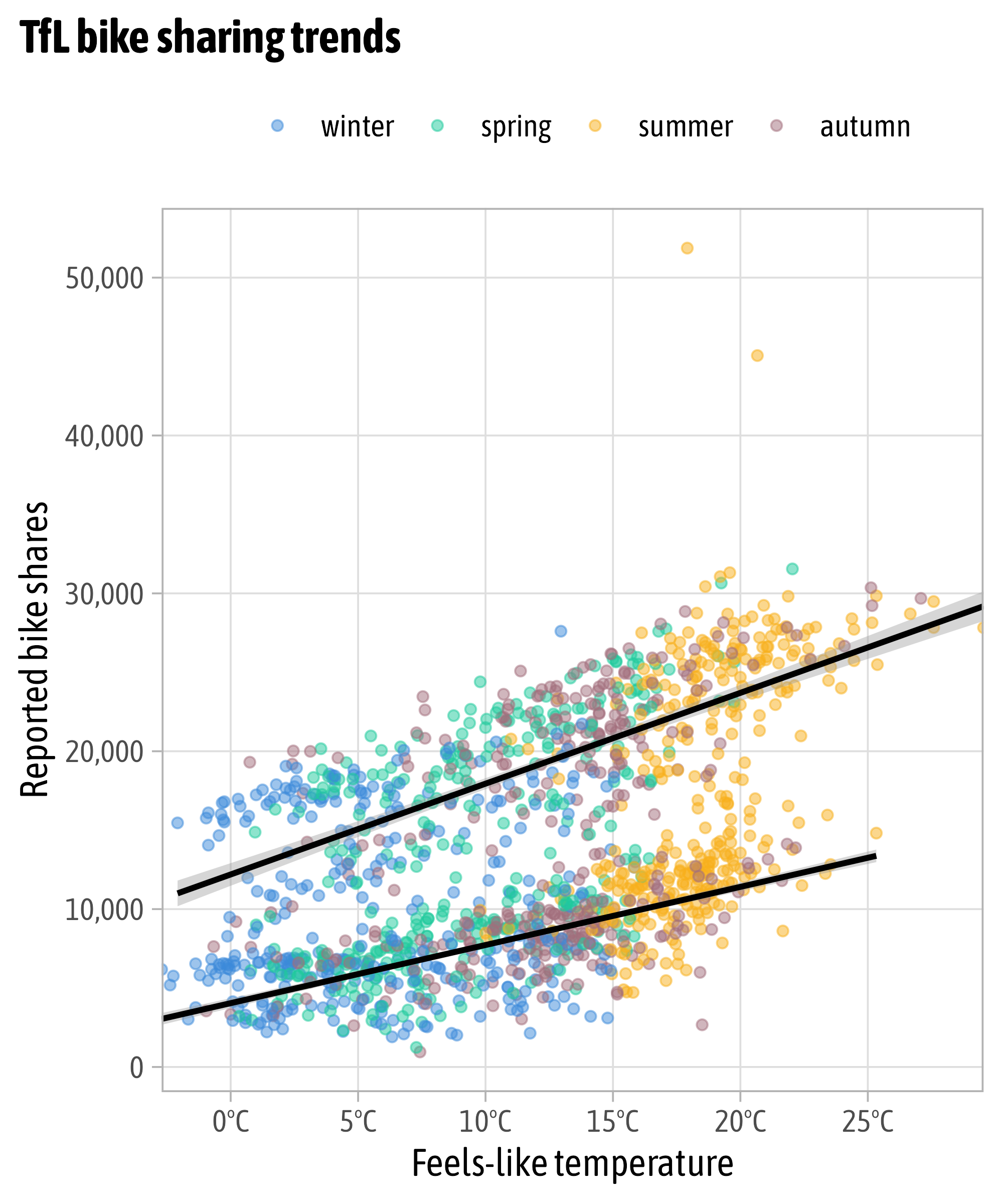
Modify Scales
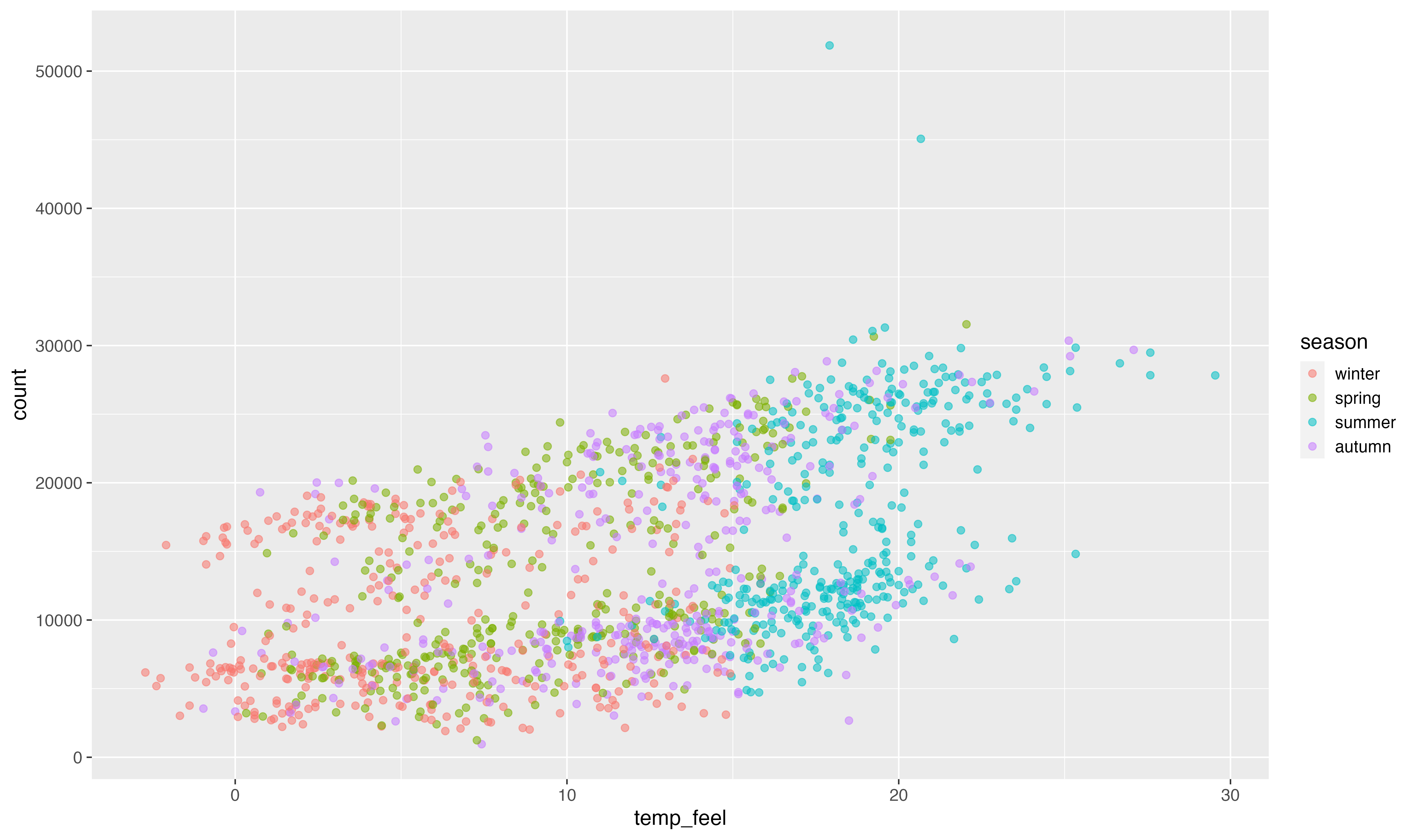
colors_sorted <- c(
  autumn = "#a26e7c",
  spring = "#1ec99b",
  summer = "#f7b01b",
  winter = "#3c89d9"
)

g +
  scale_x_continuous(
    expand = c(mult = 0, add = 0),
    breaks = seq(0, 30, by = 5),
    labels = function(x) paste0(x, "°C"),
    name = "Feels-like temperature"
  ) +
  scale_y_continuous(
    breaks = 0:5*10000,
    labels = scales::label_comma()
  ) +
  scale_color_manual(
    values = colors_sorted
  )
Modify Scales
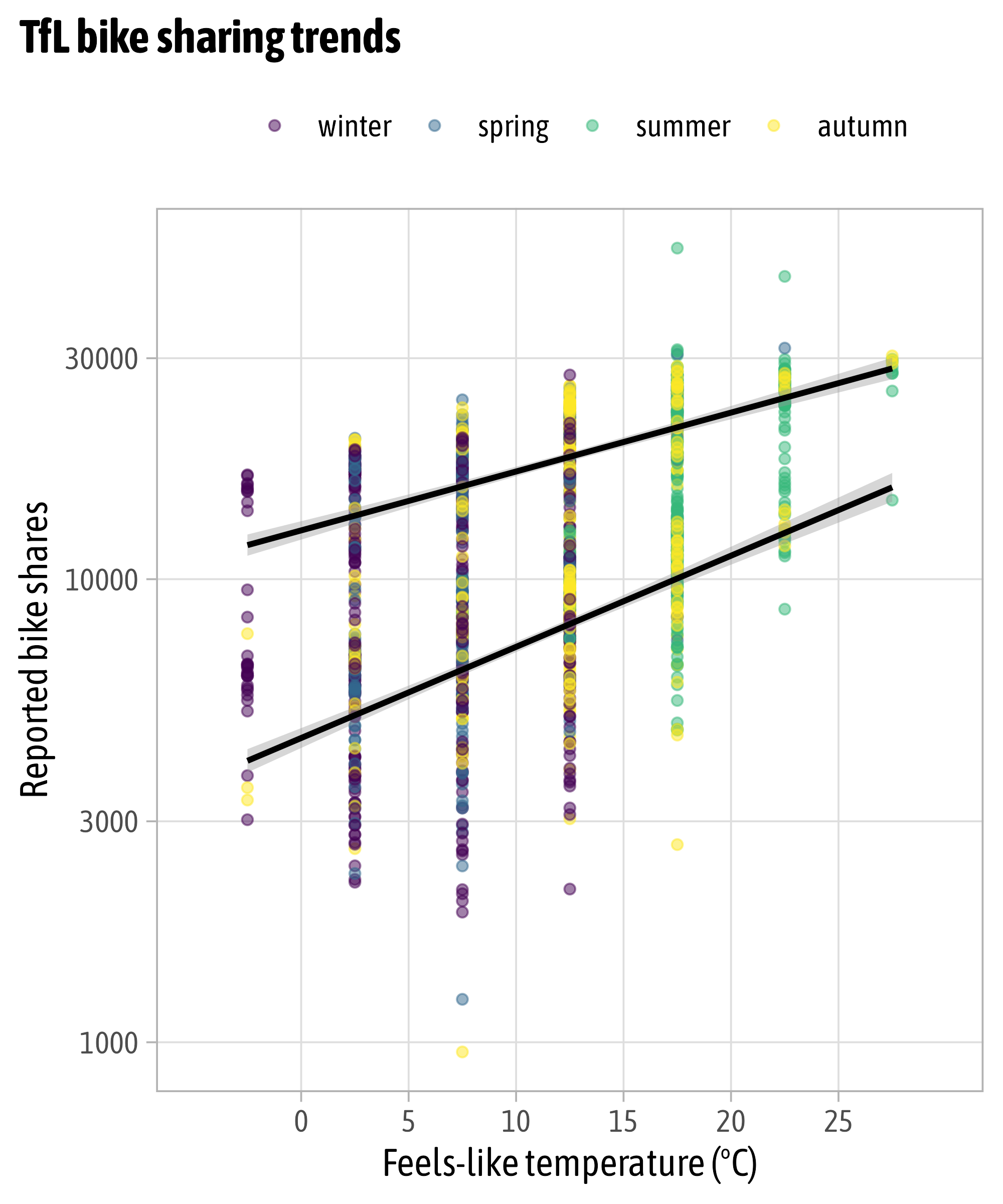
{RColorBrewer}
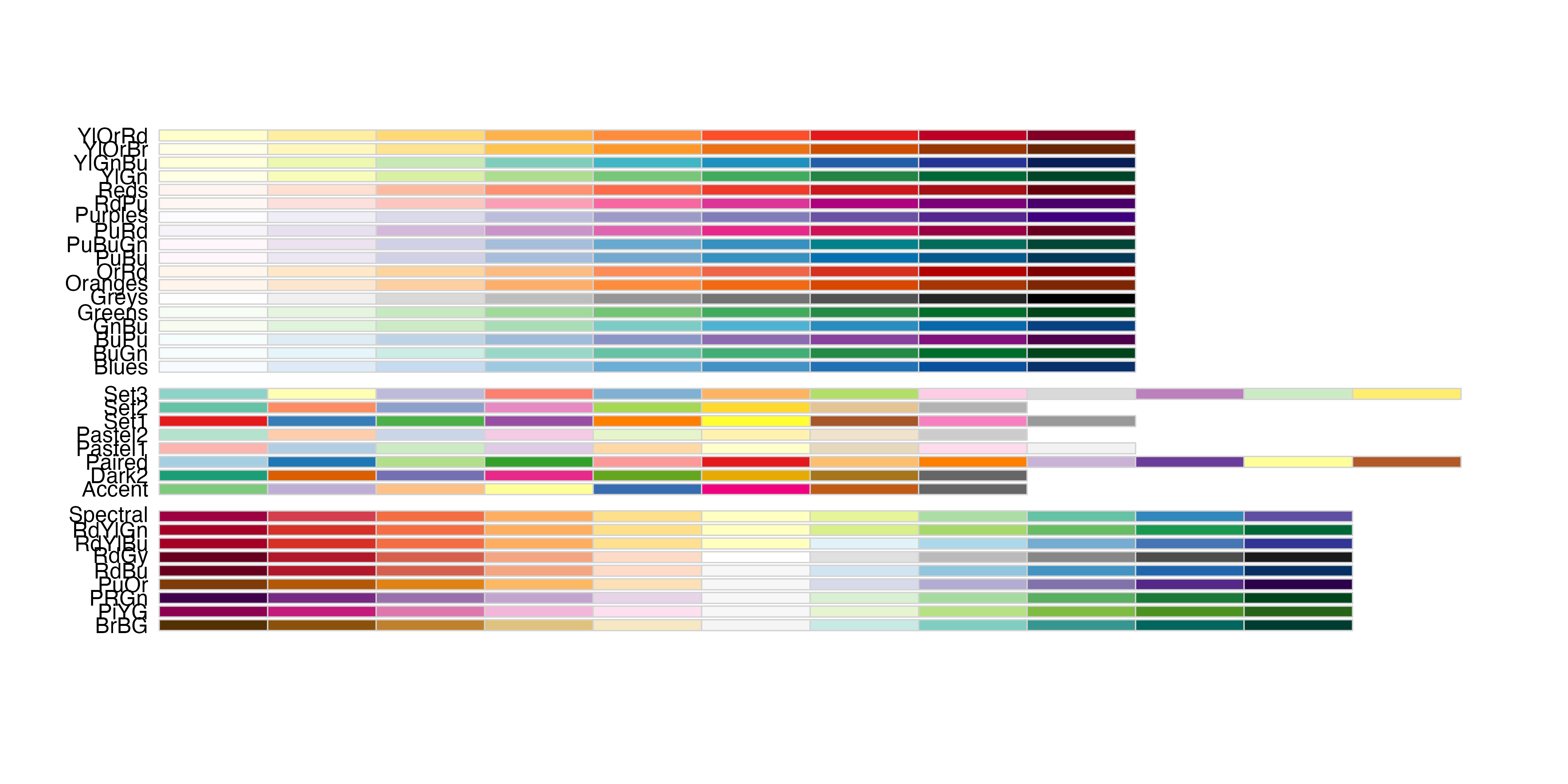
{RColorBrewer}

{rcartocolor}

{rcartocolor}
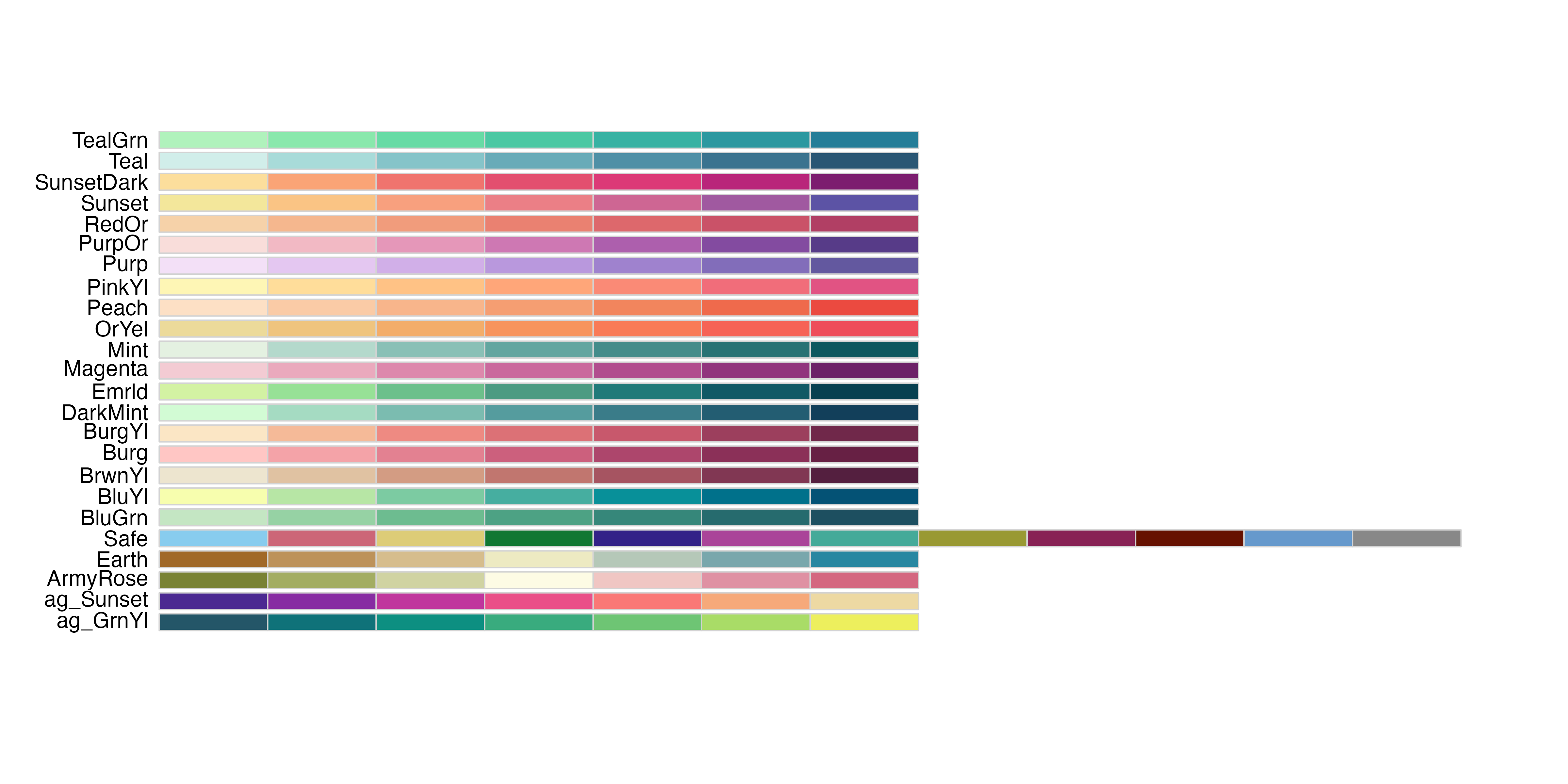
{rcartocolor}
g +
  scale_x_continuous(
    expand = c(mult = 0.02, add = 0),
    breaks = seq(0, 30, by = 5),
    labels = function(x) paste0(x, "°C"),
    name = "Feels-like temperature"
  ) +
  scale_y_continuous(
    expand = c(mult = 0, add = 1500),
    breaks = 0:5*10000,
    labels = scales::label_comma()
  ) +
  rcartocolor::scale_color_carto_d(
    palette = "Bold"
  )
{scico}

{scico}
g +
  scale_x_continuous(
    expand = c(mult = 0.02, add = 0),
    breaks = seq(0, 30, by = 5),
    labels = function(x) paste0(x, "°C"),
    name = "Feels-like temperature"
  ) +
  scale_y_continuous(
    expand = c(mult = 0, add = 1500),
    breaks = 0:5*10000,
    labels = scales::label_comma()
  ) +
  scico::scale_color_scico_d(
    palette = "hawaii"
  )
{scico}
{scico}
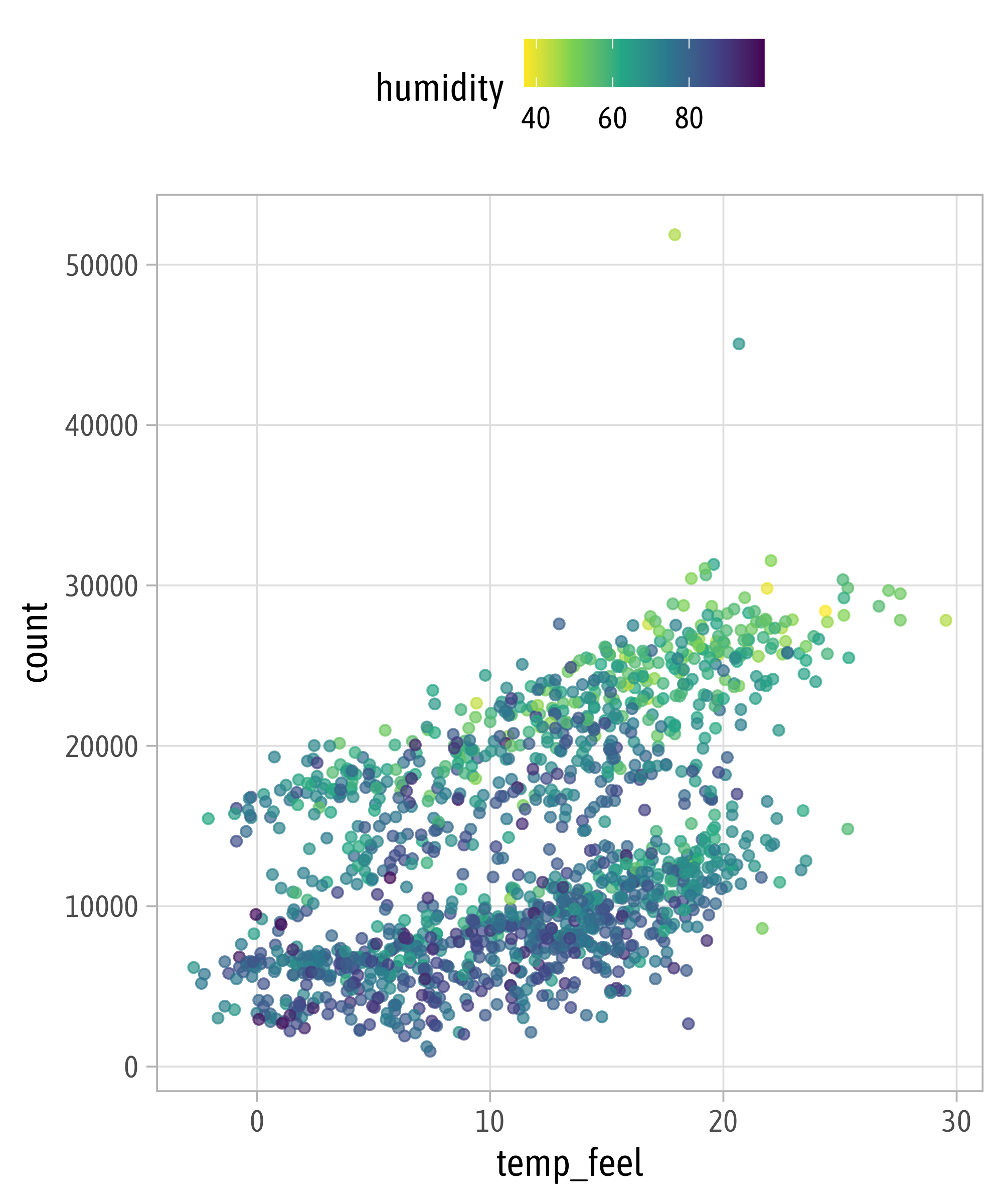
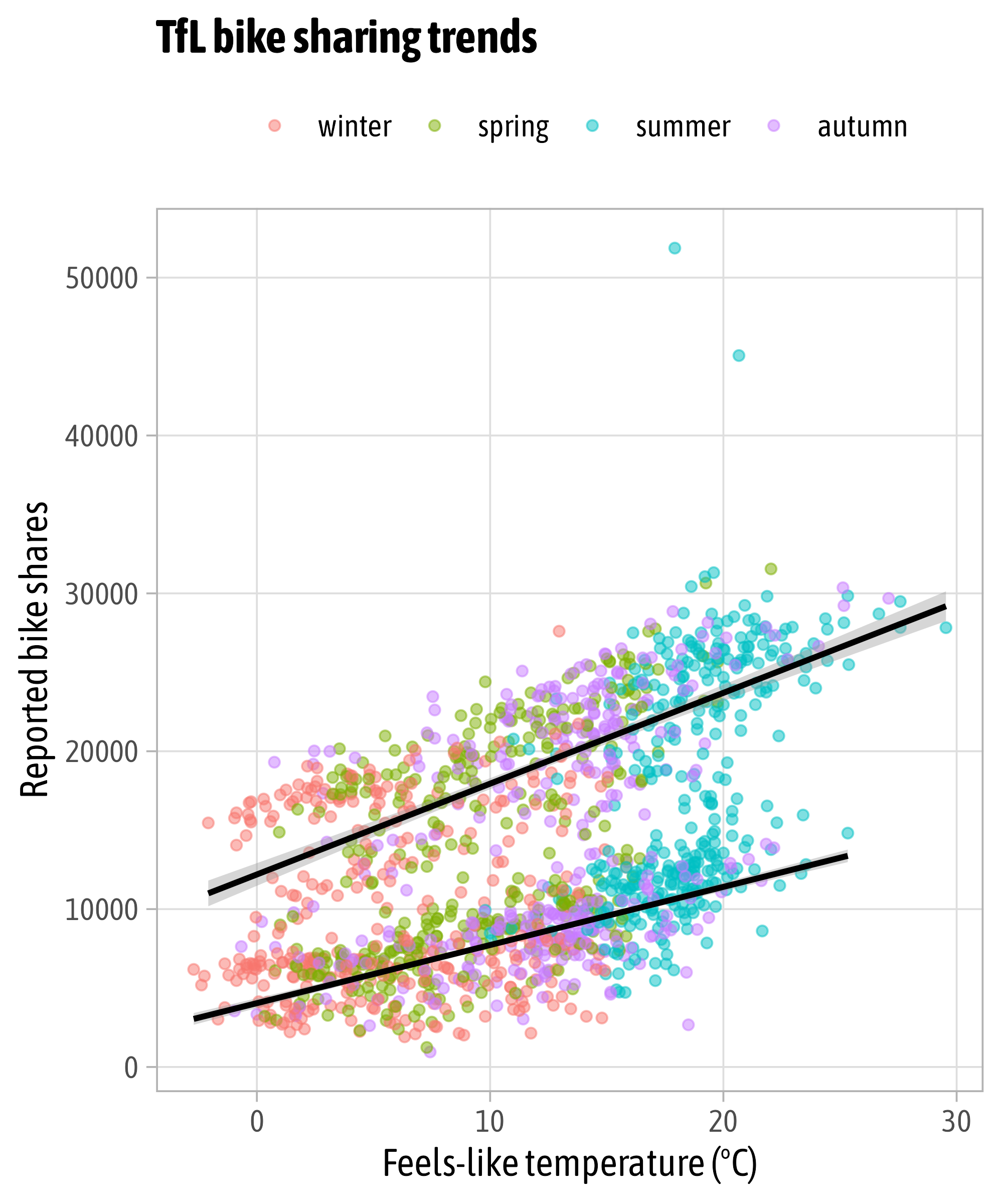
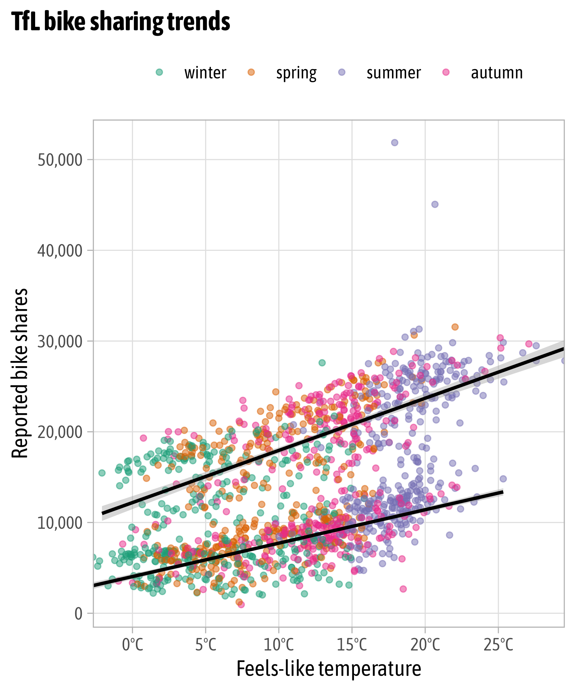
Modify Scales

Modify Scales
g +
  scale_x_continuous(
    expand = c(mult = 0, add = 0),
    breaks = seq(0, 30, by = 5),
    labels = function(x) paste0(x, "°C"),
    name = "Feels-like temperature"
  ) +
  scale_y_continuous(
    breaks = 0:5*10000,
    labels = scales::label_comma()
  ) +
  scale_color_manual(
    values = colors_sorted,
    name = NULL,
    labels = stringr::str_to_title
  )
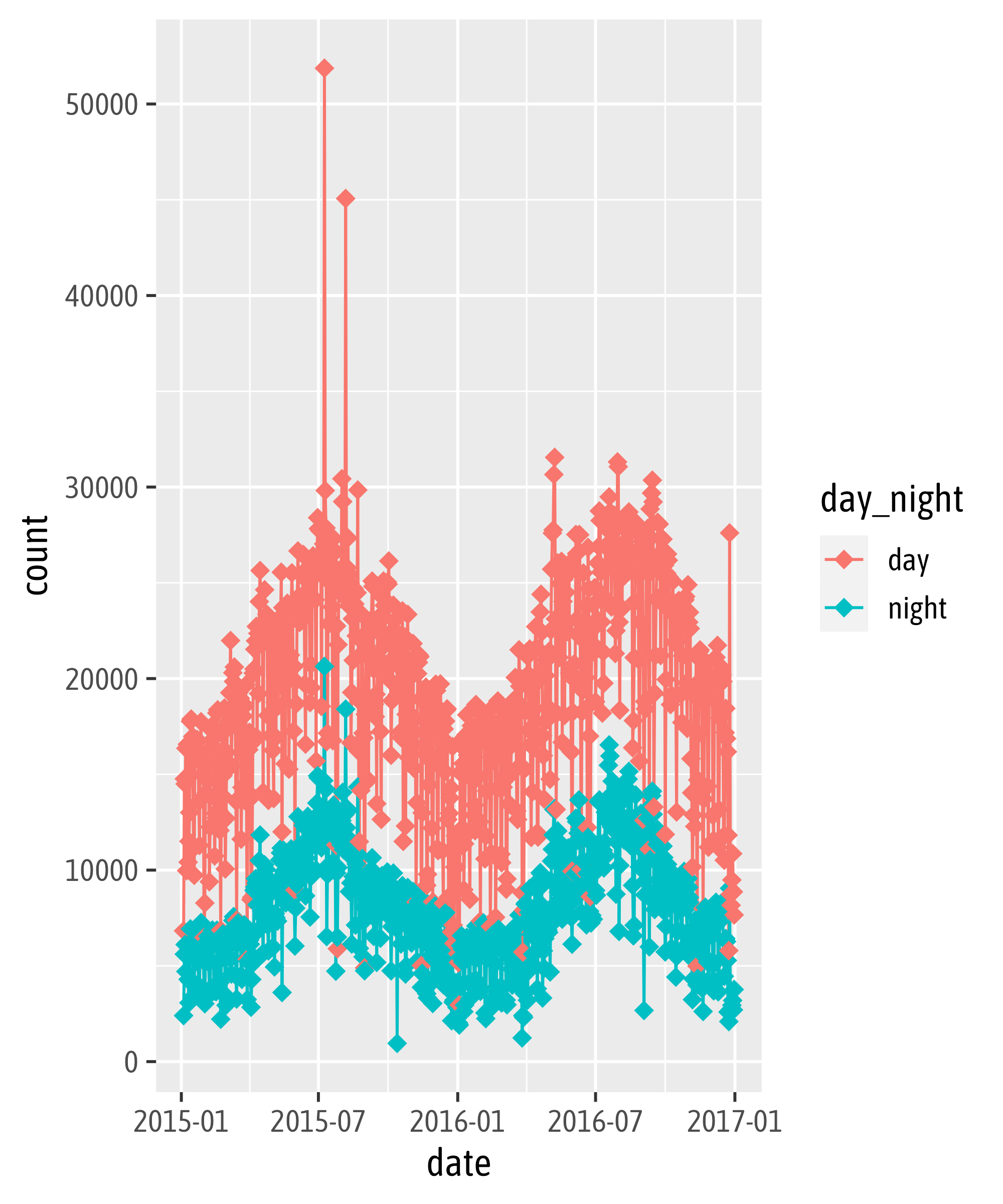
Solution Exercise
Solution Exercise
Solution Exercise
Solution Exercise
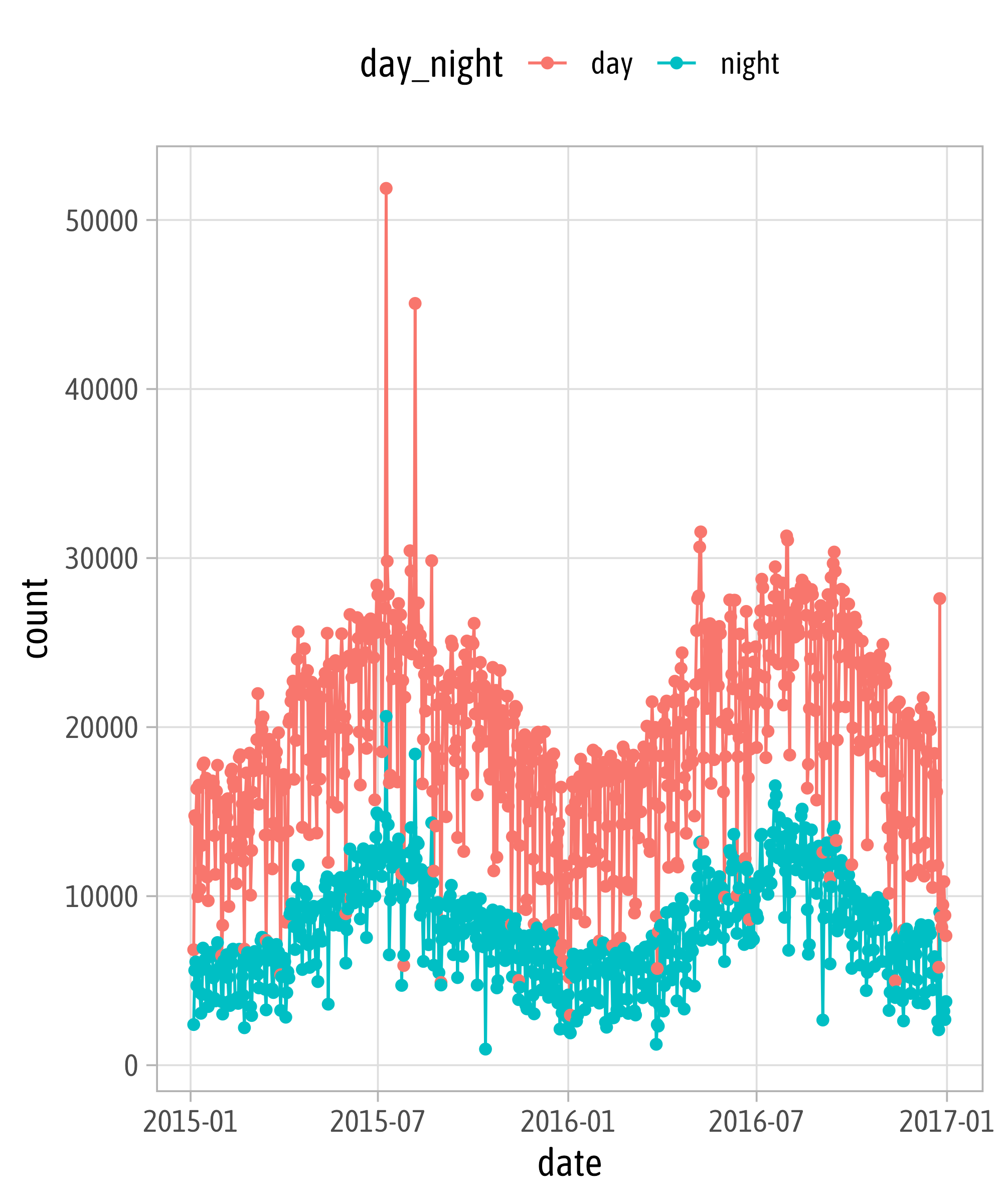
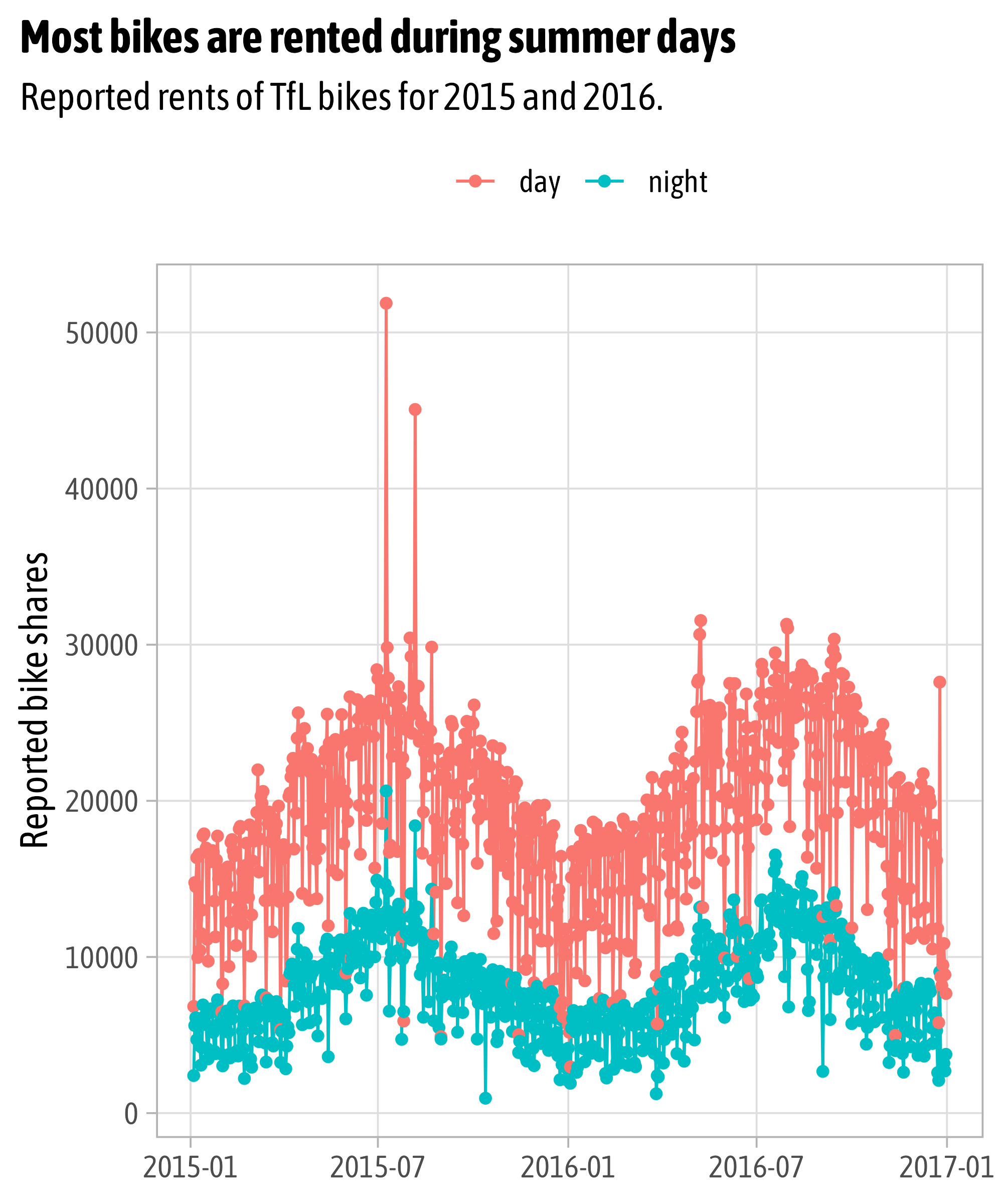
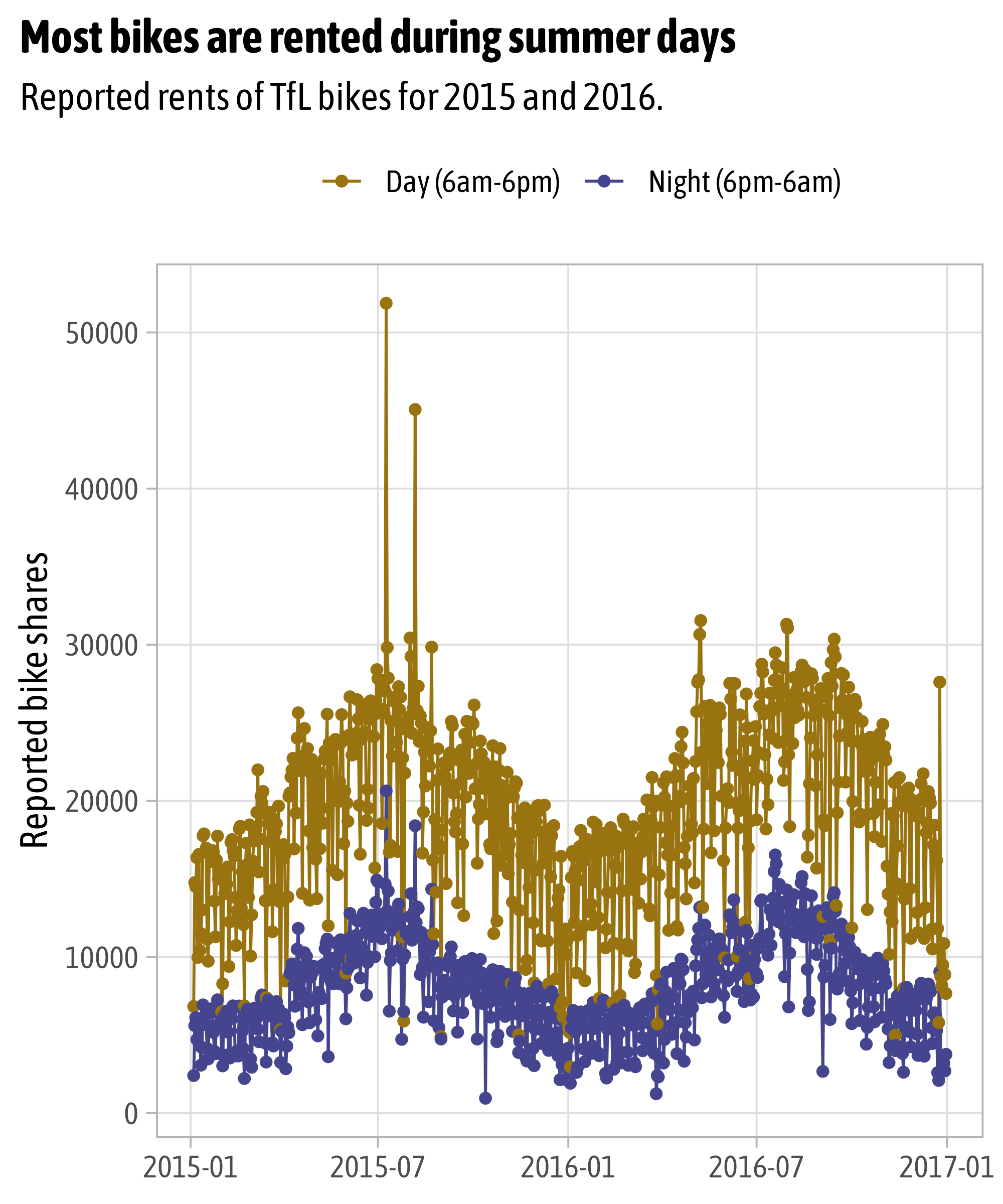
p +
scale_color_manual(
values = c("#98730F", "#44458e"),
labels = c("Day (6am-6pm)", "Night (6pm-6am)")
) +
theme_minimal(base_family = "Spline Sans", base_size = 15) +
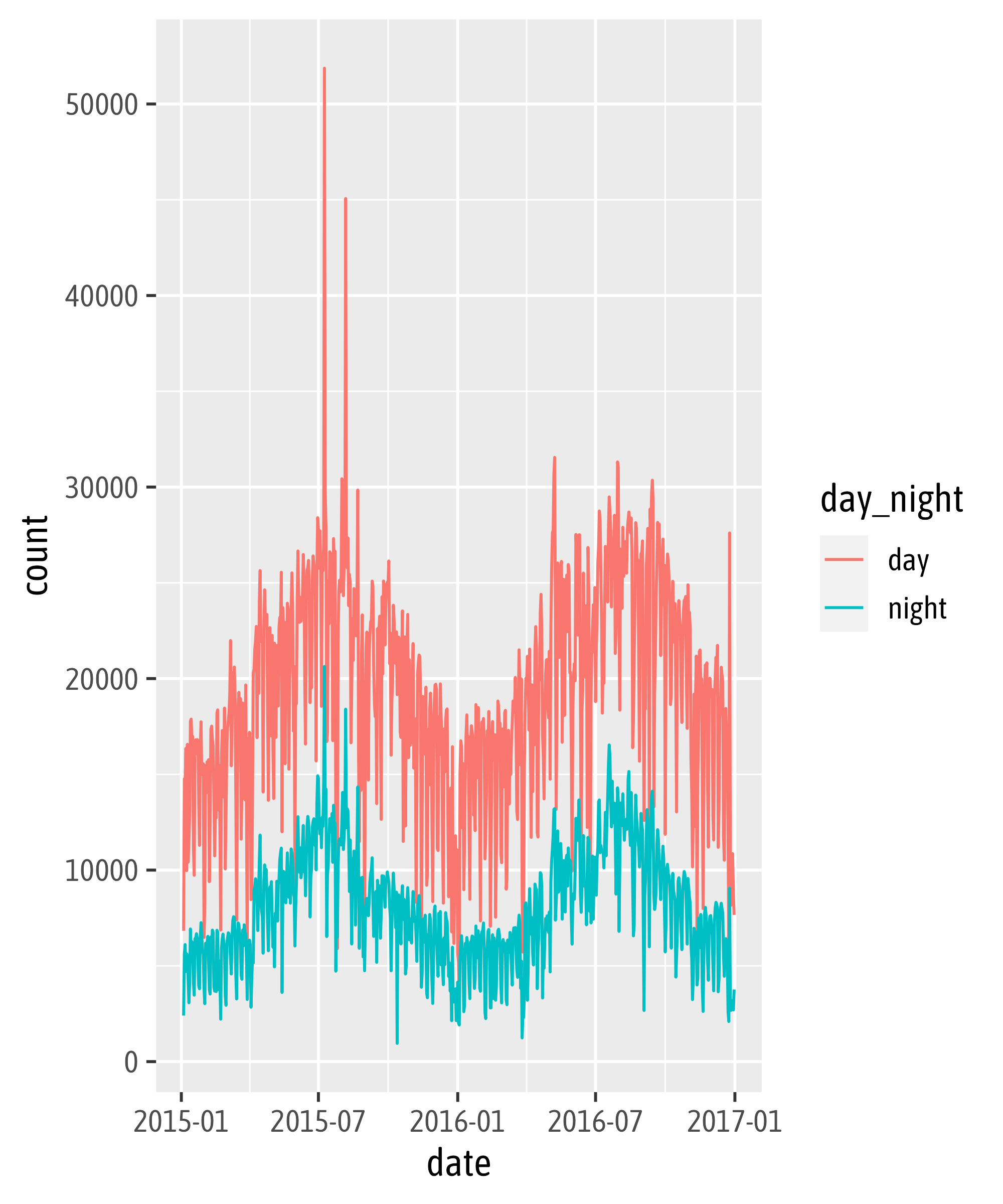
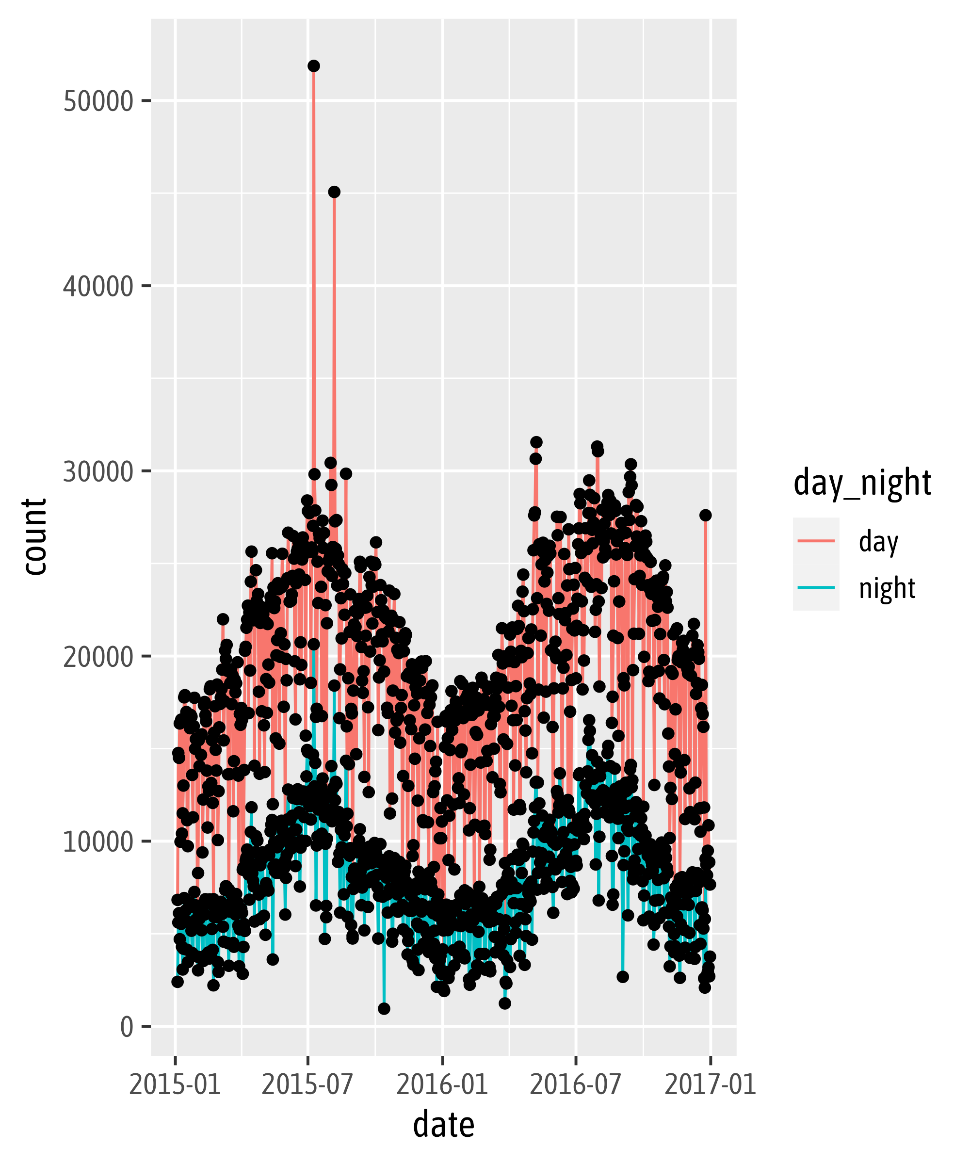
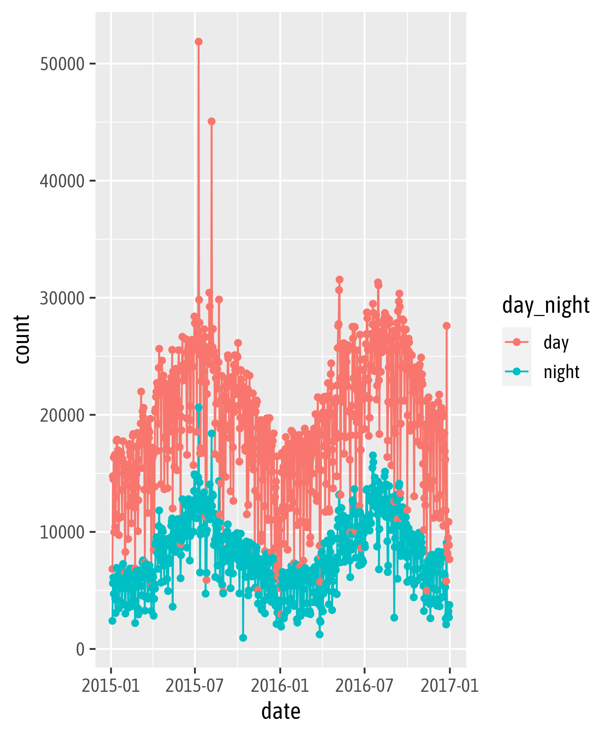
labs(title = "Most bikes are rented during summer days",
subtitle = "Reported rents of TfL bikes for 2015 and 2016.",
x = NULL, y = "Reported bike shares", color = NULL)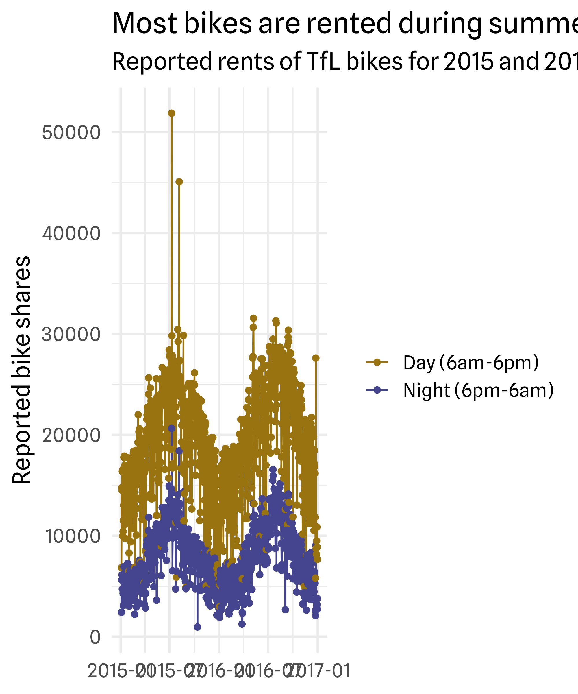
Solution Exercise
p +
  scale_color_manual(
    values = c("#98730F", "#44458e"),
    labels = c("Day (6am-6pm)", "Night (6pm-6am)")
  ) +
  theme_minimal(base_family = "Spline Sans", base_size = 15) +
  theme(
    panel.grid.minor = element_blank(),
    plot.title = element_text(face = "bold"),
    plot.title.position = "plot",
    legend.position = "top"
  ) +
  labs(title = "Most bikes are rented during summer days",
       subtitle = "Reported rents of TfL bikes for 2015 and 2016.",
       x = NULL, y = "Reported bike shares", color = NULL)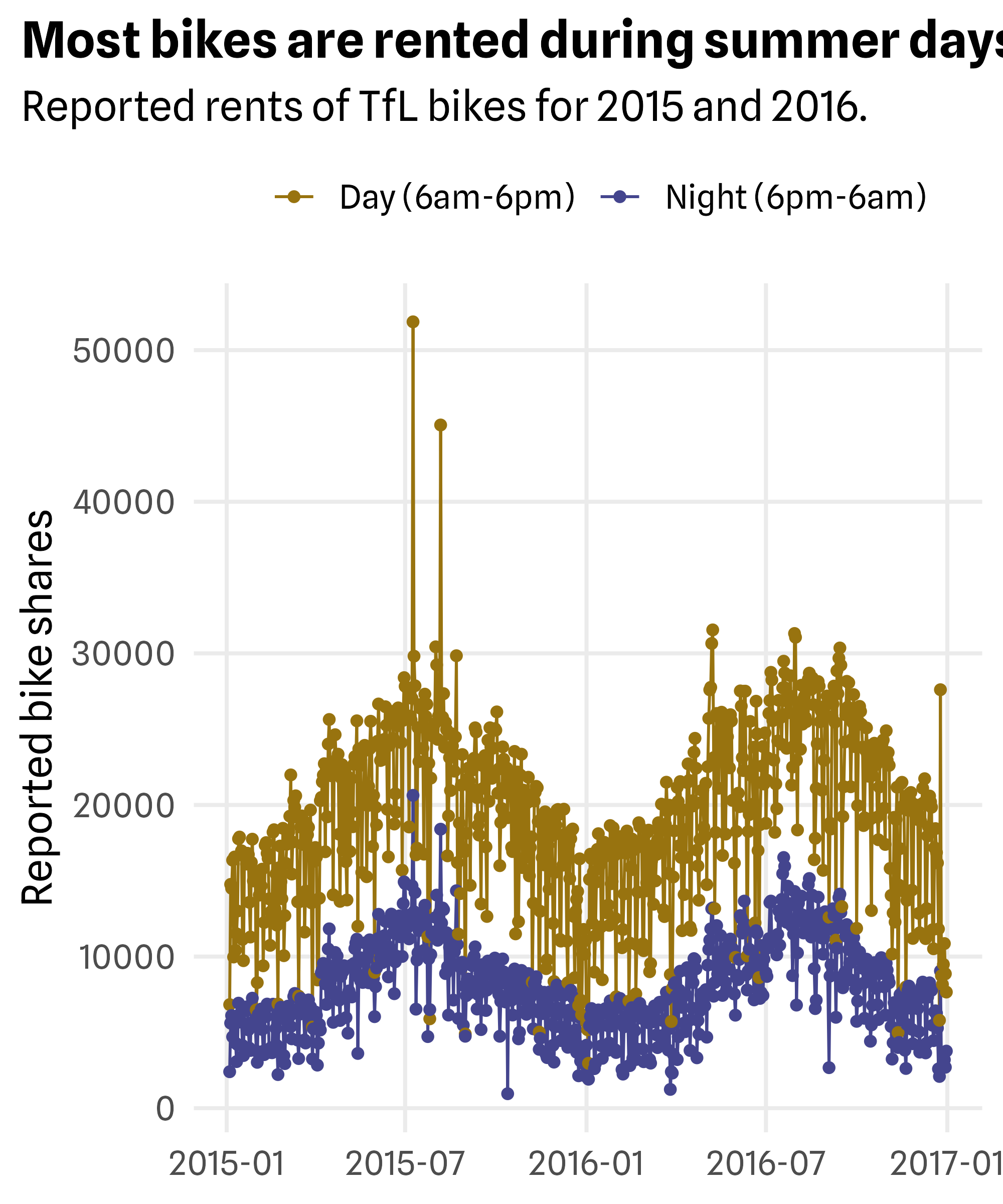
Solution Exercise
p +
  scale_x_date(
    date_breaks = "4 months",
    date_labels = "%m/'%y"
  ) +
  scale_color_manual(
    values = c("#98730F", "#44458e"),
    labels = c("Day (6am-6pm)", "Night (6pm-6am)")
  ) +
  theme_minimal(base_family = "Spline Sans", base_size = 15) +
  theme(
    panel.grid.minor = element_blank(),
    plot.title = element_text(face = "bold"),
    plot.title.position = "plot",
    legend.position = "top"
  ) +
  labs(title = "Most bikes are rented during summer days",
       subtitle = "Reported rents of TfL bikes for 2015 and 2016.",
       x = NULL, y = "Reported bike shares", color = NULL)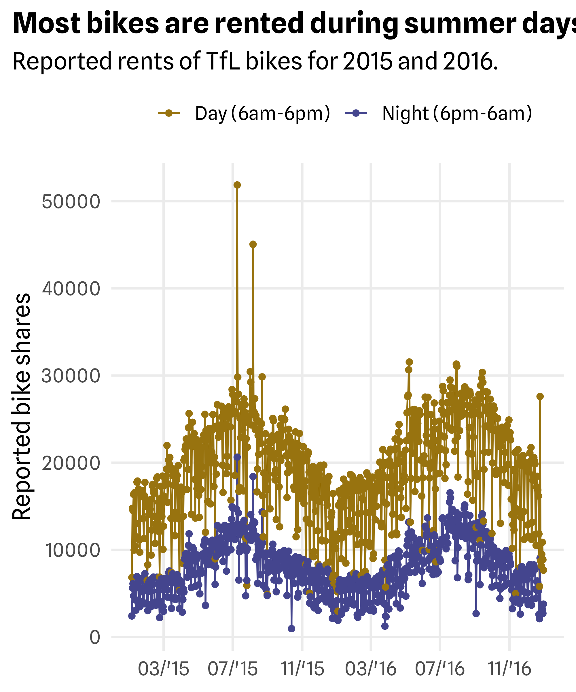
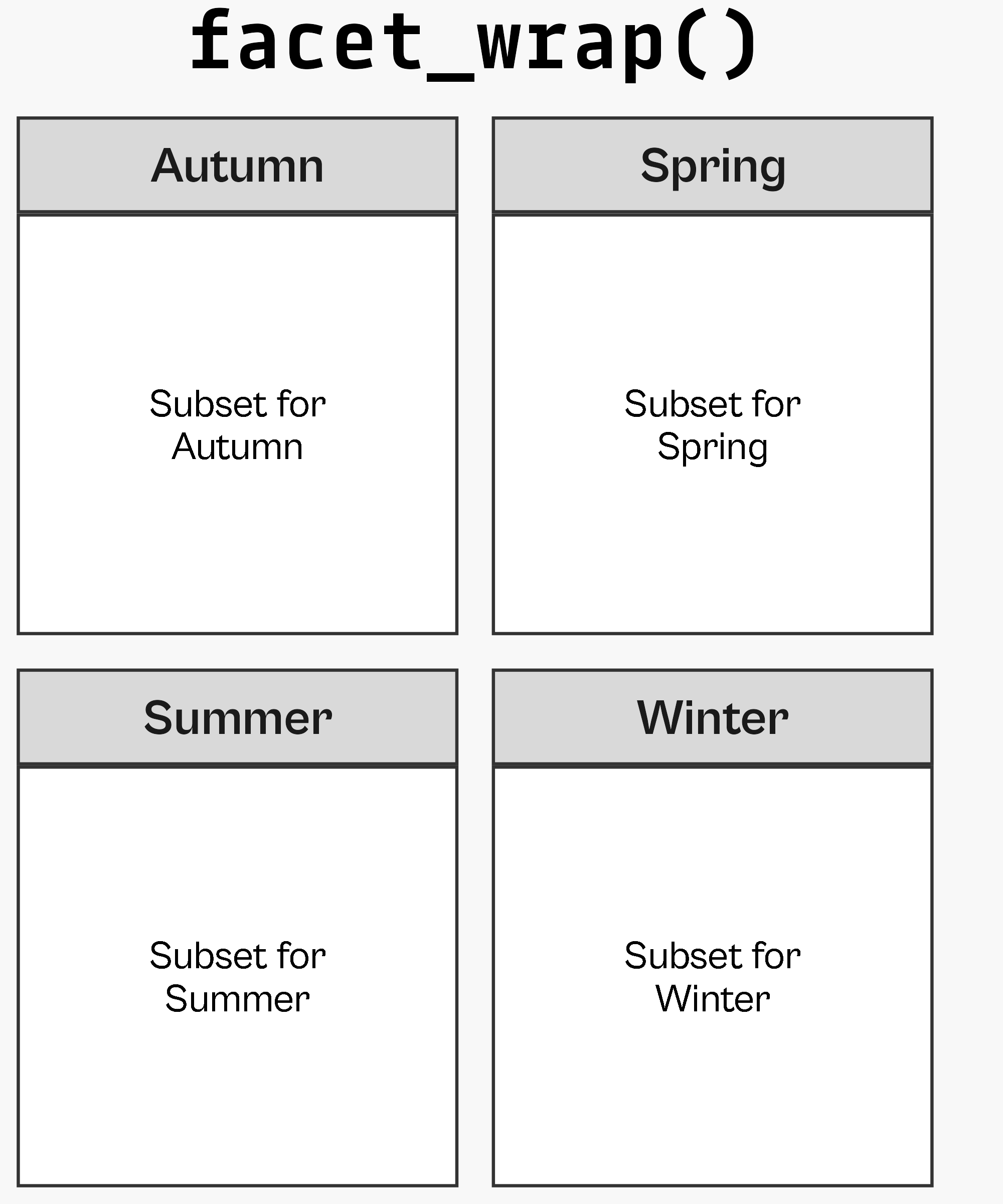

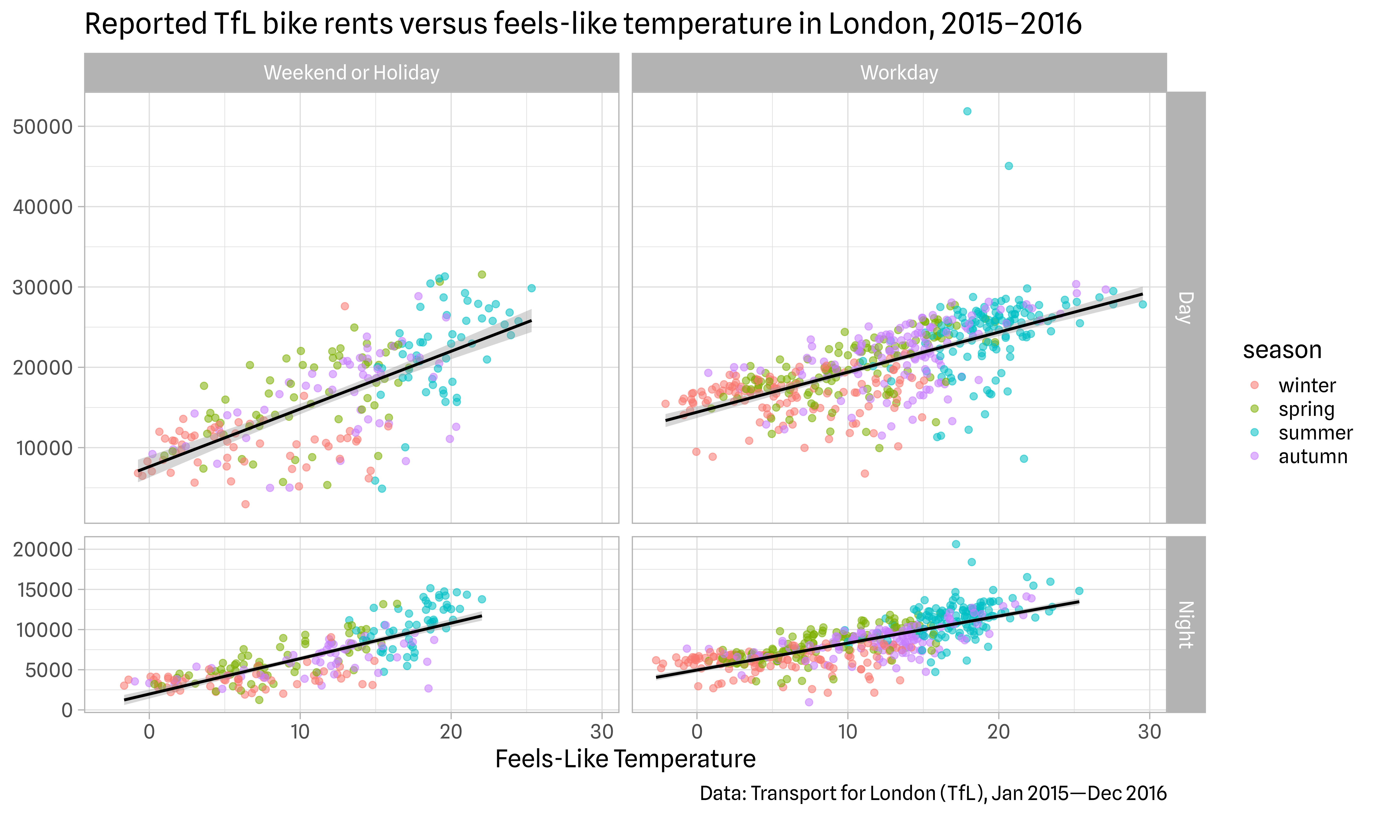
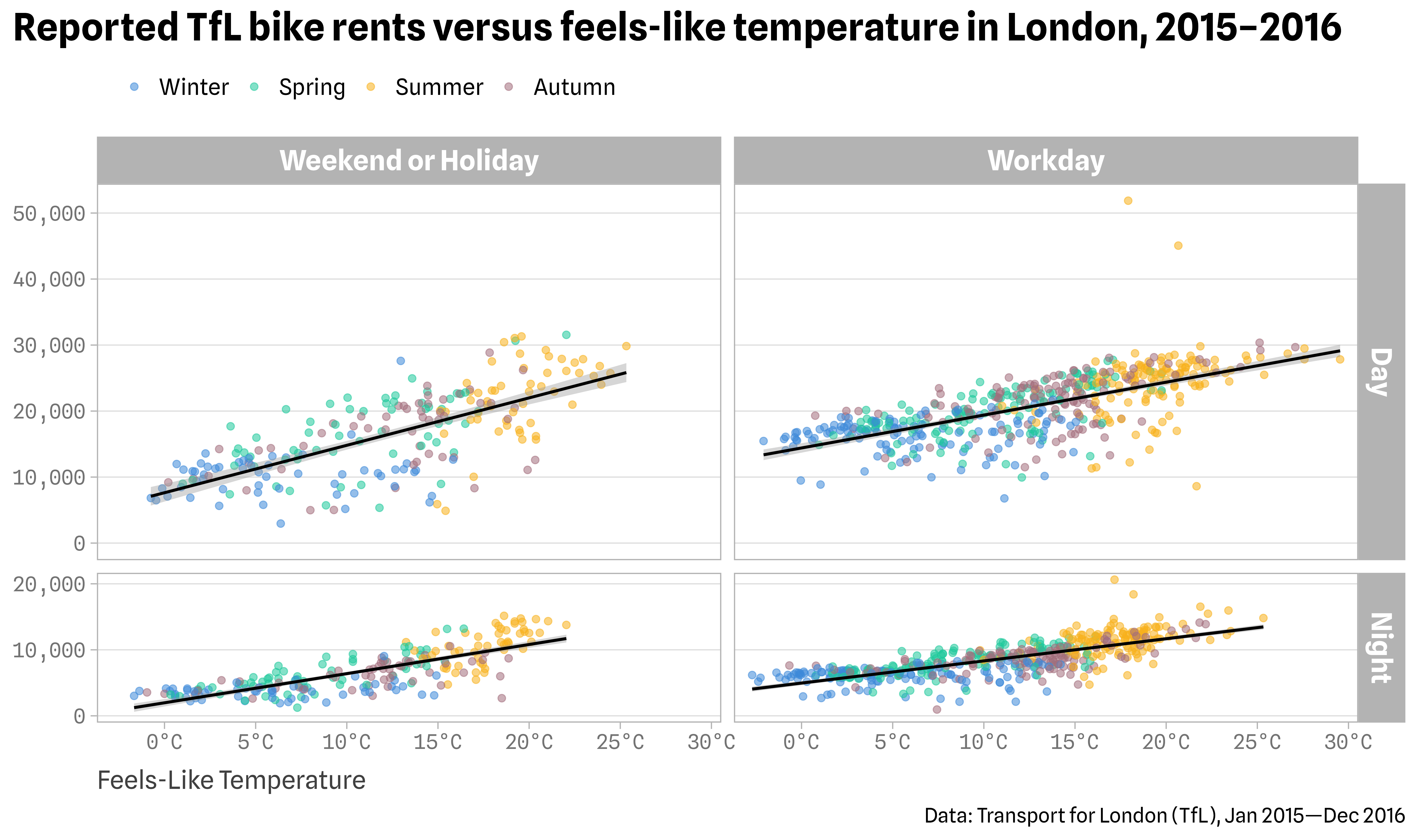
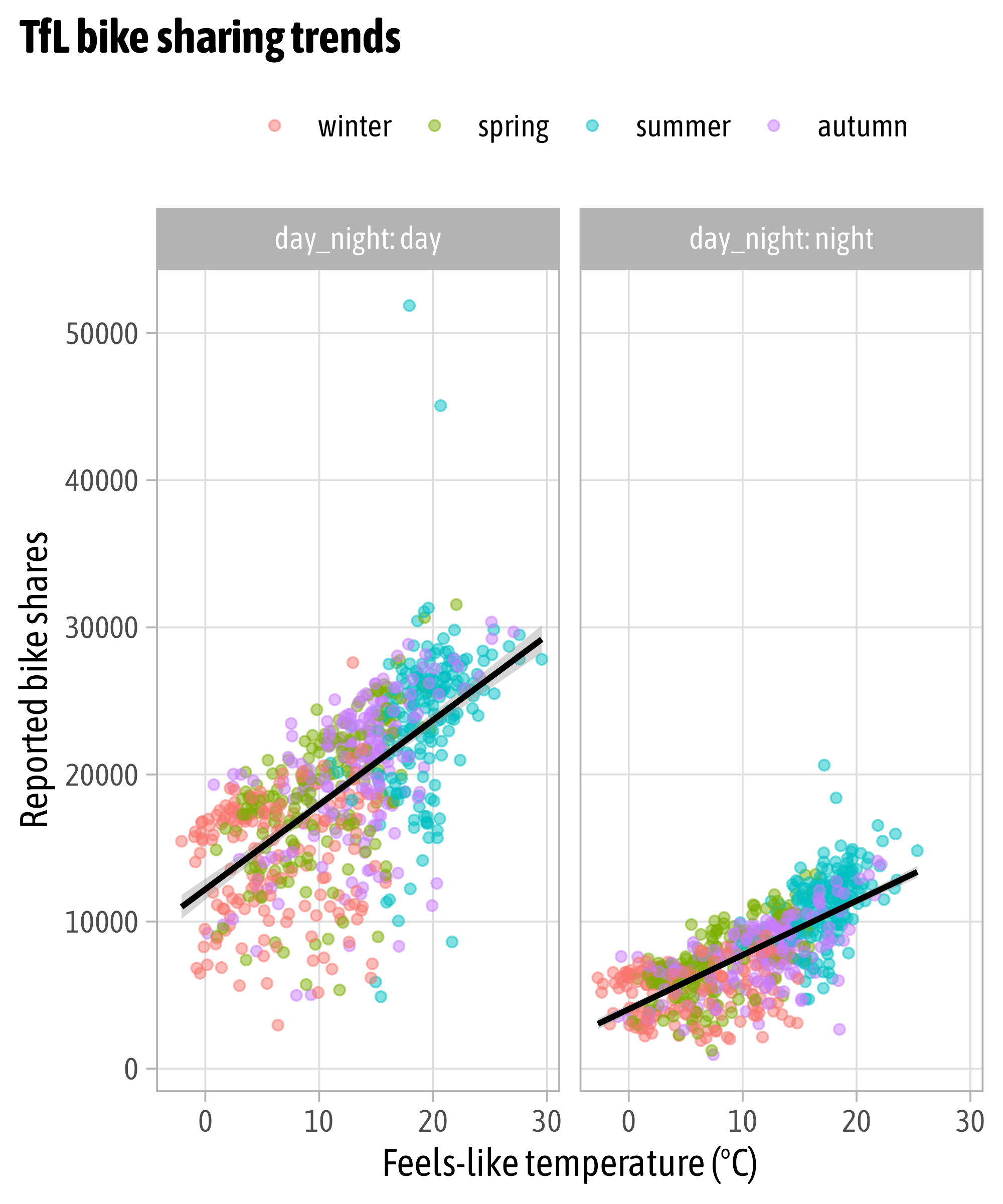
Wrapped Facets

Wrapped Facets

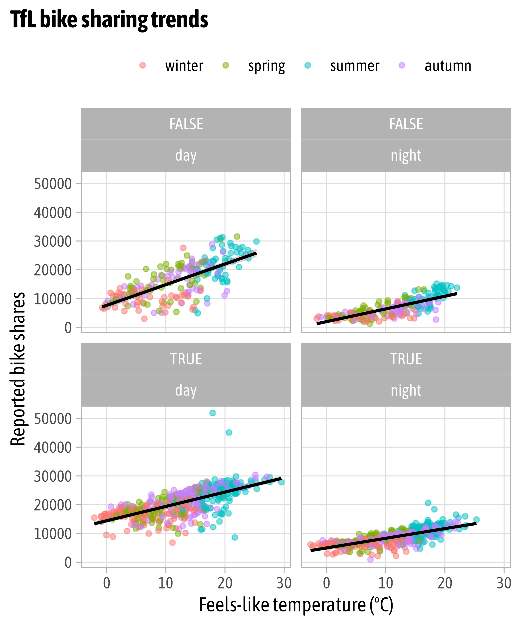
Facet Multiple Variables
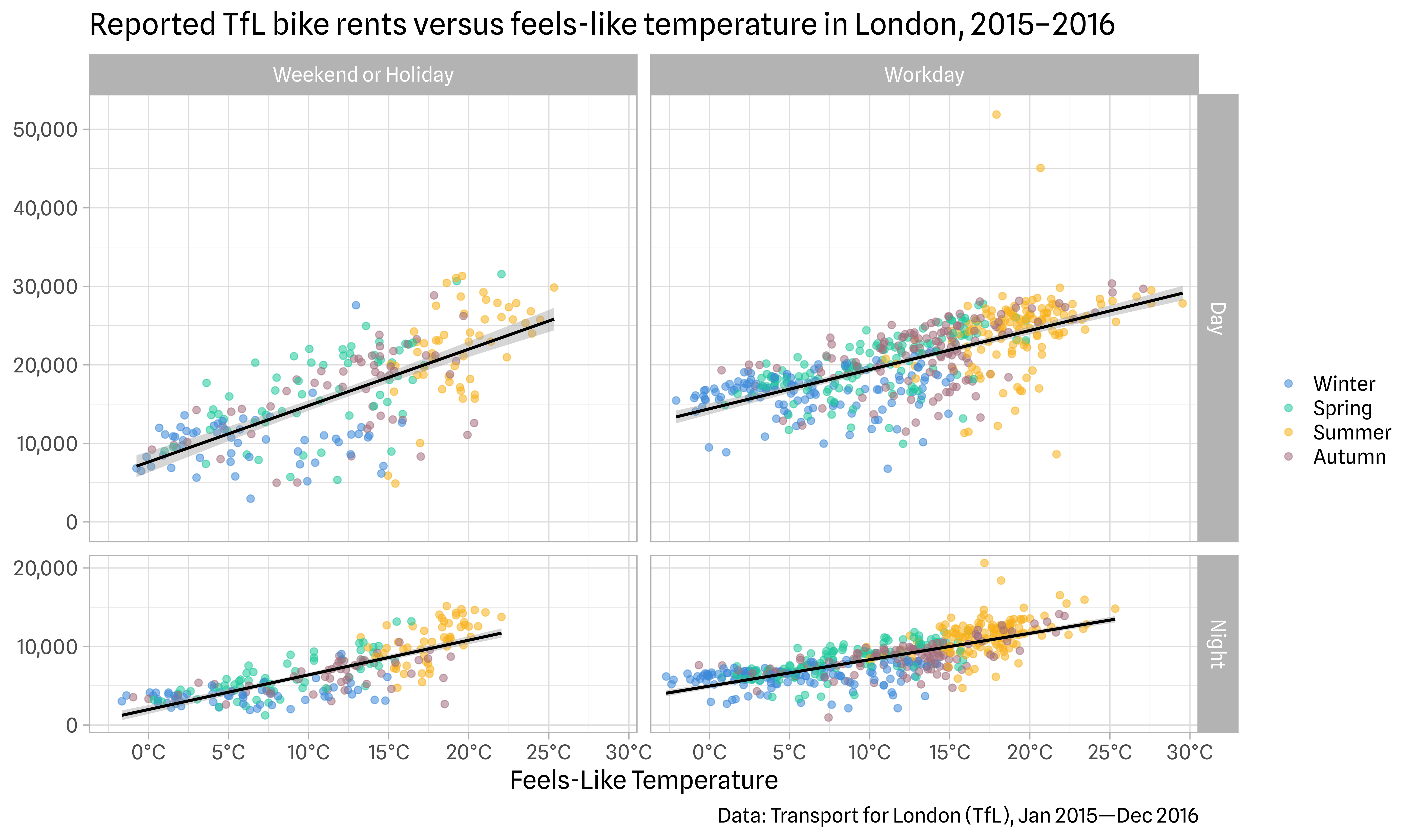
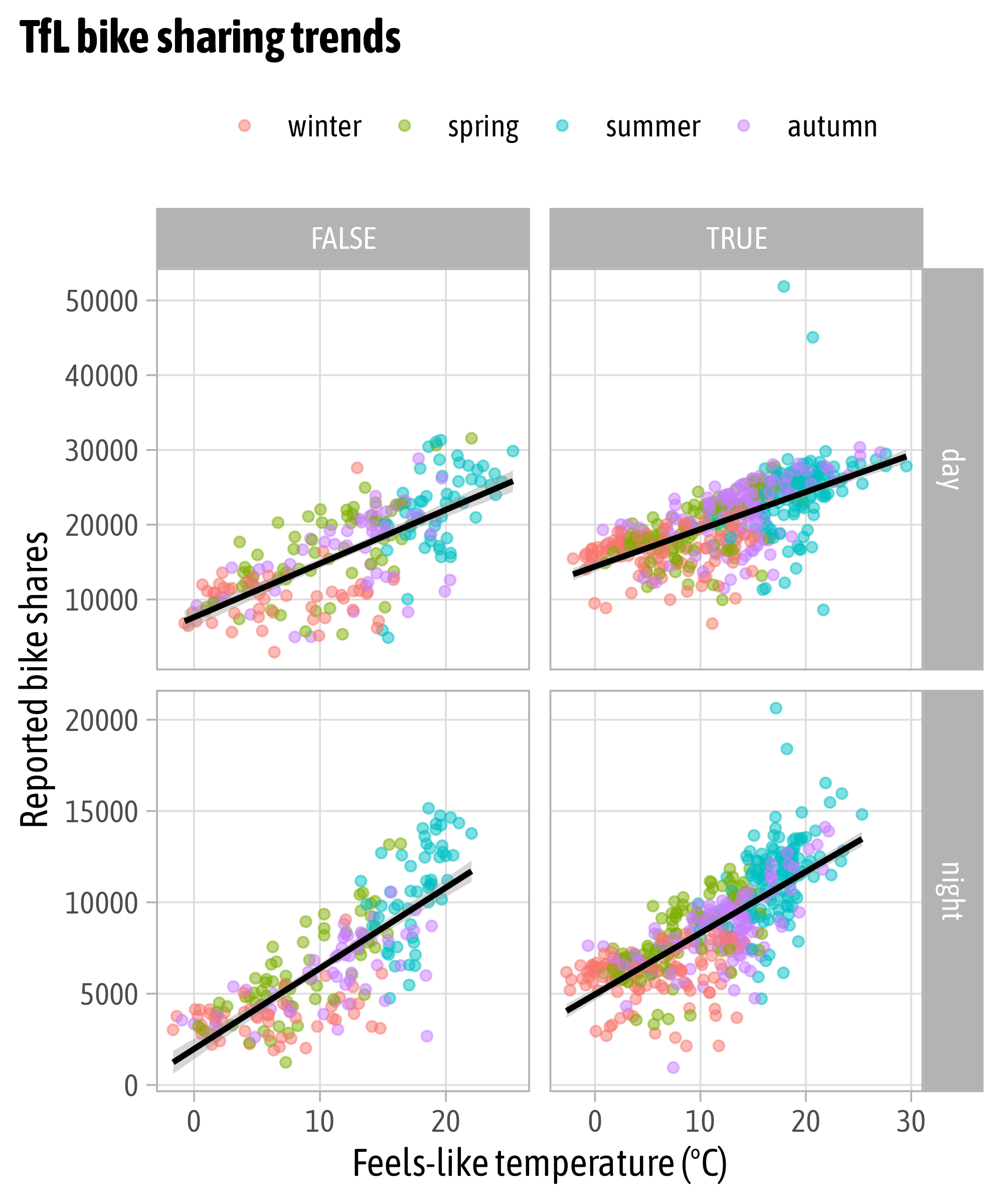
Gridded Facets
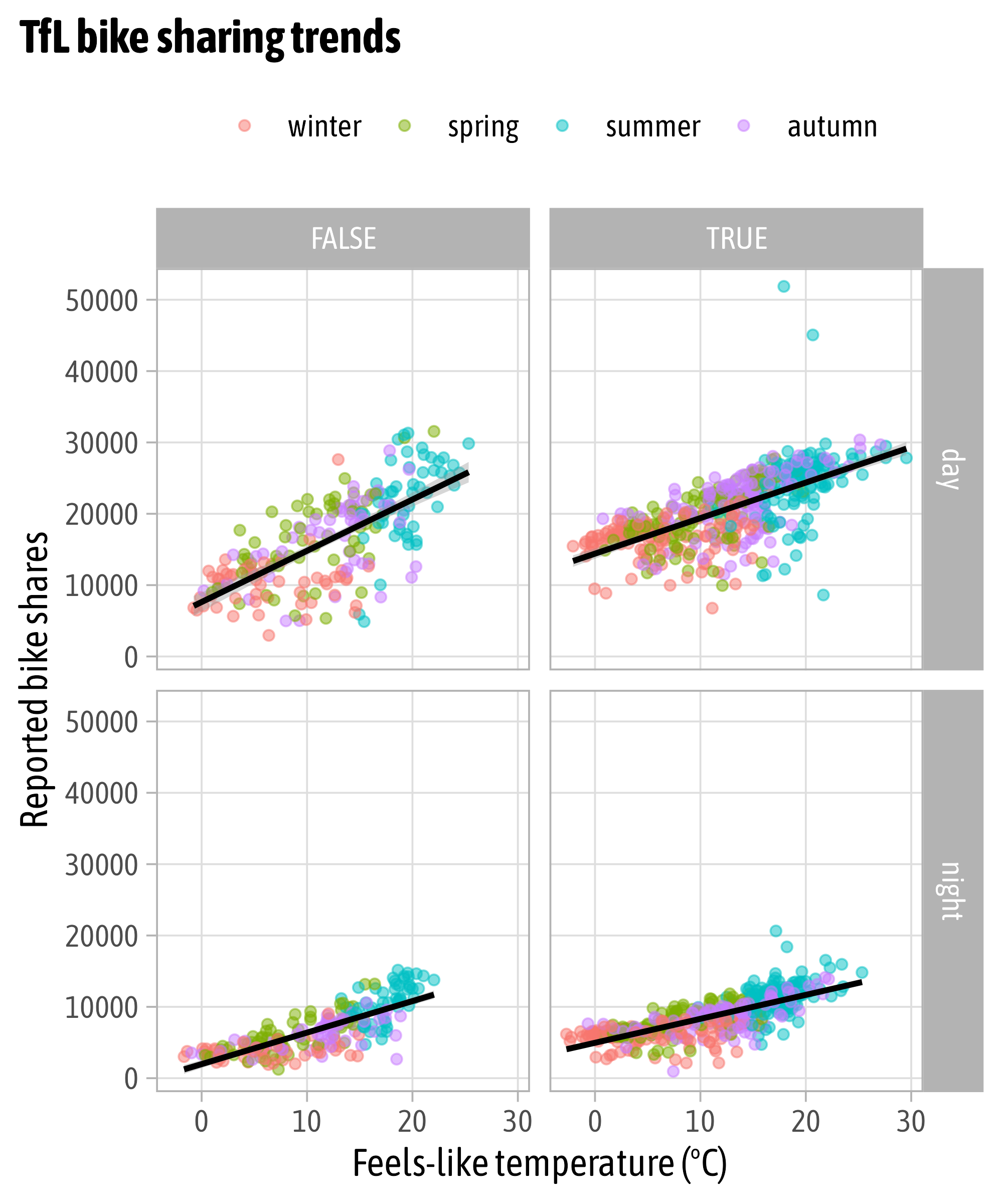
Gridded Facets

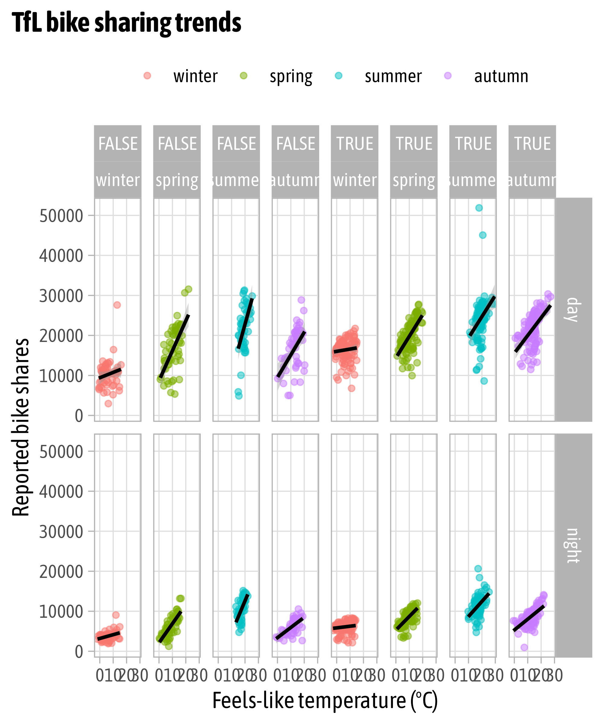
Facet Multiple Variables
Facet Options: Free Scaling
Facet Options: Proportional Spacing
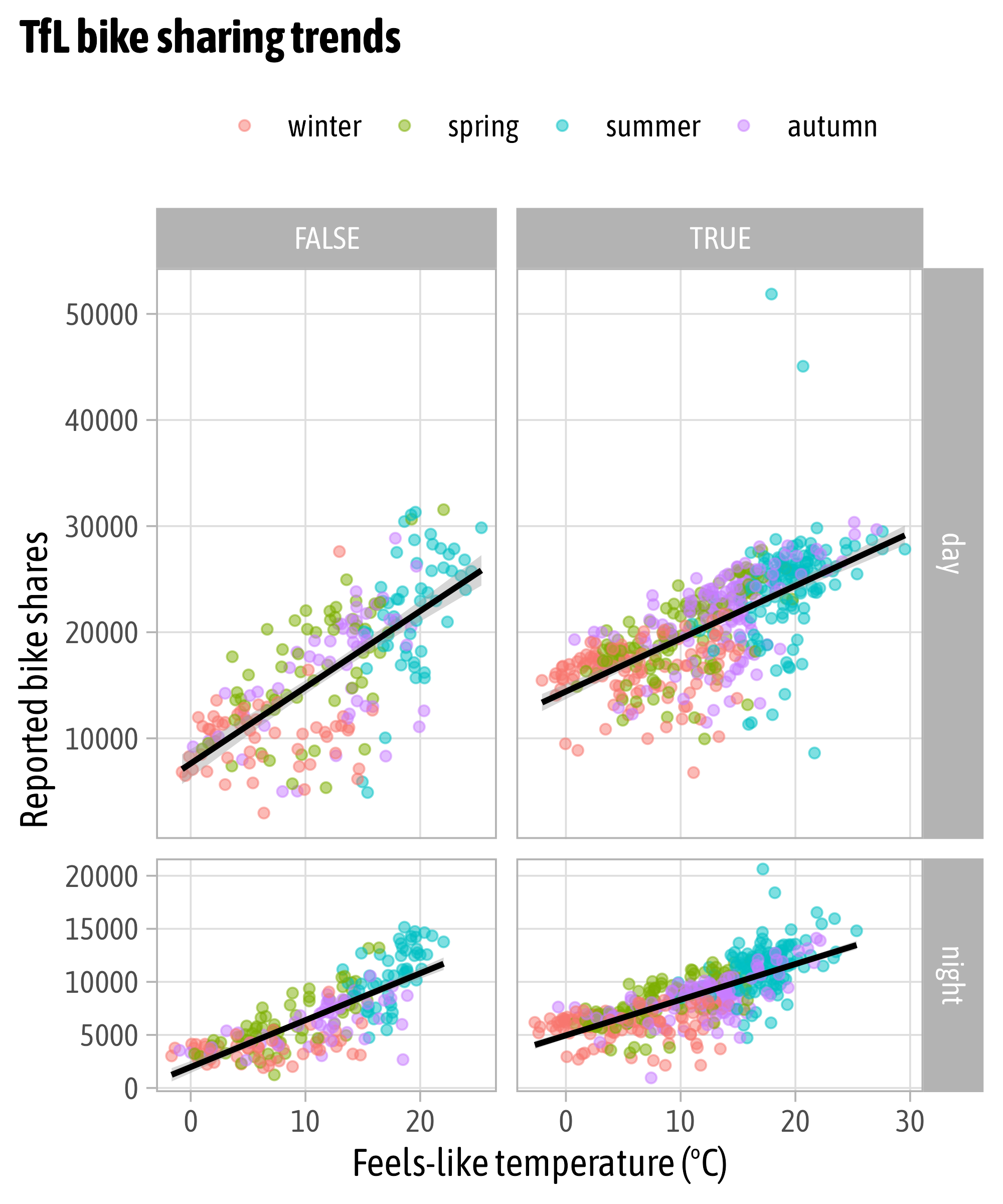
Facet Options: Proportional Spacing

Facet Labellers
Facet Labellers

Facet Labellers

Cartesian Coordinate System
Cartesian Coordinate System
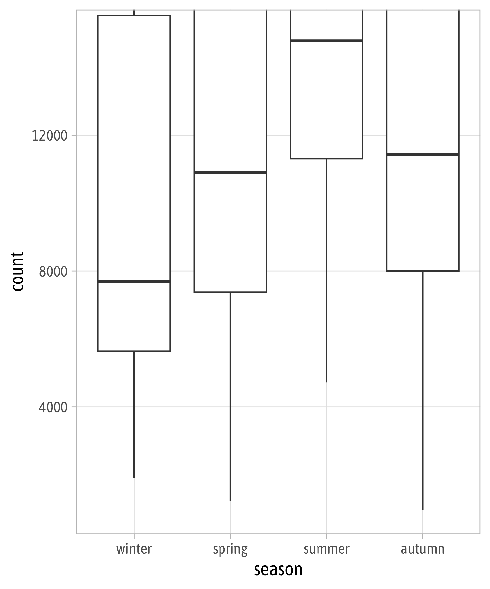
Changing Limits
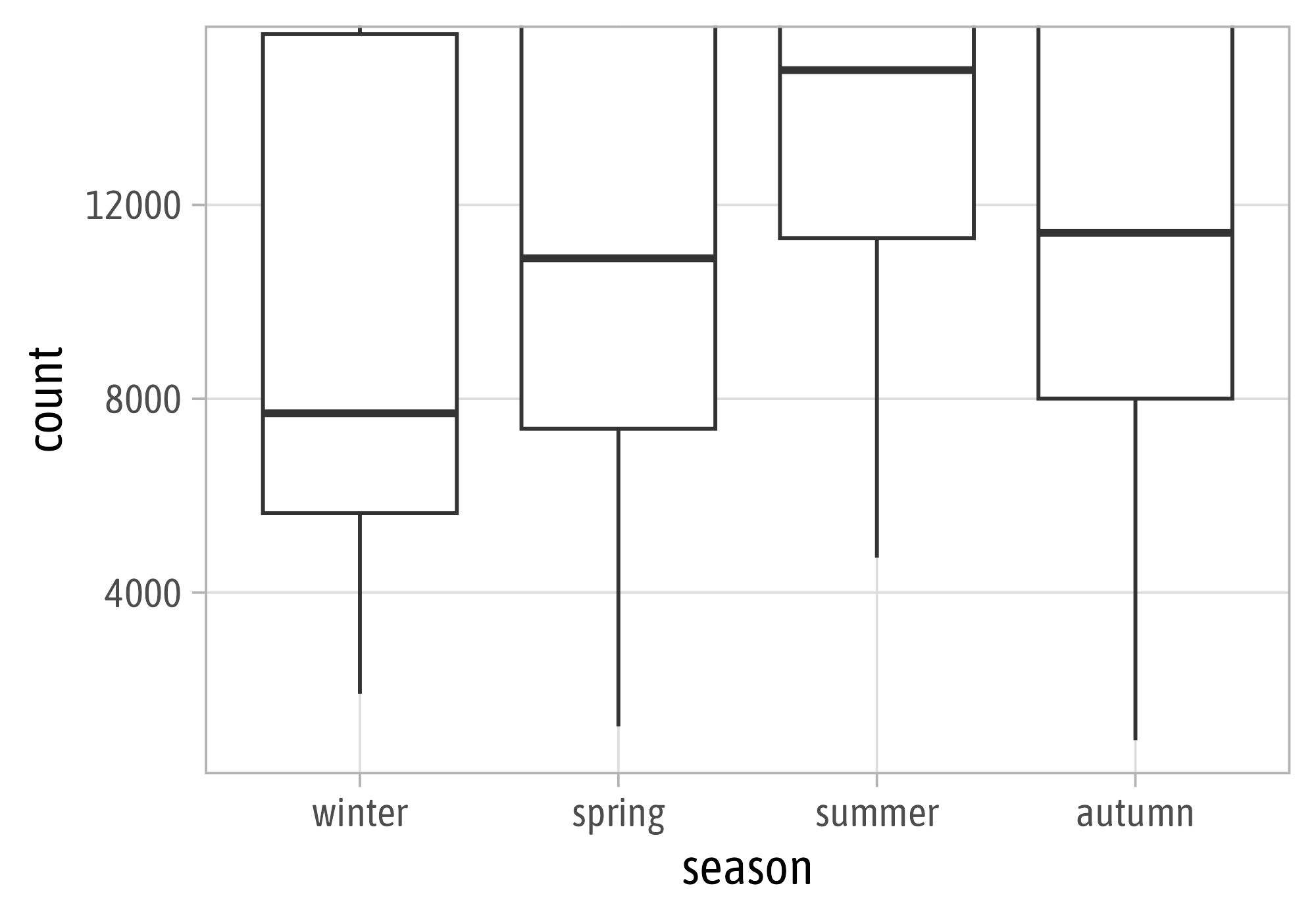
Clipping
Remove All Padding
Fixed Coordinate System
Flipped Coordinate System
Flipped Coordinate System


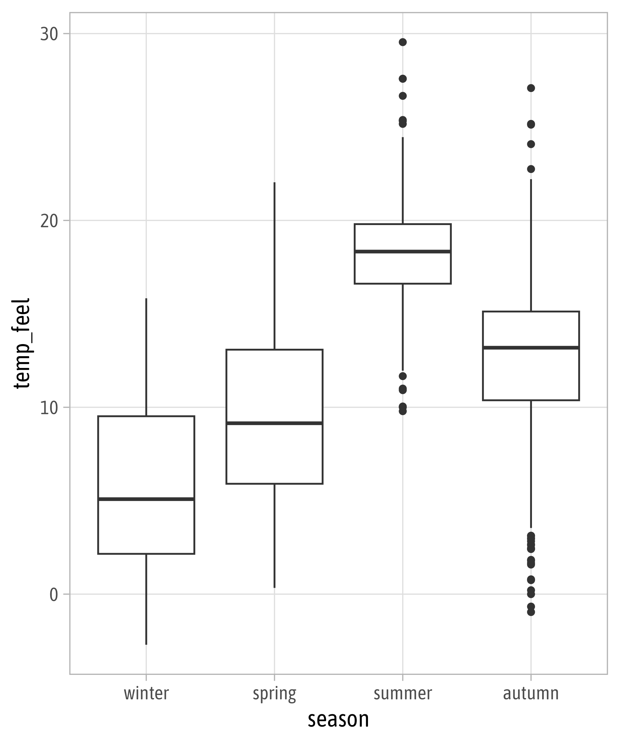
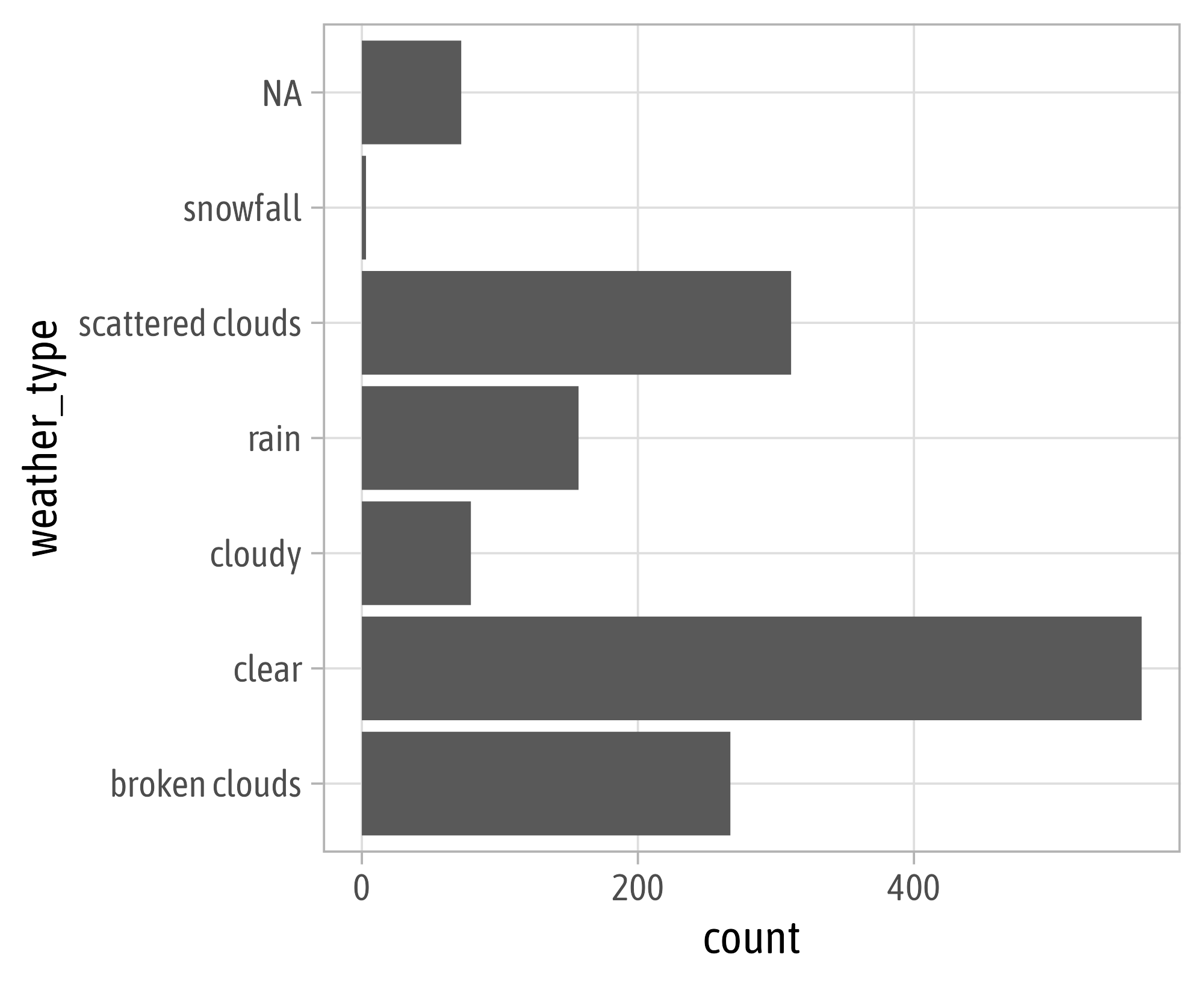
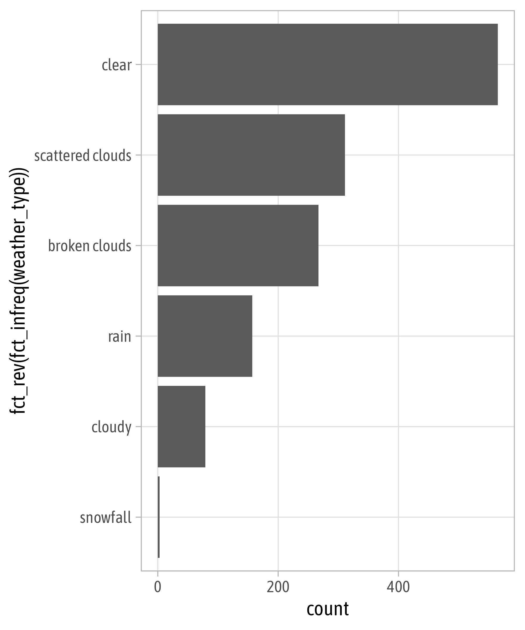
Reminder: Sort Your Bars!
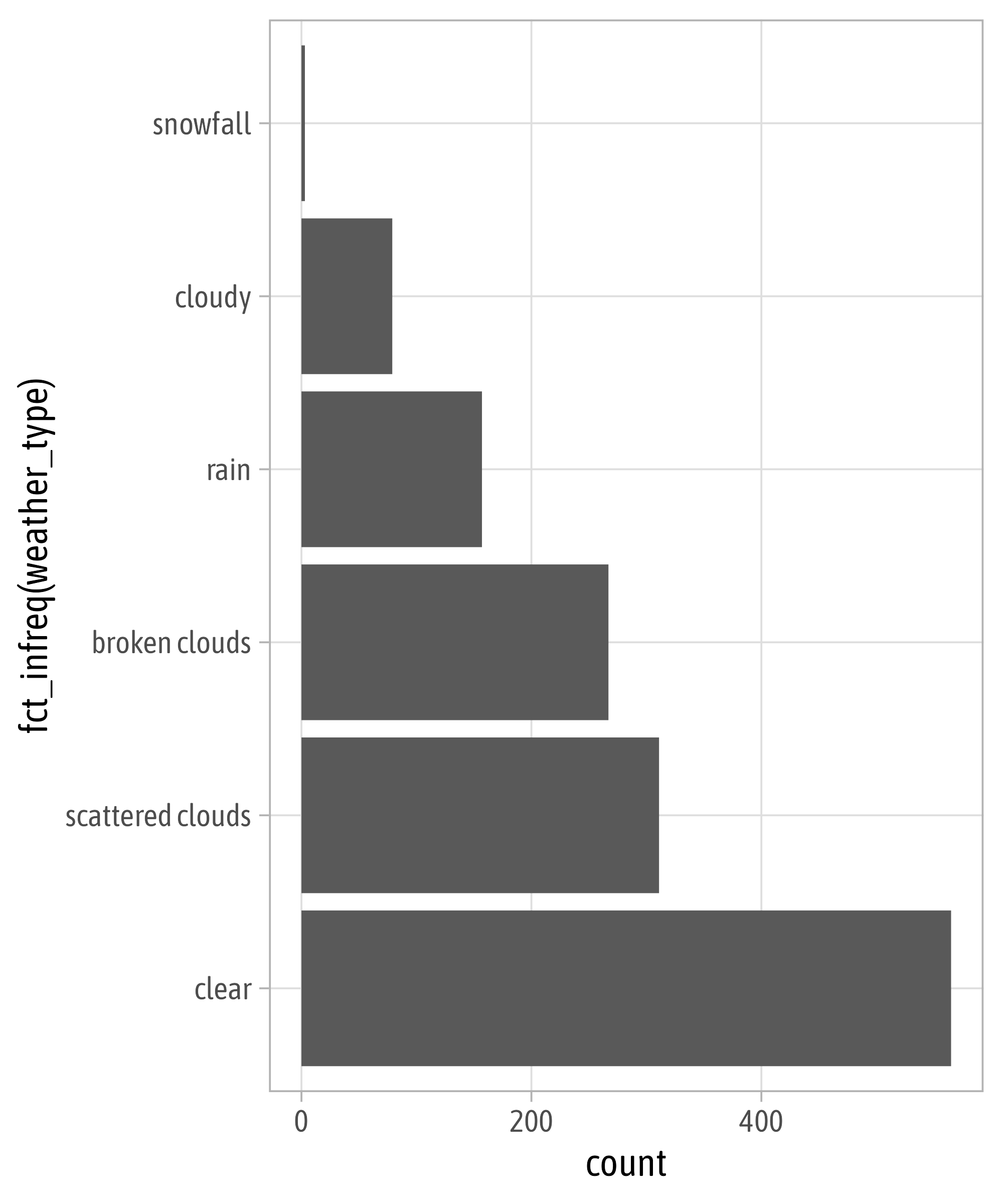
Reminder: Sort Your Bars!
geom_*() and stat_*()

geom_*() and stat_*()

geom_*() and stat_*()

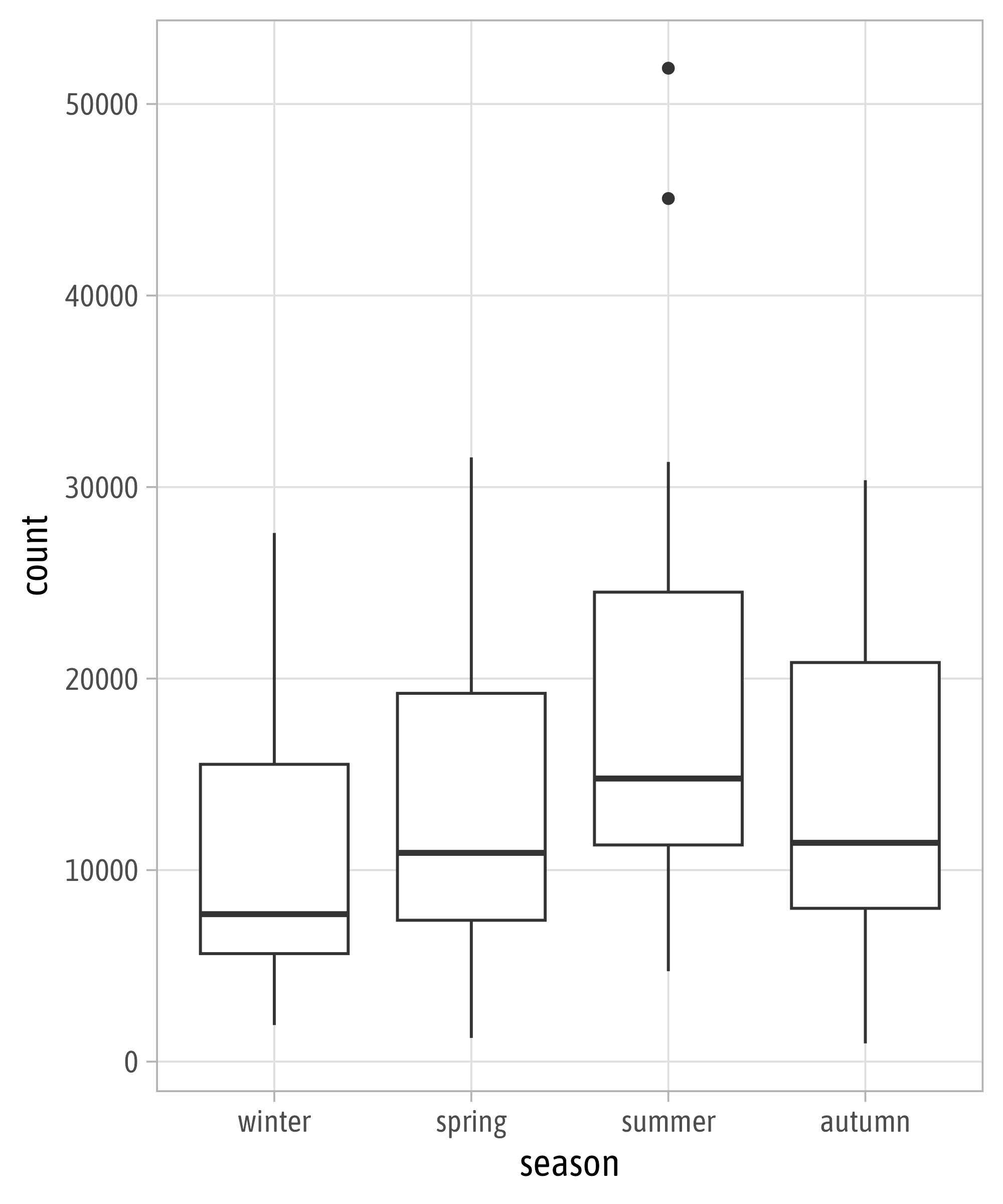
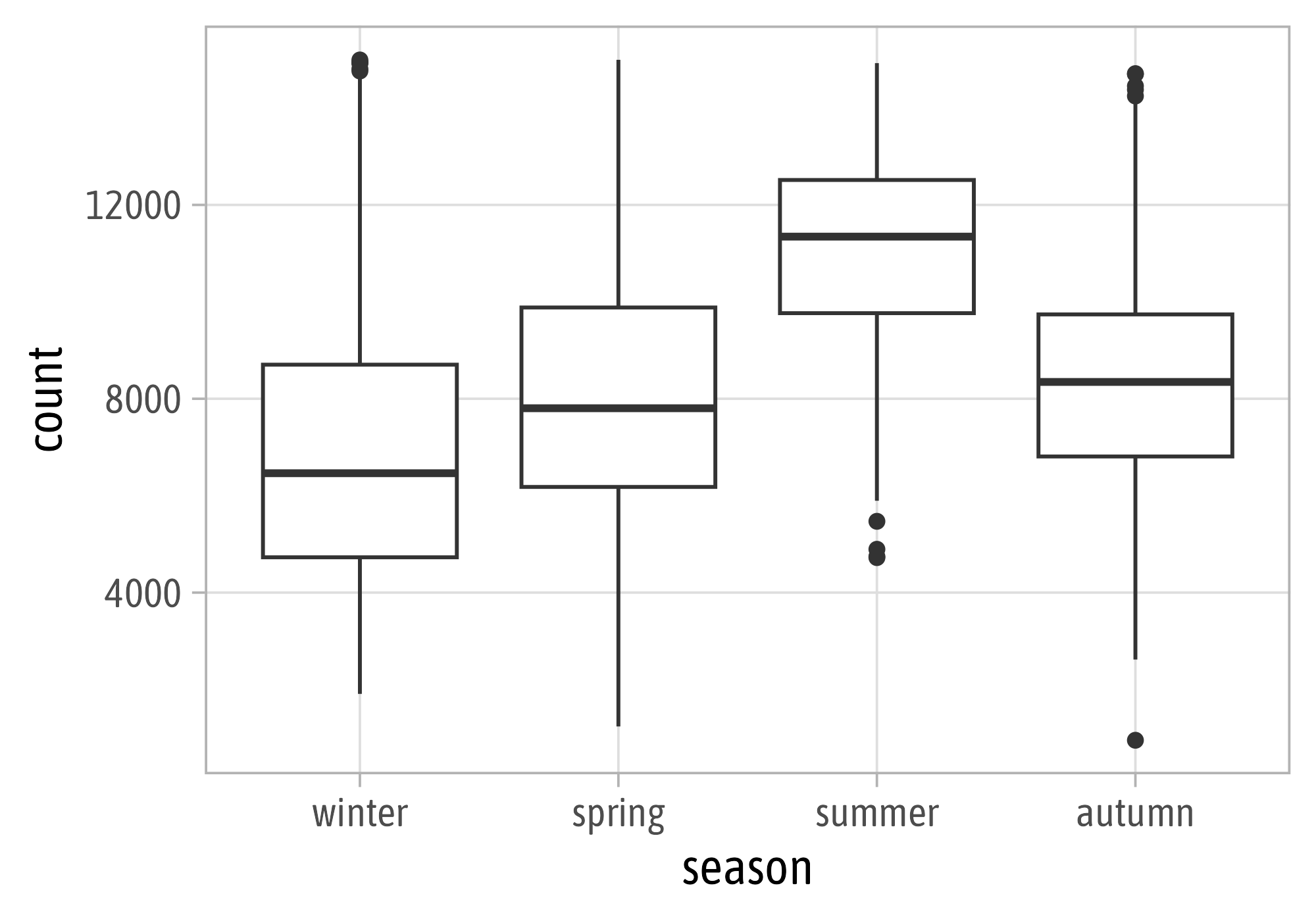
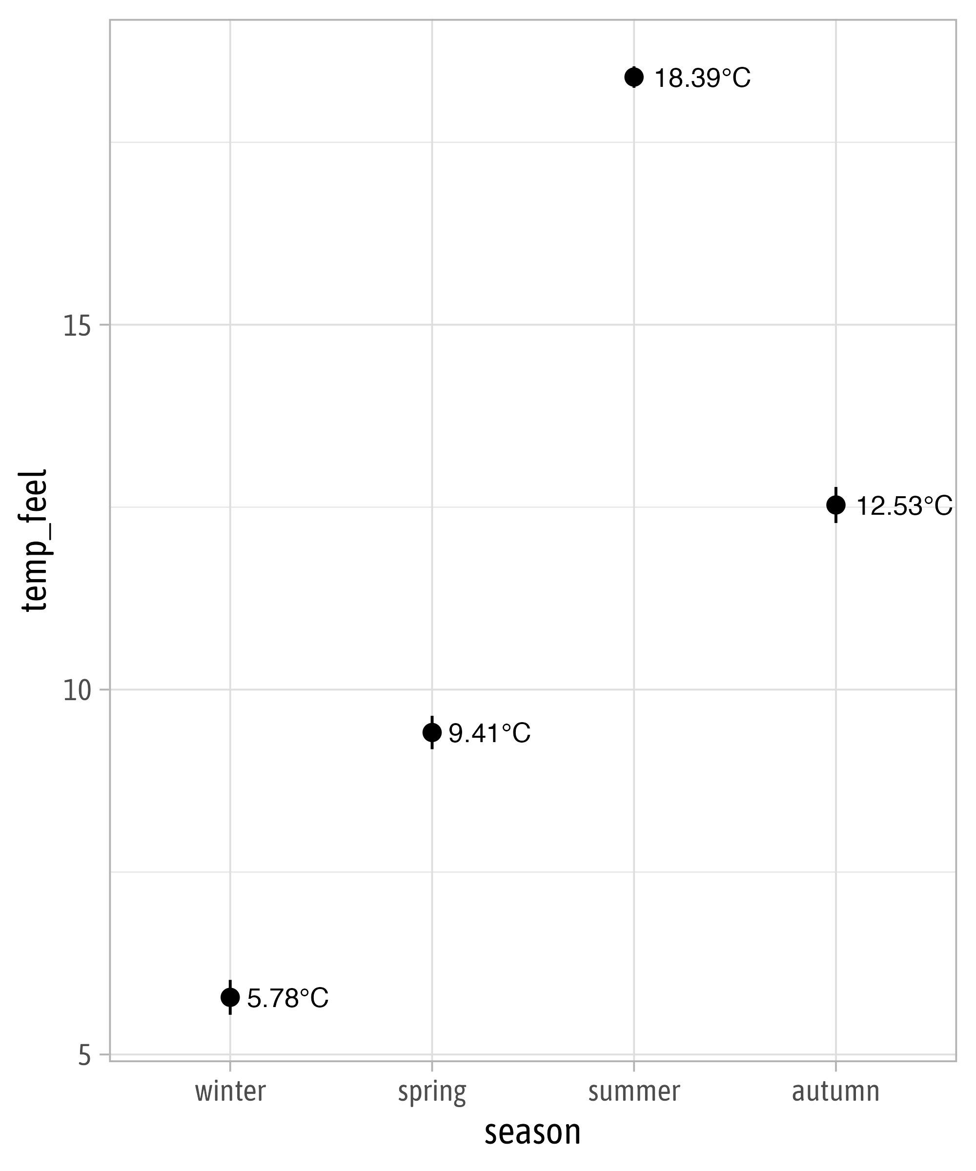
Statistical Summaries

Statistical Summaries
Statistical Summaries
Statistical Summaries
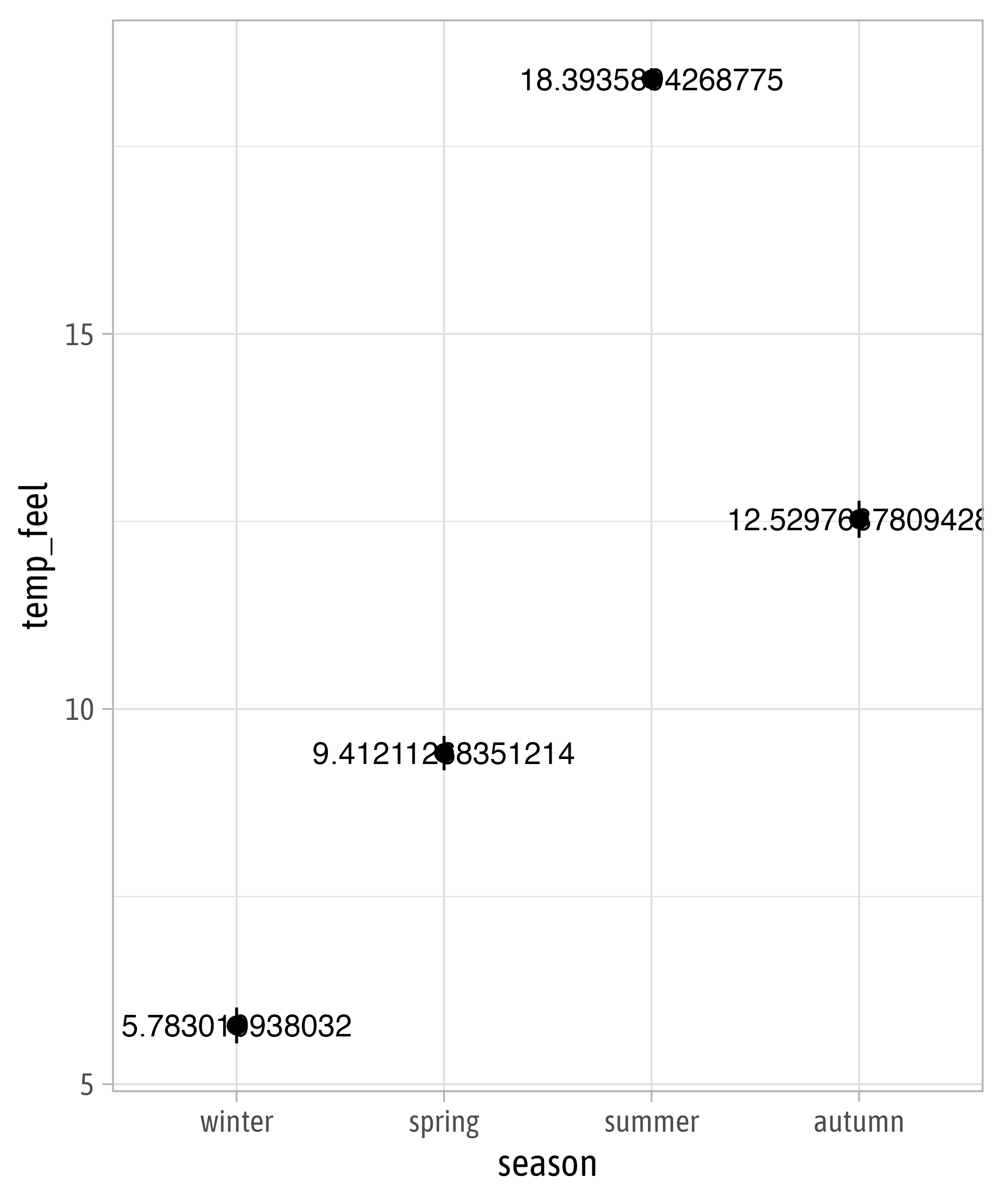
Statistical Summaries
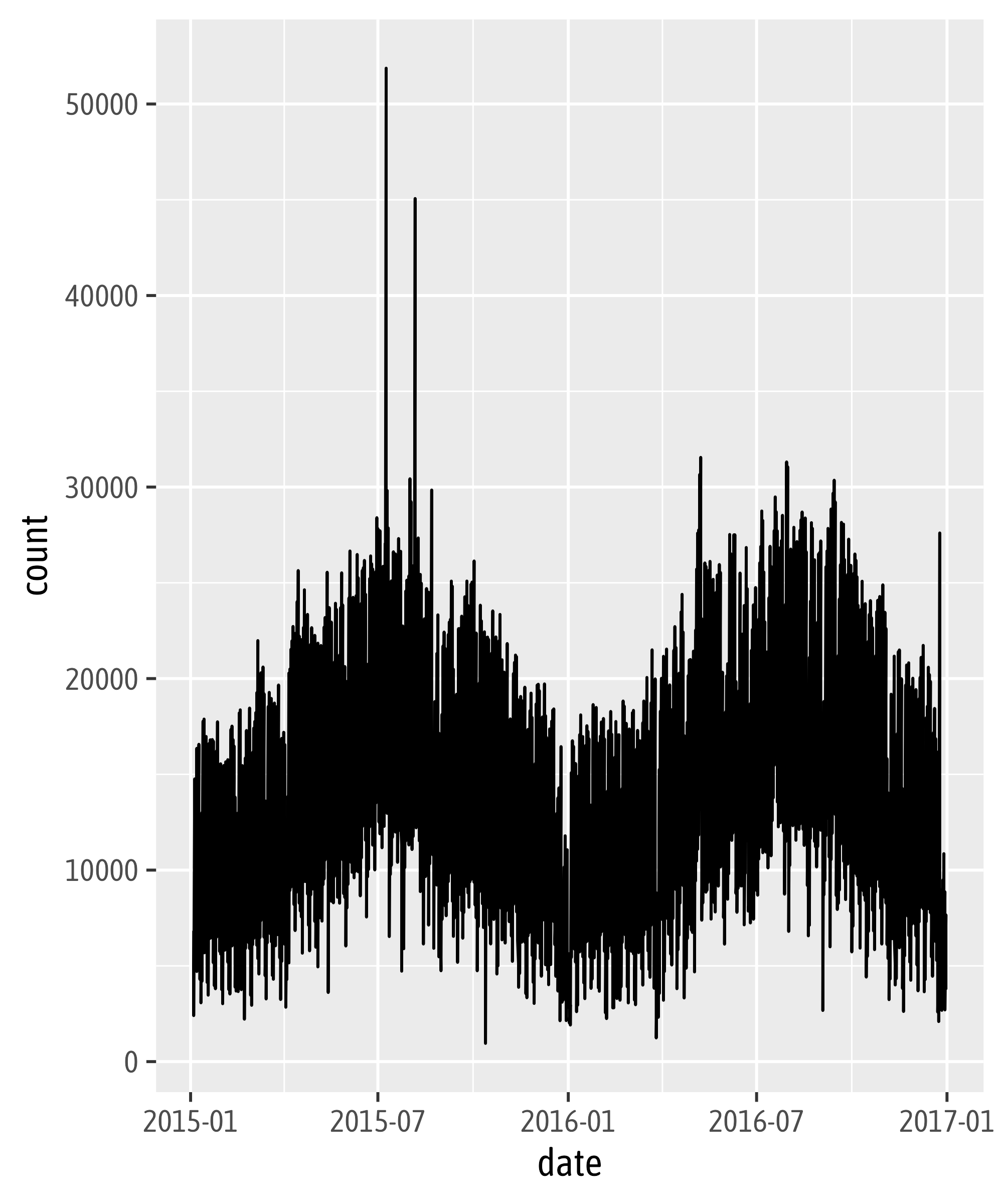
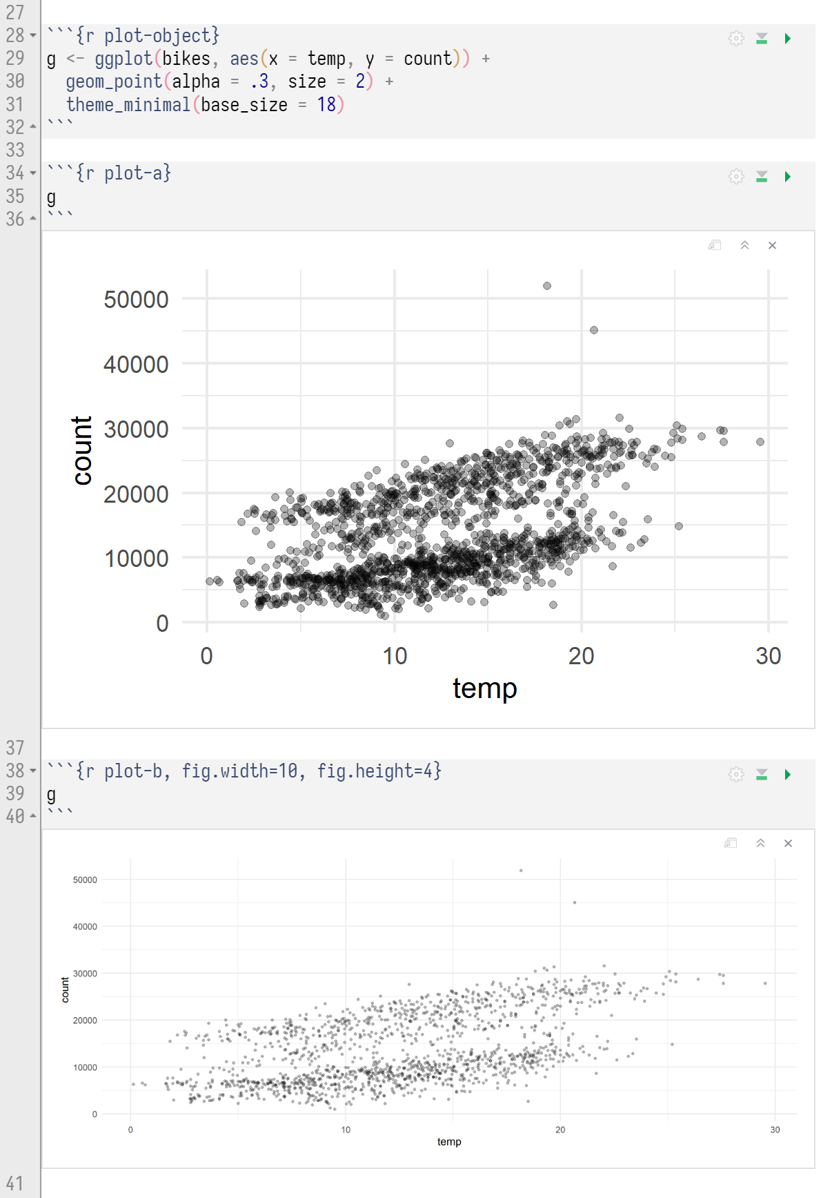
Setting Plot Sizes in Rmd’s
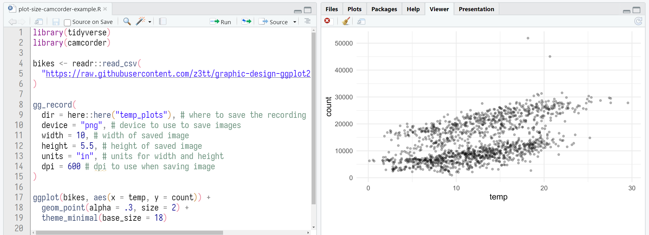
Setting Plot Sizes via {camcorder}
![]()