(Even More)
Exciting Data Visualizations with ggplot2 Extensions
cedricscherer.com/2019/08/05/a-ggplot2-tutorial-for-beautiful-plotting-in-r
{ggplot2} is a system for declaratively creating graphics,
based on “The Grammar of Graphics” (Wilkinson, 2005).
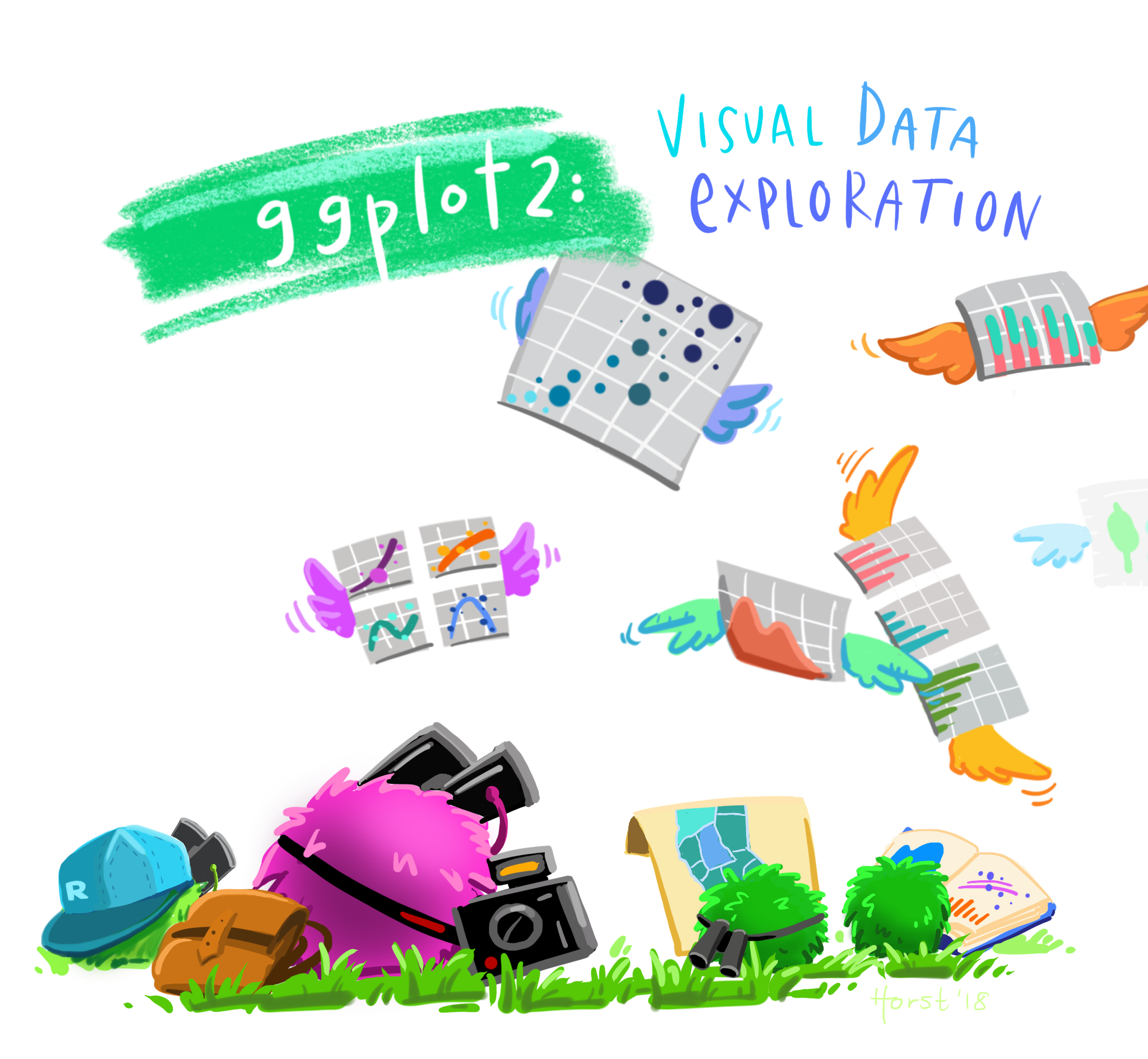
Illustration by Allison Horst

ggplot2 Examples featured on ggplot2.tidyverse.org
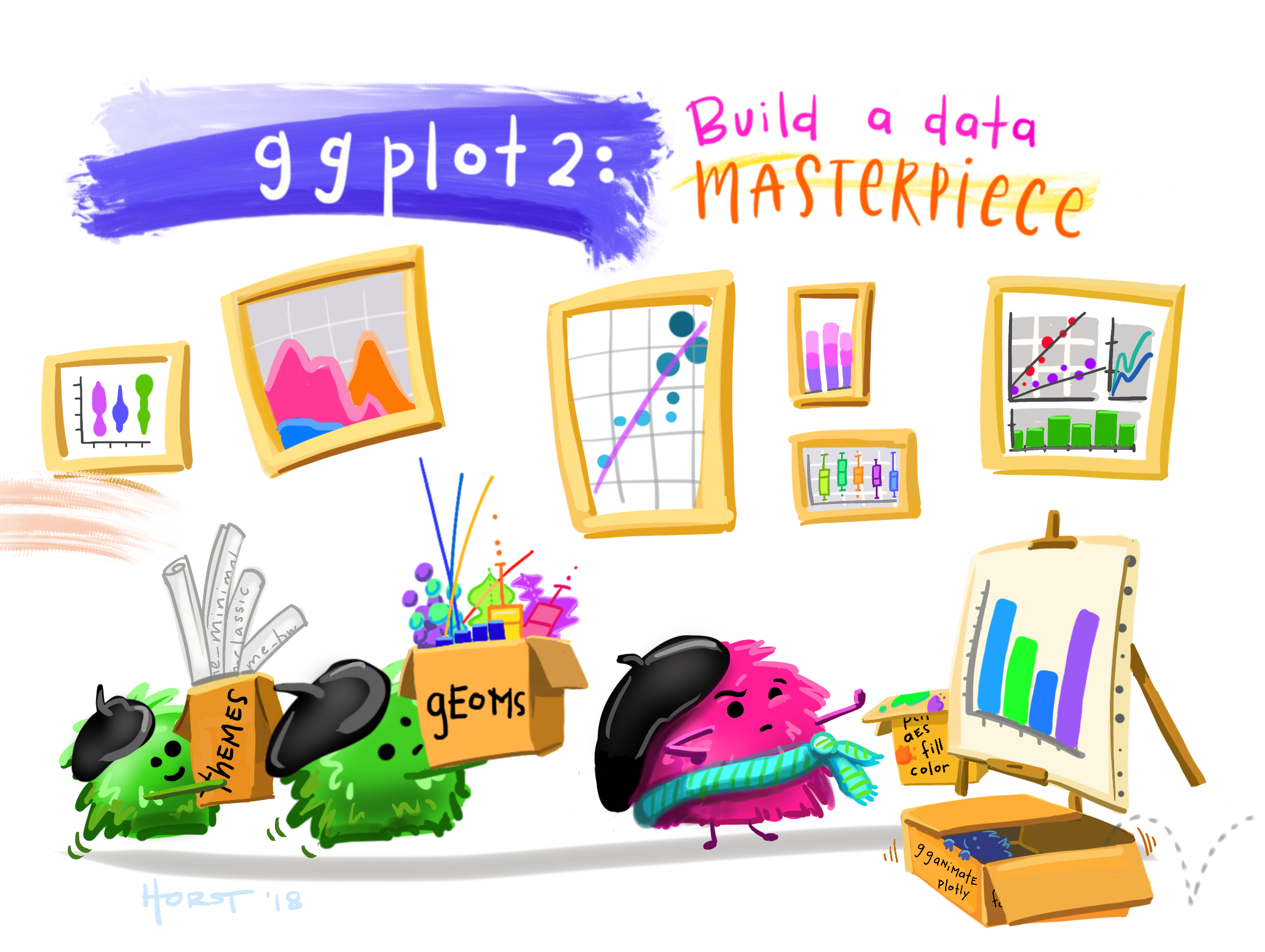
Illustration by Allison Horst
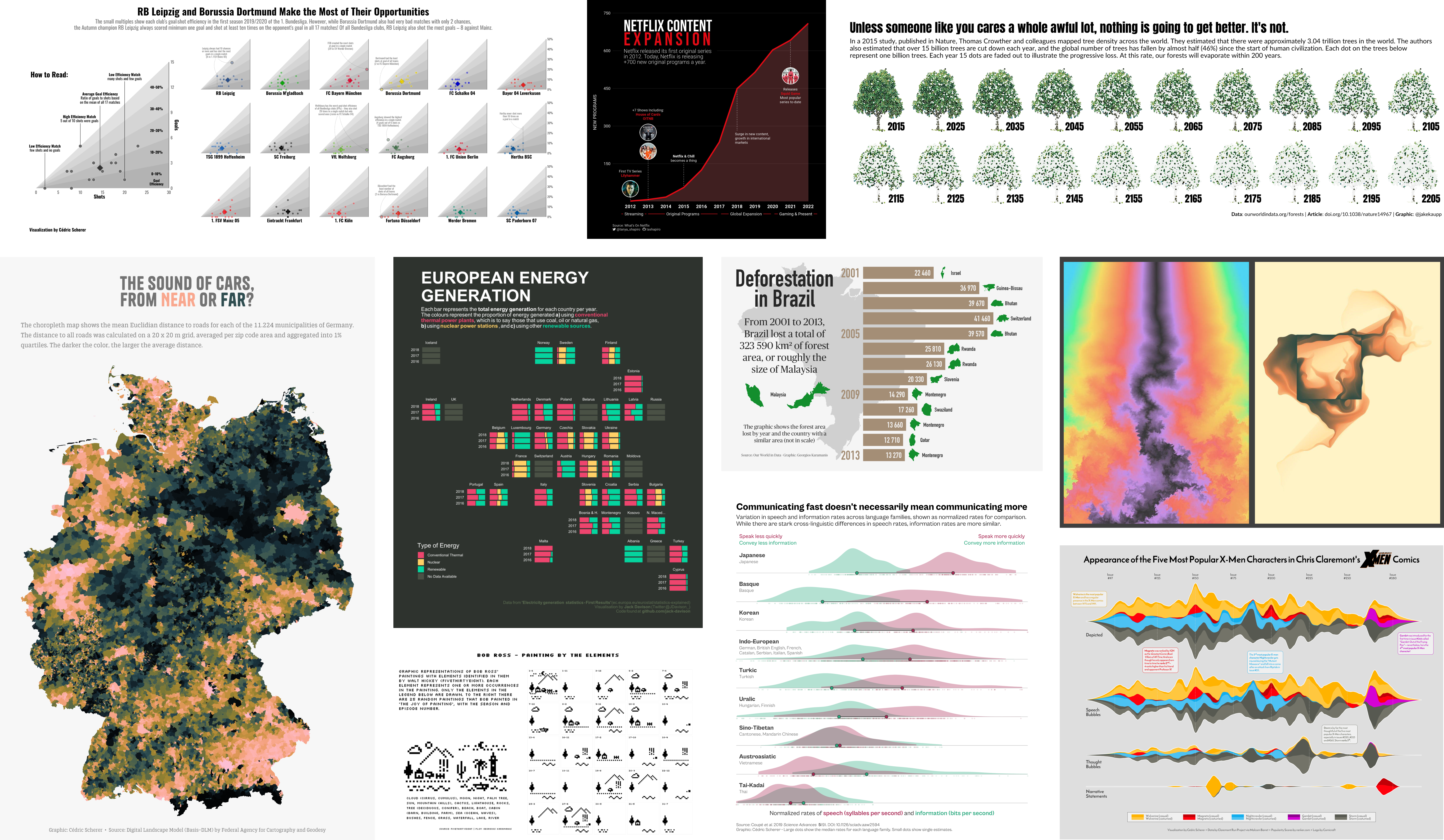
Selection of visualizations created 100% with ggplot2 by Thomas Linn Pedersen,
Georgios Karamanis, Tanya Shapiro, Jake Kaupp, Jack Davison, and myself.
The ggplot2 Extension Universe
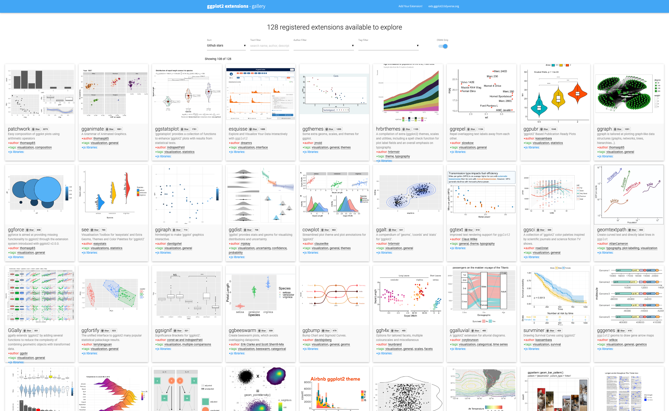
The ggplot2 Extension Universe
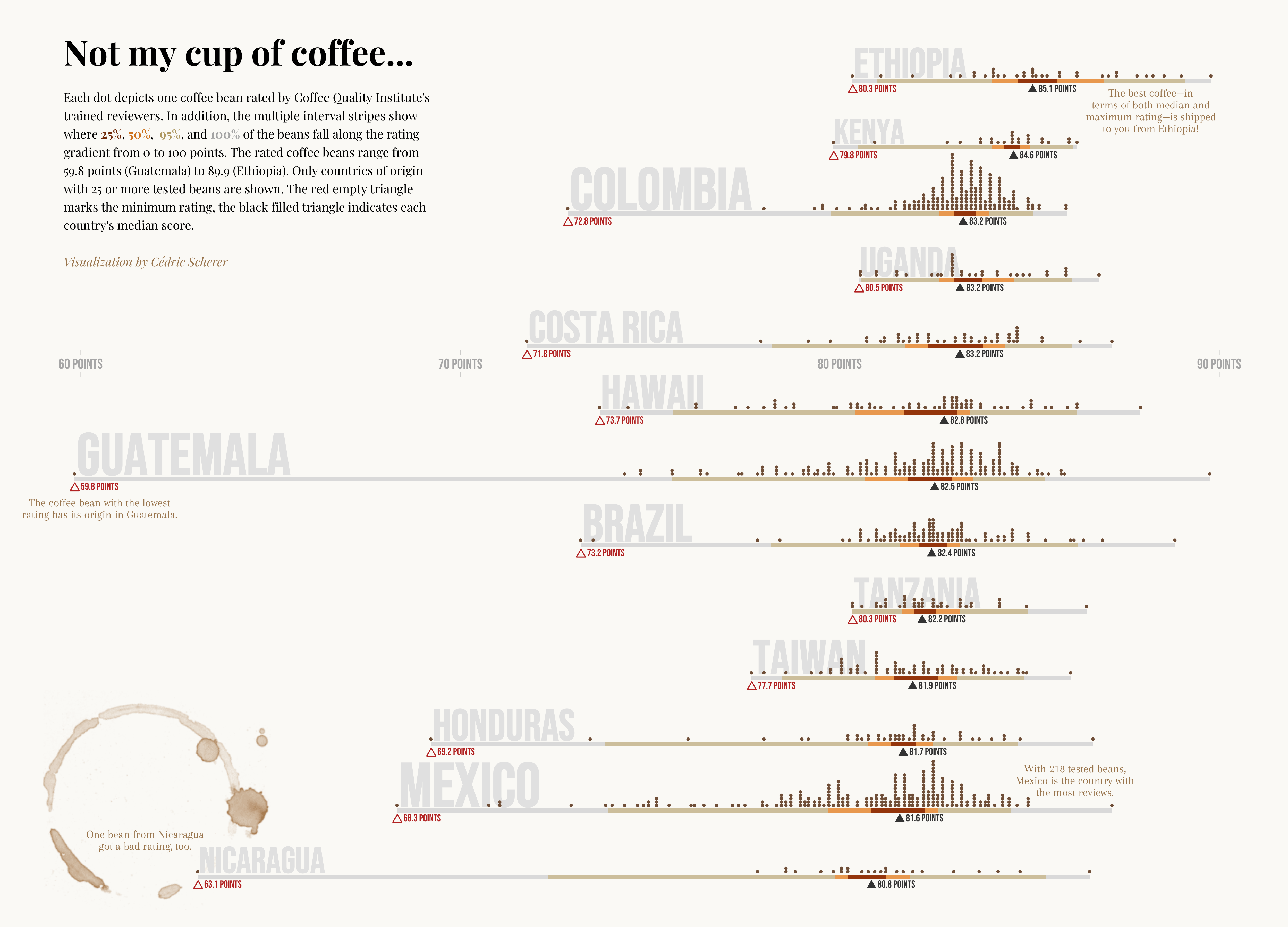
My reinterpreted The Economist graphic

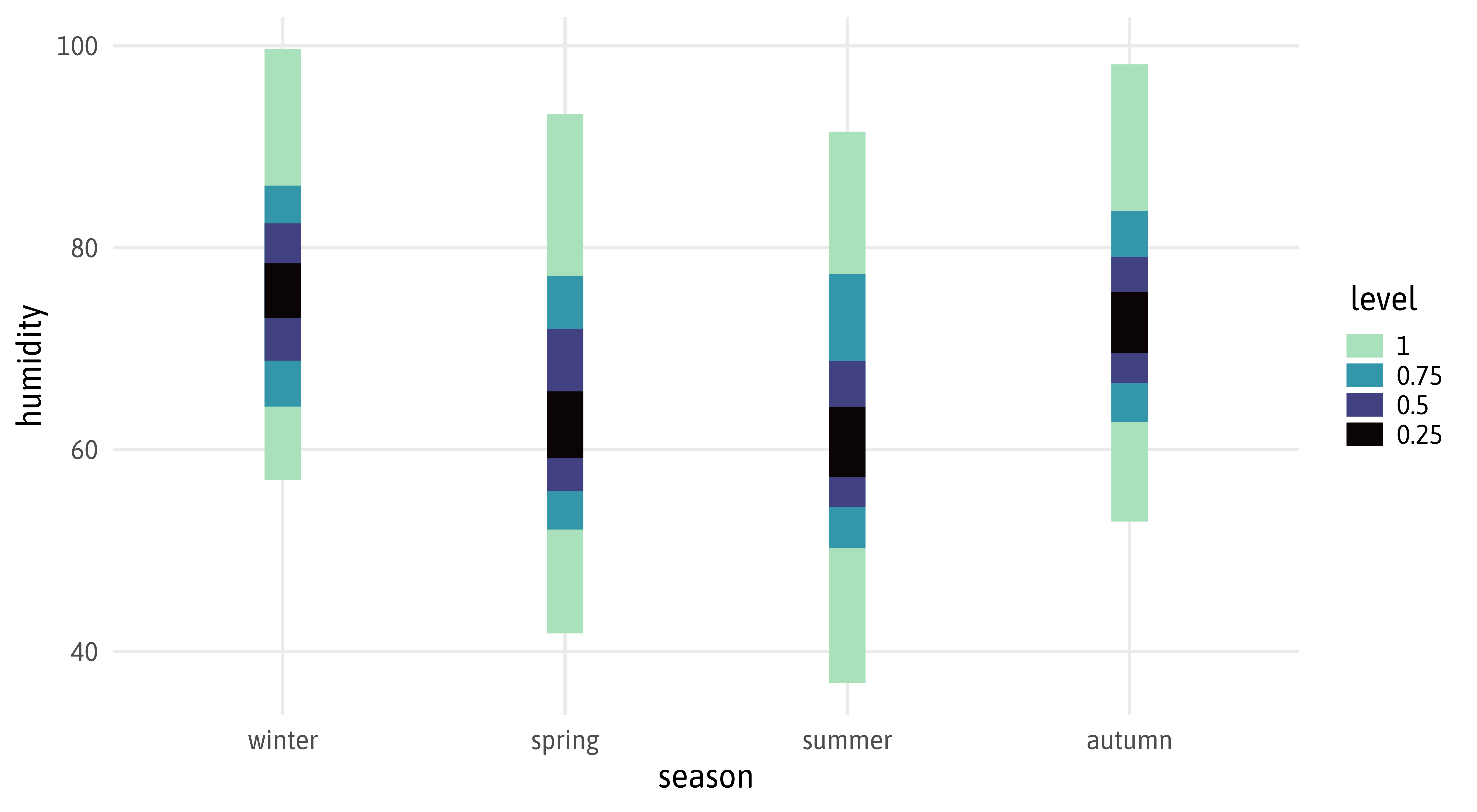


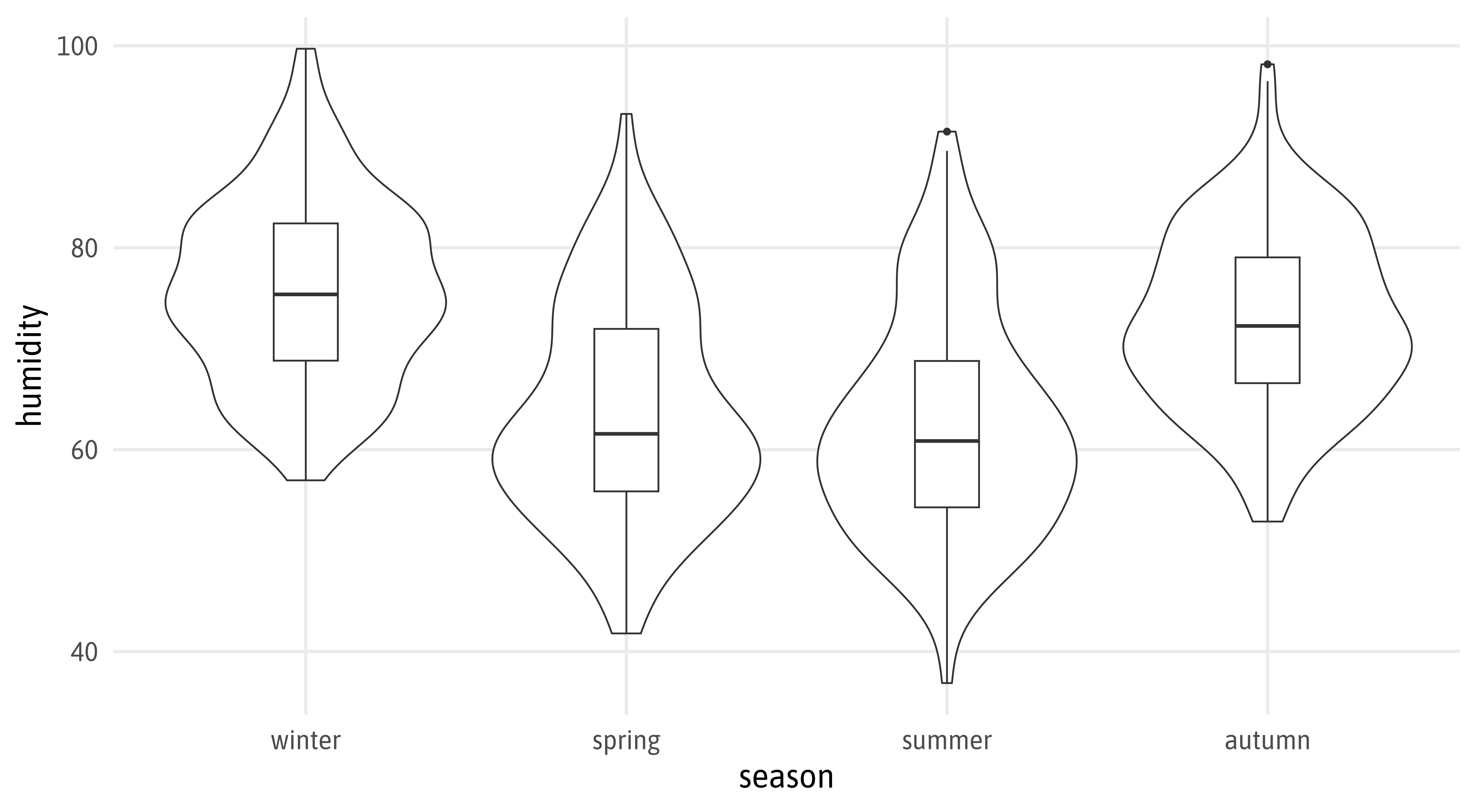
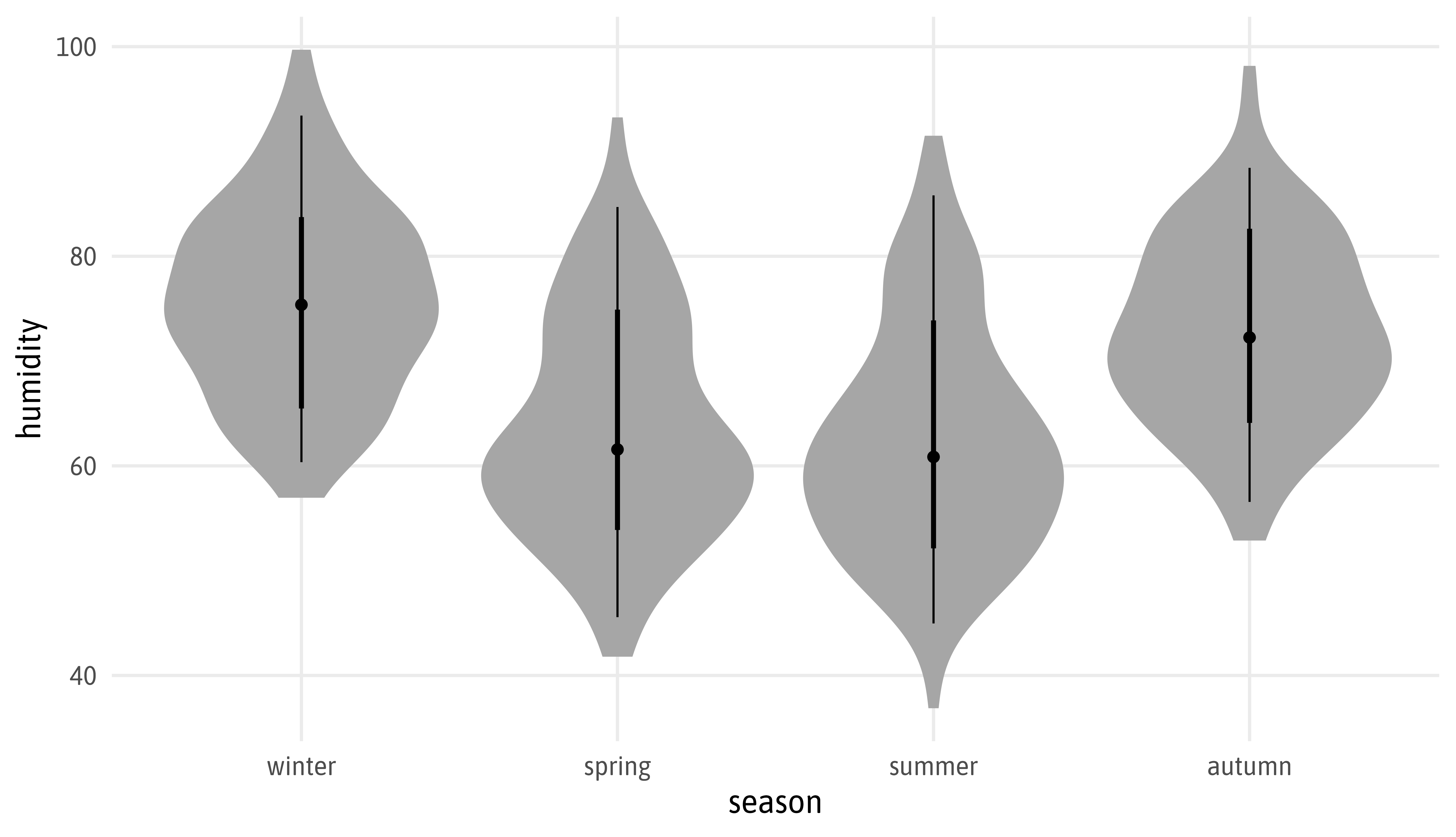
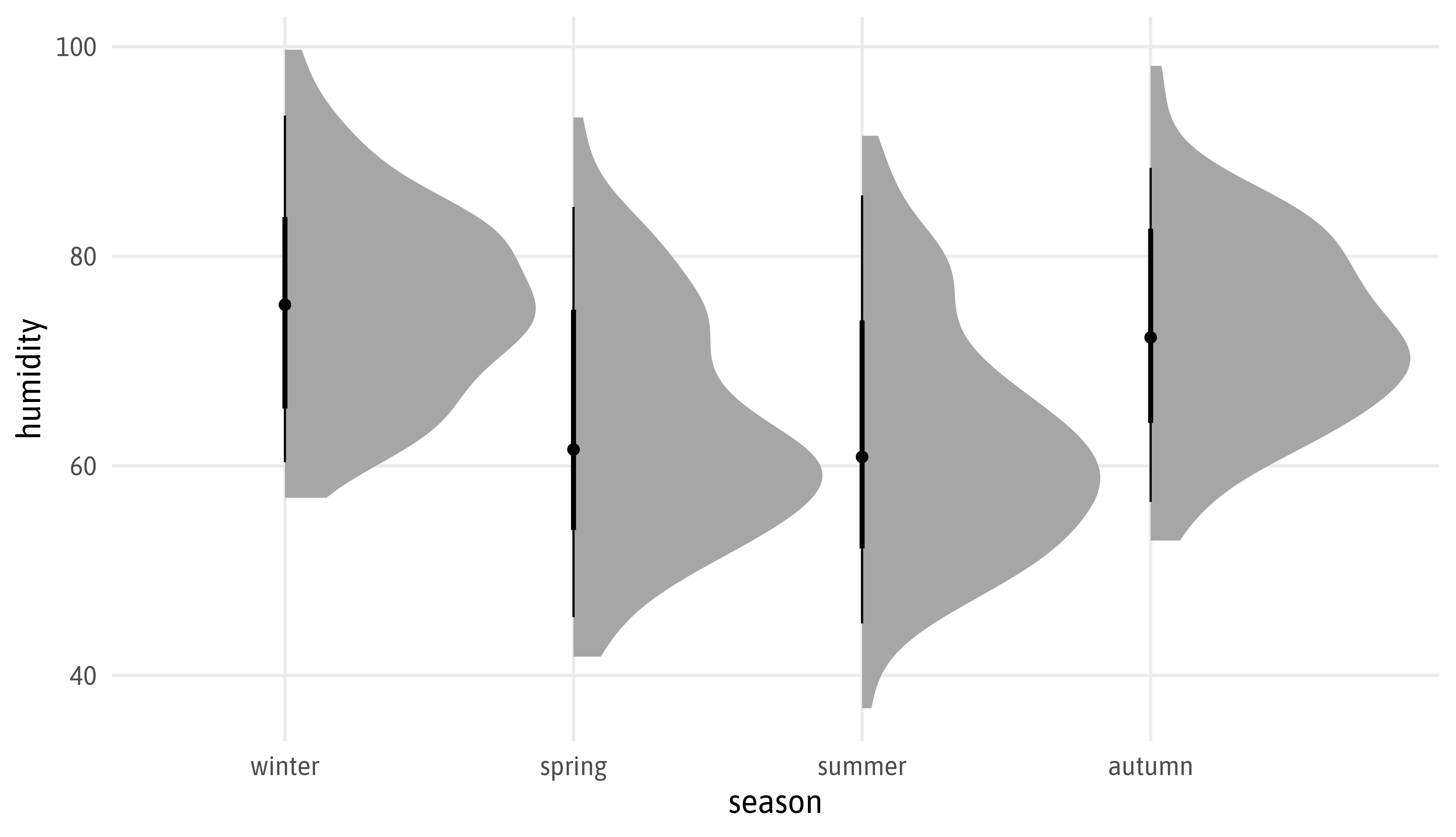
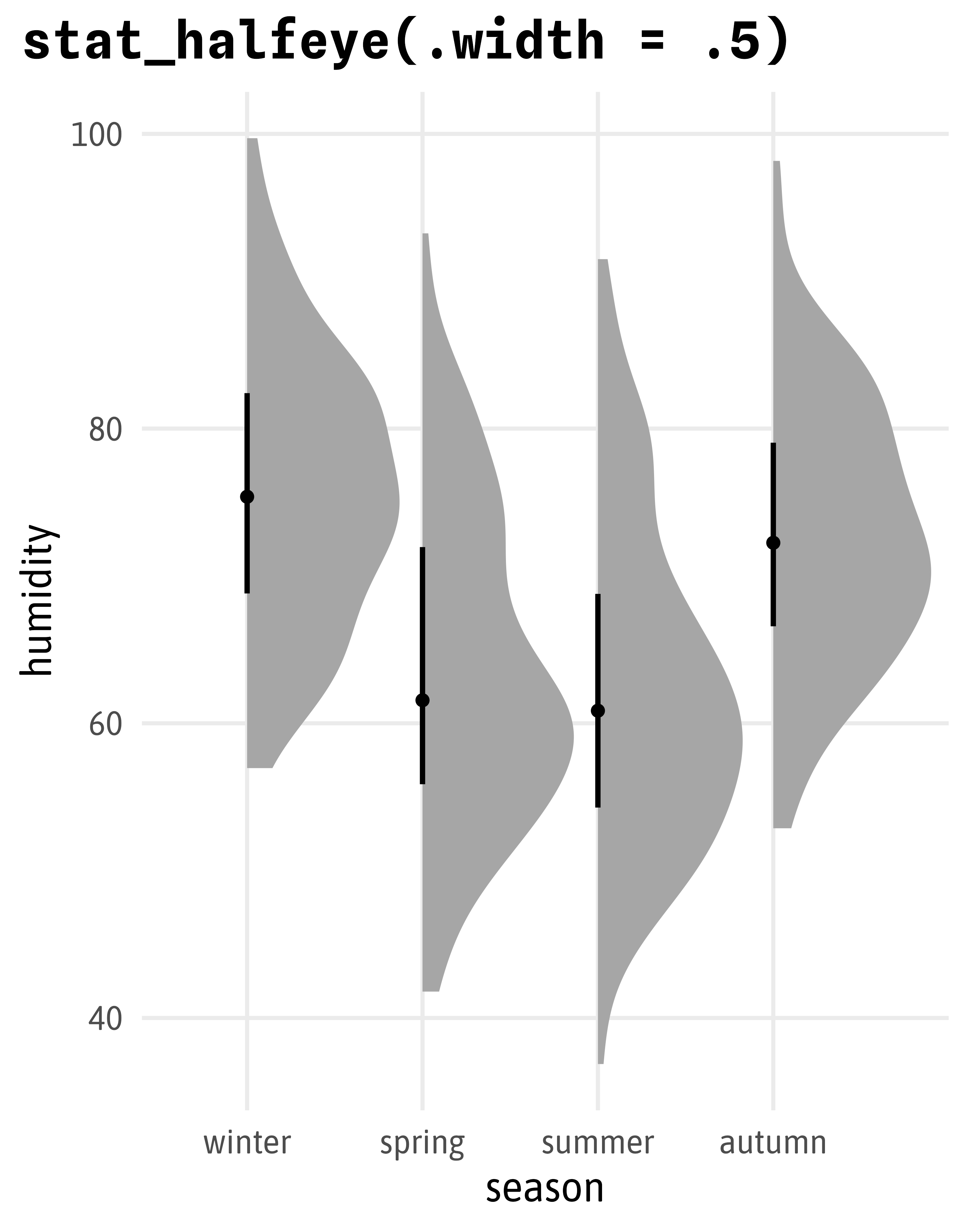
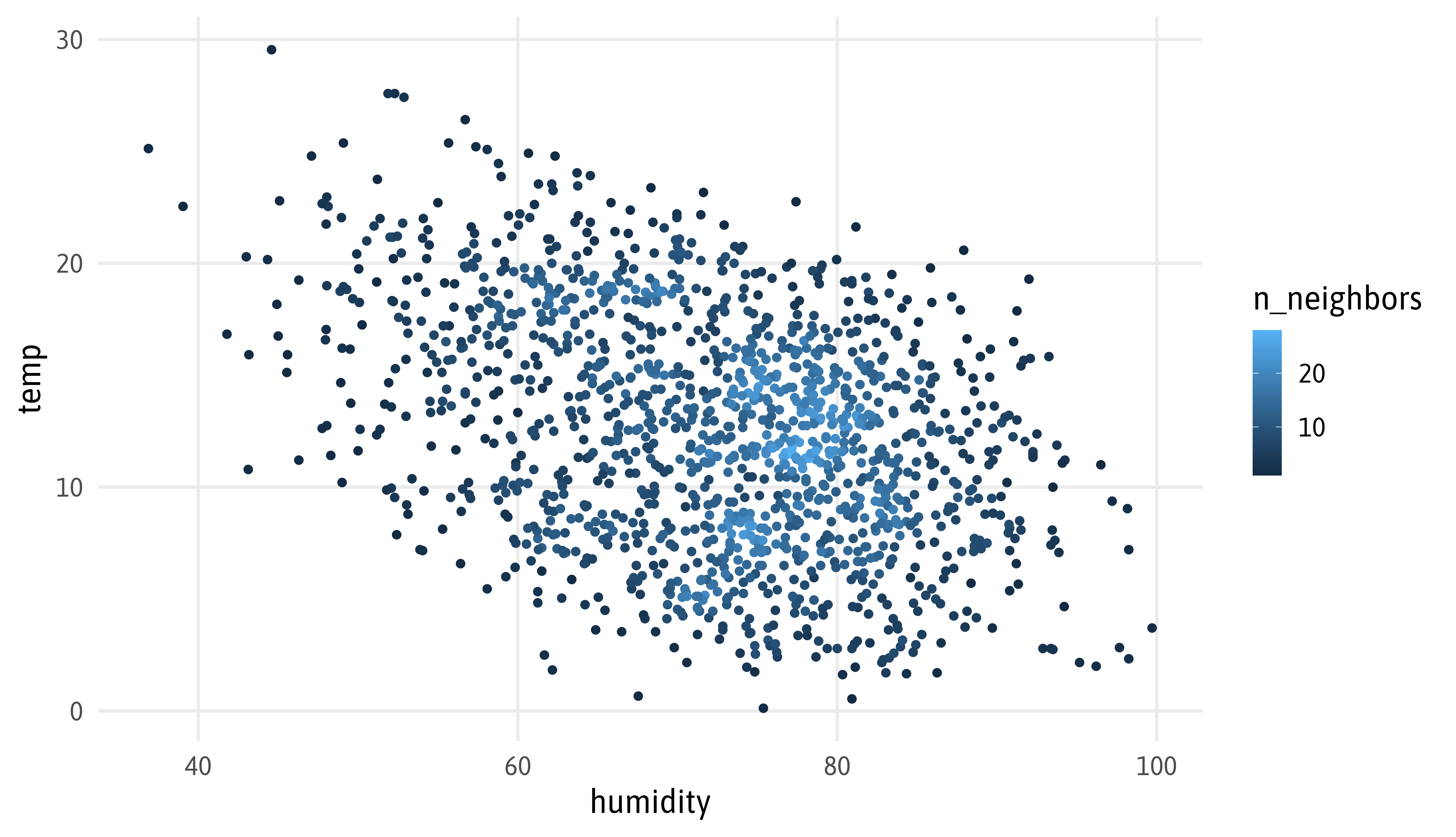
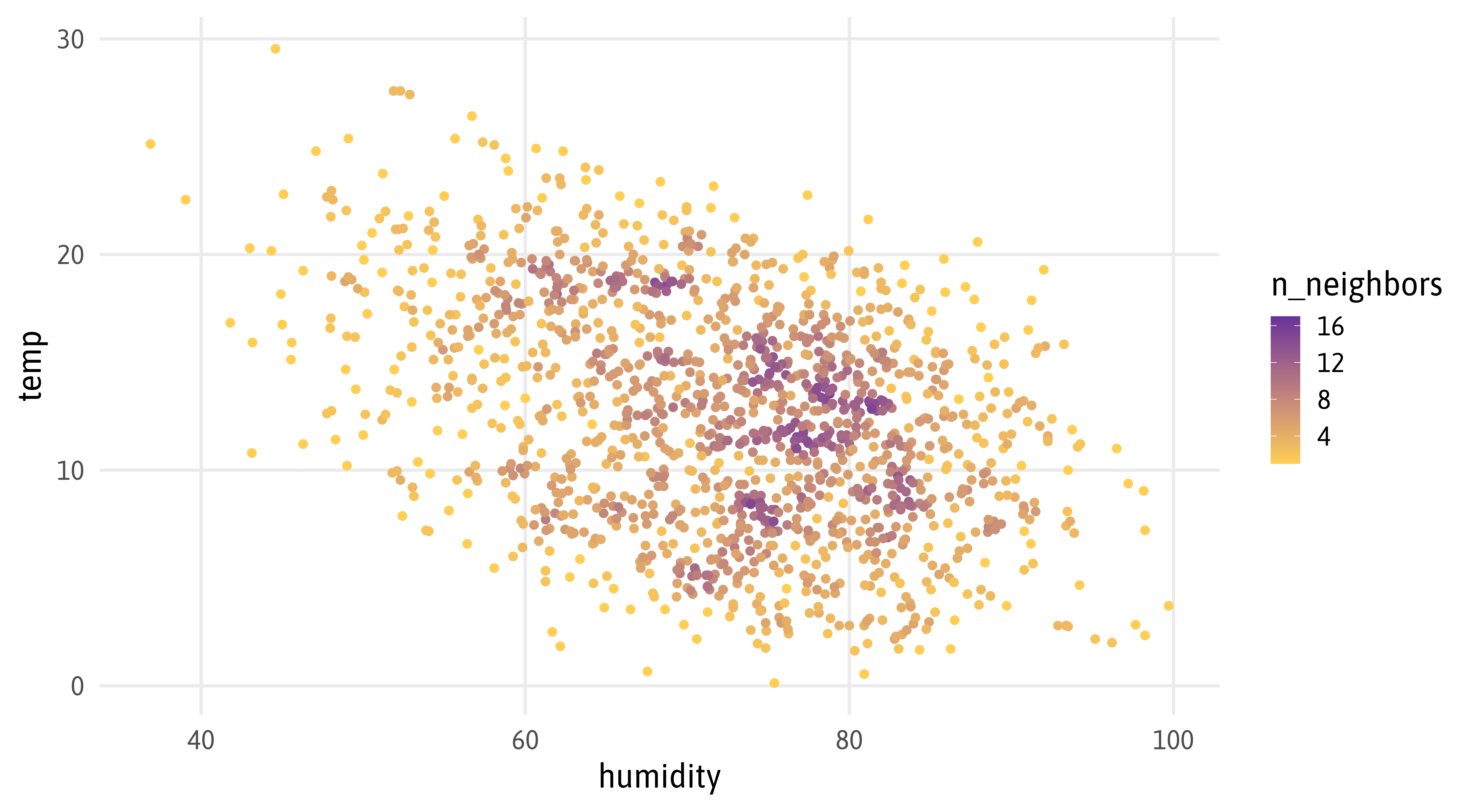
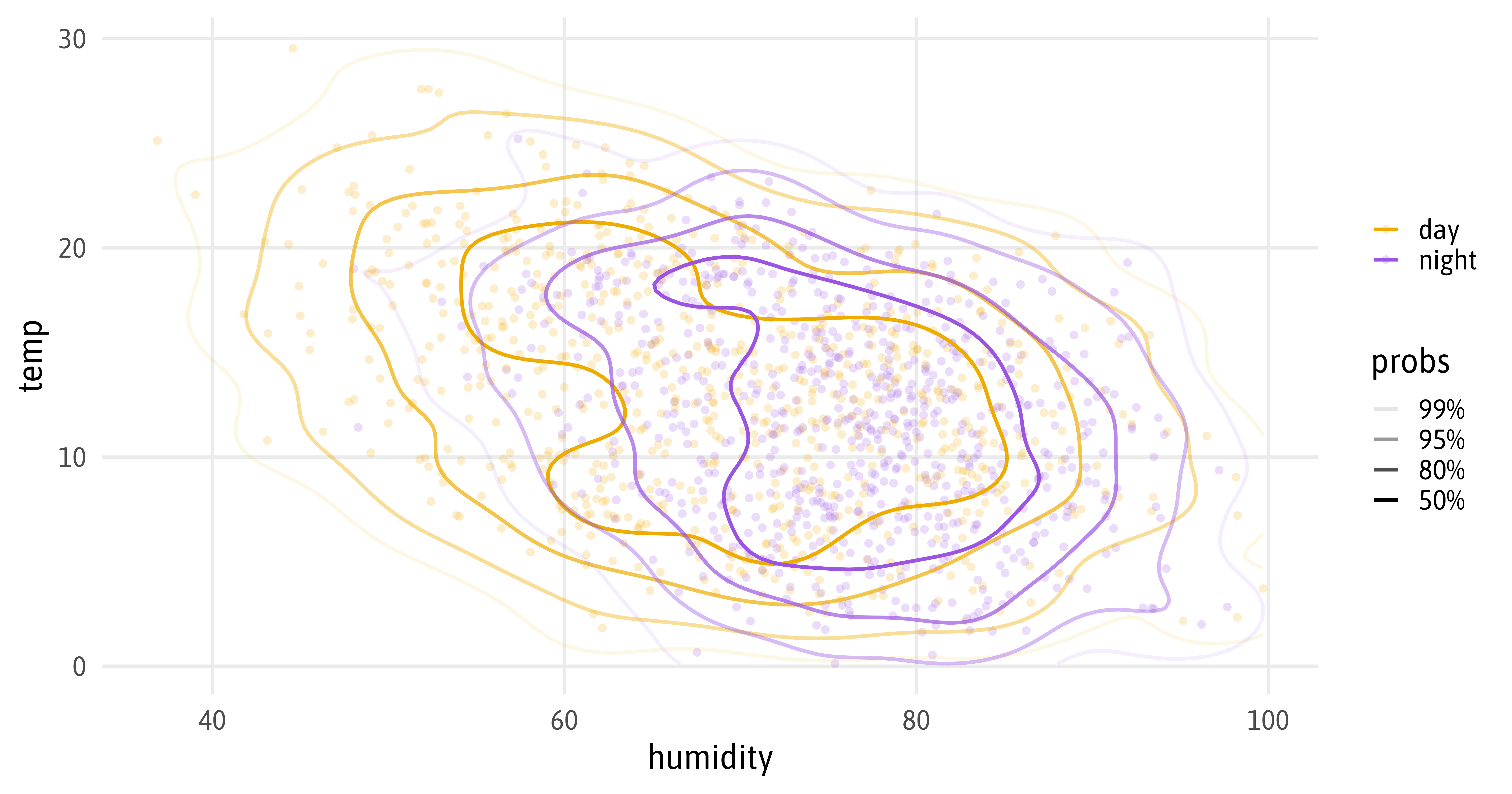
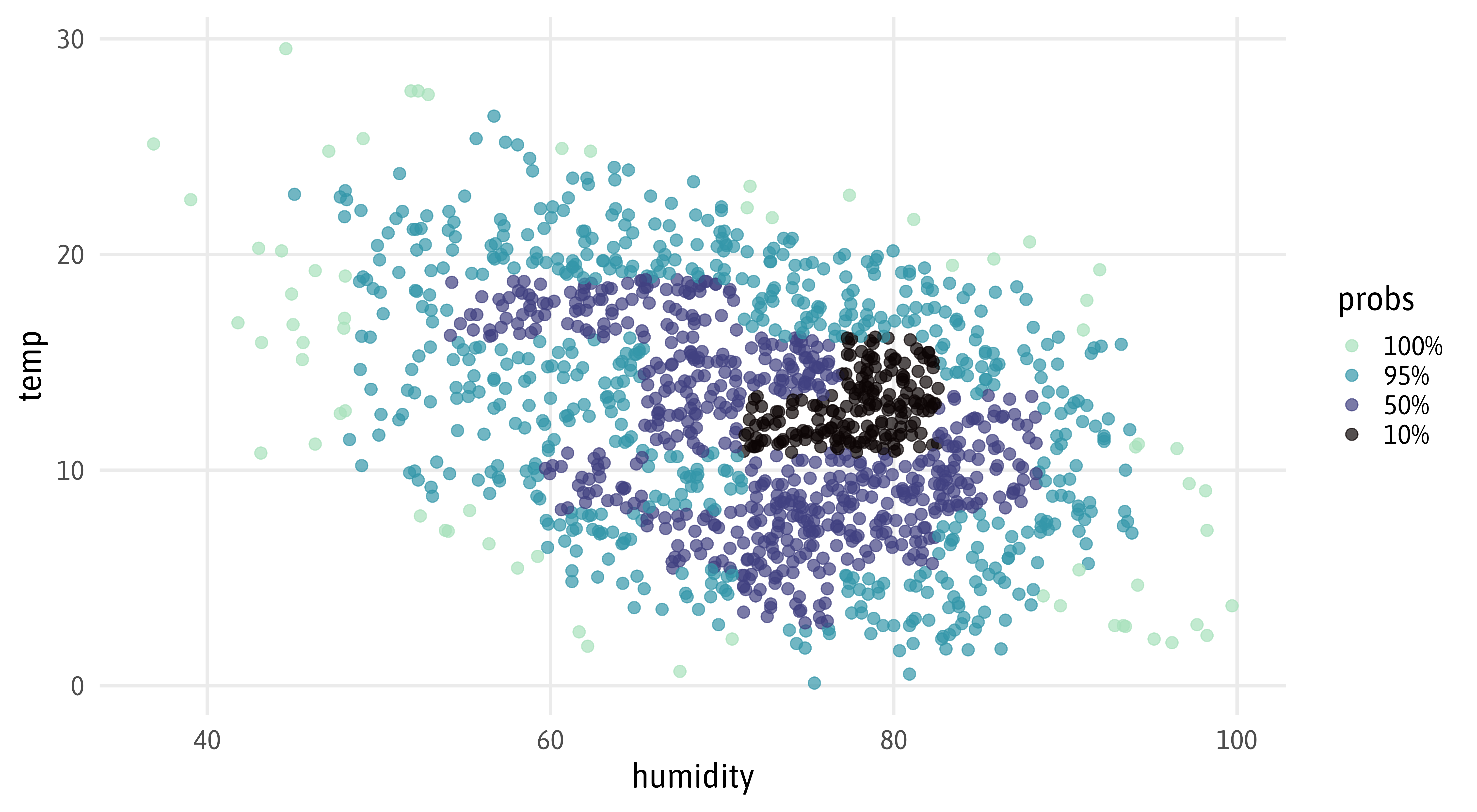
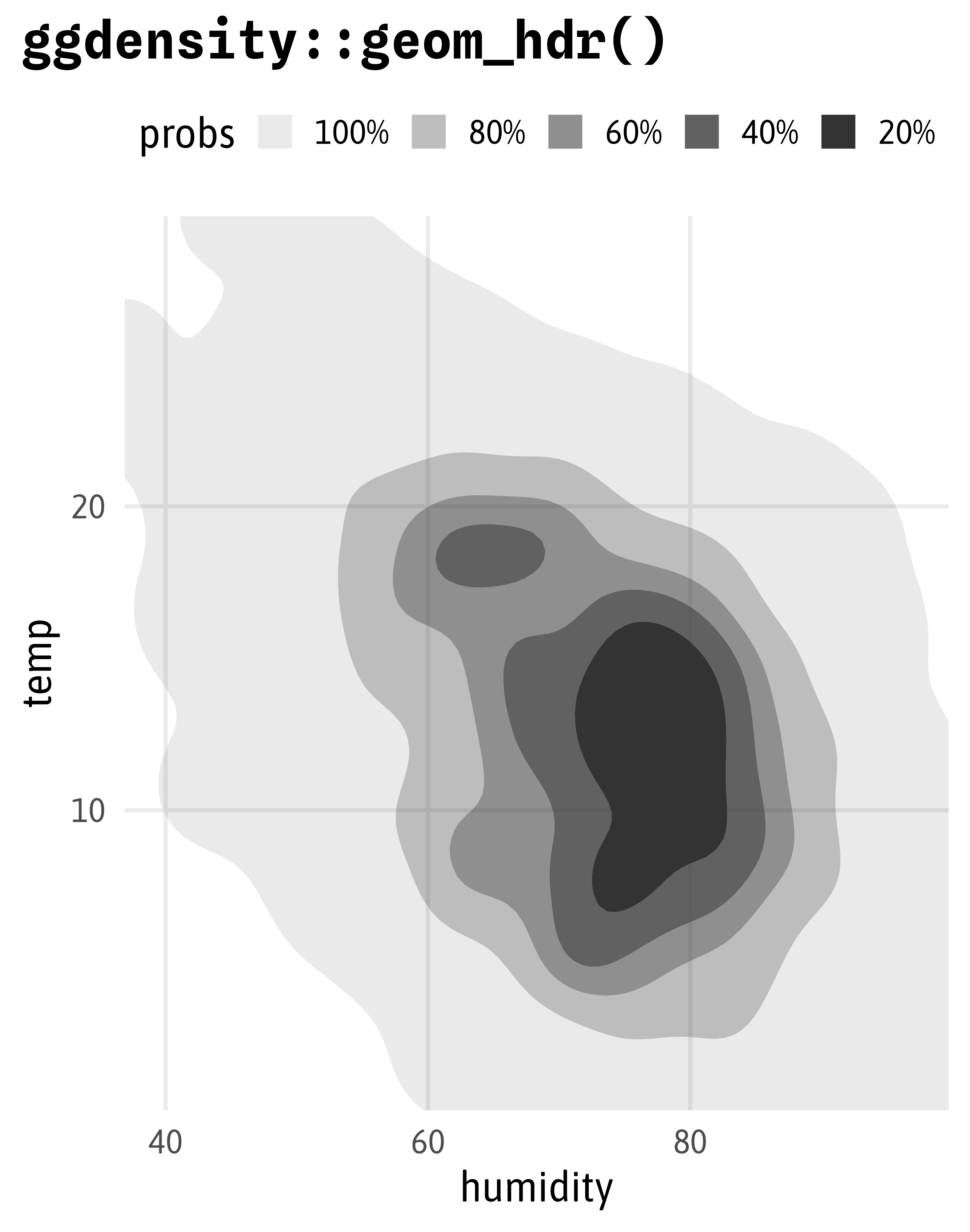
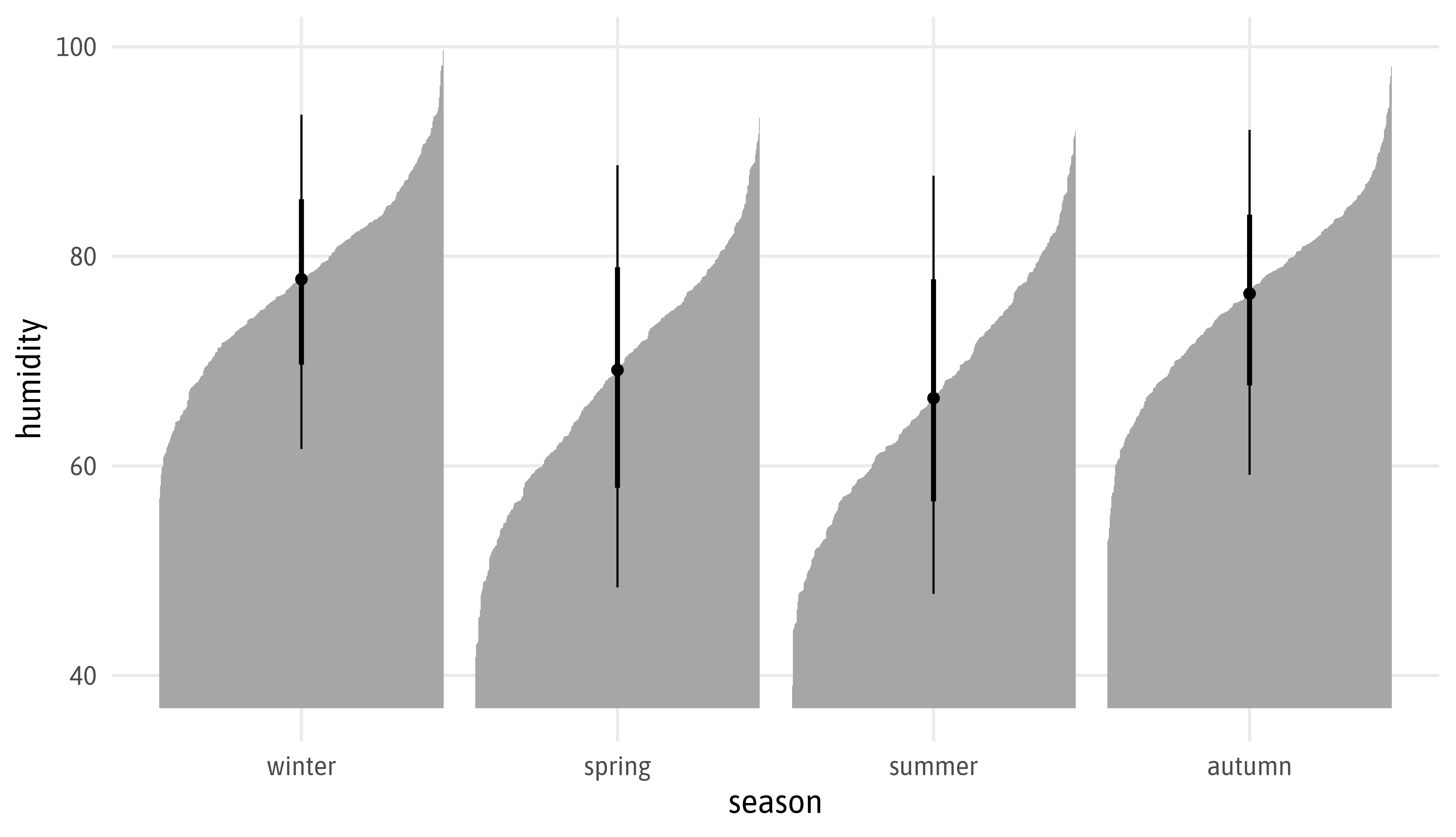
My Contribution to the SWD Challenge “Visualizing Uncertainty”
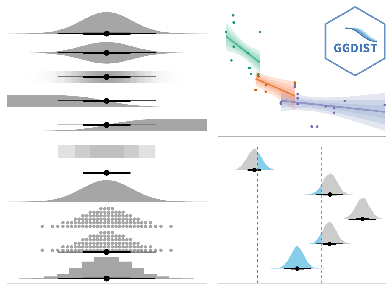
Source: mjskay.github.io/ggdist


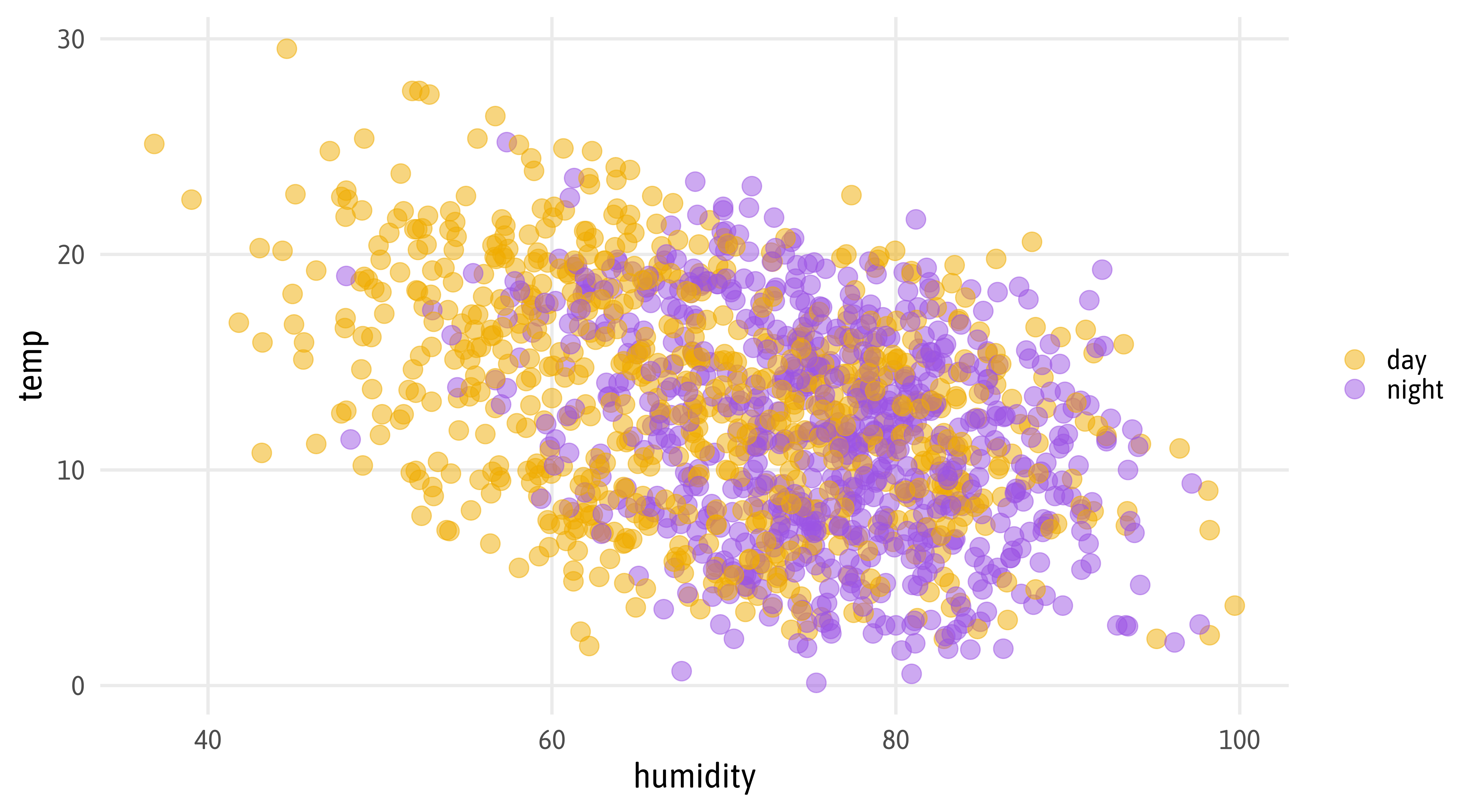
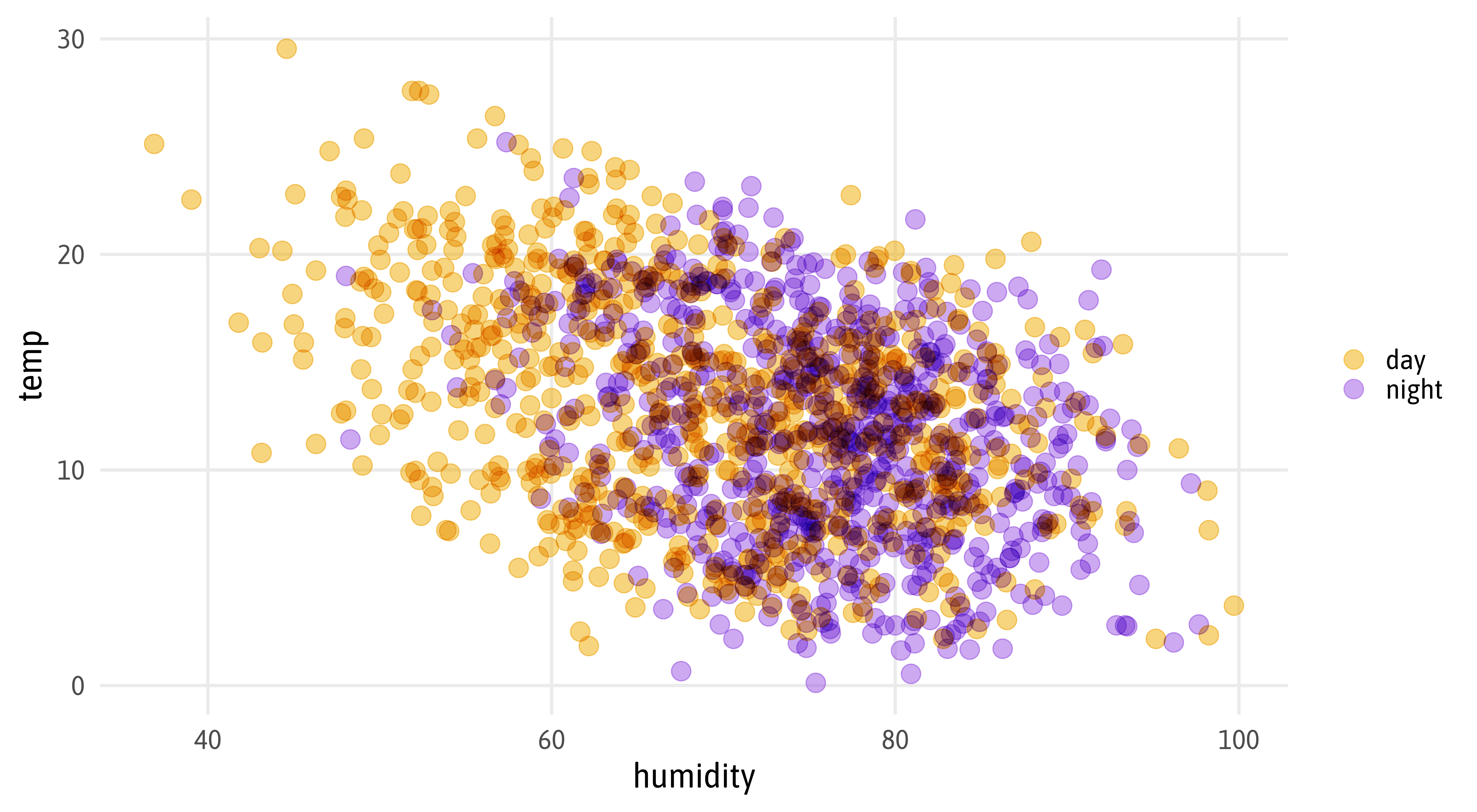
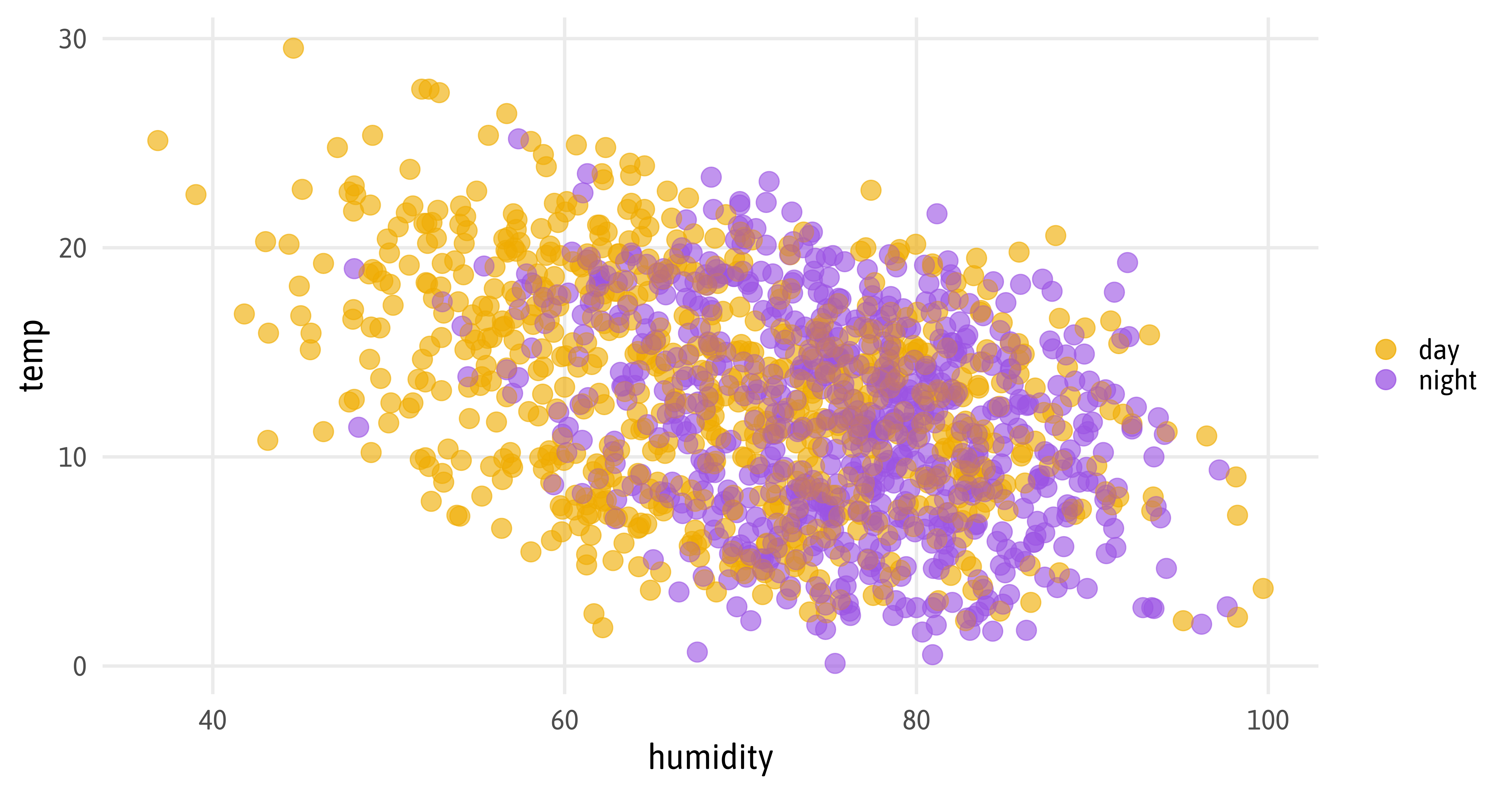
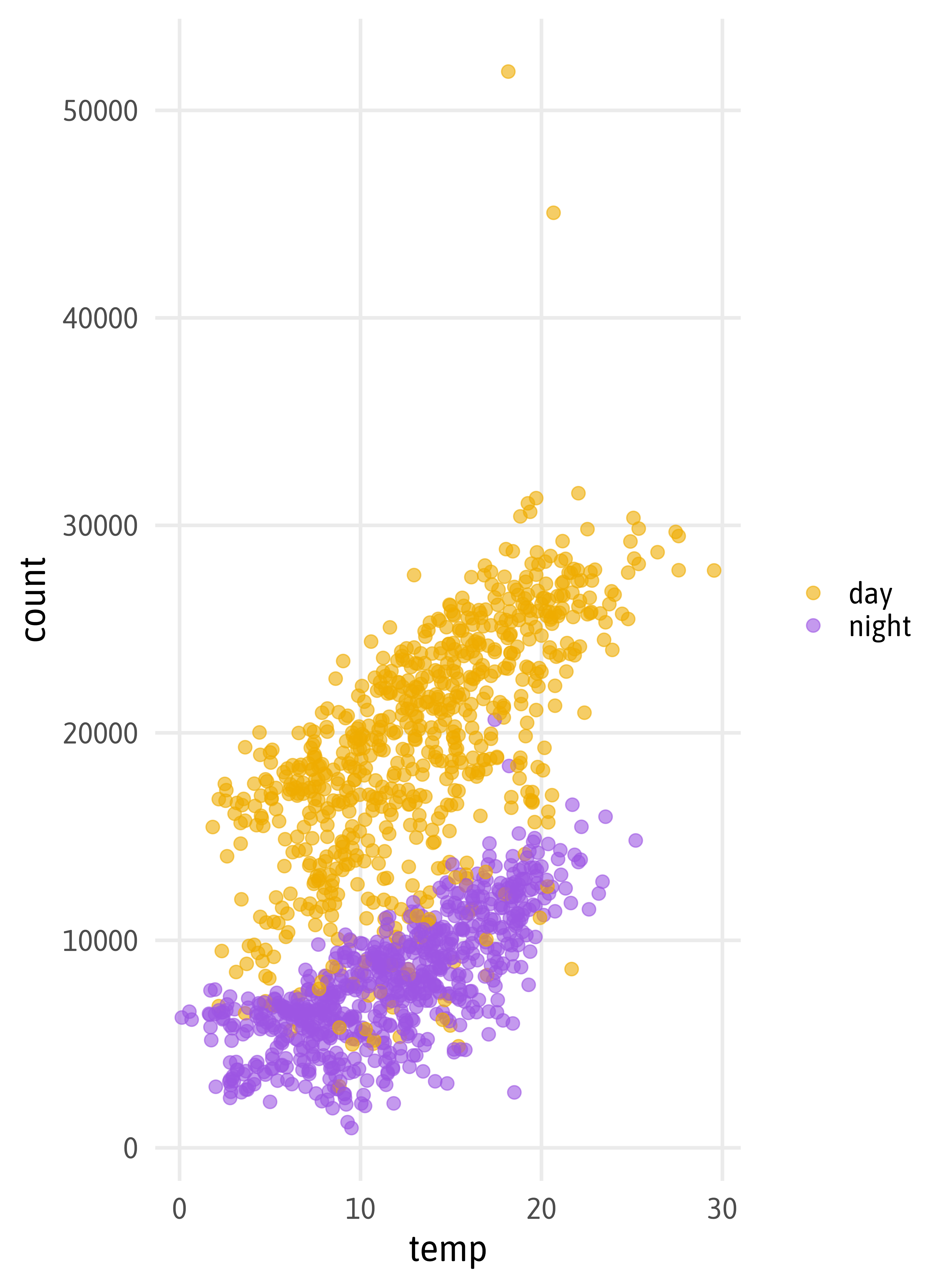
ggplot(bikes, aes(x = humidity, y = temp, color = day_night, partition = day_night)) +
  list(geom_point(size = 5, alpha = .5) * (blend("lighten") + blend("multiply", alpha = 0.5)),
       geom_vline(xintercept = mean(bikes$humidity), color = "grey", linewidth = 7)) |> blend("hard.light") +
  scale_color_manual(values = c("#EFAC00", "#9C55E3"), name = NULL)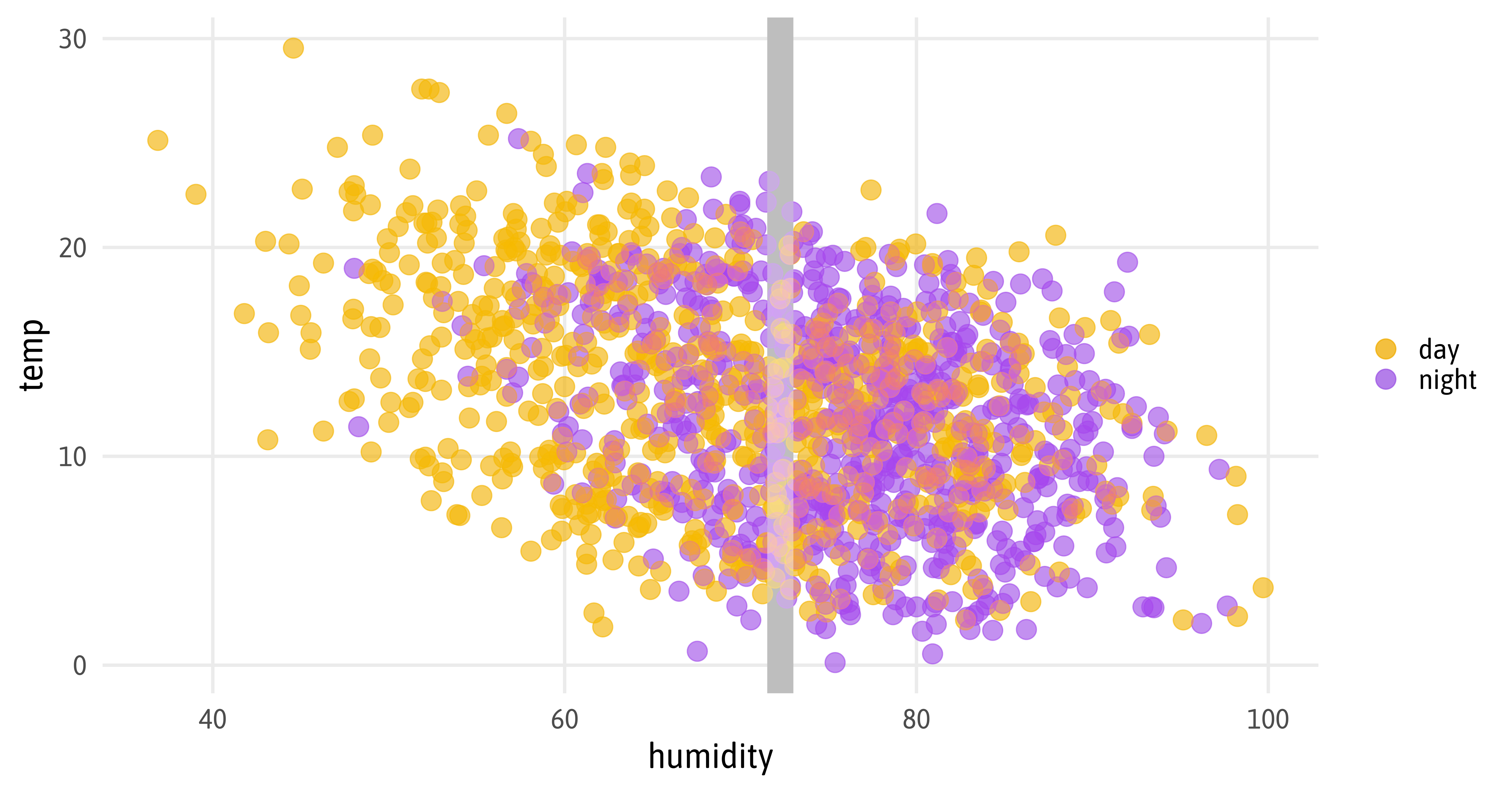


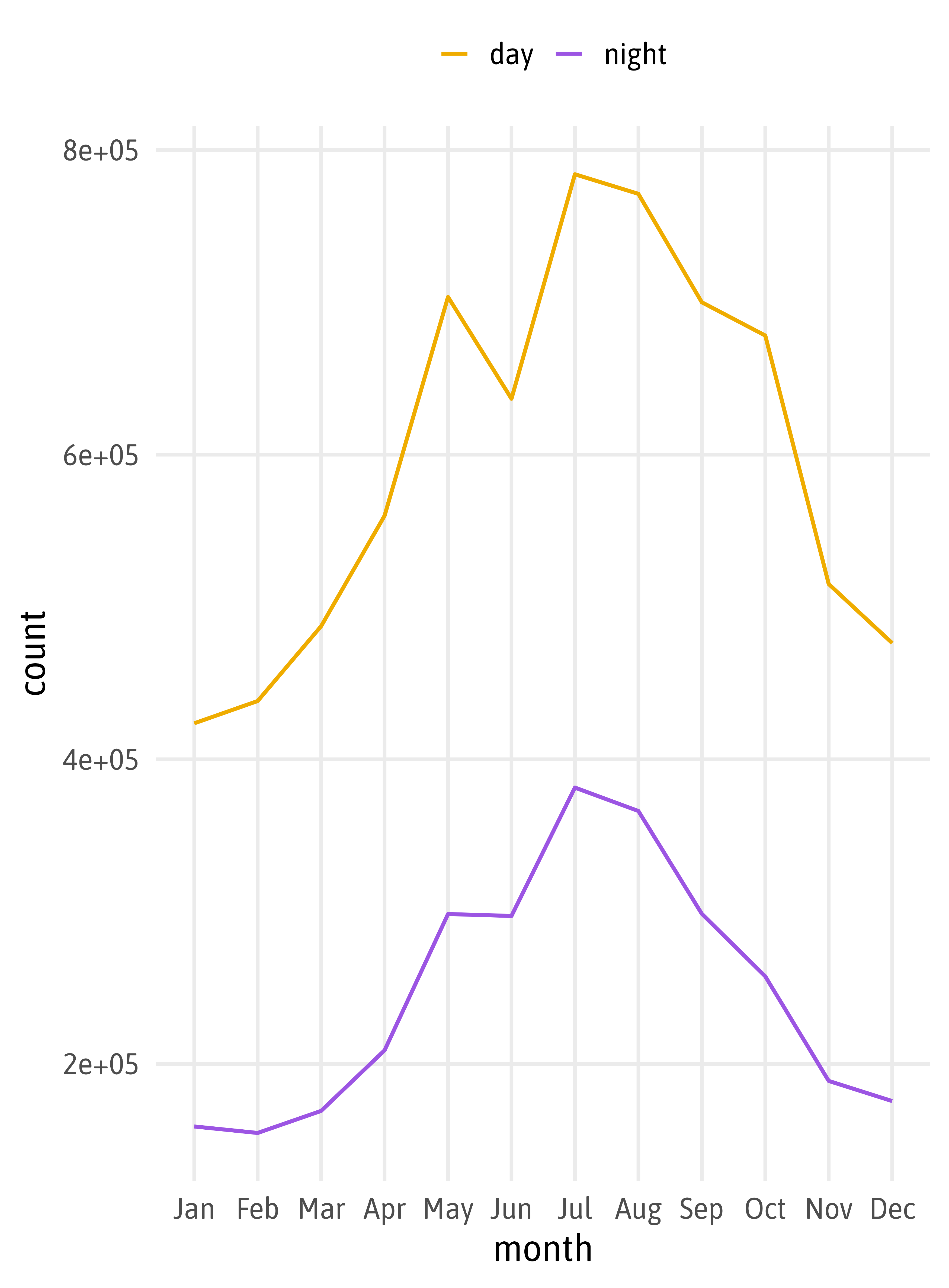
bikes_monthly |>
  mutate(day_night = if_else(
    day_night == "day",
    "Day period (6am-6pm)",
    "Night period (6pm-6am)"
  )) |>
  ggplot(aes(x = month, y = count,
             color = day_night,
             group = day_night)) +
  geomtextpath::geom_textline(
    aes(label = day_night),
    linewidth = 1,
    family = "Asap SemiCondensed",
    fontface = "bold",
    size = 6.5,
    vjust = -.5,
    hjust = .05
  ) +
  scale_color_manual(
    values = c("#EFAC00", "#9C55E3"),
    guide = "none"
  )
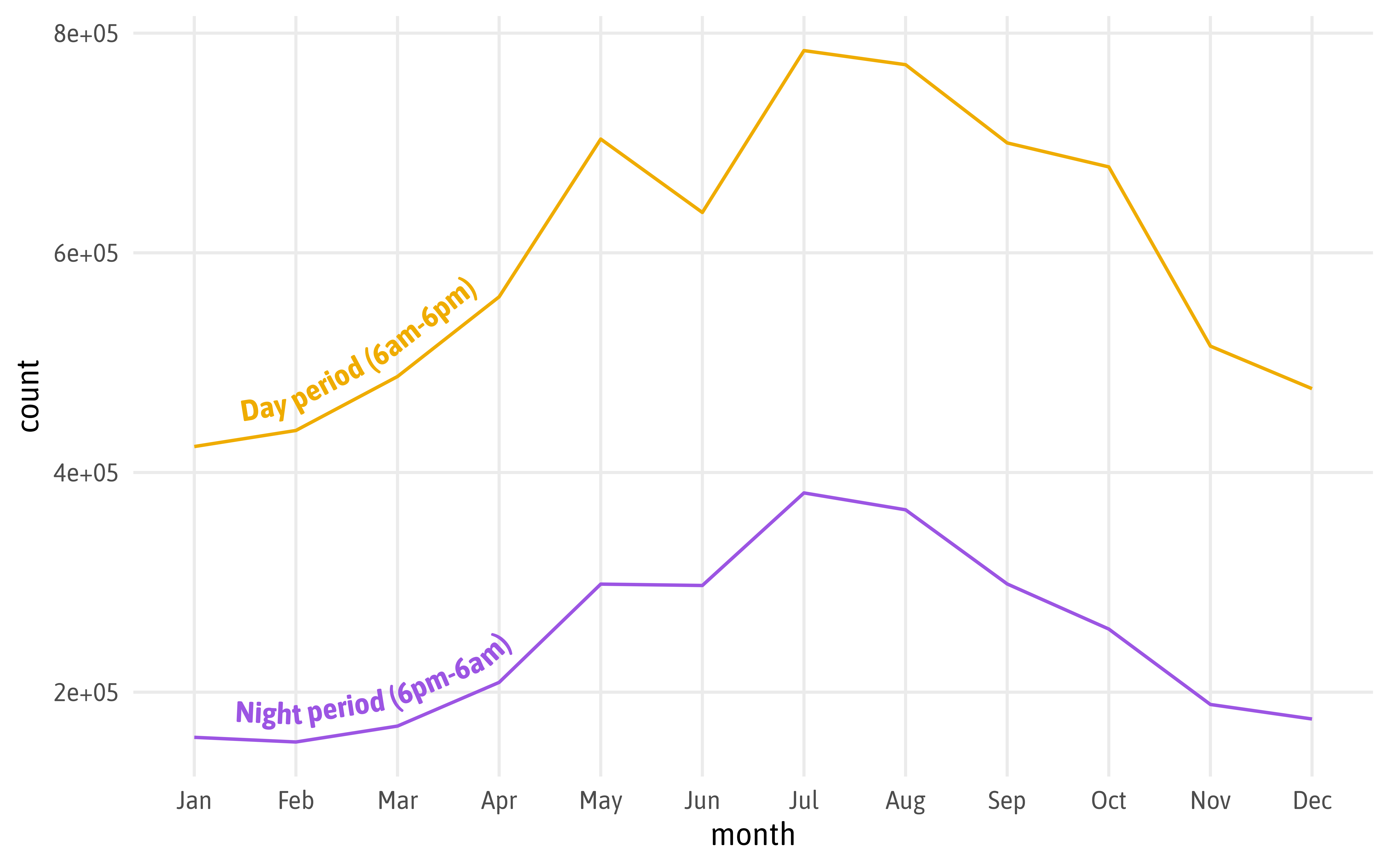
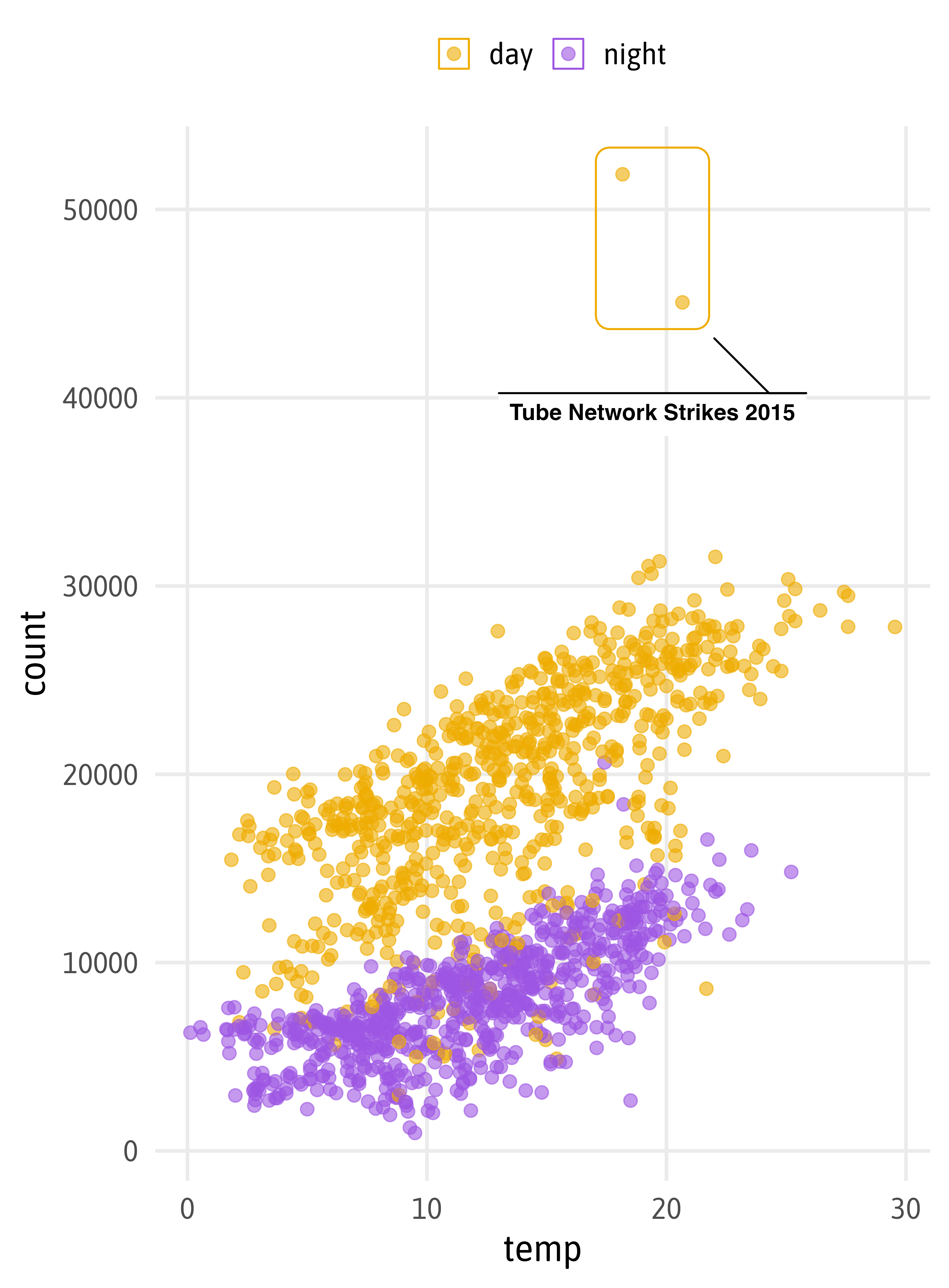
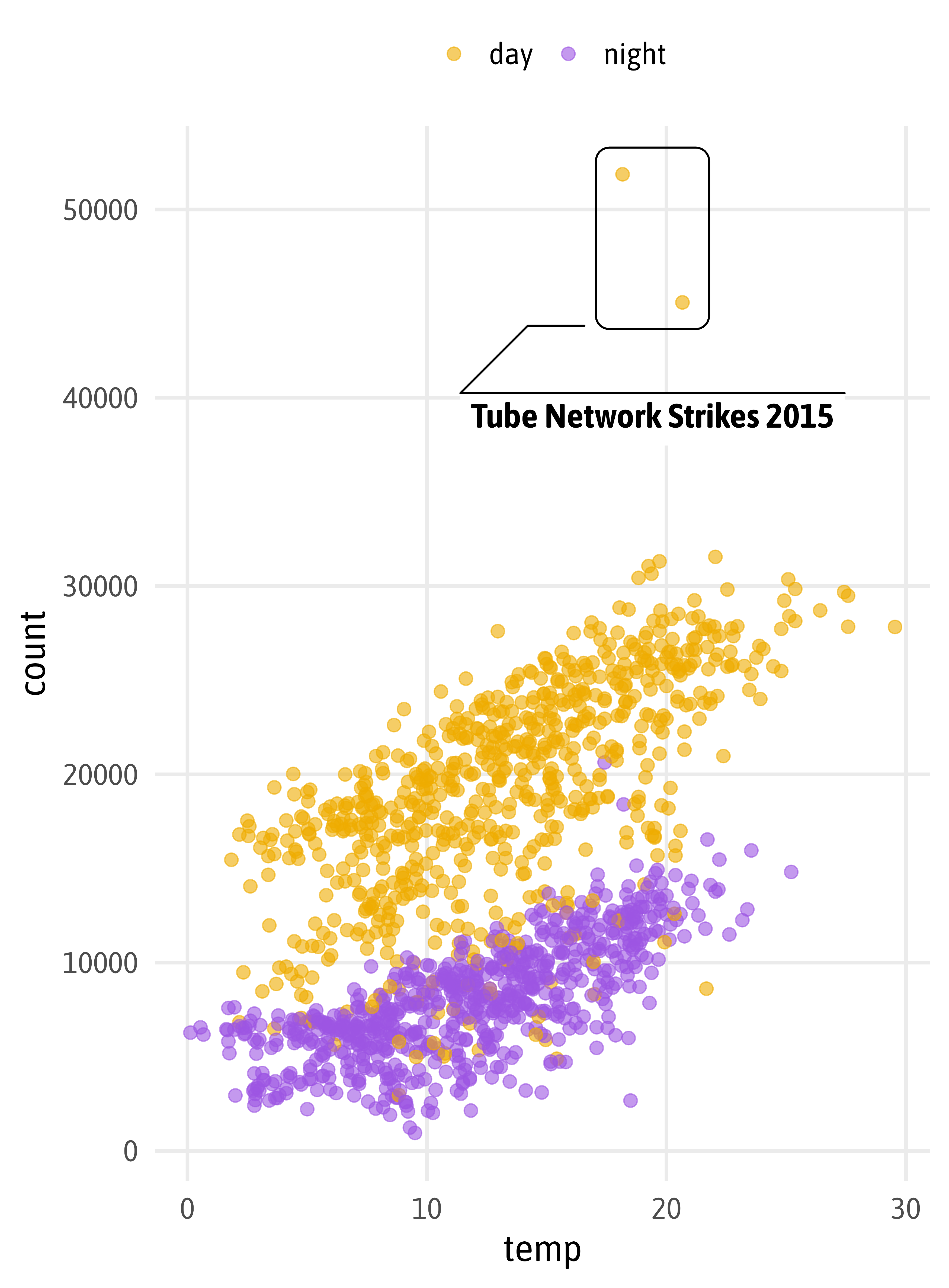
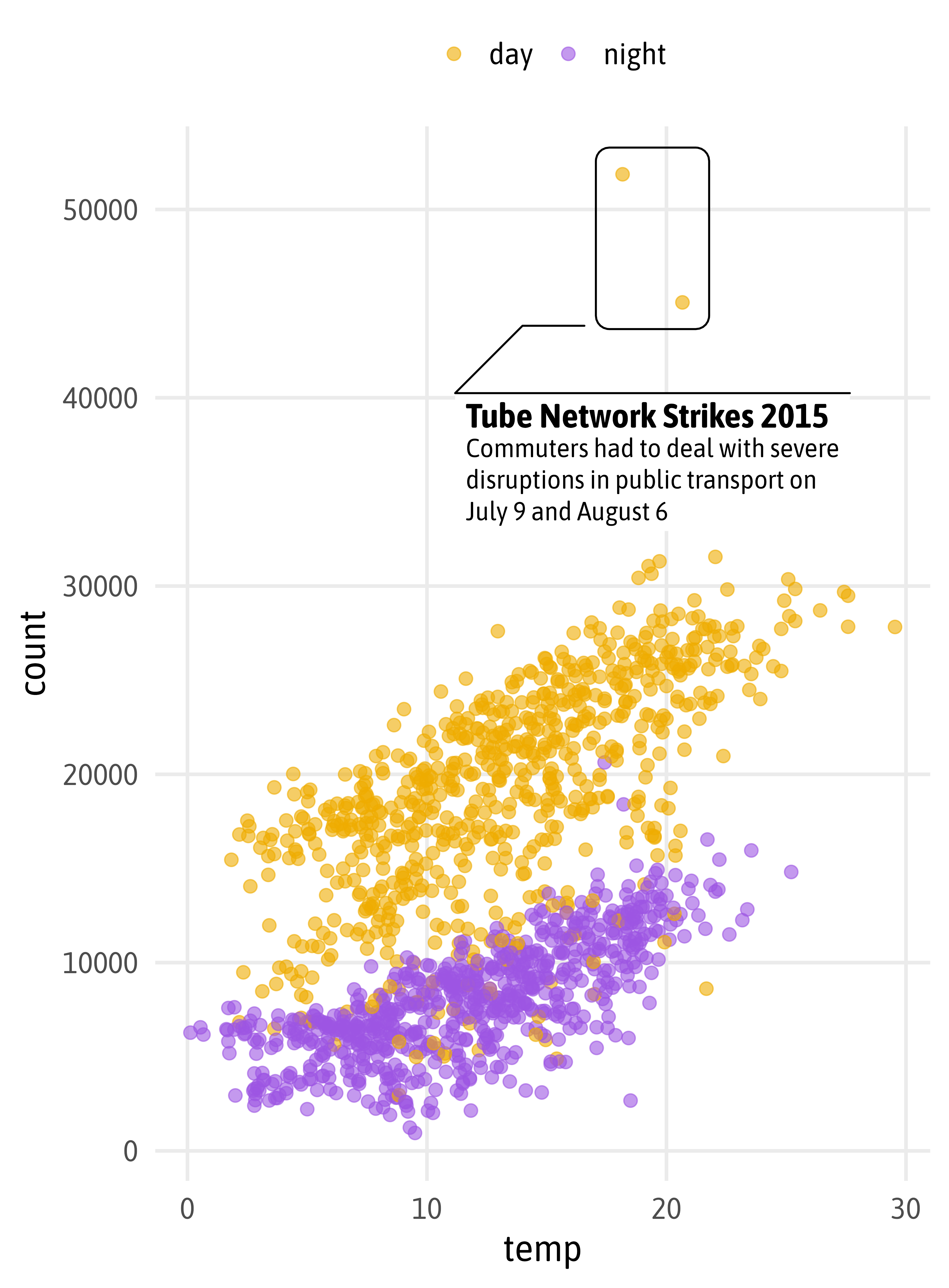
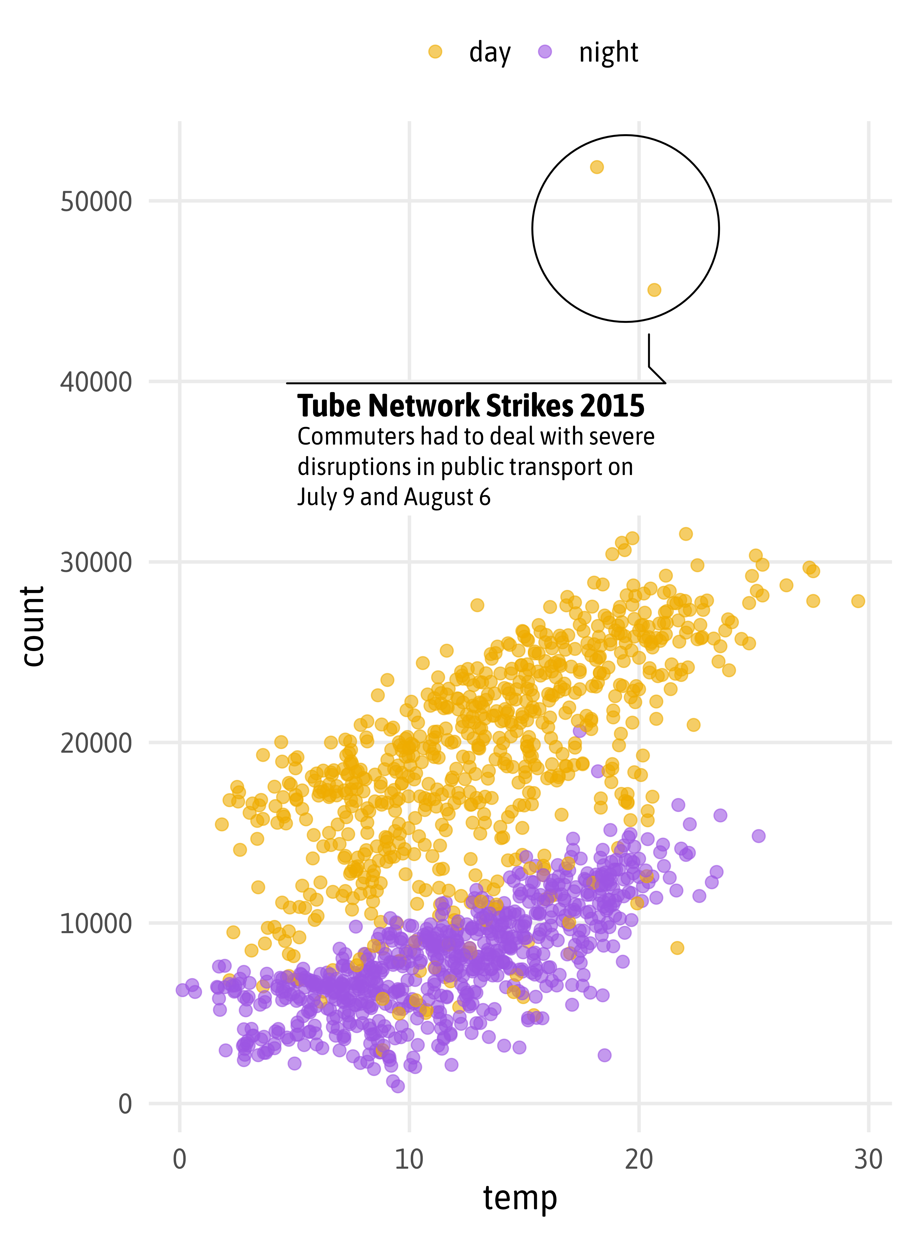
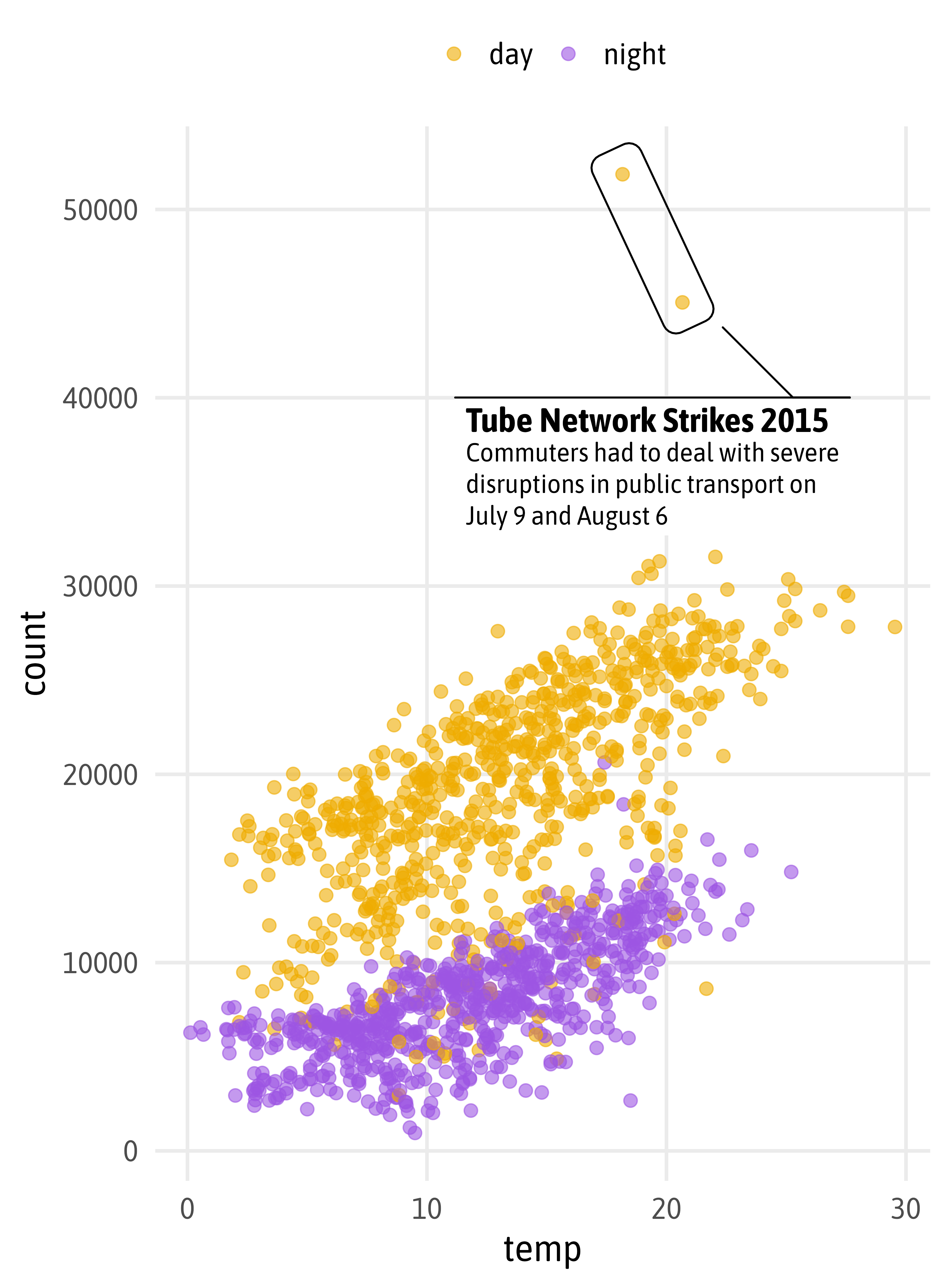
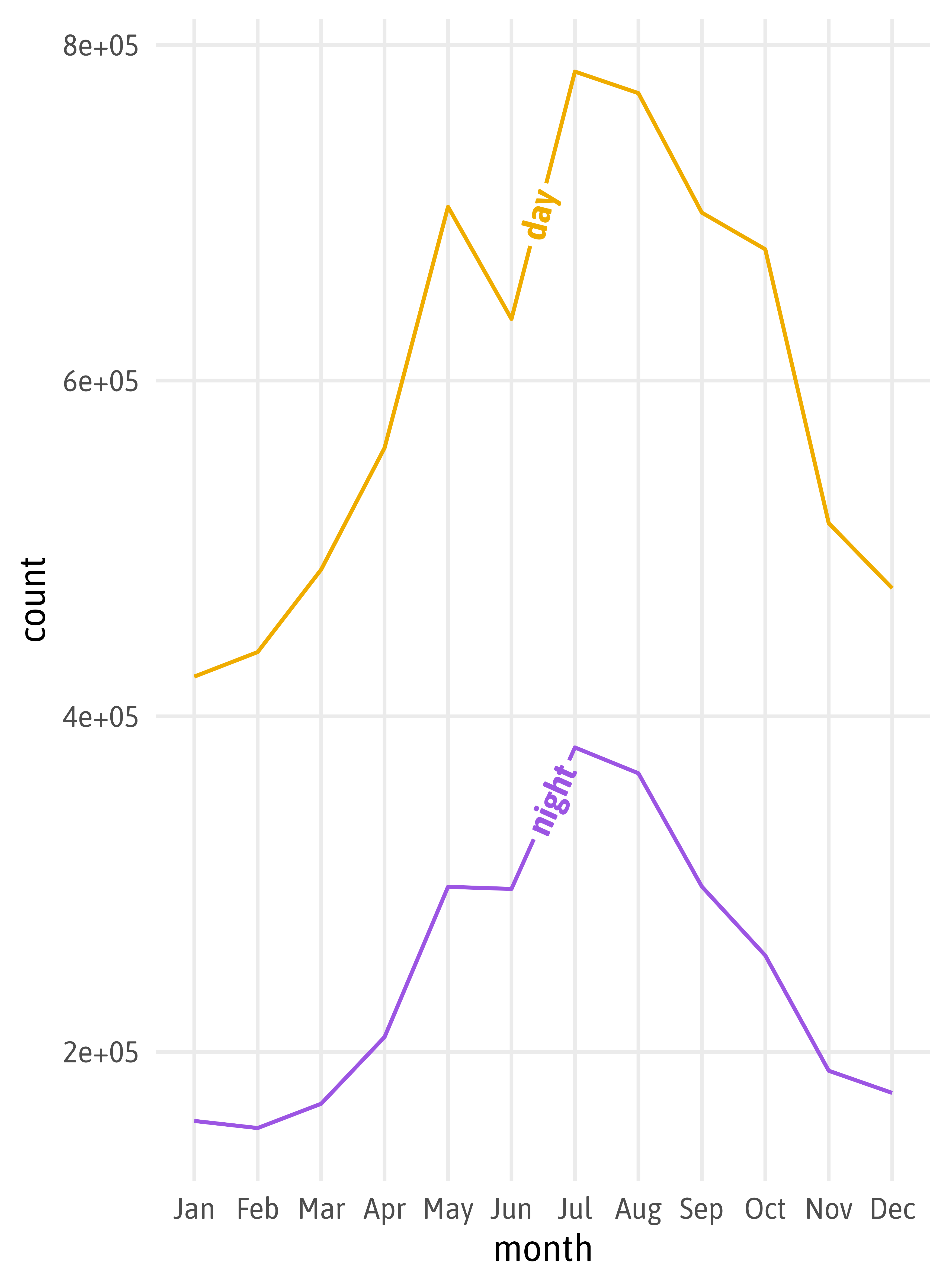
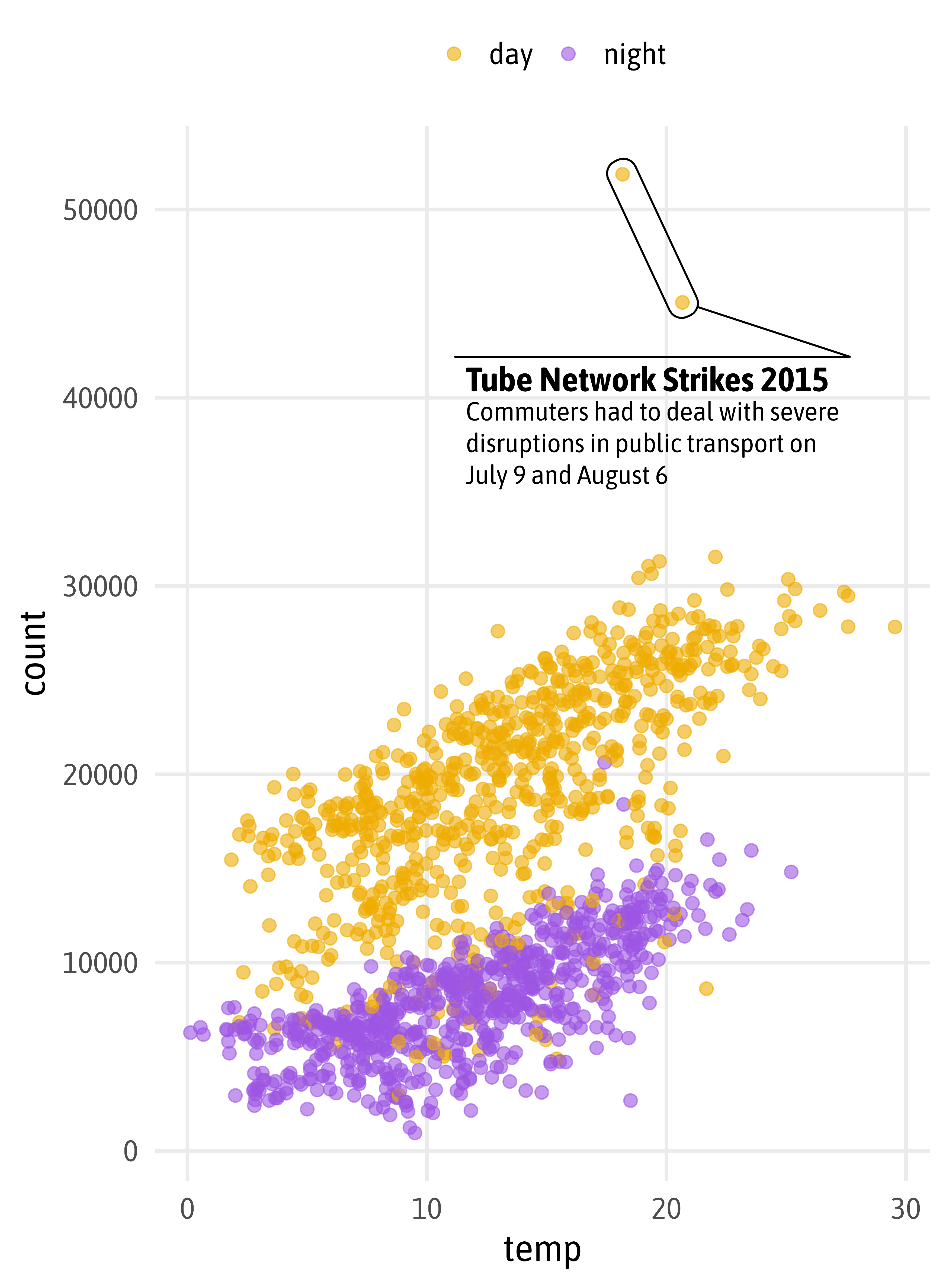
g +
  ggforce::geom_mark_hull(
    aes(label = "Tube Network Strikes 2015",
        filter = count > 40000),
    description = "Commuters had to deal with severe disruptions in public transport on July 9 and August 6",
    color = "black",
    label.family = "Asap SemiCondensed",
    label.fontsize = c(18, 14),
    expand = unit(8, "pt"),
    con.cap = unit(0, "pt"),
    label.buffer = unit(15, "pt"),
    con.type = "straight",
    label.fill = "transparent"
  )

“Verbraucherumfrage zur Zukunft nach der Krise”, kuendigung.org
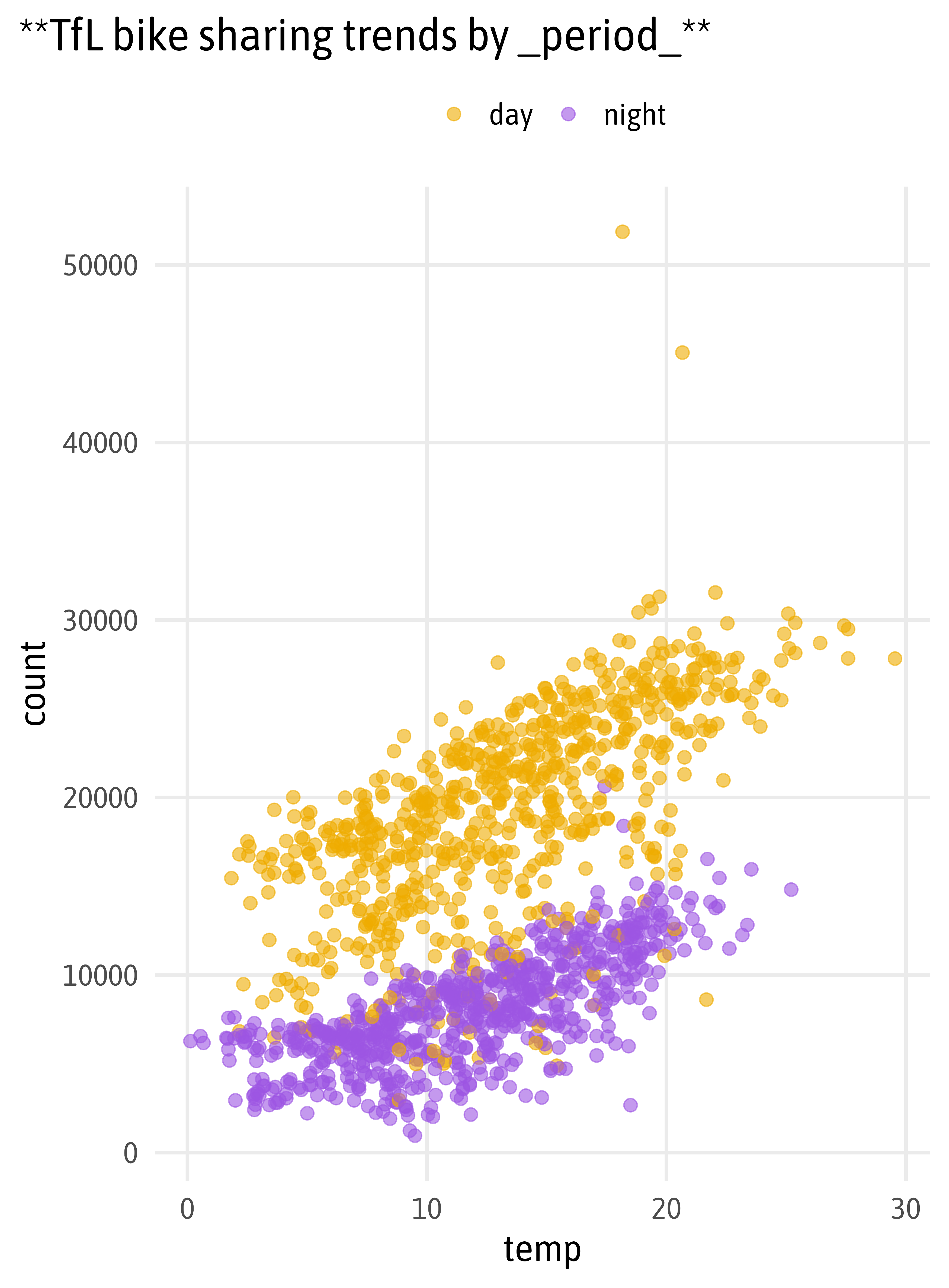
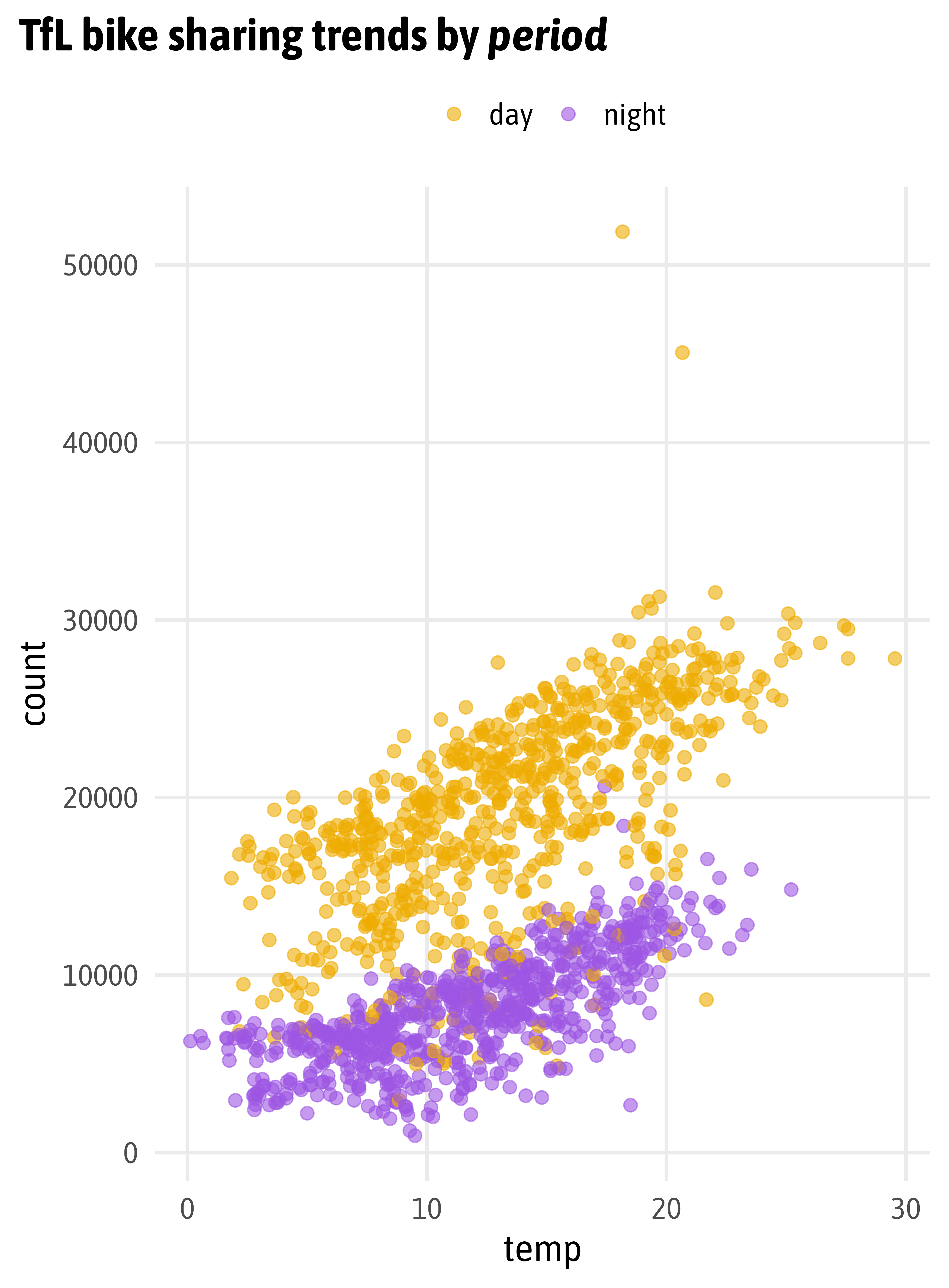

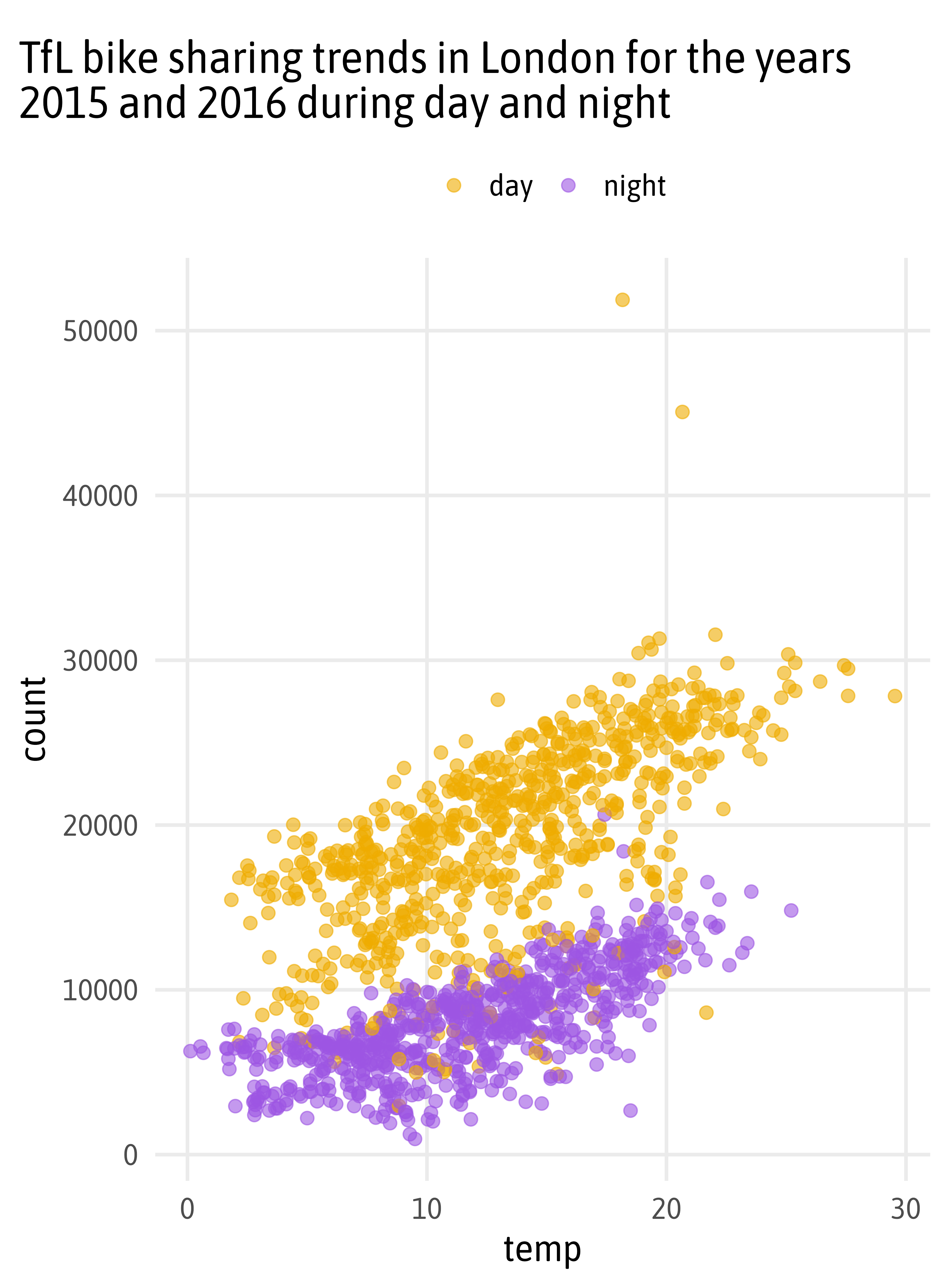
<b style='font-size:40pt;font-family:times;'>TfL</b> bike sharing trends by *<b style='color:#B48200;'>day</b>* and *<b style='color:#663399;'>night</b>*
“Chats about Friends and their Past, Present, and Future Partners”
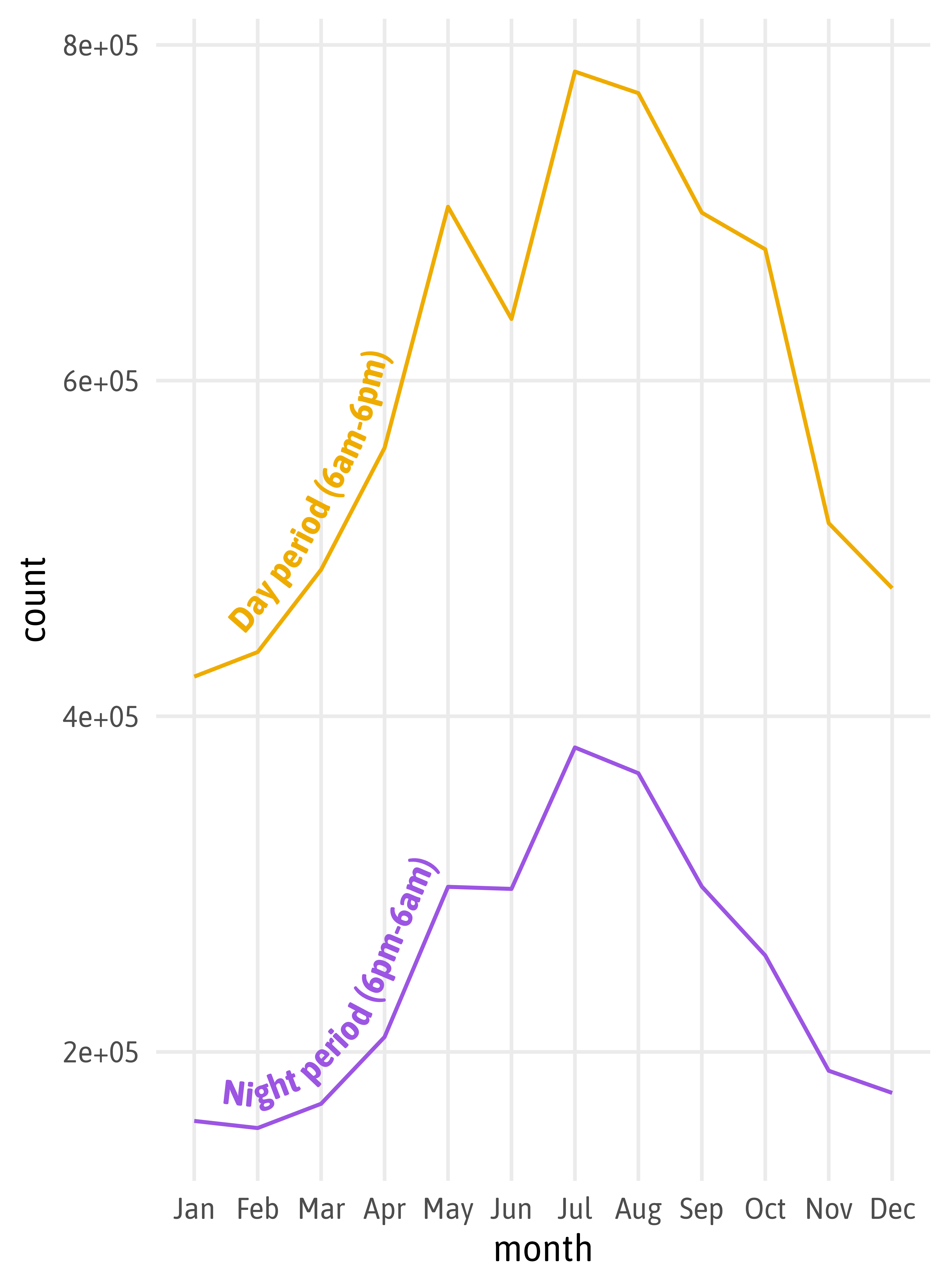
g +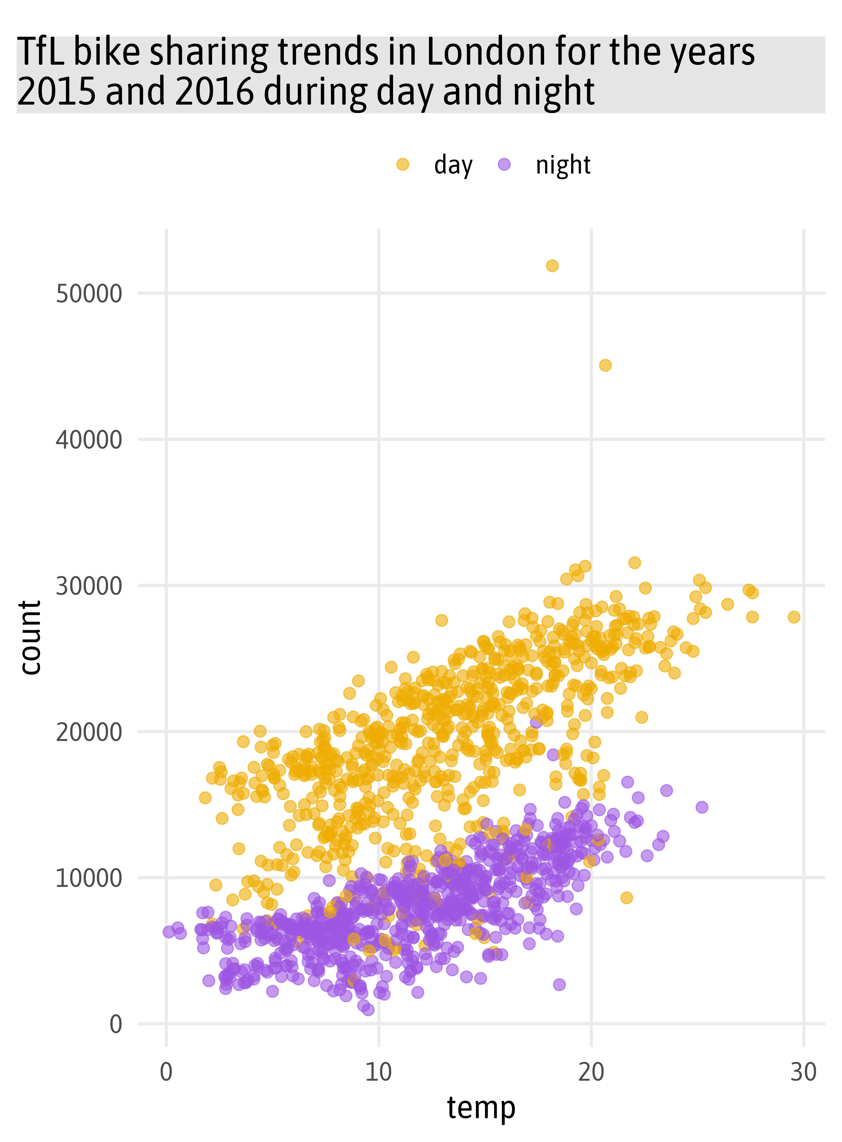
ggtitle("TfL bike sharing trends in London for the years 2015 and 2016 during day and night") +
theme(
plot.title =
ggtext::element_textbox_simple(
margin = margin(t = 12, b = 12),
padding = margin(rep(12, 4)),
fill = "grey90",
box.colour = "grey30",
linetype = "13",
r = unit(9, "pt"),
halign = .5,
lineheight = 1
)
)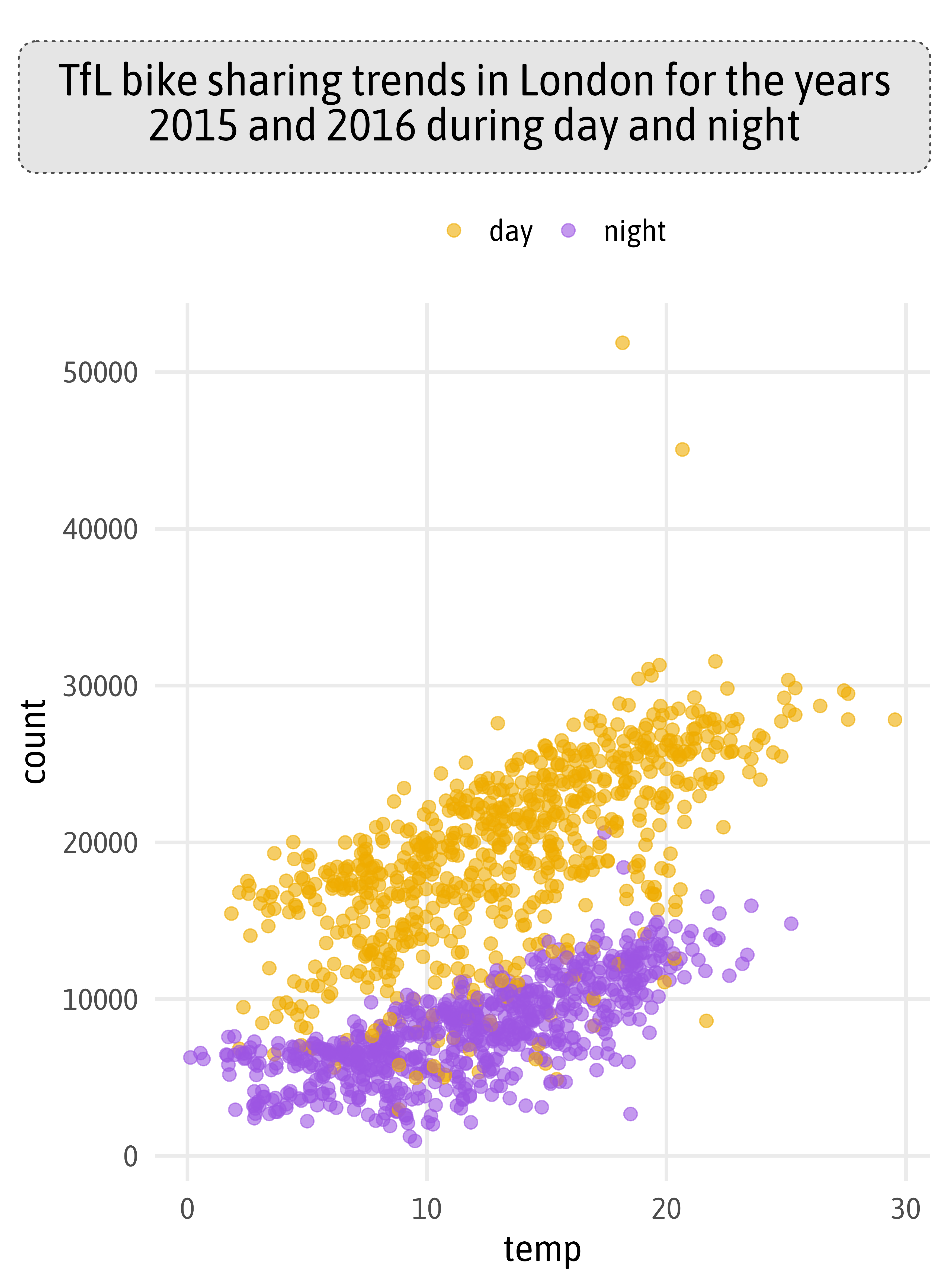
g +
  ggtitle("TfL bike sharing trends in London for the years 2015 and 2016 during *<b style='color:#B48200;'>day</b>* and *<b style='color:#663399;'>night</b>*") +
  theme(
    plot.title =
      ggtext::element_textbox_simple(
        margin = margin(t = 12, b = 12),
        padding = margin(rep(12, 4)),
        fill = "grey90",
        box.colour = "grey30",
        linetype = "13",
        r = unit(9, "pt"),
        halign = .5,
        lineheight = 1
      ),
    legend.position = "none"
  )
Thank You!
![]()

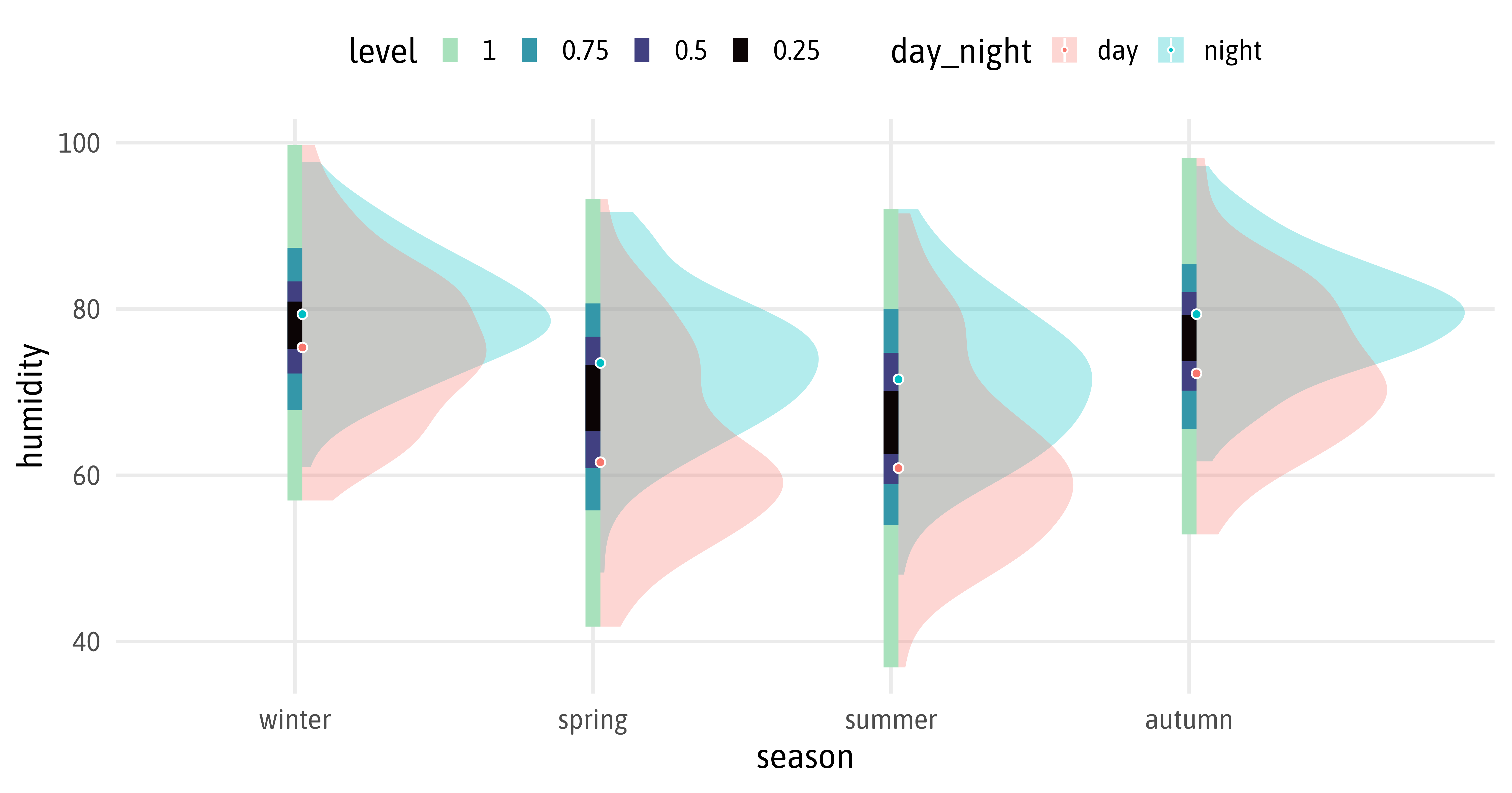
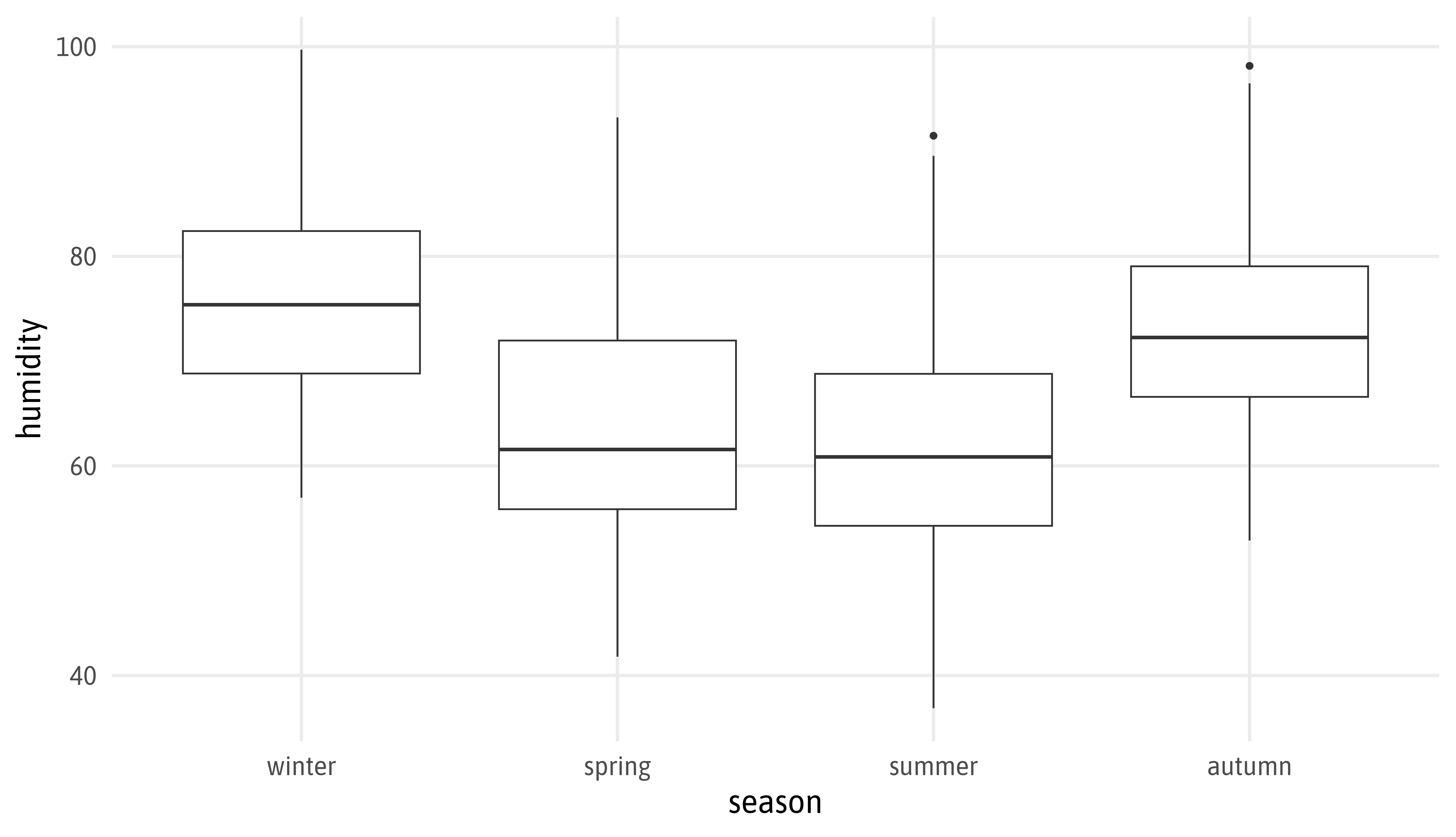
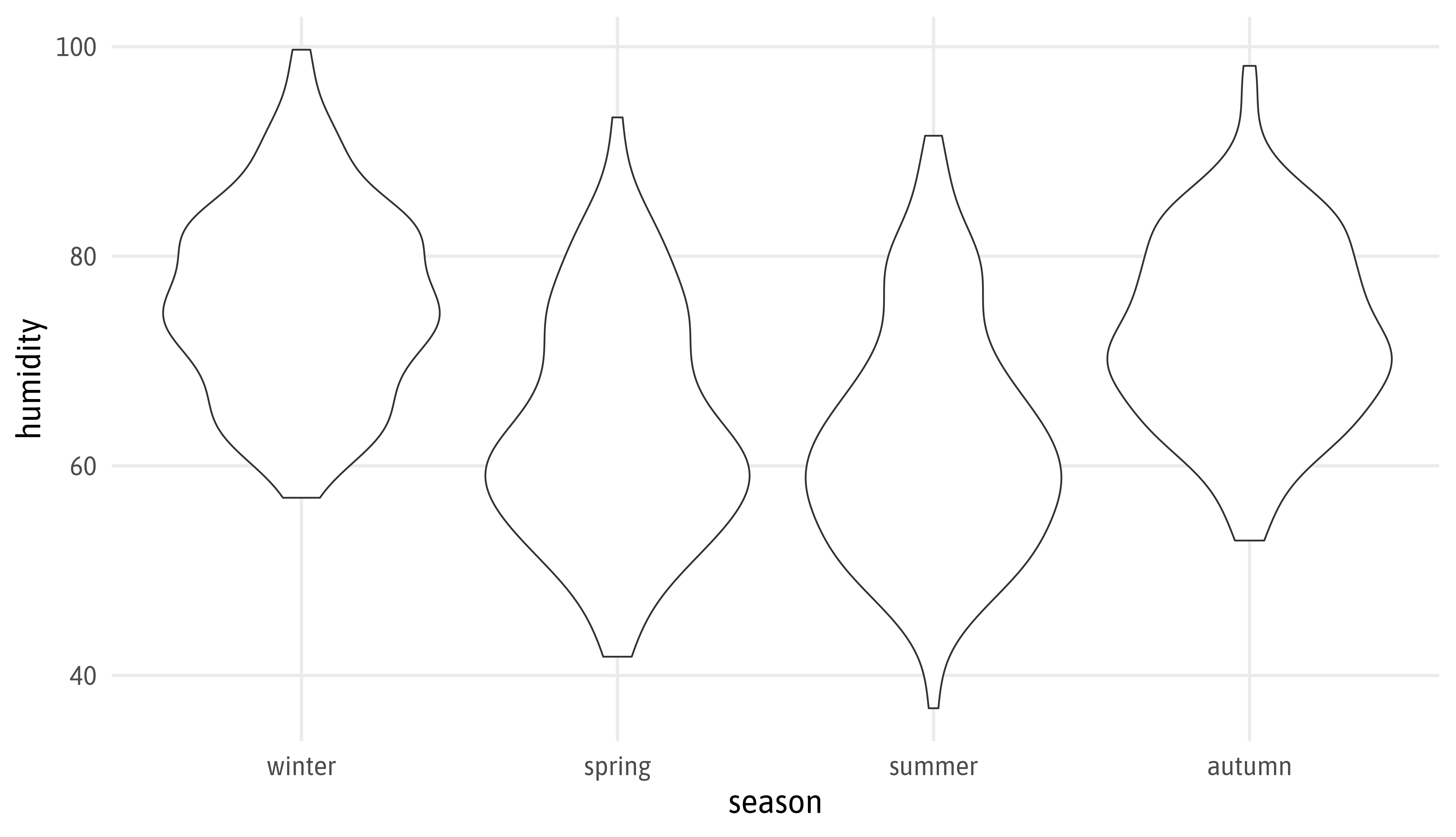
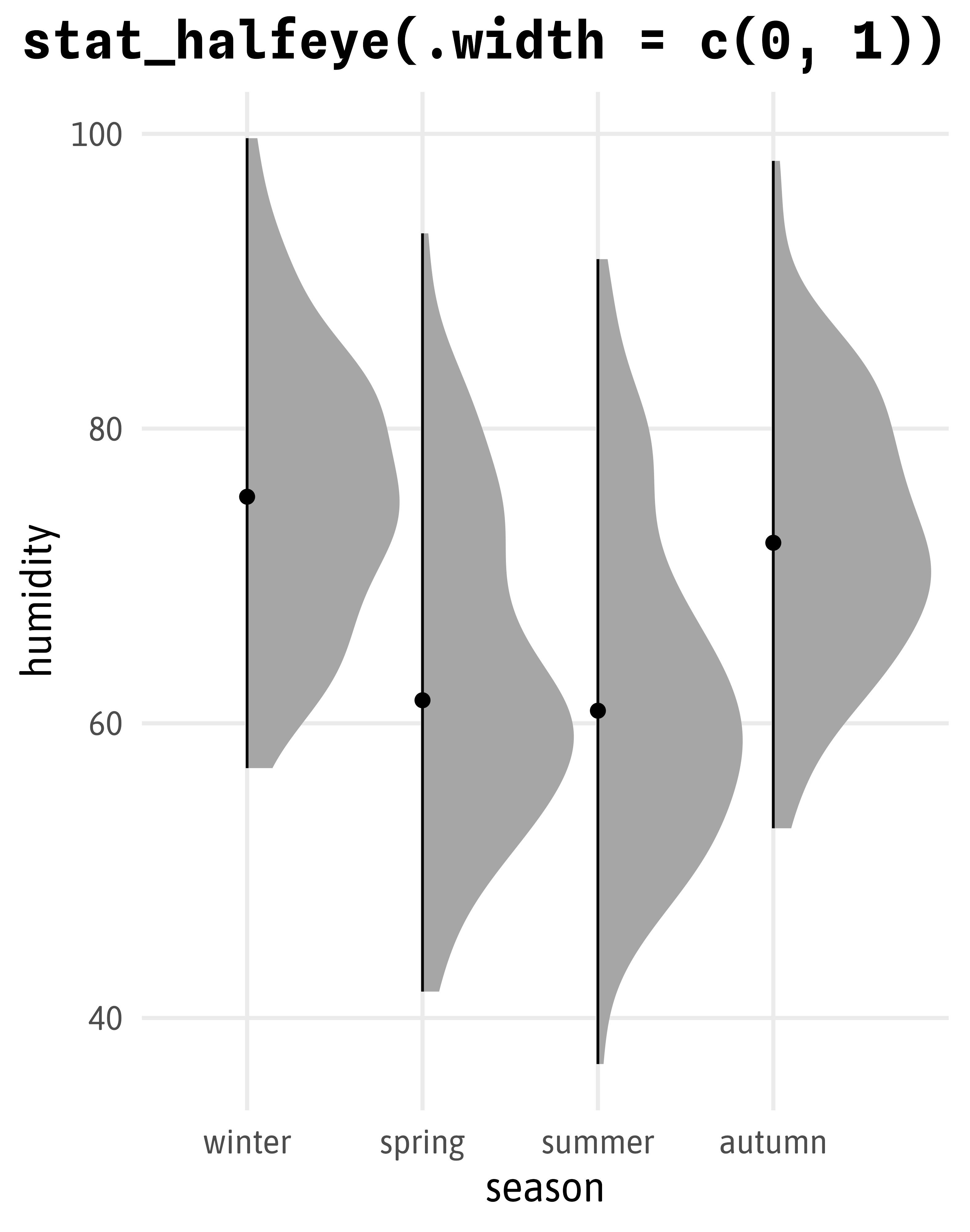
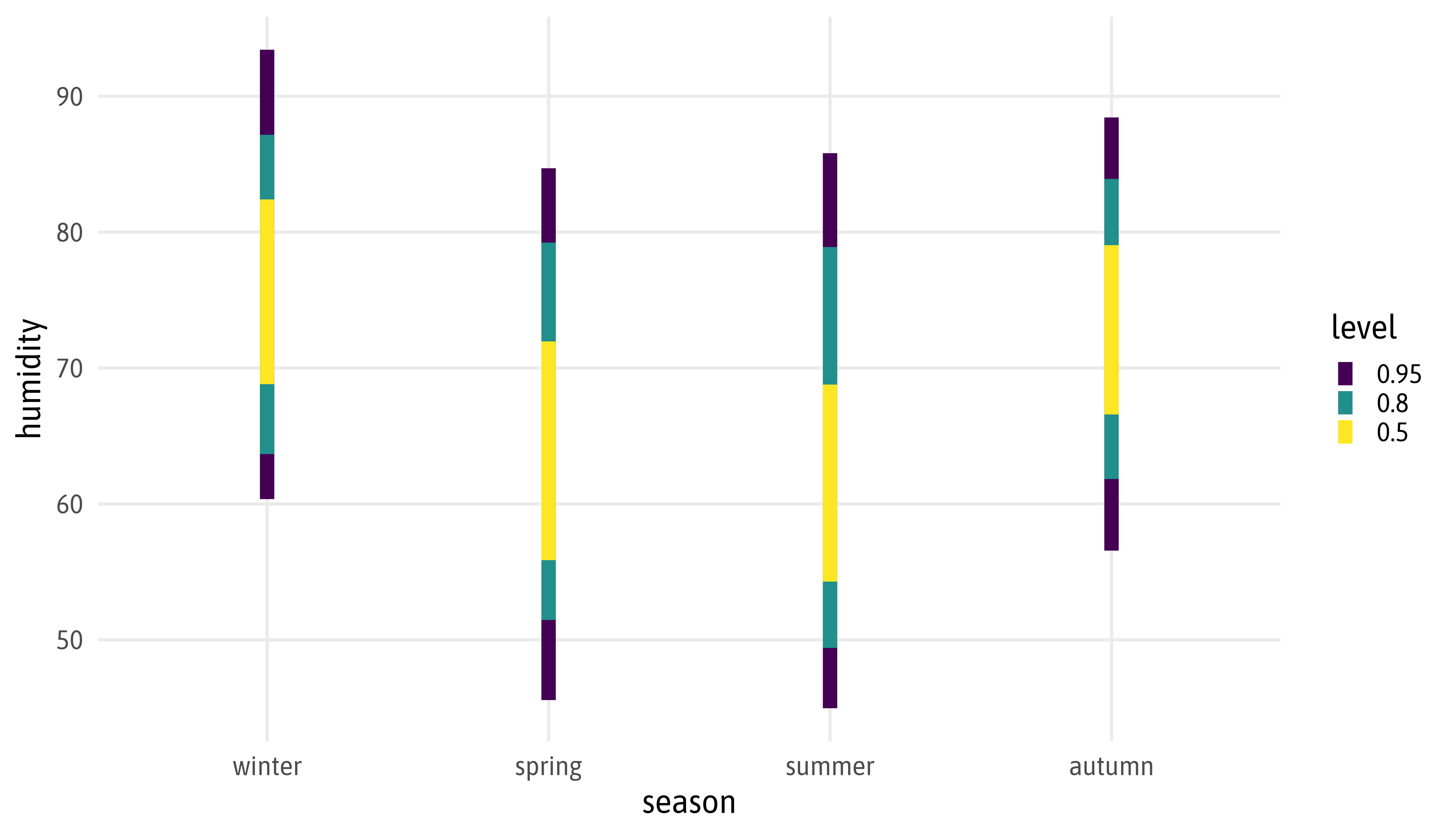
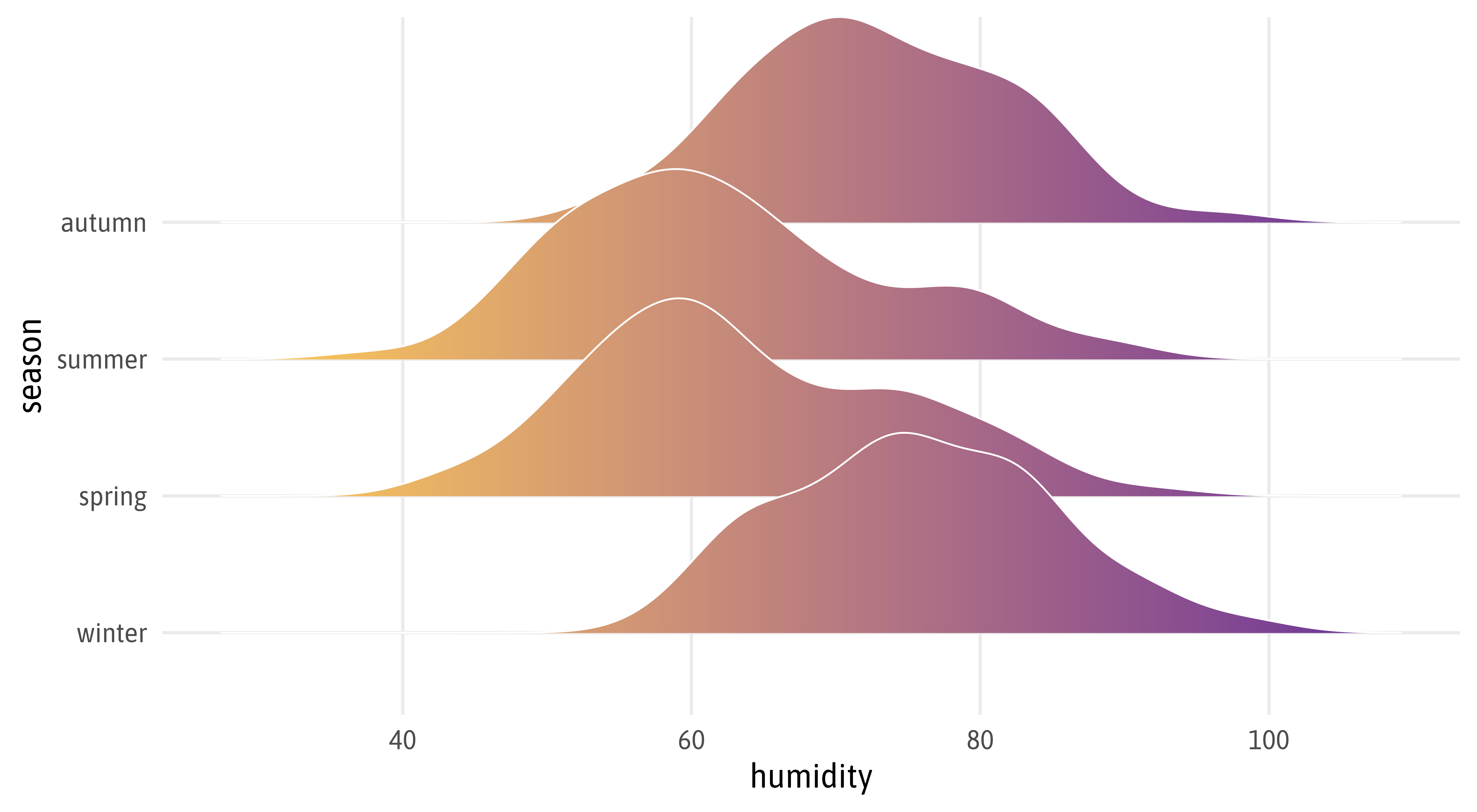
ggplot(bikes, aes(x = season, y = humidity)) +
  ggdist::stat_interval(.width = 1:4*.25) +
  ggdist::stat_halfeye(aes(fill = day_night), slab_alpha = .3, shape = 21, .width = 0, color = "white", position = position_nudge(x = .025)) +
  scale_color_grey(start = .9, end = .2) +
  scale_fill_manual(values = c("#EFAC00", "#9C55E3"), name = NULL)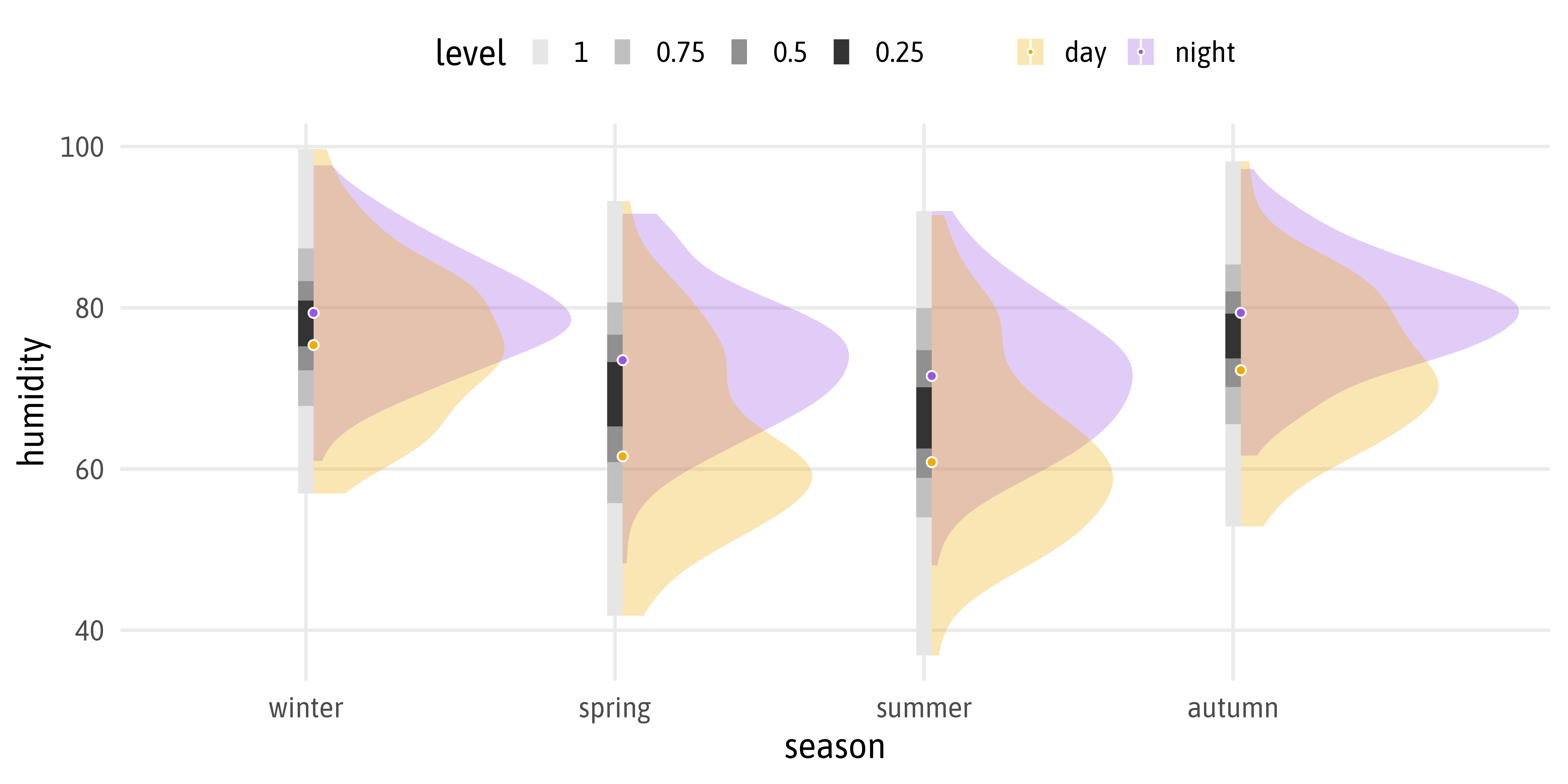
Styling Labels with {ggtext}
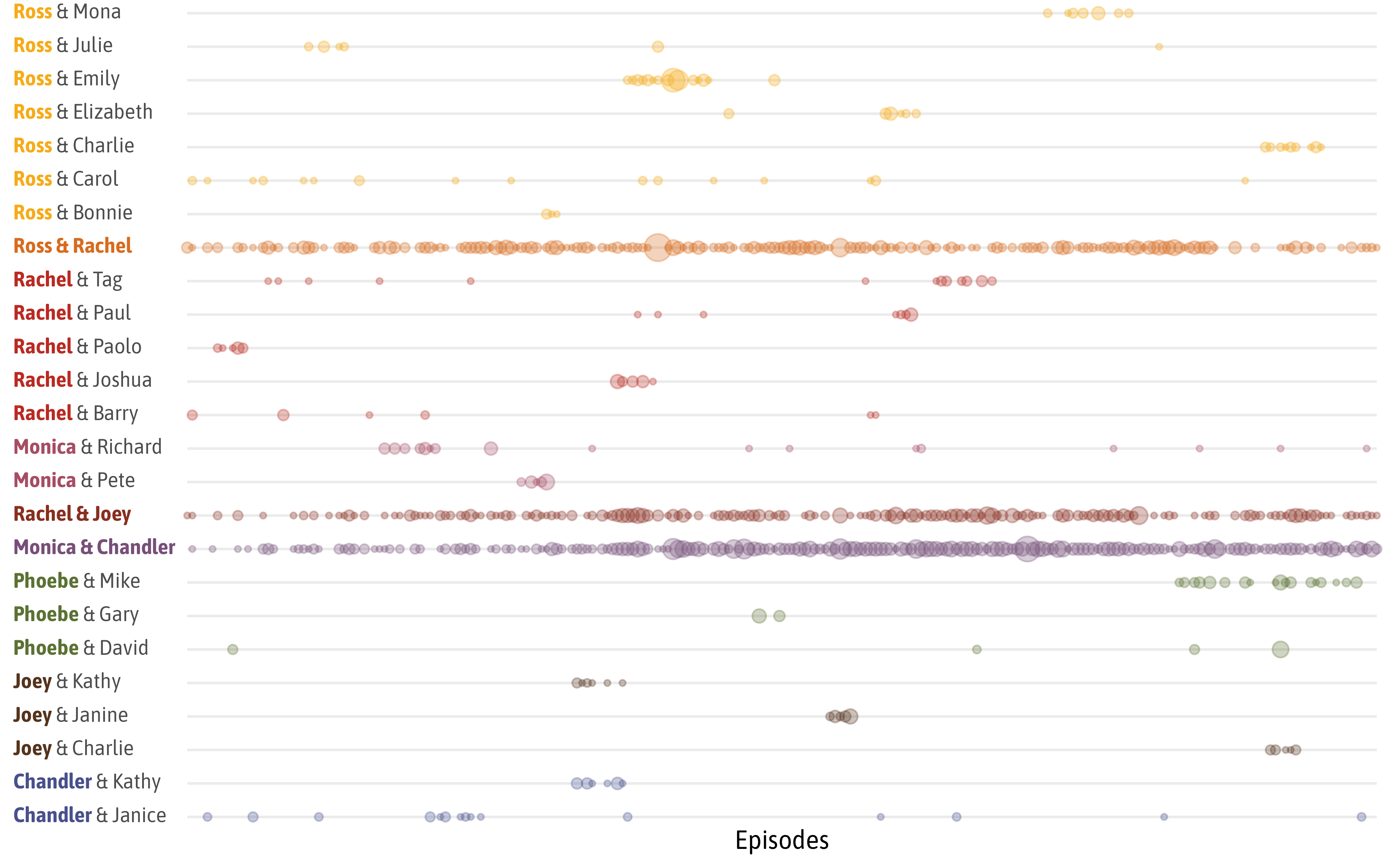
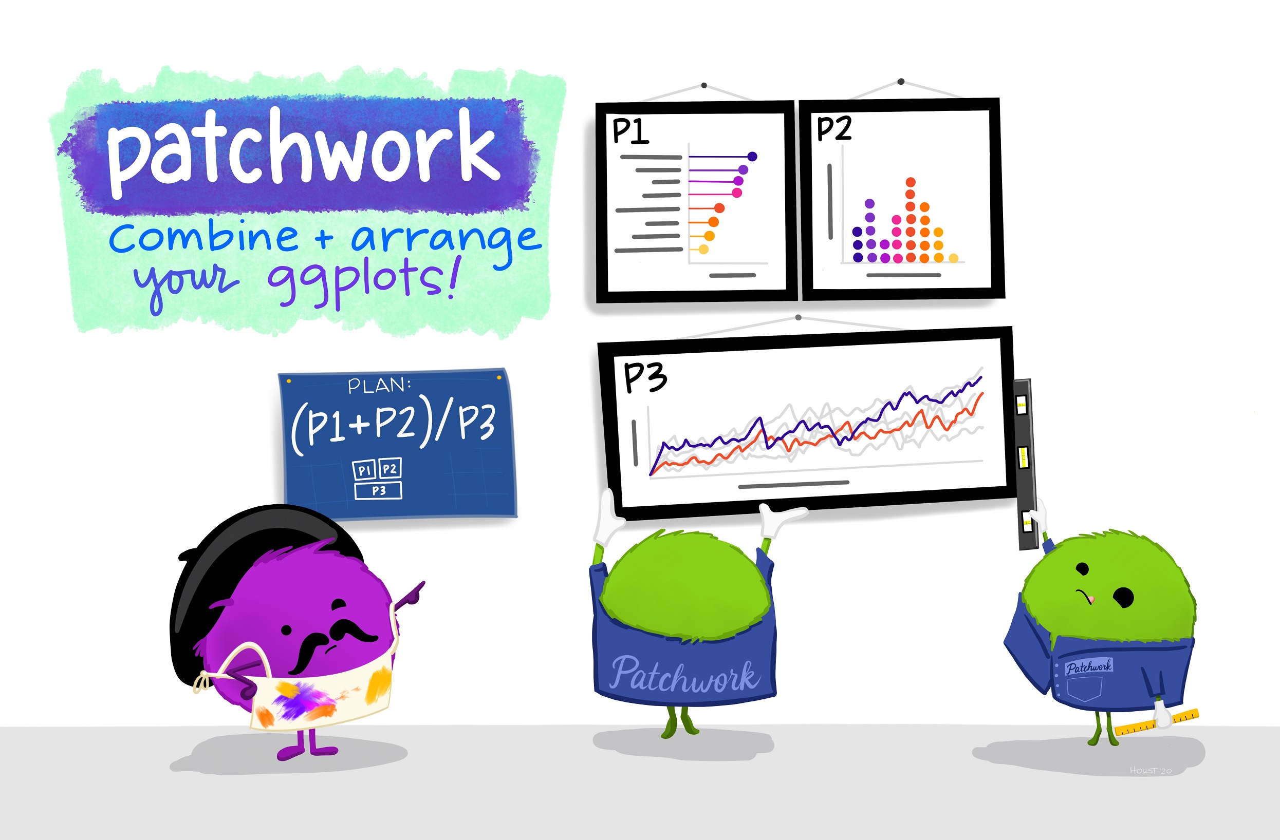
Illustration by Allison Horst
theme_set(theme_minimal(base_size = 18, base_family = "Pally"))
theme_update(
text = element_text(family = "Pally"),
panel.grid = element_blank(),
axis.text = element_text(color = "grey50", size = 12),
axis.title = element_text(color = "grey40", face = "bold"),
axis.title.x = element_text(margin = margin(t = 12)),
axis.title.y = element_text(margin = margin(r = 12)),
axis.line = element_line(color = "grey80", linewidth = .4),
legend.text = element_text(color = "grey50", size = 12),
plot.tag = element_text(size = 40, margin = margin(b = 15)),
plot.background = element_rect(fill = "white", color = "white")
)
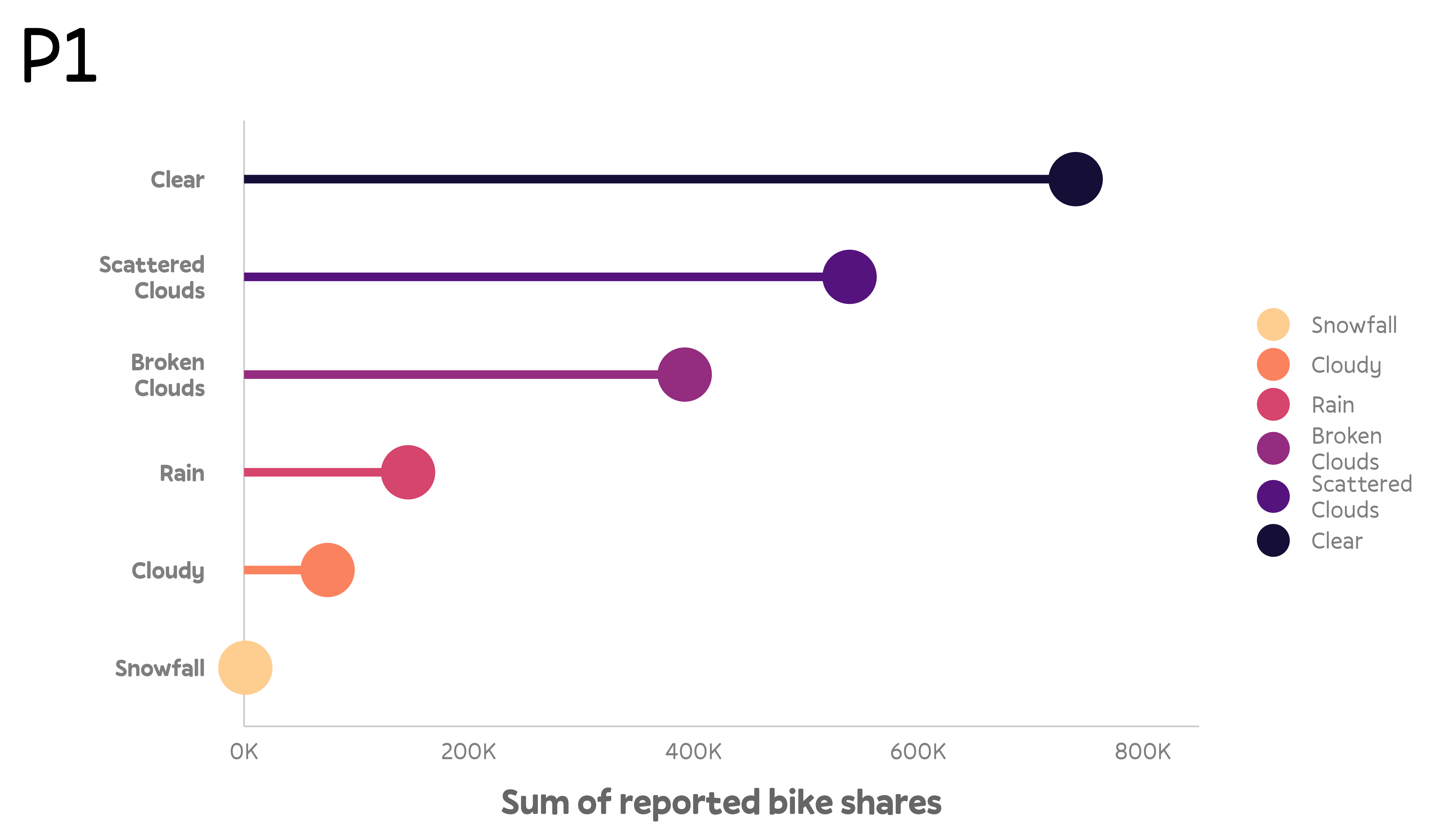
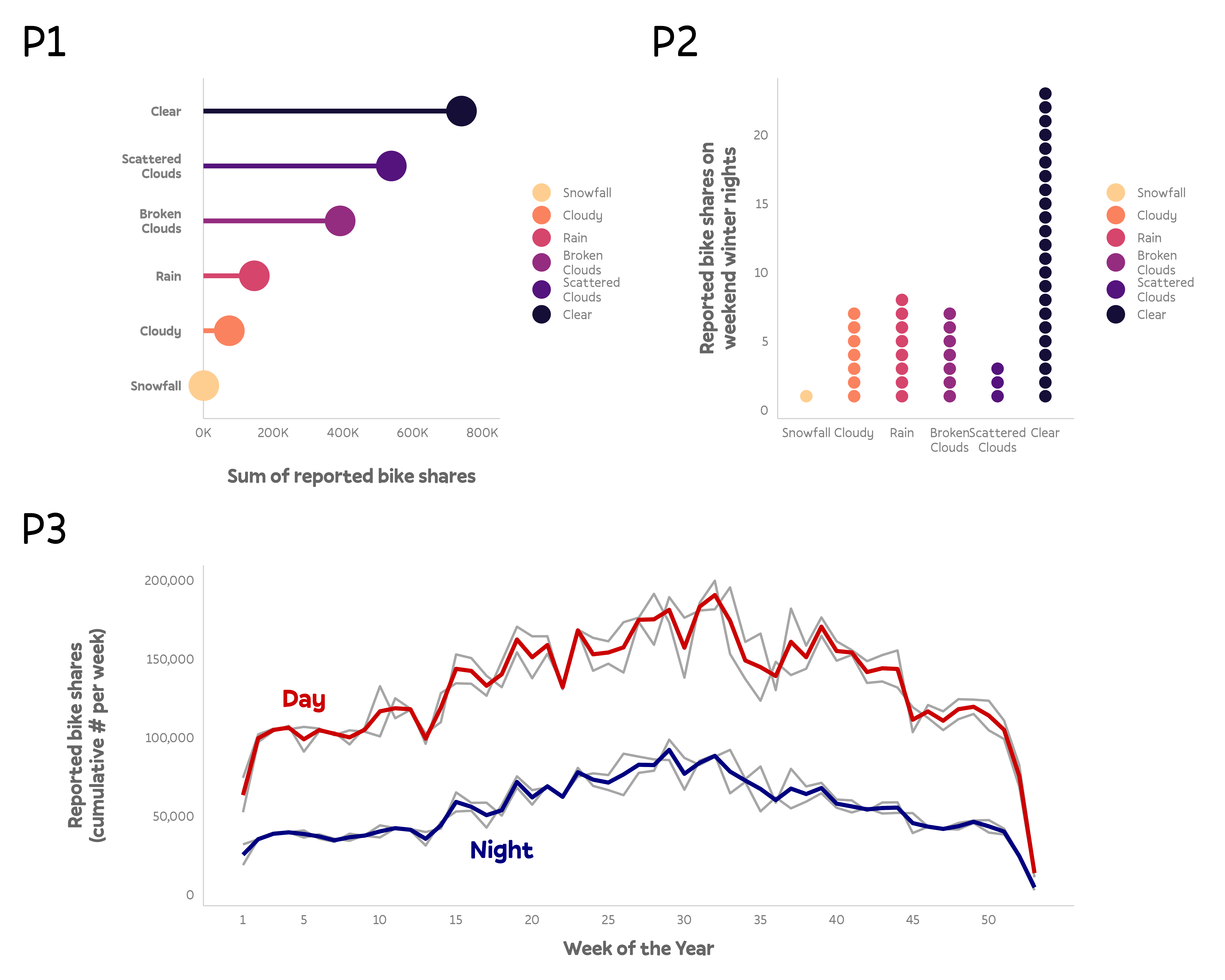
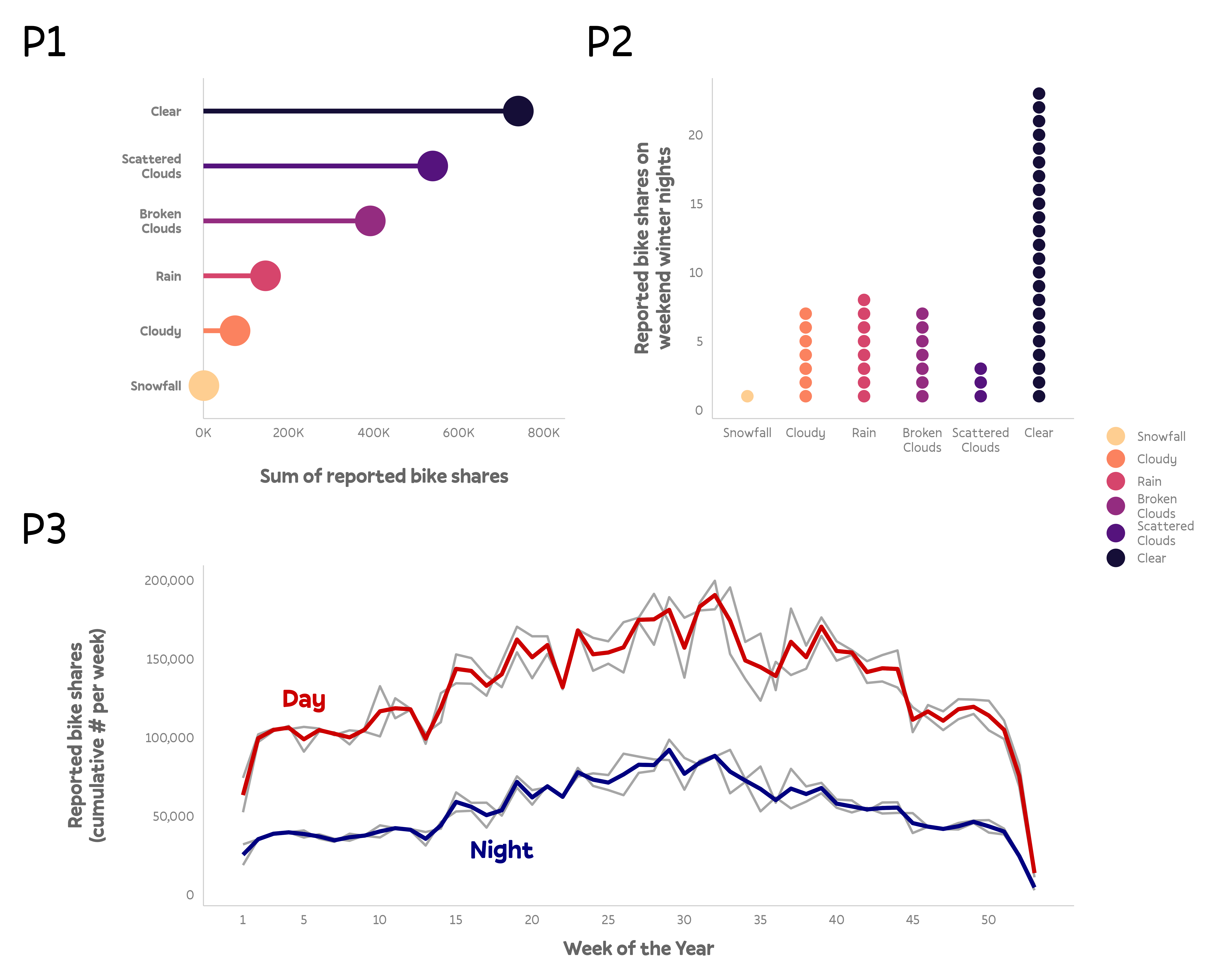
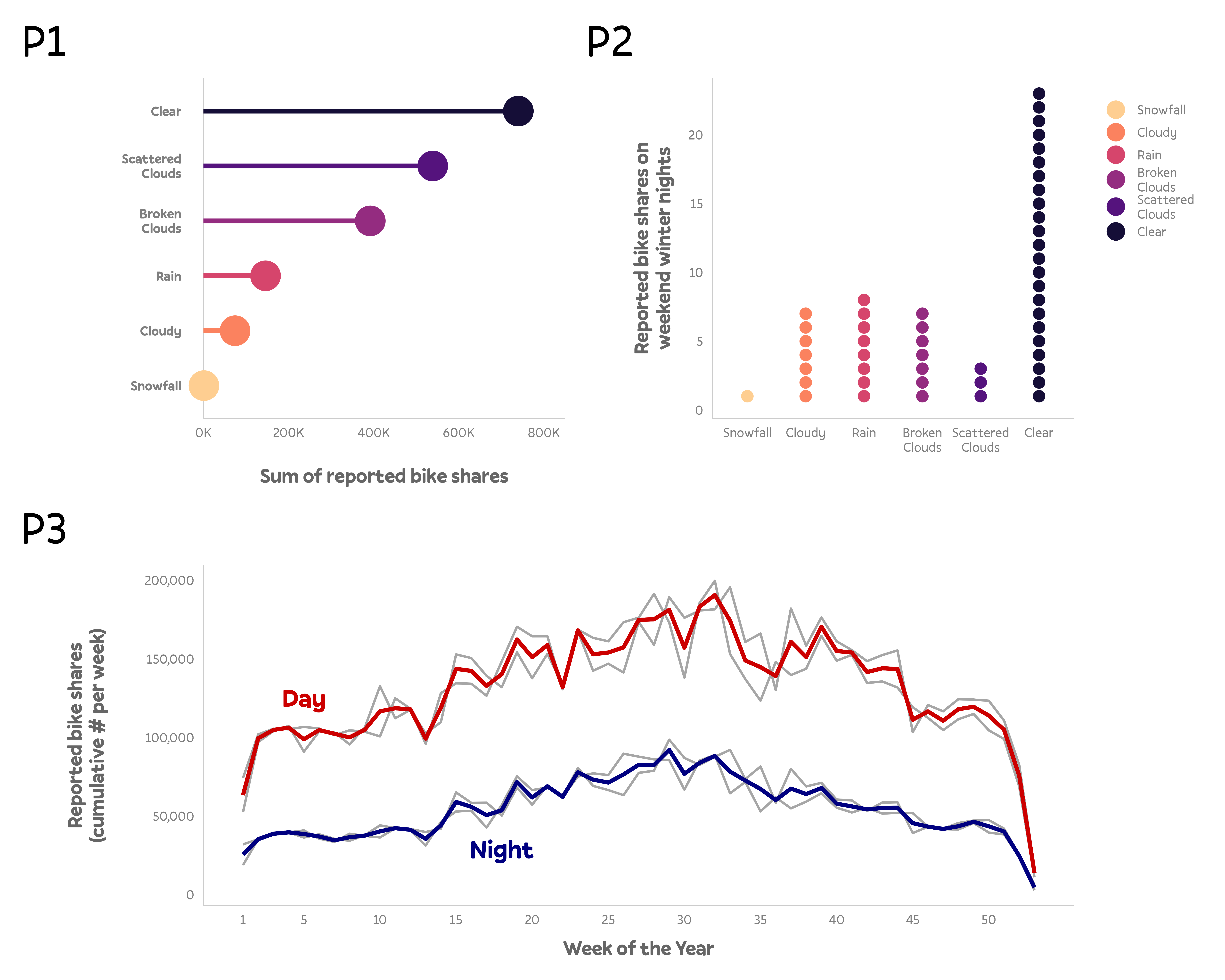
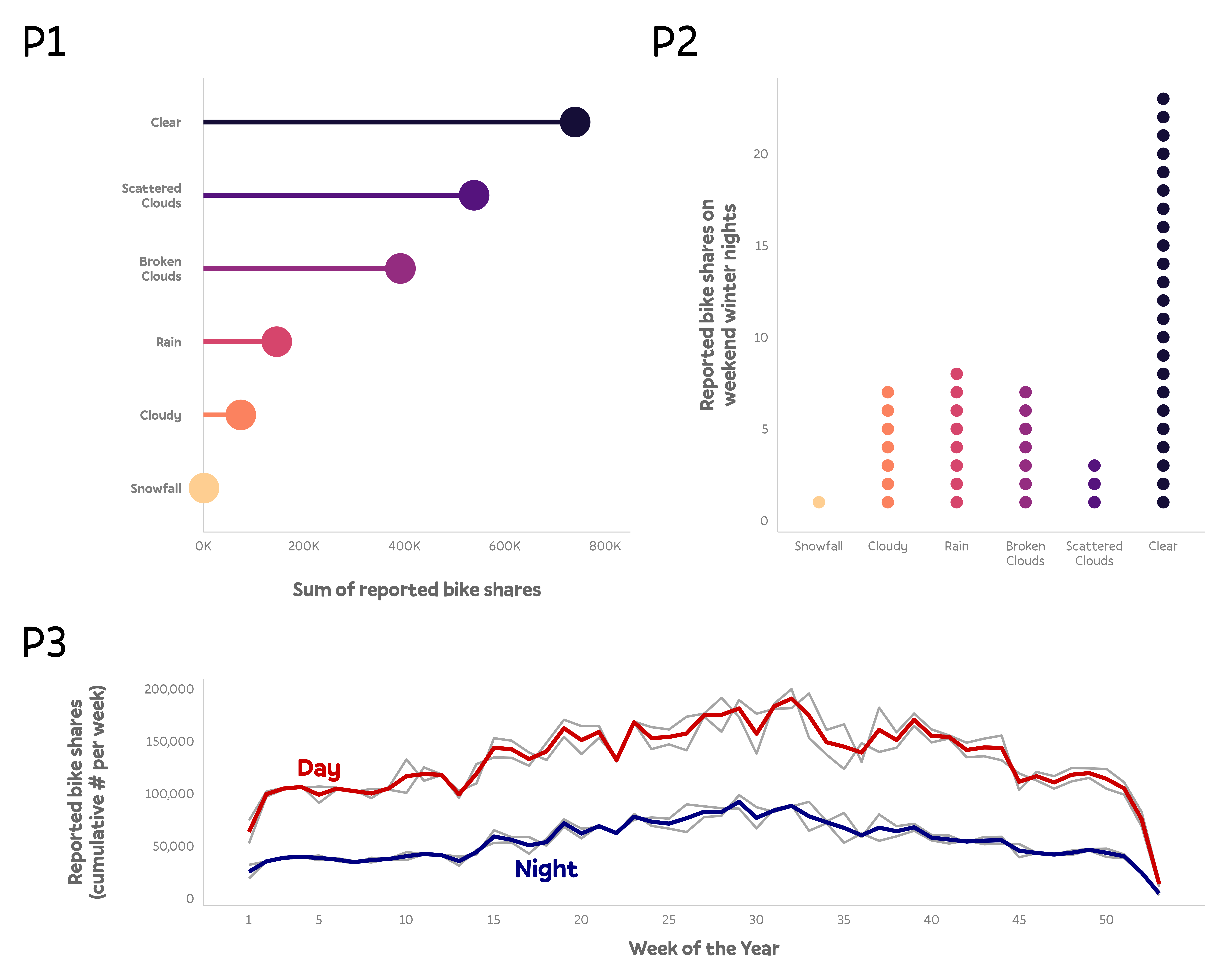
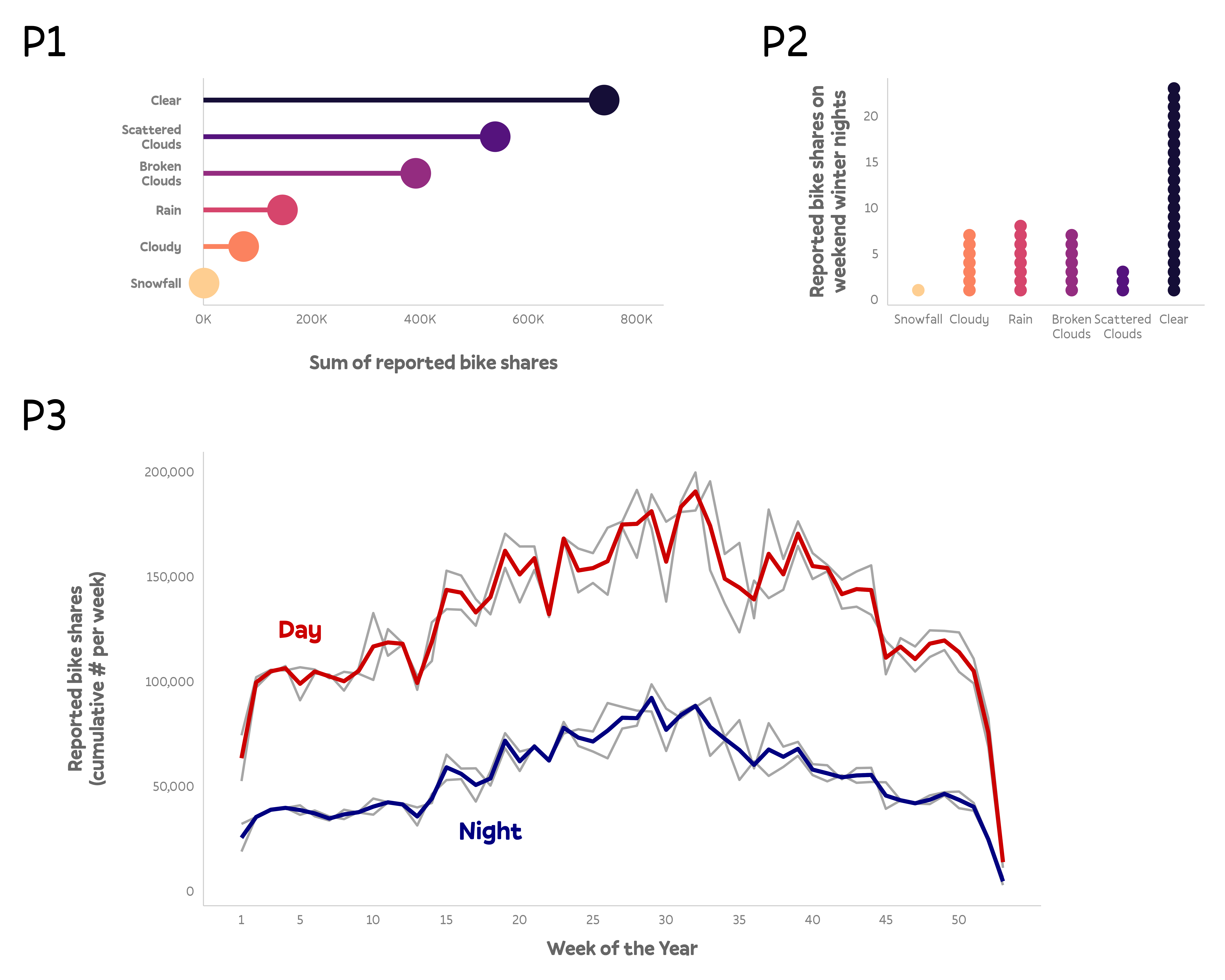
bikes_sorted <-
bikes %>%
filter(!is.na(weather_type)) %>%
group_by(weather_type) %>%
mutate(sum = sum(count)) %>%
ungroup() %>%
mutate(
weather_type = forcats::fct_reorder(
str_to_title(str_wrap(weather_type, 5)), sum
)
)
p1 <- ggplot(
bikes_sorted,
aes(x = weather_type, y = count, color = weather_type)
) +
geom_hline(yintercept = 0, color = "grey80", linewidth = .4) +
stat_summary(
geom = "point", fun = "sum", size = 12
) +
stat_summary(
geom = "linerange", ymin = 0, fun.max = function(y) sum(y),
size = 2, show.legend = FALSE
) +
coord_flip(ylim = c(0, NA), clip = "off") +
scale_y_continuous(
expand = c(0, 0), limits = c(0, 8500000),
labels = scales::comma_format(scale = .0001, suffix = "K")
) +
scale_color_viridis_d(
option = "magma", direction = -1, begin = .1, end = .9, name = NULL,
guide = guide_legend(override.aes = list(size = 7))
) +
labs(
x = NULL, y = "Sum of reported bike shares", tag = "P1",
) +
theme(
axis.line.y = element_blank(),
axis.text.y = element_text(family = "Pally", color = "grey50", face = "bold",
margin = margin(r = 15), lineheight = .9)
)
p1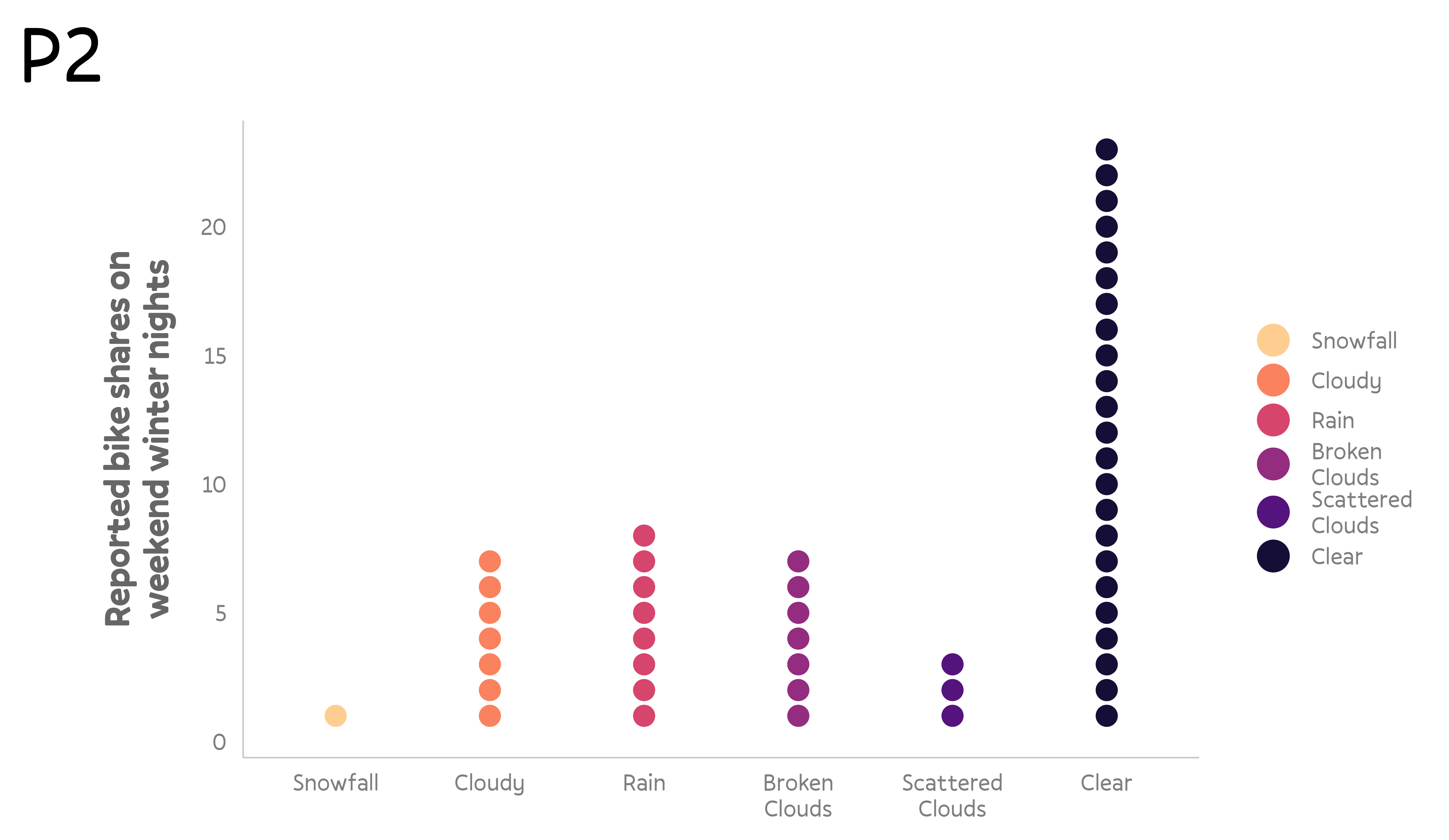
p2 <- bikes_sorted %>%
  filter(season == "winter", is_weekend == TRUE, day_night == "night") %>%
  group_by(weather_type, .drop = FALSE) %>%
  mutate(id = row_number()) %>%
  ggplot(
      aes(x = weather_type, y = id, color = weather_type)
    ) +
    geom_point(size = 4.5) +
    scale_color_viridis_d(
      option = "magma", direction = -1, begin = .1, end = .9, name = NULL,
      guide = guide_legend(override.aes = list(size = 7))
    ) +
    labs(
      x = NULL, y = "Reported bike shares on\nweekend winter nights", tag = "P2",
    ) +
    coord_cartesian(ylim = c(.5, NA), clip = "off")

p2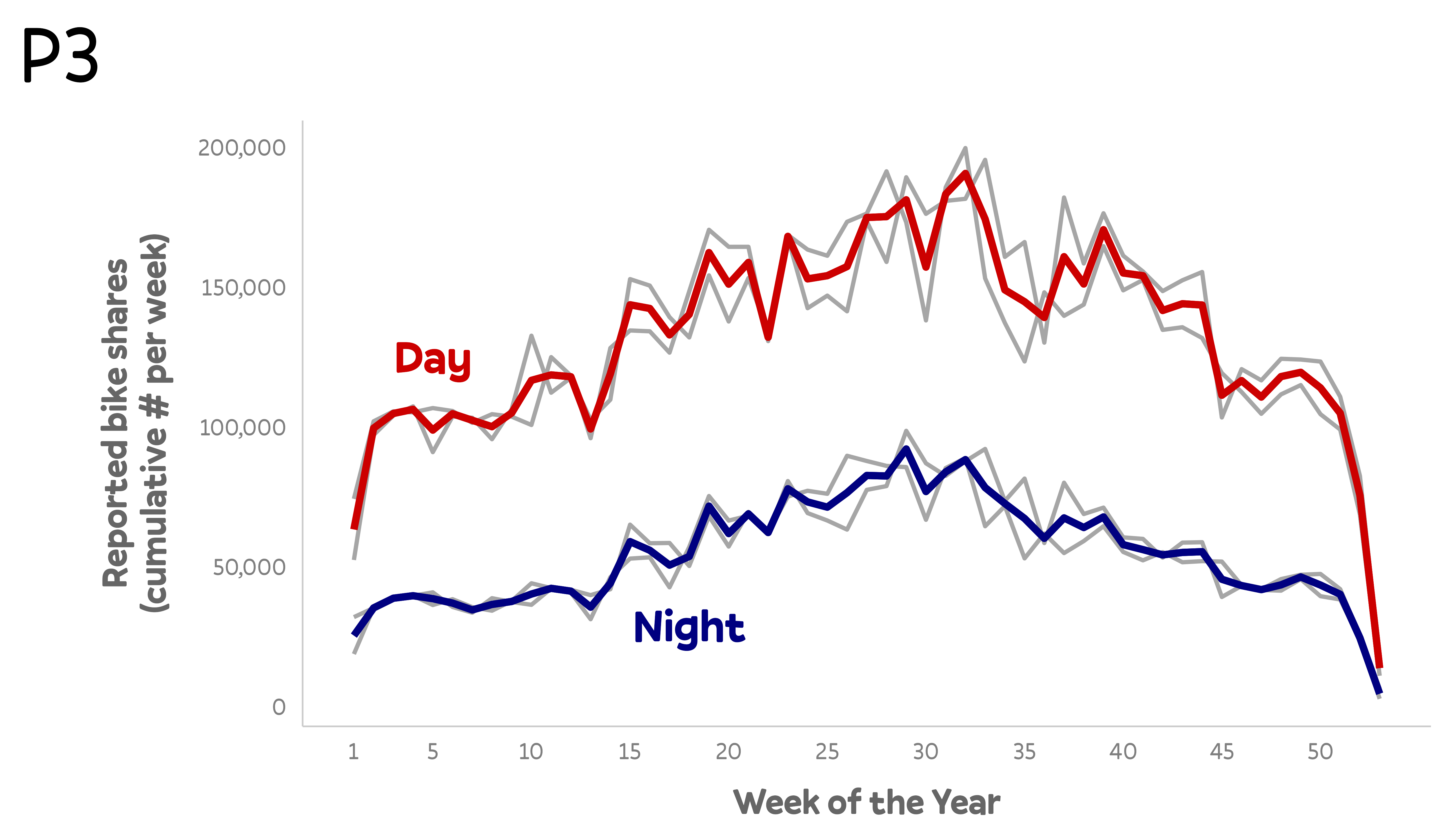
my_colors <- c("#cc0000", "#000080")
p3 <- bikes %>%
group_by(week = lubridate::week(date), day_night, year) %>%
summarize(count = sum(count)) %>%
group_by(week, day_night) %>%
mutate(avg = mean(count)) %>%
ggplot(aes(x = week, y = count, group = interaction(day_night, year))) +
geom_line(color = "grey65", size = 1) +
geom_line(aes(y = avg, color = day_night), stat = "unique", size = 1.7) +
annotate(
geom = "text", label = c("Day", "Night"), color = my_colors,
x = c(5, 18), y = c(125000, 29000), size = 8, fontface = "bold", family = "Pally"
) +
scale_x_continuous(breaks = c(1, 1:10*5)) +
scale_y_continuous(labels = scales::comma_format()) +
scale_color_manual(values = my_colors, guide = "none") +
labs(
x = "Week of the Year", y = "Reported bike shares\n(cumulative # per week)", tag = "P3",
)
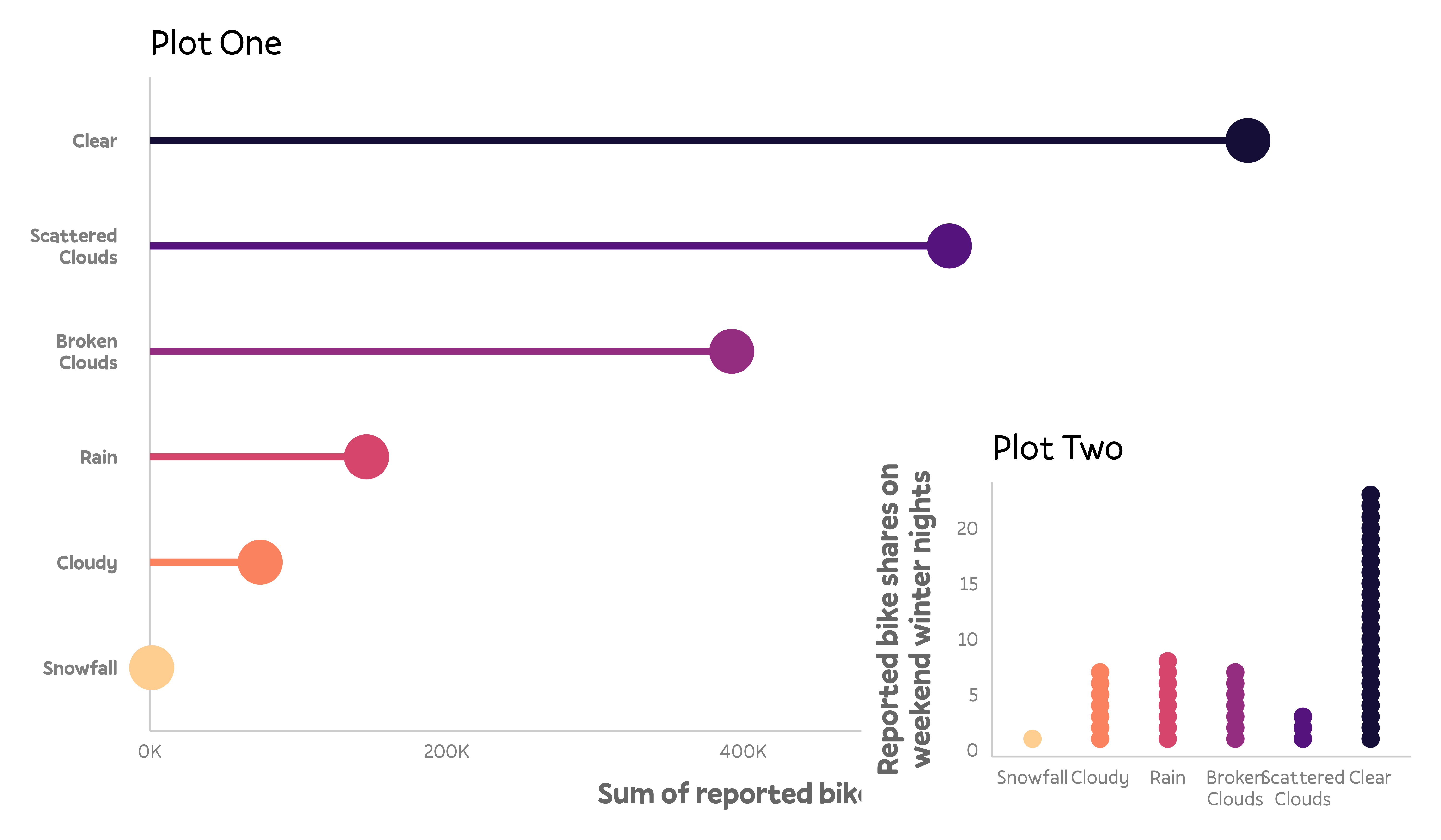
p3{patchwork}
“Collect Guides”
Apply Theming
Adjust Widths and Heights
Use A Custom Layout
Add Labels
Add Inset Plots
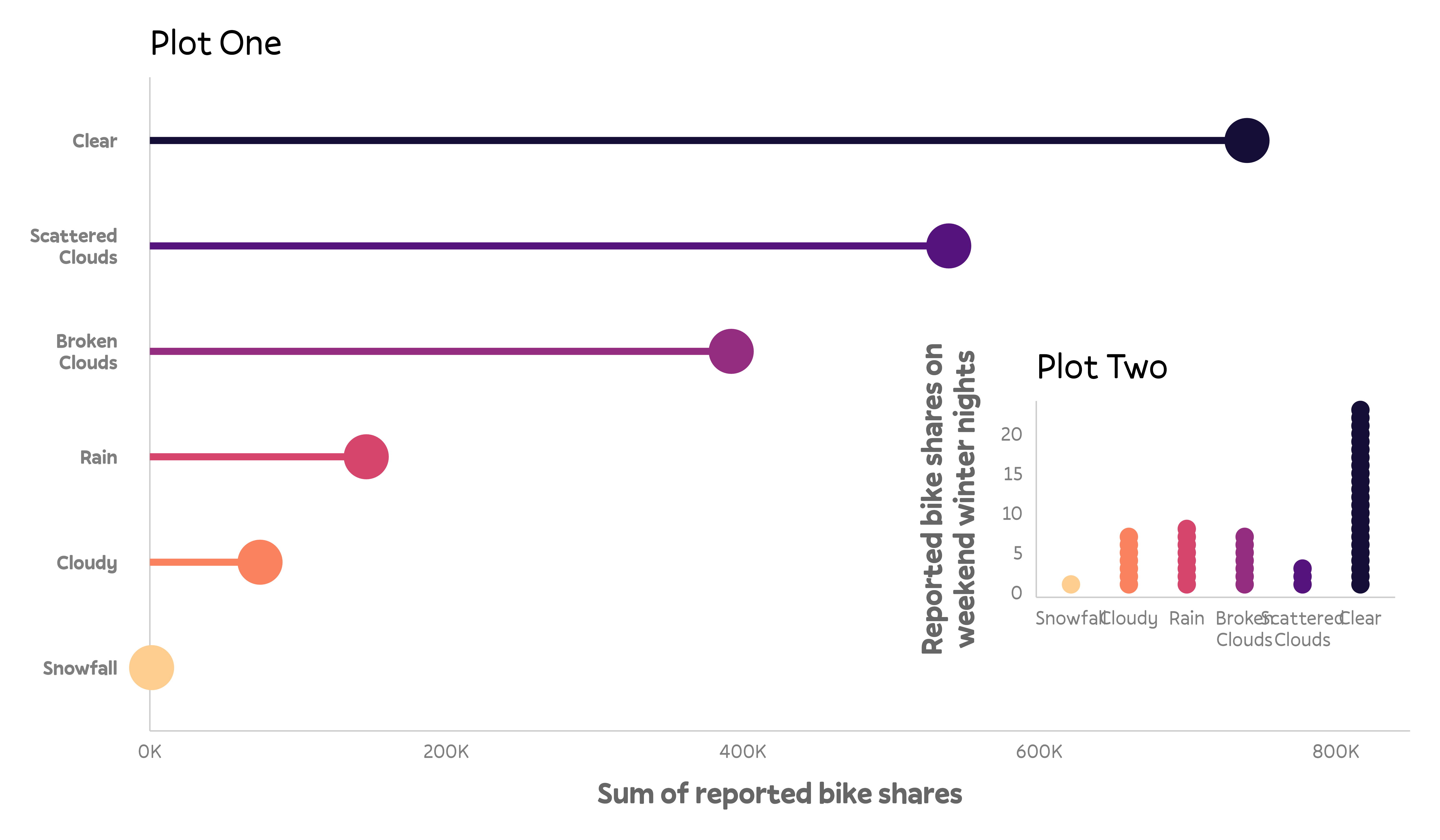
Add Inset Plots
That’s it Folks…
![]()
![]()